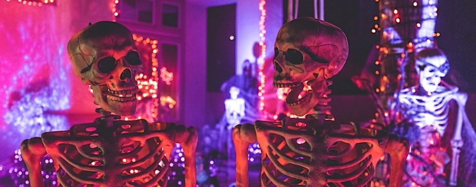
Halloween roundup: The UX House of Horrors
What’s scarier than bad UX? That’s what me and CEO Rit were thinking when we had the idea for a UX “haunted house”: a webpage so horrifyingly misdesigned that it would send users shrieking.
0 Comments
