What’s scarier than bad UX? That’s what me and CEO Rit were thinking when we had the idea for a UX “haunted house”: a webpage so horrifyingly misdesigned that it would send users shrieking.
We launched the UX House of Horrors on Halloween morning, and over the next 3 days we saw over 1,500 unique visits.

What’s behind the door?
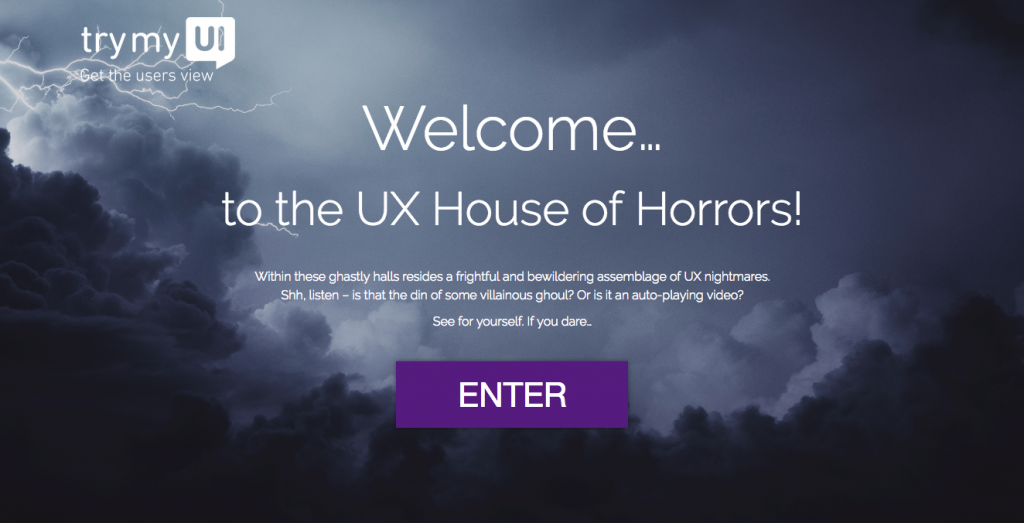
The flow starts on a simple landing page: a welcome message and Halloween-ish “flavor text,” replete with a background of dark foreboding clouds and flashes of lightning.
We wanted users to start on a relatively normal screen that would ease them into the experience by (1) setting the tone and (2) setting expectations for what’s coming.
The House of Horrors was meant to be shared around, and we didn’t want people jumping right into the thick of it without context.

Once you enter, the UX nightmares don’t stop coming.
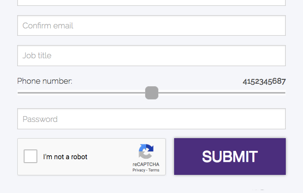
From auto-playing videos to a barrage of annoying popups, the page culminates in an unnecessarily long form with ridiculous password requirements (not shown until after an error is triggered, of course) and a slider for entering phone numbers.

The third and final step in the House of Horrors flow is the finish page, reached when users successfully submit the form. Once there, the escapees have the option to enter into a free t-shirt giveaway, as well as opt-in to the TryMyUI newsletter.
Tracking a horrific user experience
After Halloween week ended, we dove into the user testing metrics of the 3-page UX House of Horrors flow. Here’s what we found.
1. Visitors took their time soaking in the atmosphere
The content on the landing page was pretty brief, but on average visitors spent 33 seconds on the page. This “flavor text” was meant to evoke that “haunted house” atmosphere, so we were glad that users took their time to savor it! From here, 74.6% of visitors hit ENTER to continue on.

2. The average visitor spent long enough for the entire Ghostbusters dance video to finish playing
When people entered the main UX House of Horrors screen, a video of a costumed man dancing to the Ghostbusters theme started auto-playing halfway down the page.
The average time spent by users here was 2:32, while the video only lasts 1:32 – meaning most users would have heard the whole video from start to finish (unless they scrolled down and paused it, but who wouldn’t keep listening to Ghostbusters on Halloween?).
3. Despite the difficulty, 6.5% of visitors made it to the “escape” screen
Out of 1,565 unique visitors, 102 of them got past the array of UX frights and successfully submitted the form, continuing on to the finish screen. That’s a decent conversion rate, considering how difficult we made it!
Of the people who didn’t “convert,” about 2/3 exited, 12% went back to the landing screen, and another 8% clicked through to our main website.

4. Conversions on the escape screen were 59.8%
Once users made it to the finish, 59.8% submitted their names to be entered into our “This SUX!” t-shirt giveaway. (Congrats to Shawna Rabbas, UX Designer at Perpetual, for winning!)
In addition, 18.6% of users on this page (roughly 1/3 of the giveaway entries) opted in to receive TryMyUI’s UX newsletter.
5. Return visits were very common
The lure of the UX House of Horrors was strong, drawing many users back for another round. We saw 1,851 total sessions, compared to 1,565 unique visitors, indicating an 18.3% revisit rate.

Although we made sure that the UX House of Horrors was a thoroughly difficult and frustrating experience, we know it can be made even worse. We’ve already got a few ideas up our sleeves for next year.
What UX annoyances and bad design elements would you add for an even more haunting time? Let us know in the comments!


