Writing a good set of tasks is perhaps the most important part of the whole usability testing process, especially for e-commerce UX. Your tasks will make or break the whole study. If they don’t make sense, or they don’t represent a real user journey, or they don’t fit within the allotted time, it can undermine your research and make your findings useless.
Read: How to write usability testing tasks, Vol. 1
Below are the scenario and tasks for 2 usability tests we ran on H&M and Amazon, representing 2 different e-commerce UX strategies. For H&M, we broke the shopping experience down into many bite-sized steps, while for Amazon we left most of it up to the users.
H&M
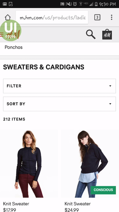
We ran this test on H&M’s mobile website for our H&M vs Forever 21 UX Wars article. When doing mobile user testing, we keep our tasks short and tend to break them into smaller bits because (1) there is less room on the screen, and (2) the tasks aren’t always showing so users have to remember it.
Scenario
With the coldest days of the year approaching, you’re thinking about buying a new sweater. You came here to check out what’s available and maybe make a purchase.
The best scenarios come close to replicating a situation that testers may find themselves in anyways. We ran this test in late January, so we took advantage of the time of year in our scenario by having users look for a sweater.
We saw users draw on their real-life circumstances in the test results. One user, looking at a sweater she’d found, commented: “Right now where I am this is kind of like perfect, because where I am it’s very cold, it’s snowing, the winds are ridiculous…”
Task 1
Do you see anything on the home page of the website that interests you? Where would you go first?
We began by testing users’ reactions to the home page. We wanted to see what stood out to people, or if anything caught their attention. If there was somewhere they wanted to go on the site, we preferred to find that out instead of immediately directing them somewhere.
 Task 2
Try and find a sweater or cardigan that you like.
Next we told users explicitly to start looking for a sweater. We decided to say “sweater or cardigan” so they wouldn’t be confused over the specificity of the instructions. We didn’t want testers to be distracted during the test wondering whether it was ok to get a cardigan or not and whether it counted as a “sweater.”
Task 3
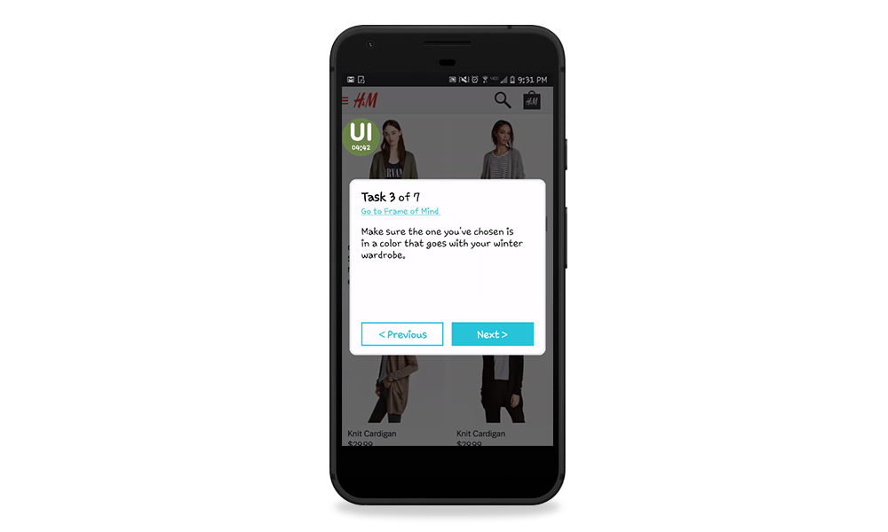
Make sure the one you’ve chosen is in a color that goes with your winter wardrobe.
Over the next few tasks, we broke down the process of finding the perfect sweater in a step-by-step sequence. This was tricky because we had to choose the order – do people look for color, then size? Or size, and then color? However, we did want to make sure that users touched on all these elements and gave feedback on them.
We went with color first, since the color of the product is immediately apparent from the pictures. We also tied this task back in with the scenario, and made it personally relevant for the users (“a color that goes with your winter wardrobe”).
Task 4
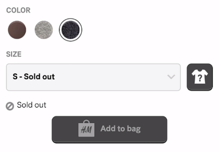
Is the sweater you’ve chosen available in your size?
We followed up by having users try and pick their size. Since it was a possibility that their size would be sold out for some items, we worded it as a question (a statement would work too). This opened the door to see what they would do if it wasn’t available.
Task 5
What were the most important factors for you in choosing which sweater to get?
Just in case it wasn’t clear from watching the previous few tasks, we had testers state specifically what had been the most important deciding factors as they made their choice.
This is important to us because every researcher watches the results through the lenses of their own bias. They might weigh things differently than the user did, so hearing them say what was most important in their minds is a great clarifier.
Task 6
Do you usually prefer to buy clothes online, or go into the store to try it on?
At the end, we asked users about their clothes shopping preferences. We wanted to get an idea of how they ideally would like to use an online clothing store – is their goal to make a purchase, or to see what’s available and then go try it in the store?
Recap: Full task script (H&M)
Scenario – With the coldest days of the year approaching, you’re thinking about buying a new sweater. You came here to check out what’s available and maybe make a purchase.
1. Do you see anything on the home page of the website that interests you? Where would you go first?
2. Try and find a sweater or cardigan that you like.
3. Make sure the one you’ve chosen is in a color that goes with your winter wardrobe.
4. Is the sweater you’ve chosen available in your size?
5. What were the most important factors for you in choosing which sweater to get?
6. Do you usually prefer to buy clothes online, or go into the store to try it on?
Amazon
Scenario
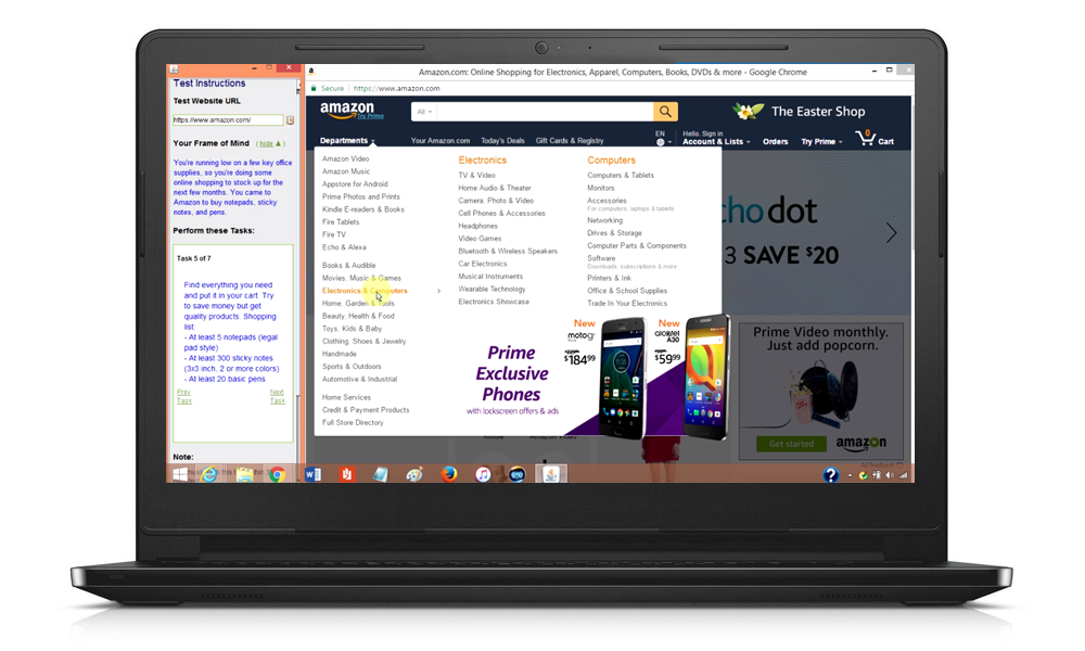
You’re running low on a few key office supplies, so you’re doing some online shopping to stock up for the next few months. You came to Amazon to buy notepads, sticky notes, and pens.
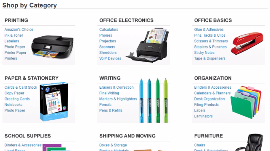
For this test, we were comparing Amazon to Google Express, so we needed to choose a scenario that would apply to both styles of e-commerce UX. Someone could buy just about anything on Amazon, but Google Express primarily offers home and office goods, electronics, and groceries.
Office supplies were a good overlap, and something that many people may order online since there is no real benefit to going to the store and buying it in person. We wrote this scenario to be simple and relatable, and filtered for testers who have office jobs.
Task 1
Have you shopped on Amazon before? If so, how frequently?
We began the test by doing some preliminary questioning to gauge users’ prior exposure to the site. People who have been on a website before could already know what to expect and where to find things, so their feedback will be different (which doesn’t mean useless!).
You may want to filter out people who have used your website before. Since Amazon is such a popular website we decided a totally random sampling, which may include new or experienced users, would be more representative and relevant.
Task 2
What kind of things do you typically shop for on Amazon, if anything? Describe a recent purchase.
The second task was a follow-up to the first to deepen our understanding of the users’ prior exposure. We were curious to know which parts of the site each user may have been familiar with and how they had previously used it. This would help us account for any biases as we analyzed the results.
Since we were expecting users with different levels of previous usage, we worded this task to suit many possibilities (adding “if anything?” to the end of the question). This was also because we would be using the same task list for Google Express, and we knew fewer people would have experience on that site.
Task 3
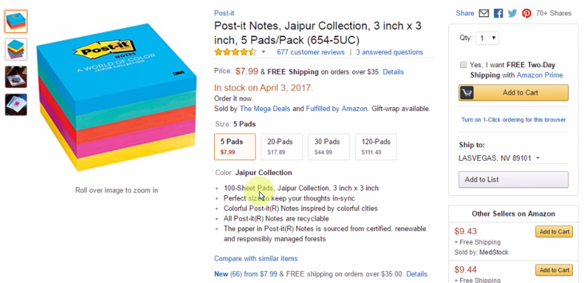
Find everything you need and put it in your cart. Try to save money but get quality products. Shopping list:
– At least 5 notepads (legal pad style)
– At least 300 sticky notes (3×3 inch, 2 or more colors)
– At least 20 basic pens
For this test, rather than break down the shopping experience task by task (find notepads, pick one you like, add it to your cart, find sticky notes, add those too…) we gave users a complete shopping list in this task and told them to fulfill it as they saw fit. We wanted to let a natural experience unfold with as little interference as possible.
We gave details about the items that would force them to sift through their options and carefully pick one that matched, instead of just going with the first thing they saw. Remember, paid testers’ motivation is extrinsic, not intrinsic – if you want them to really take their time and touch on specific aspects of your design, you may have to nudge them.
For example, the quantities of each item were chosen so that users would have to order multiples of an item or change the item size.
We also added the sentence “Try to save money but get quality products” so they would more thoughtfully consider which items they were getting, and not forget to think about cost (since they aren’t actually buying anything, users may not take cost as seriously as they would in real life).
Task 4
How much will your total order cost? How much is shipping?
After users had found everything on the shopping list, we asked them to see how much their total came out to. This was our way of getting them to go to the cart without just telling them “Go to your cart.” We also specifically wanted to see how they reacted to their total (including shipping) – would they be surprised by how much it added up to? If so, they may want to go back and pick something cheaper.
Task 5
What is Amazon Prime? Would you consider getting it? Why or why not?
Having sent users to the cart, we wanted to know what they had learned from the Prime promotions all over the site by this point. Did they understand how it worked and what it included? Would they find it appealing?
Of course, many users would already be familiar with Prime, and may even have it themselves. In that case, we would learn that about those users during this task. For the ones that didn’t, we would get to hear their opinions.
We also went deeper into this line of inquiry in the post-test written survey, where we asked users “How do you feel about Amazon as a brand?”
Recap: Full task script (Amazon)
Scenario – You’re running low on a few key office supplies, so you’re doing some online shopping to stock up for the next few months. You came to Amazon to buy notepads, sticky notes, and pens.
1. Have you shopped on Amazon before? If so, how frequently?
2. What kind of things do you typically shop for on Amazon, if anything? Describe a recent purchase.
3. Find everything you need and put it in your cart. Try to save money but get quality products. Shopping list:
– At least 5 notepads (legal pad style)
– At least 300 sticky notes (3×3 inch, 2 or more colors)
– At least 20 basic pens
4. How much will your total order cost? How much is shipping?
5. What is Amazon Prime? Would you consider getting it? Why or why not?
Final notes
There is not one right way to write your tasks. The best thing you can do is to think from the testers’ point of view as you write them. Will your tasks make sense to someone who doesn’t know your company, website, or app as well as you do? How might they misinterpret your wording? Will your tasks actually get users to do what you want them to?
Think about who they are, what they know, and what their goals are. Just like with UX design, the key to test design is being user-centric.
For more task-writing tips, read this breakdown of our task list for a Domino’s Pizza usability test.


 Task 2