
Your friend has been really excited about their new shoes from the brand Allbirds, which they bought online. Since they told you about them, you’ve been curious about the brand. You decided to check out the Allbirds website to see their shoe options, and consider maybe getting a pair for yourself.
The worst thing about my experience is that the main page said one thing about having a limited edition color for sneakers (would’nt let me navigate and interact with it) so I had to go the long way in trying to find the same pair I liked. However in finding it, it wasn’t consistent since the color was not shown as a choice for the same sneakers it showed on the main page.
Adding a lot more sustainability and explanations and comparisons of how these sneakers and apparel are more sustainable than other retailers and explain that data and how it came about. Also, make tab menu navigation on the site so its easier to know the different sections on the site and be able to navigate and find all the sections without missing out on information. Make sustainability a priority and advertise as such on the main page at the top and throughout.
I liked how modern it looked and the sustainability the company offers with their shoes.
No other comments other than my improvement suggestions. I hope all of this is helpful! I do really value sustainability, biodegradability, recycling, etc. I would love to see more on the site about the materials (how they are sustainable) and what that means for how long the shoe will last and what to do when the shoe is worn out. i.e. can it be recycled? does the company take it back? I would also love to see as part of the sustainability initiation program that there are ways people can buy "not perfect" or "defected products" for a whole lot less so these potential mess ups in products don’t go to waste and this also helps sustainability, along with partnering with conservation organizations like WWF or 4Ocean.
You have been eyeing some new supplies for your dog and decide to do some online browsing.
3
As I mentioned, the text on the homepage seemed cramped and the overall design of the homepage seemed a little throw together. None of the products really excited me as a user.
I like how easy it was to search for things. It was easy to customize my search, so even if they didn’t carry the right brand I could find a replacement.
All accounts, tests, and data have been migrated to our new & improved system!
Use the same email and password to log in:
Legacy login: Our legacy system is still available in view-only mode, login here >


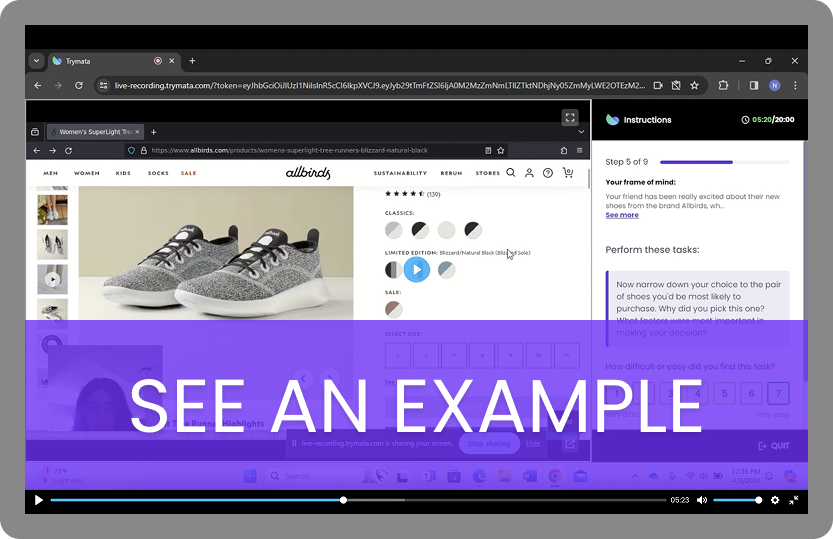
This test is a typical example of a usability study on desktop. The website being tested, AllBirds, is an online shoe store specializing in eco-friendly materials.
We recruited participants from our panel who had purchased shoes from comparable brands before. Then, during their sessions, we had them perform a series of tasks on the AllBirds site, starting from the home page and continuing on to find and check out a pair of shoes.
Inaccurate product options: The user was frustrated when the shoe color she liked, which was shown in the main product listings, was missing from the actual product page. “It’s a little bit misleading. It showed a limited edition color on the main site, but that color wasn’t there when I clicked in.”
Lack of detail about critical selling point: The user was very interested in AllBirds’ sustainability efforts, but felt that the site did not provide enough details on what makes the shoes environmentally friendly. After looking at their sustainability section, she noted she still didn’t know how they achieved (or measured) their lower carbon footprint, or whether the shoes are recyclable.
These insights are from just one 12-minute clip from a single tester. Imagine how much more you’ll learn about your UX with a full user testing study!
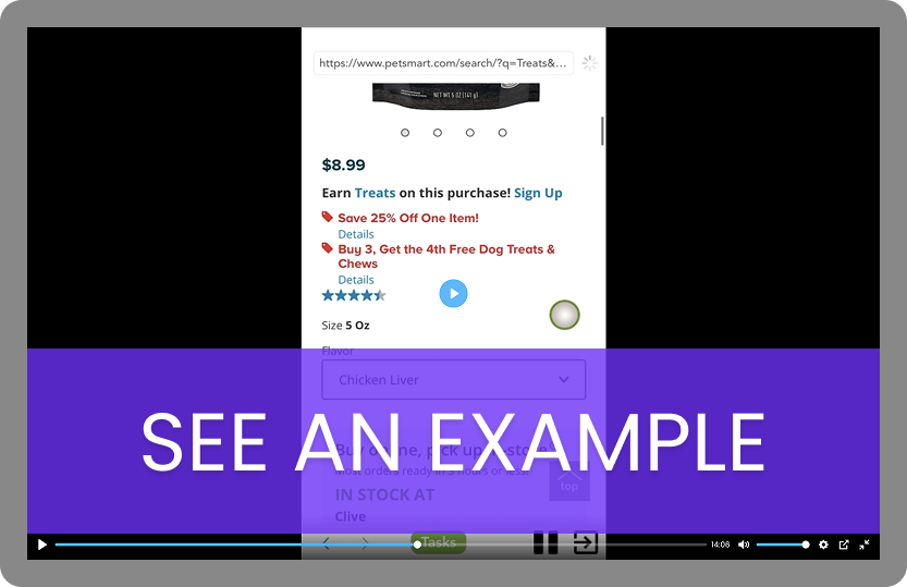
This test is a typical example of a usability study on a mobile website. PetSmart is an ecommerce website for finding and purchasing pet food and supplies.
We recruited real-life dog owners from our panel to participate in this test. Then, during their sessions, we had them perform a series of tasks on the PetSmart mobile site, beginning on the home page before moving on to try and find products for their dog.
Poor mobile layout: At several points throughout the session, the user remarks that the appearance and format of the website is “cramped” and cluttered, and not well-suited for usage on a mobile device.
Cart page confusion: While setting up an in-store pickup, the user notes that the store info is somewhat small as well as quite far down the page, making it easy to miss. With a “Continue to checkout” button right at the top of the page, they point out that they might skip by and finish the process with the wrong store location selected.
Trymata offers user testing for mobile apps, websites, and prototypes – find out how you can take your mobile UX to the next level!


