In usability testing, a cognitive walkthrough is a practical approach for evaluating an interface from a new user’s perspective. This method involves analyzing the user’s ability to complete tasks without prior experience, making it invaluable for identifying potential usability challenges early in the design process.
By focusing on user goals and task flows, cognitive walkthroughs help designers and usability experts pinpoint critical design elements that may hinder user experience.
In this blog, we will explore the fundamentals of cognitive walkthroughs, their benefits, and how to conduct them effectively.
What is a Cognitive Walkthrough?
A cognitive walkthrough is a usability inspection method designed to evaluate the usability of a new system or interface from the user’s perspective. It focuses on how new users interact with an interface to accomplish specific tasks. The methodology was initially developed to aid in designing interactive systems, ensuring that users can efficiently complete tasks without prior knowledge or extensive training.
At its core, the cognitive walkthrough method seeks to answer critical questions about user interaction with a system, such as whether users will notice key interface elements and associate them with the actions they need to take. This structured approach allows usability experts and UX practitioners to simulate user behavior and identify potential usability issues in a controlled setting.
Key Aspects of Cognitive Walkthroughs
- Focus on New Users: The cognitive walkthrough primarily targets new users unfamiliar with the system. This is crucial as many usability problems arise from the initial user experience.
- Task-Oriented: The method is based on specific task descriptions that users must complete within the system. This task-oriented focus ensures that the evaluation is grounded in real-world user behavior.
- User-Centric Questions: The cognitive walkthrough relies on a series of targeted questions that guide evaluators through the user’s decision-making process, helping to uncover usability challenges.
How to Conduct a Cognitive Walkthrough
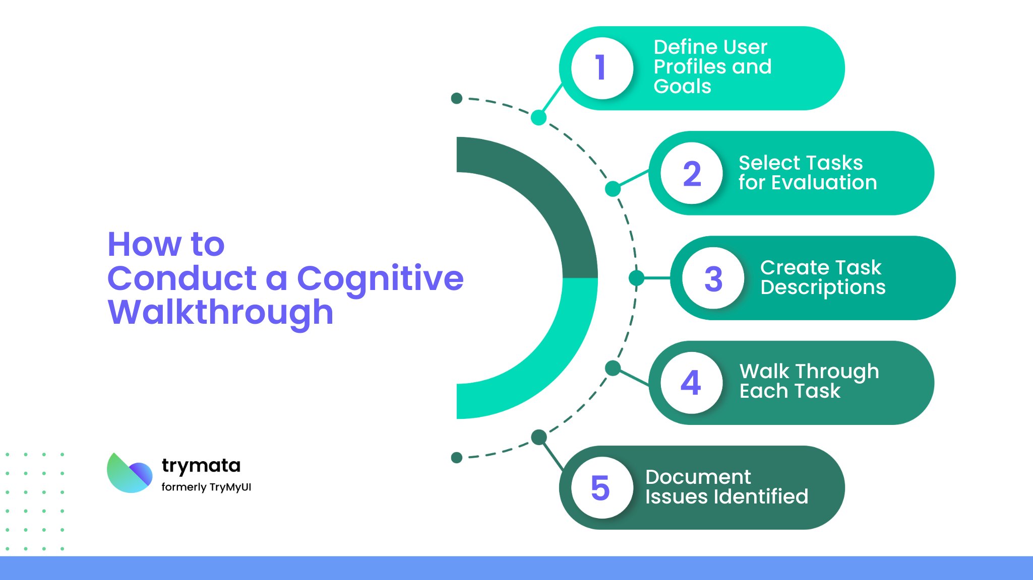
Conducting a cognitive walkthrough involves several systematic steps. Here’s a structured approach to help you effectively implement this method:

1. Define User Profiles and Goals
Before starting the walkthrough, establish a profile for your users. This includes their demographics, prior knowledge, and experience with similar systems. Understanding your audience will provide insights into what tasks they might find challenging.
For example, new users with little prior experience may need help with more complex user interfaces, while experienced users may navigate more seamlessly.
2. Select Tasks for Evaluation
Identify a set of sample tasks that users commonly perform within the system. These should cover a range of functionalities, including basic and complex tasks. Aim for a balance that represents typical user interactions.
3. Create Task Descriptions
Develop clear and concise task descriptions that detail the actions required to complete each task. This should include information about what users are trying to achieve, the starting point, and any relevant context.
4. Walk Through Each Task
As you conduct the walkthrough, follow these steps for each task:
- Step 1: Begin by asking whether users will attempt to achieve the goal.
- Step 2: Determine if users will notice the available action. Is the interface designed to draw attention to the necessary controls?
- Step 3: Consider whether users can associate the correct action with the desired outcome. For example, if they need to click a button to save their work, is it clear that it serves that purpose?
- Step 4: Evaluate whether users will receive adequate feedback once they take the correct action. Does the system indicate that progress is being made toward the task completion?
5. Document Issues Identified
As you progress through each task, document any usability issues that arise. Note whether users need help to notice actions, misunderstand feedback, or associate actions with outcomes. This will help you compile actionable insights for design improvements.
Questions to Ask During a Cognitive Walkthrough
During the walkthrough, evaluators should ask several targeted questions that facilitate a deeper understanding of the usability from the user’s perspective. Some key questions include:
- What are the user’s goals for this task?
Understanding the user’s goals ensures that the walkthrough focuses on the right outcomes.
- What actions does the user need to take to achieve this goal?
Identifying the correct actions helps clarify the task flow.
- Will the user notice the correct action at this step?
Evaluators must ensure that all necessary actions are visible and prominent.
- Does the user understand what to do next?
This focuses on the clarity of instructions and feedback provided by the interface.
- What if the user makes a mistake?
Analyze how the system handles errors and whether the user can recover gracefully.
- Is there any support for users who may struggle?
Consider if the interface includes help features or guides for new users.
These questions guide evaluators in assessing the system’s usability and ensure that critical aspects are addressed.
Tips for Effective Cognitive Walkthroughs
To conduct a practical cognitive walkthrough, follow these essential tips:
1. Define Clear User Goals and Tasks
Start with well-defined user goals and detailed task descriptions. This helps evaluators focus on typical user behaviors and ensures the walkthrough remains relevant to real-world interactions.
2. Assemble a Skilled Evaluation Team
Involve a mix of usability experts and, if possible, real users who can provide diverse perspectives on potential usability challenges. This combination strengthens insights, especially when dealing with complex user interfaces.
3. Ask Targeted Questions
Use a structured approach with questions focused on the user’s journey, such as:
- Will the user know what to do at this step?
- Will they recognize the correct action?
- Does the interface provide feedback confirming the correct action? These questions help evaluators uncover critical usability issues.
4. Simulate the New User Experience
Evaluators should approach tasks as if they have no prior knowledge of the system, allowing them to identify challenges new users may face.
5. Focus on Complex Areas
Pay extra attention to decision-heavy or multi-step areas, as users often need help with these parts of a complex interface. This targeted focus can highlight specific usability issues.
Maintain detailed notes of each issue and potential solutions. Share insights across teams to foster improvements and effectively address usability problems.
7. Iterate Based on Feedback
Continuous improvement is key. Review feedback from team members and real users after each walkthrough to refine the process and make future walkthroughs more impactful.
Following these tips, cognitive walkthroughs become a powerful tool for enhancing usability and creating user-centered designs.
Benefits of a Cognitive Walkthrough
Conducting a cognitive walkthrough provides several advantages, making it a valuable tool in user interface design and usability testing:
- Early Identification of Usability Issues: The cognitive walkthrough helps to catch identified usability issues early in the development phase by simulating the new user experience. This early detection makes it easier to implement design changes.
- Focus on the User’s Perspective: Since the walkthrough is performed from the viewpoint of someone unfamiliar with the system, it helps ensure the design meets users’ needs without requiring prior knowledge of the interface.
- Effective for Complex Systems: The cognitive walkthrough is especially beneficial for more complex user interfaces, as it helps designers understand how the design might appear to those who still need to become proficient with it.
- Supports Iterative Design: Cognitive walkthroughs provide actionable insights, allowing for iterative improvements to the interface ensuring it becomes more intuitive and effective for new users.
Limitations of a Cognitive Walkthrough
While the cognitive walkthrough method is invaluable, it also has some limitations:
- Lacks Real User Interaction: This method doesn’t involve real users, so it may overlook usability issues due to unique user behaviors or unexpected interactions.
- Reliant on Expert Judgment: The insights gained from a cognitive walkthrough heavily depend on the skill and perspective of the evaluators, who may only partially predict the experiences of some user types.
- Time-Consuming for Complex Interfaces: When evaluating complex user interfaces with multiple steps, cognitive walkthroughs can become time-intensive, especially when defining the correct sequence for many tasks users might complete.
- Limited by Defined Tasks: This approach focuses on specific tasks, so issues identified might only cover a subset of potential problems, missing usability issues in untested areas.
Conclusion
The cognitive walkthrough is a valuable tool in the arsenal of usability evaluation methods. By simulating new users’ experiences, this structured approach provides crucial insights that can identify potential usability issues and enhance user interface design.
Despite its limitations, the cognitive walkthrough offers a pathway to create more user-friendly systems that align with the goals of effective human-computer interaction.
By conducting a thorough cognitive walkthrough, UX practitioners can ensure that their designs are intuitive, enabling users to complete tasks and achieve their goals successfully. This method promotes better usability and a more satisfying user experience overall.
As the field of user experience design continues to evolve, the cognitive walkthrough remains a key aspect of designing interactive systems that meet users’ needs in an increasingly complex digital landscape.
Comparative usability testing: Why it matters for your business


