First impressions matter when designing user experiences. The Five-Second Test is a simple yet effective UX method that measures how quickly users can grasp a design’s key elements. Within just five seconds, you can gain valuable insights into your design’s clarity, visual impact, and message retention.
Our article offers a step-by-step guide to ensure that your designs communicate effectively and engage your target audience from the very first glance. Whether you’re testing a website, ad, or branding element, this technique will help refine your user experience.
What is the Five-Second Test?
A five-second test is a UX testing technique used to measure a user’s immediate first impression of a design, typically within five seconds of viewing it. This test helps assess a design’s clarity, value proposition, and visual impact. It’s primarily conducted on static visuals such as website designs, logos, advertisements, or other forms of visual content.
The premise is simple: users are shown the design for exactly five seconds, after which they are asked specific questions about what they remember or noticed most. This short time frame is often enough to gauge whether a design’s key elements are noticeable and easily understood.
Why is Five-Second Testing Important?
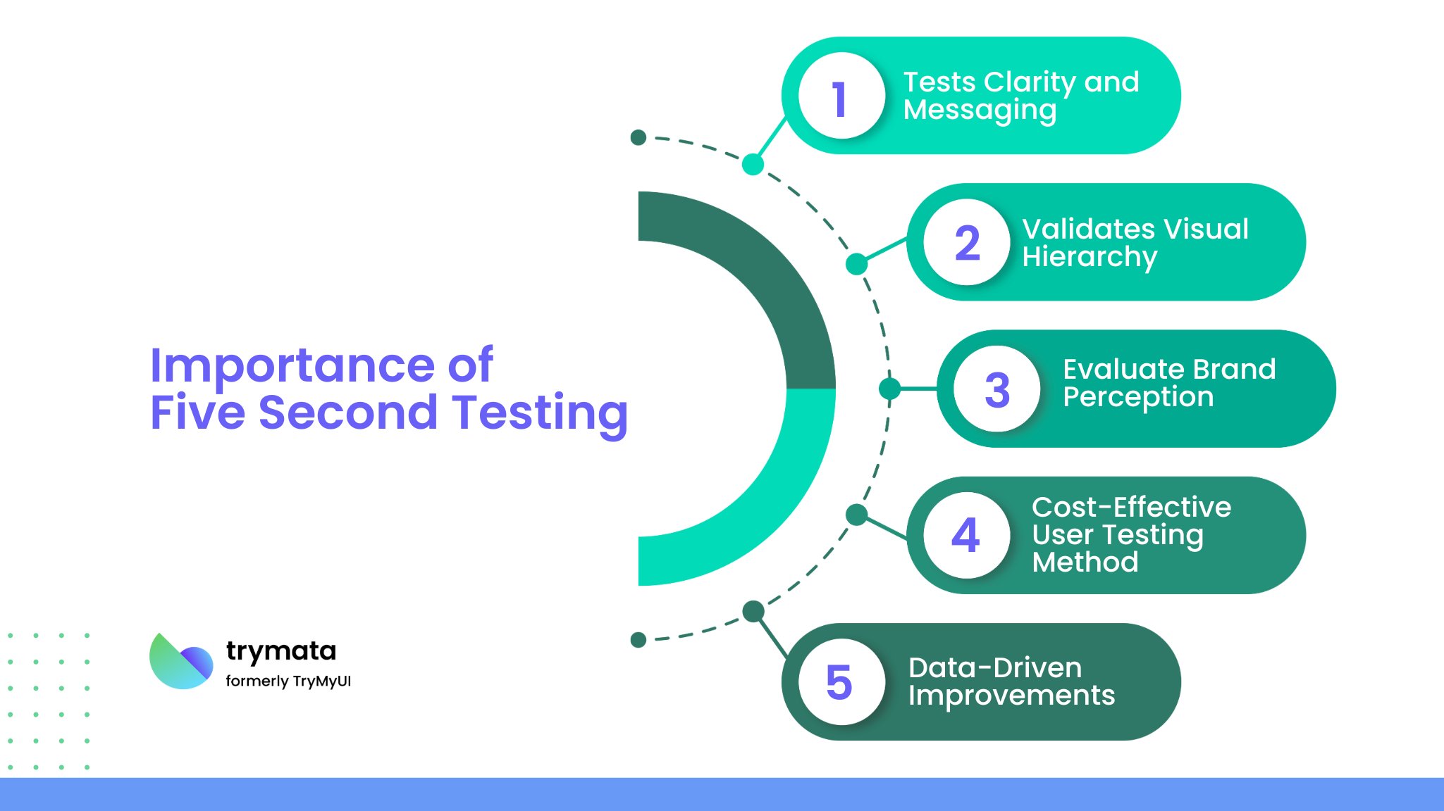
Five-second testing is crucial in UX design because users often make split-second decisions when browsing online. A strong first impression can mean a user staying on or leaving a site. Here are a few reasons why a five-second test is valuable:

- Tests Clarity and Messaging: This helps assess whether the main message is clear and whether users understand the purpose of the design.
- Validates Visual Hierarchy: It allows designers to check if the most important elements, such as logos, headlines or calls to action, are the first things users notice.
- Evaluate Brand Perception: The test provides insight into users’ initial perception of a brand’s tone, value, and quality.
- Cost-Effective User Testing Method: A five-second testing tool is highly cost-effective for gathering valuable feedback. It’s quick and easy to administer.
- Data-Driven Improvements: The insights gathered provide an objective basis for improving design elements.
When to Use
Five-second tests can be useful in various stages of the design process but are particularly valuable for initial design and content validation. Some ideal situations to use a five-second test include:
- Early Concept Testing: To see if early designs resonate with users.
- Redesign Feedback: To compare a new design with an old one and gauge if improvements are clear.
- Branding Validation: To see if users quickly grasp brand values and identity through a logo or visual branding.
- Marketing Material Testing: To ensure that key points or value propositions are immediately clear in ads or banners.
- Usability Testing of Landing Pages: To understand if users can quickly identify the purpose of a page and the next steps they should take.
A Step-by-Step Guide About How to Conduct a Five-Second Test
Setting up a five-second test is straightforward. Follow these steps to ensure your test yields actionable insights.
Step 1: Define Your Objective
Identify what you want to learn from the test. Common objectives include understanding how well a design communicates its message, assessing if users understand the value proposition, or testing if the call-to-action (CTA) is clear. Defining a clear objective will guide the test setup and analysis.
Step 2: Choose Your Visual Content
Select the specific visual content you want to test. This could be a homepage, an advertisement, a product page, or a logo. Ensure that the visual is polished enough to elicit a fair user response.
Step 3: Determine the Audience
Identify the target audience from which you want to gather feedback. Your test participants should represent the actual audience for the design being tested. You can use online platforms like UsabilityHub, Maze, or Pollfish to reach participants quickly.
Step 4: Design Your Questions
Develop questions that align with your objective. After participants view the design for five seconds, ask questions that reveal their initial impressions, comprehension, and feelings. Keep questions simple and direct.
Step 5: Conduct the Test
Display the visual to each participant for exactly five seconds. After five seconds, the image should automatically disappear. Then, present your predetermined questions to gather feedback. Many online platforms for UX testing allow you to set up the timing and question flow easily.
Step 6: Collect Data
Compile the responses. With tools like UsabilityHub, the data is often collected automatically. Alternatively, you can record responses manually if conducting the test in person or through simpler platforms.
What Questions Can You Ask in a Five-Second Test?
The questions you ask after the test should be designed to capture user perception, comprehension, and recall. Here are some sample questions that align with common testing objectives:
Comprehension and Clarity:
- What do you think this page or product is about?
- What service or product do you believe is being offered?
- What information stood out to you the most?
Visual Impact and Design:
- Describe what you remember about the design.
- Did anything in the design catch your attention?
- What did you like or dislike about the visual?
Branding and Tone:
- What brand or company do you think this design belongs to?
- What impression do you get from this design? (Professional, friendly, innovative, etc.)
Next Steps and Call-to-Action Clarity:
- Was it clear what you should do next?
- Would you be interested in learning more based on this visual?
Each question should focus on one aspect to avoid overwhelming users with multiple concepts. Choose questions that align with the design’s purpose to gather the most relevant insights.
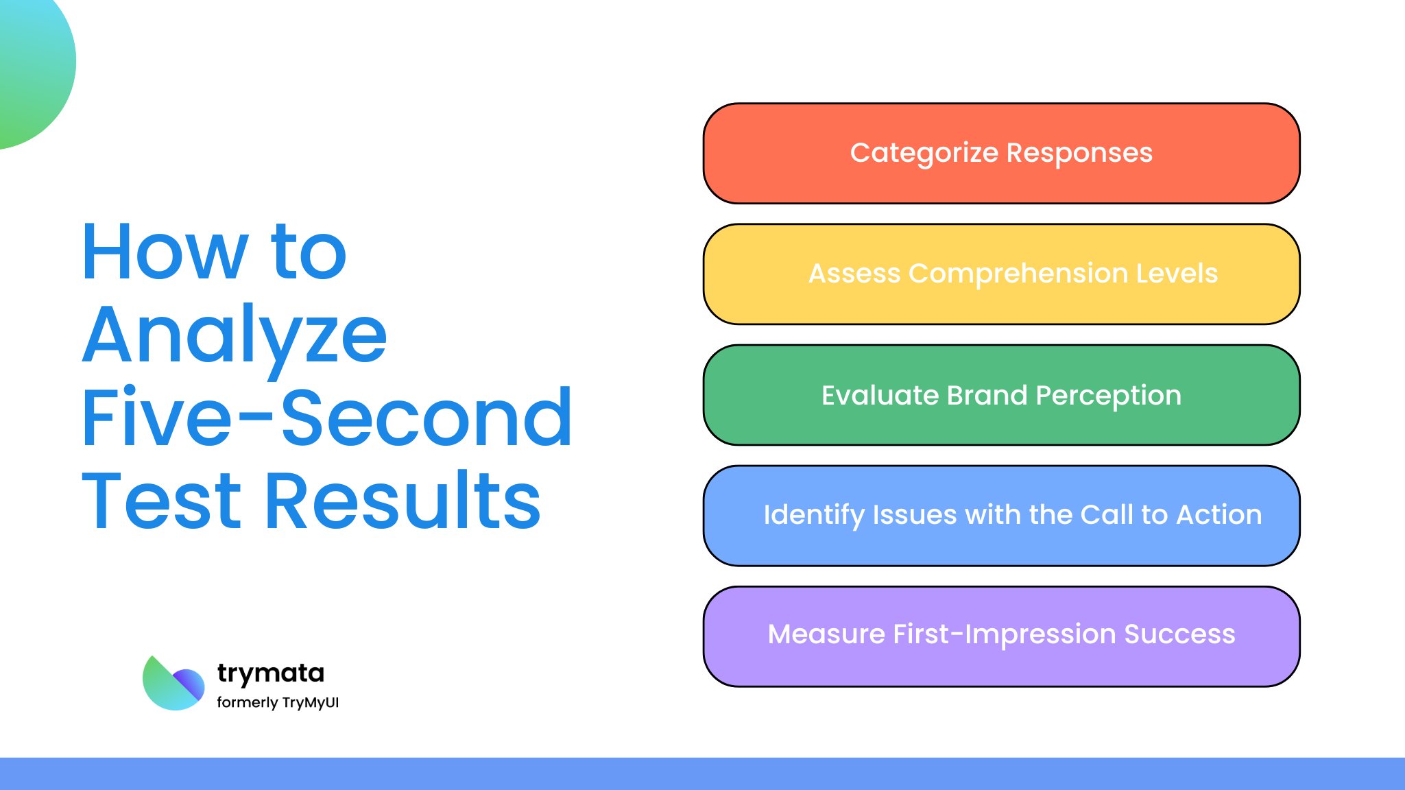
How to Analyze Five-Second Test Results
After gathering responses, it’s time to analyze the data to identify trends, patterns, and actionable insights. Here’s how to approach the analysis:

1. Categorize Responses
Sort responses based on common themes. For instance, many participants remember a specific part of the design, which indicates a strong visual hierarchy.
2. Assess Comprehension Levels
Look for responses that align with your intended message. If most users describe the product or service correctly, the design effectively communicates its purpose. If comprehension is low, consider adjusting elements like headlines or imagery.
3. Evaluate Brand Perception
Analyze responses to see if users’ initial impressions align with your brand’s tone and identity. If participants perceive the design differently than intended, color schemes, typography, or imagery adjustments may be necessary.
4. Identify Issues with the Call to Action
It may not be prominent enough if users don’t mention the CTA or seem unclear about the next steps. Consider making the CTA more noticeable or improving its wording to clarify what action users should take.
5. Measure First-Impression Success
For some five-second tests, you can use quantitative metrics, such as the percentage of users who correctly identified the purpose or noticed the CTA. This data can help you set measurable targets for future design iterations.
Common Mistakes to Avoid in Five-Second Testing
When conducting five-second tests, avoid these pitfalls to ensure you gather accurate and useful insights:
- Overloading with Information: Too many elements in a design can overwhelm users within five seconds, so keep it simple.
- Asking Leading Questions: Avoid phrasing questions that may bias responses. Use neutral language to get genuine feedback.
- Testing Too Late in the Process: Conduct the test early in the design process so you can make meaningful changes before finalizing the design.
- Skipping Analysis: Results from a five-second test are only as valuable as the insights you derive. Spend time thoroughly analyzing responses for patterns and actionable feedback.
Conclusion
The five-second test is a quick, efficient, and insightful UX testing method that helps you understand a user’s first impression of a design. By determining the clarity, impact, and recall of your design’s message, you can improve user experience and align with your brand goals.
When conducted effectively, five-second tests can yield actionable insights to refine visual hierarchies, improve messaging, and ensure your audience connects with your design. Whether you’re testing early prototypes, marketing materials, or branding elements, the five-second test is a versatile tool to keep in your UX toolkit.


