In today’s fast-paced digital landscape, user attention spans are fleeting. Ecommerce competition is fiercer than ever, and consumers’ multi-tab browsing habits (especially on mobile devices) have made it more difficult than ever to hold onto users’ attention.
Thus, understanding user behavior – and using it to optimize website performance – is paramount for achieving digital success.
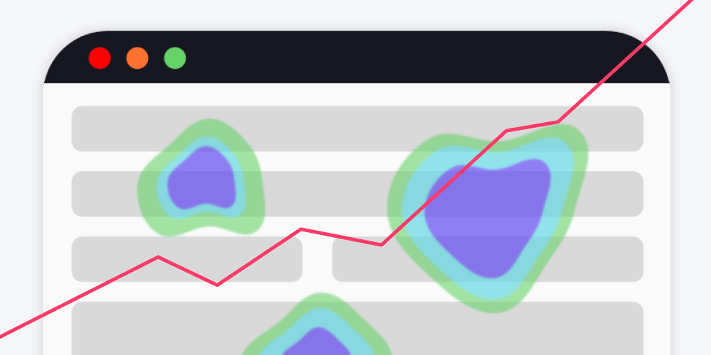
One of the best tools for unlocking a better understanding of user behavior is heatmaps. Heatmaps are powerful visual tools that provide insight into users’ experiences on specific website pages by representing aggregated patterns of user interaction.
By analyzing the data generated by heatmaps, businesses can gain a deeper awareness of how users interact with the different content and functionalities on their website. In other words, with heatmaps you can begin to identify which pages and elements are most (and least) effective in capturing user attention and driving engagement – and use that knowledge to your advantage.
Read more: Guide to behavioral analytics
The insights derived from heatmaps are highly actionable, enabling you to make informed decisions to enhance the overall user experience. By identifying areas of low engagement or poor performance through heatmaps, you can take rapid measures to improve those aspects and drive more user behaviors that are aligned with your business conversion goals.
In this article, we will explore the various types of heatmaps, delve into their benefits, and discuss how they can be harnessed effectively to propel digital success.

Defining heatmaps (and how to use them)
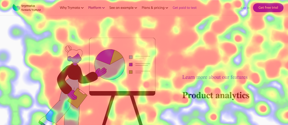
A heatmap is a data visualization tool that is a representation of aggregated user activity and engagement on a webpage.
Heatmapping tools generate these visualizations by tracking all visitor actions on a page: scrolls, mouse movements, clicks, and any other interactions. Then, all of these actions are aggregated together and layered onto a screenshot of the page.
Looking at a heatmap, you’ll be able to see the most common areas that users moved their mouse over, the most frequent elements they clicked on, how far most users tended to scroll down the page, and other patterns.
Generally, heatmaps are shown with color-coded displays, allowing for easy interpretation. Warmer colors (reds and oranges for example) typically indicate areas of high user interest or engagement. Cooler colors, conversely, indicate areas of low engagement, while a lack of any overlaid colors in a heatmap indicates spots where no one is clicking, engaging, or paying attention.
Learning about conversion performance from heatmaps
By studying your heatmaps for hotspots (and “coldspots”), you can learn what your web visitors like. What drives them to click your CTAs and fill out your forms? What kinds of content are they ignoring? Identifying these user preferences can fuel more effective design choices throughout your website.
For example, if you notice that one of your landing pages has a higher conversion rate than other similar pages, you might check the heatmaps for each page to see which elements are catching users’ attention. If you find that the higher-converting page gets lots of visitors dwelling on the feature illustrations, or the bulleted list of product benefits, you could then add similar elements to the pages that aren’t performing as well.
Another example: maybe as you observe the heatmaps for several of your pages, you notice that embedded videos tend to get ignored by most users. That’s a good sign that you should try using a different kind of media instead – perhaps gifs, or still images.
Yet another application of the insight gleaned from heatmaps is the strategic repositioning of page elements to areas with high visitor traffic. That is, if you want users to click on your CTA (call-to-action) button that’s at the bottom left of the page, but your heatmap tells you that most visitors are looking at the top right, you can try moving the CTA to that top-right portion to boost clicks.
The principle behind all of these examples is the same: heatmap data enables you to align your website’s design and functionality with users’ preferences and behaviors, thus maximizing your performance on key digital objectives. Whether those objectives are tied to signups, purchases, views, or some other conversion-related goal, collecting and analyzing heatmaps can point the way.

Types of heatmaps
There are several types of heatmaps that provide different insights into user behavior and website engagement. Each type serves a specific purpose, and sheds light on different aspects of page performance.
Let’s explore some of the most common types of heatmaps:
Click heatmaps
Click heatmaps visualize the areas of a webpage that receive the most clicks. They are particularly useful when analyzing user interaction with specific elements on a webpage, such as buttons, links, or navigation menus.
Click maps illustrate which elements are most engaging, which areas users tend to ignore, and how users navigate through the page. By leveraging click heatmaps, you can optimize your website design and the placement of important elements to improve user engagement, increase click-through rates, and drive conversions.
Scroll heatmaps
Scroll heatmaps track how far down the page users scroll before leaving. These scroll maps reveal the areas where users lose interest or abandon the page, helping to identify content gaps or optimize page layout for better engagement.
By analyzing scroll heatmaps, you can optimize your webpages’ content placement, design, and format to improve engagement, keep users on the page longer, and increase conversion rates.
Movement heatmaps
Movement heatmaps, also known as hover or mouse movement heatmaps, show where users move their cursors and hover on a webpage. They provide insights into areas of interest or hesitation, helping to optimize navigation elements and improve the overall user experience.
By analyzing movement heatmaps, you can optimize your website’s navigation elements, improve user experience, and guide users towards important content or calls-to-action for better conversions.
Attention heatmaps
Attention heatmaps combine various engagement metrics like clicks, scrolls, and mouse movement to generate a comprehensive representation of user attention. They highlight the most engaging sections of a webpage and enable marketers to prioritize content and calls-to-action based on user interest.

How to increase conversions on a webpage with heatmaps
Following the right analytical approach is crucial to using heatmaps effectively. Heatmaps are filled with insightful user behavior data, but like any tool, they’re only useful if you know how to use them.
With a scaleable, repeatable process, you can use heatmaps to constantly optimize your webpages and increase conversions.
Below is a basic 10-step process to start with when using and analyzing heatmaps:
1. Define objectives
Clearly articulate your goals and objectives before you even start generating heatmaps. Determine the specific question you want to answer or problem you want to solve, and the specific webpage(s) relevant to your objectives.
For example: “I want to increase new account signups from my Google ads landing page.”
2. Select the right heatmap type
Choose the heatmap type(s) that aligns with your objectives, whether it’s a click, scroll, movement, or attention heatmap.
3. Collect sufficient data
Collect a substantial sample size of user interactions over a substantial period of time (at least 2 weeks is a good rule of thumb) to ensure accurate, reliable information. If traffic to the target webpage is low, you may need to gather data over a longer duration.
4. Visualize your heatmap
Carefully examine the heatmap’s visual representation of user behavior on your webpage. Identify hotspots, cold zones, and patterns that emerge.
5. Extract key insights
Analyze the heatmap data in context and compare the patterns you’ve identified to your objectives for the page. Identify areas of high engagement, underperforming elements, and potential usability issues.
6. Formulate hypotheses
Develop hypotheses to explain the observed user behavior, and to guide your conversion optimization strategies. Create an idea for increasing conversions (or reaching whatever goal you’ve set) based on the evidence from your heatmap analysis.
For example: “If I move my CTA button to the bottom left of the page, more visitors will click on it.”
7. Conduct A/B testing
Validate your hypotheses by implementing your changes to the webpage and comparing outcomes through A/B testing. Measure whether your idea is achieving the improved performance that you intended to achieve.
8. Iterate and refine
Heatmap analysis, and webpage optimization in general, is an iterative process. Continue to collect new data, monitor user behavior and interactions, and refine your website designs based on new insights.
9. Combine with other metrics
Supplement heatmap analysis with other web analytics metrics like conversion rates, bounce rates, and time on page to gain a comprehensive understanding of user behavior and website performance.
10. Apply learnings at scale
Use the insights gained from heatmap analysis and other metrics to make informed decisions about webpage design across the board that enhance user engagement, conversions, and overall user experience.
By following these 10 steps, you can effectively employ heatmaps as a tool to optimize your website, increase conversions, and drive greater digital success.
Unlock better digital experience with heatmaps
As powerful behavioral analytics tools, heatmaps play a crucial role in driving digital success and optimizing your digital presence.
Whether you’re a marketer working to increase leads, a designer working to improve the user experience, a product owner working to improve customer engagement, or anyone trying to boost the performance of your website – heatmaps can and should be a foundational tool in your arsenal.
If you’re ready to start improving web performance and increasing your conversions with heatmaps, get started with a free 2-week trial of Trymata! Our Product Analytics suite offers a variety of heatmap options for all your webpages, along with many other powerful tools and datasets for understanding how users interact with your digital platforms.
Get started today: