Few things can convince a team member or stakeholder of the flaws in a design quite like watching users struggle with the design first-hand.
Every usability testing study invariably turns up plenty of moments of struggle and grief; but it’s easy to lose those moments in hours of video data. A study with just 5 users may yield 100-150 minutes of video; running a larger batch with 30 or more tests can easily exceed 10 hours of data to dig through.
You may remember word-for-word what someone said about a particular page or feature – but which user was it? Where in the video did they say it?
It can be almost impossible to relocate those “aha” moments without wasting a lot of time rewatching user videos, yet sharing clips like that with your team is critically important to any truly user-centered design discussion.

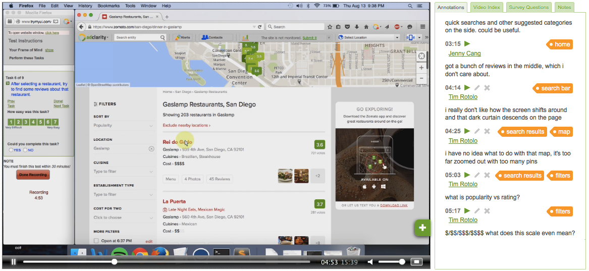
With the updates to our video annotation feature, cataloging and sharing your usability research is easier than ever, and can even be coordinated remotely. While watching your videos, you can add annotations on the fly to pinpoint important sequences, interactions, or quotes.
Creating an annotation
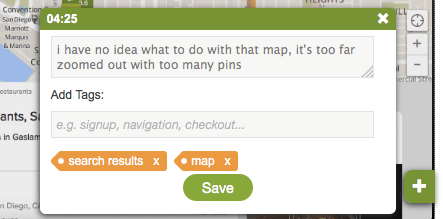
The annotation creator has two fields. The first is for writing a brief description to help you remember what happened, or what lessons or implications may be drawn from that moment. Often in the description field we at TryMyUI quote users word-for-word (such as in the example below), which can help to jog the memory later on and preserve detail and specificity.
The second field is for adding tags to your annotation. This helps to tie individual moments within and across user videos to a broader issue, feature, or flow. For example, we tagged this user’s complaints concerning a restaurants map from the Zomato search page with “map” and “search results” – thus bucketing it with any other feedback regarding either the map feature or the site’s search results.

We recommend using broad tags not exceeding one to three words in length; the idea is categorization, not detail. A useful tag may refer to a feature (“product zoom”), a user flow (“edit your profile”), a concept (“first impressions”), or any other common pattern you observe in your videos (“mission confusion,” “need labels”).

Each annotation automatically acquires a timestamp linked to the corresponding point in the video; they are then added to an Annotations timeline in the right-hand panel. From there, one-click playback allows you to jump straight to any annotation in the video.
You can also edit your annotations – clicking the Edit icon next to any annotation will re-open it in the creator window, where you can alter your description and add or remove tags.
You can also use the right-hand panel to filter your annotations by various characteristics. Click on any tag, for instance, and only annotations with that tag will be displayed; or, click on an author’s name to see only annotations created by that author.
Collaborative analysis
TryMyUI’s annotations feature becomes even more powerful as part of the Collaborative Analysis suite of remote usability testing tools.
Collaborative Analysis is a research paradigm that engages the whole product team, including researchers, designers, developers, and product managers, in the usability testing process to inspire user-centered design.
With TryMyUI’s Collaborative Analysis software, every team member can access user testing results and data with a unique login. This makes sharing key moments and highlights easier than ever: by interacting with annotations left by teammates, anyone can efficiently peruse the videos to watch the most critical sequences and see which issues and flows had the most issues. Of course, one can also watch the video results in full and leave their own comments and insights for the rest of the team to view and discuss.
This allows the greatest number of people the greatest amount of exposure to usability findings that are useful and relevant, while also enabling product teams to collect and compare a variety of viewpoints and perspectives on the data.
If you need more help, we invite you to read:
Update: Use your video annotations to create a highlight reel


