
Establishing a good first impression with your users is important if you want them to stick around and buy something (or sign up, read your content, or meet some other conversion metric).
This post is a guide to analyzing and understanding users’ first impressions of your website using TryMyUI’s Impression Test.
What is an impression test?
The impression test, if you choose to include it, occurs after users read the “Frame of Mind” instructions, but before they start performing the tasks you’ve written.
First they are directed to your landing page, where they will have about 15 seconds to take in what they can. Then, the page is hidden and replaced by a set of questions about what they saw:
1. Say three words that you remember from the site, or that you would use to describe the site.
2. What is this site about?
3. What services and/or products are offered on this site, and for whom?
4. What is the feel of this site? (e.g. professional, fun, small-company, corporate)
Watch: Impression Test Example Video
Here’s how to interpret and synthesize your impression test results into a meaningful portrait of the first impression your site creates for users.
Understanding your impression test results
When we tested the online apparel store Serengetee, we had each user perform an impression test. I will refer to the results we collected from these tests to illustrate some of the following pointers and methods.
1. What do users see?
The first thing to look for is how users behave during their 15 seconds on the landing page. Pay attention to where they move the mouse, which words and phrases they read out, and which parts of the page they talk about as they explore.
One of our Serengetee users, Alex, started off by looking at the main image on the home page, before quickly jumping up to the company name and logo along the top. Next he scrolled down to focus on the blue bar below the picture, reading the headings over each statistic out loud.
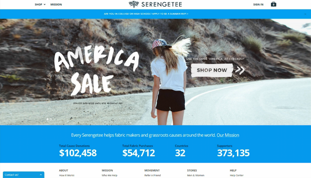
Almost every user followed a similar path: first the large main photo (and the “America sale”), then the brand name and logo, followed by the statistics in blue down below.
Many users will not spend very long on your site, and they’ll only pay attention to a few elements in that time. Look for patterns in the things that people look at first, or which groupings of elements they typically notice. Are those the few things that you want new visitors to see? They could forever define your brand for those people.
2. What do users say?
Users’ answers to the first follow-up question will confirm which parts of the website stuck out to them, and also start to dig into their perceptions of the tone and visual character of the website.
“Say three words that you remember from the site, or that you would use to describe the site.”
There will usually be a mix of common words and phrases that many testers recall, and more unique descriptors that each person comes up with. A good strategy for making sense of all these responses is to make a word cloud:
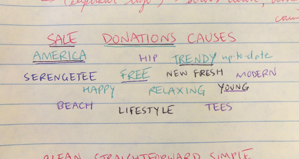
Write down all of the words each user says, grouping related words closer together (for example, “trendy” “hip” “fresh” “young”). Indicate which words are repeated by more than one user; here, words have been underlined for each time someone new repeated them.
After all the data is collected, it will be easy to see which words the most users remembered or used to describe the site. In this case, the single most common words were “donations” and “America,” and there is a notable cluster of words related to the trendy, young character of the site.
Word clouds are a great way to generalize the kind of first impression your landing page creates, and also to see past individual answers that may contradict each other. After everyone’s views have been aggregated, a clear picture emerges of how the site is perceived.
The same strategy can be used for the fourth question:
“What is the feel of this site? (e.g. professional, fun, small-company, corporate)”
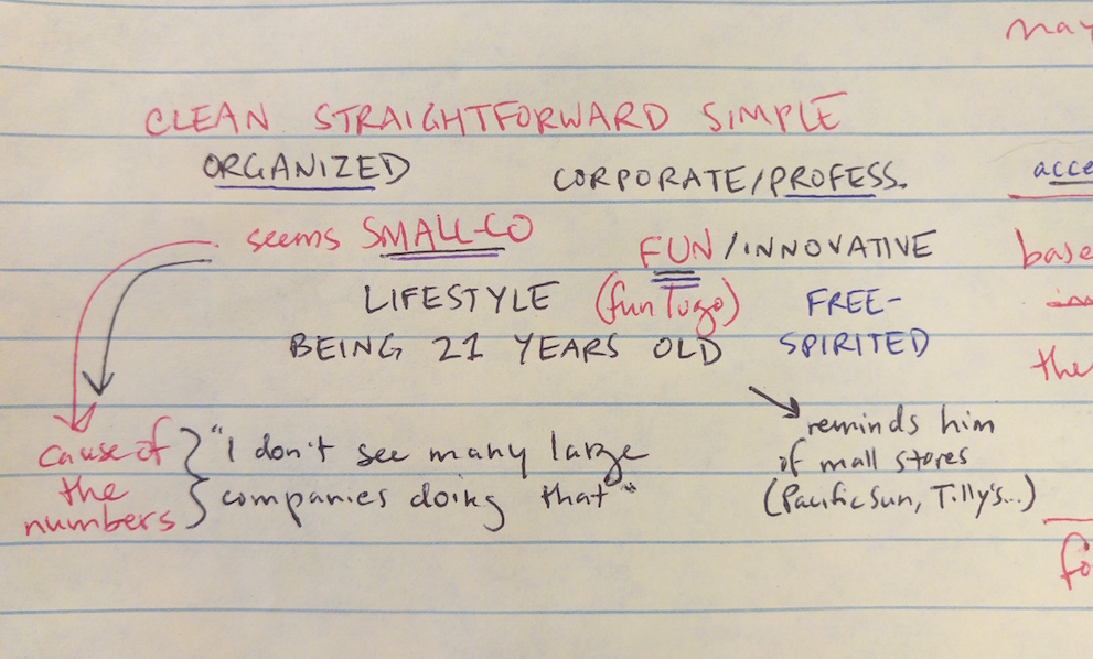
In the word cloud above, one user said the site felt corporate, while others said it seemed small-company. But it turned out there were 2 more users who agreed with the “small company” diagnosis, even citing why they felt that way.
Other interesting findings: 4 users called the site “fun” (out of 5), 2 called it “organized,” and one said it felt like “being 21 years old” and reminded him of stores in the mall.
3. What do users understand?
The remaining two questions deal with whether users can identify what the site is actually for, and who it is targeted to. Compared to the other questions, these ones are more about stories, and a powerful way to understand and communicate your results is to write down key user quotes.
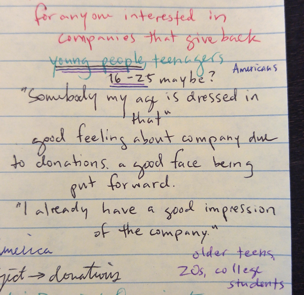
Users’ observations about Serengetee concluded that the primary audience was young people from their late teens to their 20s, and perhaps anyone interested in supporting companies that give back. One user, Edwin, pointed out that he got a good feeling knowing the company donates to causes, and that it represented “a good face being put forward…I already have a good impression of the company.”
Furthermore, as someone who was himself within the target audience of the site, he noted that in the main image “somebody my age is dressed in that,” which helped him to identify with the brand.
Quotes like this show what is going through the user’s mind, revealing the effect that elements of the home page have on their perception. Taken together, they give a strong indication of the page’s effectiveness and whether or not the messaging works as intended.
User quotes are also a powerful way to pass your findings on to stakeholders and team members, since words straight from the mouth of the user carry legitimacy without any questions of bias.
What do users think of your home page?
Impression testing is a simple, fun, and effective way to explore one of the most important aspects of your website design. First impressions can make all the difference, both to users and to your business. See what kind of impression you’re making today!