Update: We no longer prepare Competitive UX reports for clients, but we’d love to help you run your own competitive usability study!
Check out our latest article on setting up your competitive usability testing study.
Imagine a swimmer training for the Olympics. Every day he practices, timing himself, striving to beat old records. He works hard, buys the newest, most advanced swim gear, and continues to improve his times – all very good progress. But if he doesn’t compare his performance to the rest of the world’s top swimmers, he has no way of knowing if he’s ready for the Olympics, or if there’s something he should be doing differently to prepare for the real face-off.
In the same way, your website doesn’t exist in a vacuum – it operates amid a vast web of competitors and distractors that not only vie for users’ business but also furnish every web user with a host of pre-instilled habits and expectations about site layouts and functions. To survive on the web, it’s not enough just to keep being better than the old you: you need to be better than the current them.
Keeping an eye on the competitors
So what can you concretely do to keep abreast of the competition? Our answer is the Competitive UX Report: a comparative, data-driven survey of an industry that puts your website’s usability firmly in context and provides concise recommendations and action items.
Here’s a look at what you’ll see on this new feature…

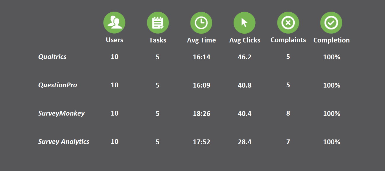
The data dashboard. The front page of the report features a matrix with average figures for total time taken per test, total clicks made by each tester, total number of distinct complaints made on each site, and total test completion rate (frequently, the numbers aren’t so rosy).

The usability ruler. Usability rankings are displayed by percentile based on the System Usability Scale, a means of reliably quantifying web usability (Learn more about SUS). Also included are the raw scores for each site, including the overall Global Satisfaction score as well as Usability and Learnability sub-scores.
Impressions. We run an Impression Test with every user, showing them the site’s home page for 15 seconds and then asking what they remember about it and how they would describe it. An analyst writes up roughly a page synthesizing their responses into an assessment of your landing page and the message you’re sending users, comparing and contrasting it with competitors’ landing pages.

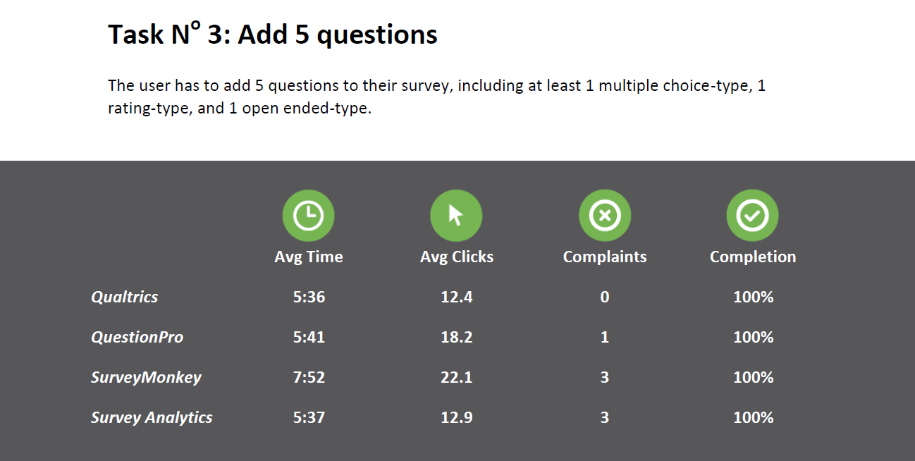
The task module. Data concerning average time taken, average number of clicks made, total distinct complaints voiced (if 2 people have the same issue, it is only counted once), and total completion rate for each task in the test. Beneath the task module, each complaint against your site is detailed, and categorized as Critical, Moderate, or Minor. The specific issue that testers ran into is clearly delineated.
Competitor spotlight. When a competitor’s UI was particularly well-designed or noteworthy, expect a competitor spotlight, in which an expert describes, with screenshots, what they did right and how you can learn from it. They’re more than competitors – they can also be your teachers.

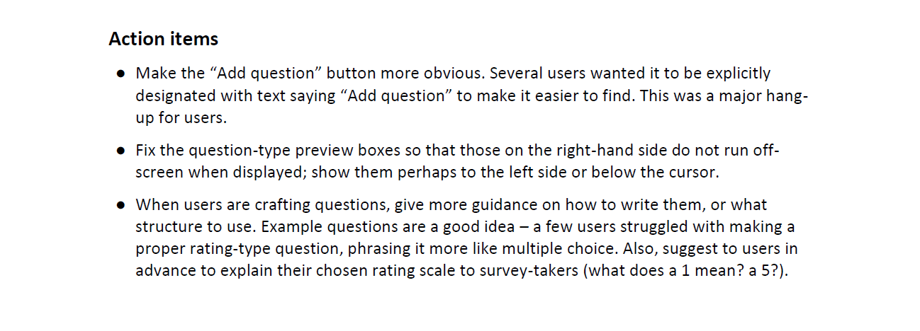
Action list. A bulleted list of actionable recommendations from a UX expert, with suggestions on how to fix each problem that users complained about. The action list is your hotspot for managing and improving the UX of each task along the user’s journey, pre-prioritized with critical issues first and minor ones last.
Final evaluation. Our expert gives a synopsis of tester responses to the written survey portion, and covers any other pertinent information. General comparison of the websites tested, and broad discussion of their relative strengths and weaknesses, is included. The body of the report ends with a complete list of recommendations for thinking about your site’s usability and the steps needed to improve your UX.
Appendices. Everything you could ever want to know.
Your website is not a closed system. Your users are surrounded by other options, other influencers. But your competitors can be a valuable learning tool if you pay attention.
See a complete sample Competitive UX Report


