Last month, in what has become a TryMyUI Halloween tradition, we revisited our UX House of Horrors, piling on fresh design atrocities to make users shiver in fear.
What is the UX House of Horrors?
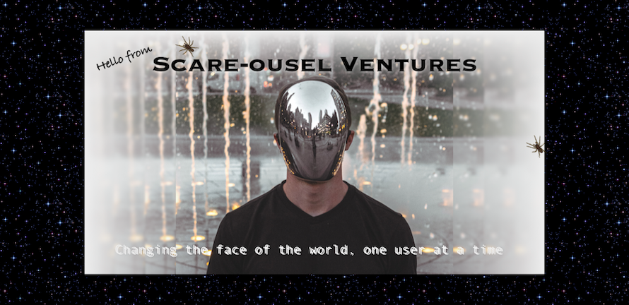
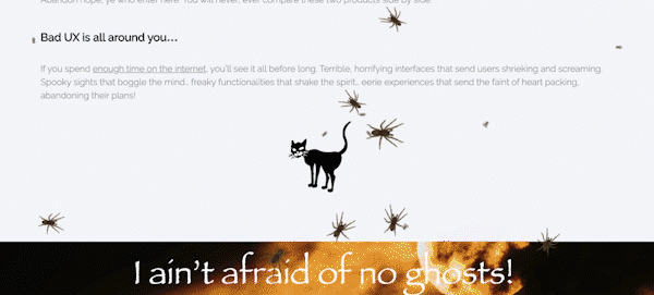
It began with a half-joking premise last fall: “Bad design is scary!” Starting with that seed of an idea, we built an online “haunted house” experience where, instead of fog machines, bowls of spaghetti noodles, and guys in vampire costumes, the scary bits were showcases of bad UX design taken to nightmarish extremes.
Last year’s page was already terrifically awful, but in brushing it up for a new year, our team members were inspired by some of our (least) favorite UX follies, new and old.
So how do you make a horrifying user experience? A ghoulish GUI? Follow these simple guidelines:
- Auto-play videos on your webpages. This instantly adds atmosphere and an element of fun to your site. To ensure the fun never ends, try embedding one of the many “1-hour version” videos you can find on YouTube, and loop it when it ends!
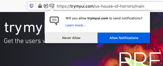
- Push notifications: Your website is really important to your users, so make sure you ask them to allow push notifications. Then, send them one as soon as they click Allow.
- Add sound effects! Click on a button? Sound effect. Scroll through a carousel? Creaking door sound effect. Scroll past a photo of a spooky hallway? Spooky echoing laugh sound effect.
- Carousels: the longer, the better. By now, everyone knows that the rotating nature of carousels make it easy for users to miss the information they contain, so try this UX hack: make it mandatory to scroll through the whole thing before continuing down the page! Users will have no choice but to see each slide, so now you can put in as much content as you want (in our case, 12 slides)!
- Buzzwords: People need to know what your company is about, but at the same time, you don’t want to alienate any visitors by explicitly describing your products and services – what if it’s not what they’re looking for? Use general statements like, “We expand the way our users interactively engage with holistic, multi-platform virtual experiences.”
- Lot of fonts! Variety is the spice of life, and of web design too.
- Textured backgrounds: Nostalgia is in right now, so we decided to capitalize on it by adding a tiled twinkling-star background a la SpaceJam.com and the other sites of the era. They’re remaking Space Jam anyways, so we’re right on trend!
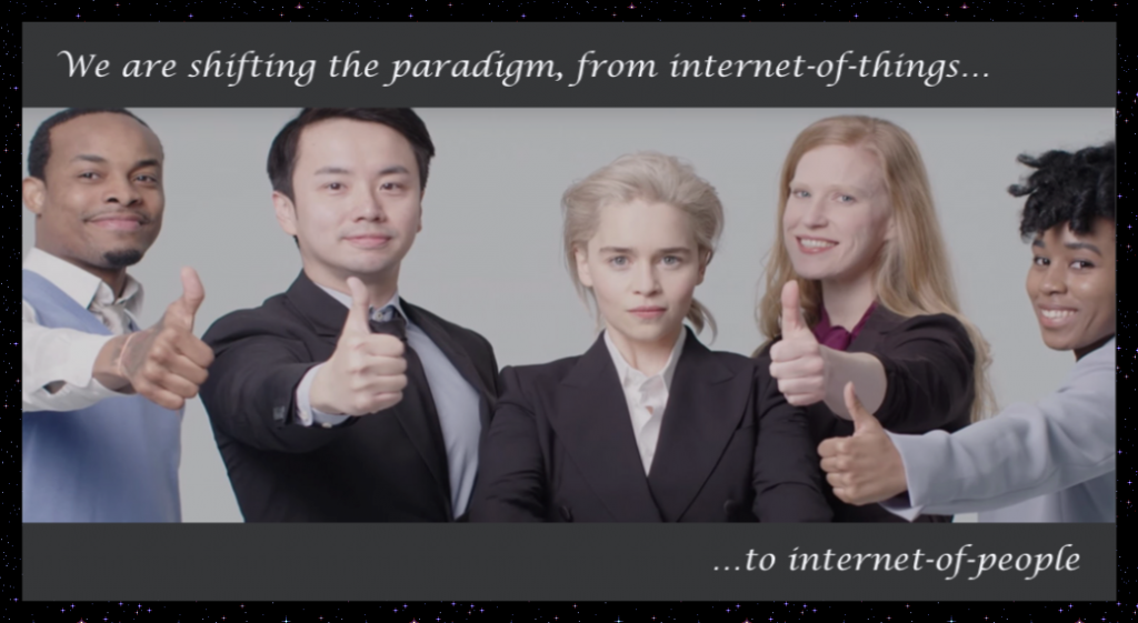
- Corny stock images: You want users to relate to you at a human level, so include personable stock photos that echo the kinds of activities they do in their own daily lives – for example, standing around in a circle with their co-workers making thumbs-up signs while smiling disingenuously. And yes, that is Emilia Clarke.
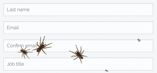
- Long forms: This could be your only chance to get users into your system, so collect as much info as possible up front. Make sure they have to type in their email twice to confirm it.
- Security questions: Make them as specific as possible so nobody else could ever guess the answer. Give plenty of useful options for users to choose from (like “What city were you conceived in?” and “What is your favorite security question?”)
- Bugs! Lots and lots and lots of bugs.
That’s not even a comprehensive list of things we added, just the most notable. If you haven’t already, you should check it out! We recommend headphones, since it can get noisy:
www.trymyui.com/ux-house-of-horrors
Bad design is all around us
Some of these items, like textured backgrounds and corny sound effects, poke fun at outdated design tropes that have long been recognized as bad design. Those are always fun to mock, but it’s not really the main point of the UX House of Horrors.
Many of the other elements we included were inspired by real things we’ve experienced on serious websites in the past year.
Carousels that you can’t scroll past until you scroll through? We’ve seen it on multiple websites recently. Buzzword salads? Not that hard to find on sites in the tech industry. Even the security questions were inspired by a real experience I had a few months ago (yes, “What’s your favorite security question” was an actual option I was given). And we’ve all seen the “Allow notifications” popups popping up on more and more websites, to no one’s pleasure.
Every year gives rise to new trends and fads in web design. Plenty are good for the user experience and move our design paradigms in the right direction. But a decent number are also misguided and backwards-facing, like the mandatory carousels that have been appearing all of a sudden.
It’s always a good idea to take a step back from the design trends of the moment, cast a critical eye on them, and really consider: is this good for our users?
I survived the UX House of Horrors!
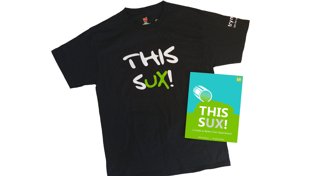
Like last year, users who made it all the way through the page and successfully submitted the final form were entered into a raffle to win a free “This SUX” t-shirt (shown below).
This year, we gave away shirts to 3 lucky winners:
- Barry Hylton, Senior Developer at DesignSensory
- Paul Nattress, User Experience Designer at Computershare
- Hau Tran, Sr. UX Designer at Slickdeals
Thanks to everyone who participated this year, and for those who didn’t win, there’s always next year, when the House of Horrors will emerge scarier than before!
In the meantime, let us know your favorite elements in this year’s experience in the comments below, and any suggestions you have for next year.