We were curious to see what’s possible with these tools. So last month, we ran some usability tests on two Shopify-hosted shoe stores: Allbirds and Greats.
Both stores sell high-end shoes made from high-quality materials in a similar price range. Our question was, which one uses the tools at their disposal to provide a superior e-commerce UX? Read on to find out…
Task 1: What is your first impression of the site?
“The front page says everything.”
Before sending users off to find a pair of shoes, we gauged their first impressions of each website.
After viewing the Greats home page for just 15 seconds, users already had a good sense of the brand’s identity. Half used the word “luxury” to describe the page; other words that came up included “modern,” “fashion,” and “casual.”
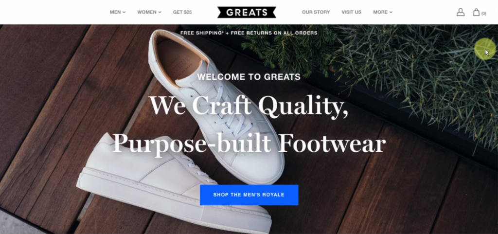
It was clear to all that selling shoes was the site’s main focus – “I think it said sneakers specifically,” recalled one user. (In fact, the word doesn’t appear anywhere on the page, but it is an accurate description of Greats’ products).
While the “high-end” nature of the brand was clear from the first 15 seconds, some users felt that the site looked kind of generic. Said Kate from the D.C. area, “It didn’t stand out that much from other online retail sites.”
Greats does have a pretty common layout and visual style, which perhaps is to be expected from a site built on a template-based platform like Shopify.
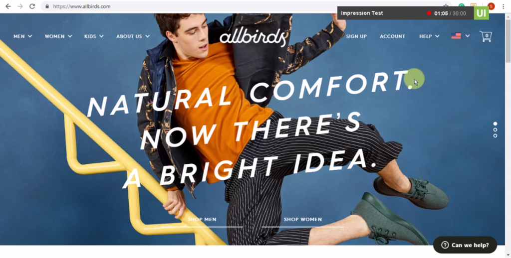
Allbirds, however, had a much more distinctive style. Far from generic, it stood out to users for using bold, bright colors, gifs, and hand-drawn illustrations.
Users brought up words like “vibrant,” “eye-catching,” and “energetic.” Responding to a gif of two feet wiggling in a pair of Allbirds shoes, one user commented that “I’ve never seen anything like that before.”

The site’s choice of banner images, however, didn’t clearly communicate to everybody what was being offered. Noting the lack of focus on one specific product, user Jenny stated that it was “kind of hard to immediately understand what is being sold” beyond general apparel.
Elaborating further, she added, “There’s not, like, a photo of a spoon and you can look it and say… They sell spoons here.”
(Note: Since we tested the site, the banner images have been updated to photos that are much more explicitly about shoes.)
So which site wins the first impressions round? Although the majority of users understood Allbirds’ product offerings, the site did provide less overall clarity than Greats from that first 15 seconds.
On the other hand, the unique and brash style of Allbirds left a deeper impression on users, garnering comments like “I LOVE LOVE LOVE the front page!” Reactions like that can certainly hold users’ interest long enough until they figure out what’s being sold.
For websites, first impressions are about making people stick around, and with users throwing around the L word, we’d say Allbirds is taking the lead.
Task 2: Find a few shoes that you like
“These black ones aren’t bad‐‐d’oh, until I saw the price.”
At the beginning of this task, most users ended up on the main Men’s or Women’s product listing page.
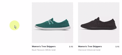
Users responded positively to the way that Greats very simply displays every single shoe available in a neat, compact, and organized layout.
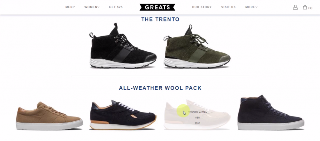
User Caleb enjoyed how he could “quickly scroll through this page and see which of your shoes catch my eye,” with very little text on the page to distract or clutter.
Unfortunately for William (size 15 shoe wearer), this ultra-simple page had no filters or sorting options, so there was no way he could narrow down the products to see which ones were even available in his size.
Allbirds‘ listing page wasn’t as deconstructed as Greats’, but earned compliments for a different reason.
When users hovered over the thumbnail image for a shoe, the perspective changed from a profile view to a top view, adding valuable extra info that happened to be exactly what browsing users were looking for. “That’s what I wanted to see, how the top looked,” said Jenny.
Beyond the main listings, both sites employed similar strategies to convince users that their relatively expensive shoes were worth the cost.
Each featured high-resolution photos showcasing the shape, materials, and textures of the shoes. The photos on Greats were especially impressive – “Super close-up pictures!” exclaimed one user.
Allbirds didn’t get quite as detailed, but their UI for viewing all the photos was more intuitive (hover-on-the-thumbnails instead of click-through-the-carousel) and they also provided a video of someone wearing the shoes in each gallery.
Each site also had pretty lengthy product pages, filled with additional pictures and extra details about the make of the shoe.
Greats‘ pages, one user summarized, were “very image-heavy, which is great, but it meant that the product pages loaded very slowly for me.” This was a problem for a few people. The length of some pages also had a few users scrolling for a long time to find what they were looking for.
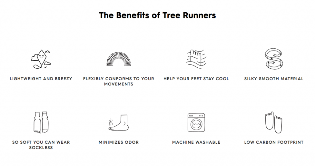
Allbirds‘ product pages were also pretty long, and also chock full of additional info. Of the users that scrolled down, we saw that most skipped over certain parts entirely (the more detailed, technical sections) while the pithy “Benefits” list attracted more attention.
Both Allbirds and Greats got a little clunky at times during this task, but both sites still impressed users with their products (and, less positively, with their prices!)
Greats‘ higher-quality photography traded off with slower loading times, and their viewing gallery was less user-friendly. Add to that the lack of filters, and the “delight” factor Allbirds achieved with their hover state, and it looks like the latter is pulling further ahead in this competition.
Task 3: Compare your top picks and choose a shoe
“I wanna see them both on the same page together. Like I would in the shoe store!”
After browsing around the products, we asked users to consider their favorites and decide on which one they would buy, if any. (“‘If any,’ that’s interesting. I don’t think at this point I would buy anything.”)
Allbirds‘ relatively small selection of products and straightforward naming conventions made it simple for the most part. Each shoe model is called by its material and its purpose (“Wool Loungers” “Tree Runners” etc.)
While some users felt that in fact there were not enough options to choose from, it was not hard for them to compare the shoes they had picked.
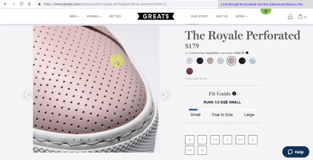
On the Greats website, a much more expansive product list made for a more challenging proposition. Users started looking for what made each model different, and struggled.
Kate, looking at the Royale Grosgrain, noted “I find it interesting and a little disappointing that there isn’t a really clear description of why this shoe is different from the one I was just looking at.” Scrolling down the page, she found a blurb, but it seemed to be general to every “Royale” model (Greats also offers a Royale Classic, Royale Knit, Royale Court, Royale High, and more).
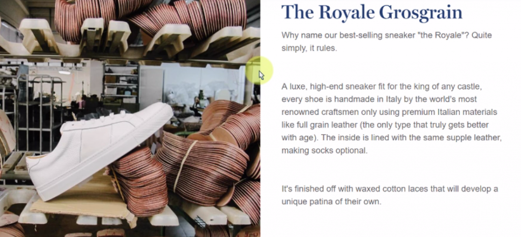
Checking a different shoe, Kate verified that the blurb was the same for all Royale models (“It doesn’t really help me understand”).
One thing Greats had that Allbirds didn’t have, though, was user reviews.
Many of Greats’ product pages boasted hundreds of reviews, most of them glowing. Several users noted how important reviews are in deciding whether or not to purchase. Allbirds, by contrast, didn’t have any reviews at all.
Interestingly, this didn’t seem to be a big deal for their visitors. Perhaps this was due to the other forms of affirmation scattered throughout Allbirds’ website, like feeds of tagged Instagram posts and excerpts from positive press coverage. Given the lack of concern expressed over missing reviews, it seems that these strategies worked.

Meanwhile on Greats, users appreciated the reviews but found that there was no way to sort them to see, for example, just the 3 star reviews. “I like clicking on the 3 star reviews because those seem to give a balanced opinion.”
Greats seems to have fallen ever further behind by the end of this task. With one more task to go, is there anything they can do, or any misstep Allbirds could make, that would reverse the tide?
Learn more: user testing better products and user testing new products
Task 4: Check out
“You want a shoe to fit like a glove.”
Being Shopify-hosted stores, both Allbirds and Greats have extremely easy purchase flows. Each one offered a variety of options beyond credit card checkout, including Google Pay, Amazon Pay, and PayPal. Many users on both sites said they would take advantage of these trusted options.
But before making the purchase, there was a final hurdle on each site: choosing a size.
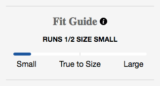
Each Greats shoe displayed a size guide indicating whether the model tended to run small, large, or true to size.
“That’s really good to know, especially when ordering shoes online,” one user said.
The problem came when that same user eventually picked a shoe that ran true to size – according to the site – but found it difficult to be sure. “I wonder if this one might also run a little bit small and there just aren’t enough review to indicate that yet?”
A few other users were wary of the sizing, noting that ordering shoes online is “iffy” if you’re not certain of the fit. However, scrolling down these users instantly found the prominent Returns/Exchanges Policy with a 21-day guarantee, and were by and large reassured.
Allbirds users faced a different size-related problem: the site doesn’t offer half sizes.
Of course, that’s a product issue and not a UX design one, but in such a situation the job of the design is to persuade and reassure the user, and guide them to the best possible choice for themselves.
Below the size dropdown, there’s a note reading “Half size? We suggest you size up,” and above it there’s a “Fit Finder” with a 3-step guide to picking the right size:
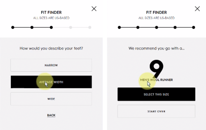
Nonetheless, many users were not sold. “It was easy to find the fit guide, but I’m still concerned cause even a half size bigger is not ideal.” Another: “I’ve been talked into sizing up before and I had to give them away.”
The verdict? One third of the users on each site said they wouldn’t purchase by the end of the test.
On Allbirds, this was mainly due to uncertainty about sizing, with some angst about the price; on Greats, it was due mainly to feeling like the shoes were overpriced, and a little bit because of the size issues.
Conclusion
In both cases, the sites attempted to ameliorate issues beyond the scope of UX design, and sometimes fell short.
Yet neither site provides a bad user experience or off-putting GUI. This article focuses on all the blemishes in order to compare, but on the whole users felt positively about both Allbirds and Greats.
And that makes sense – both are relatively successful, now-established companies that have made great use of the Shopify platform. The websites they have built convey the essential and unique character of their brands, while still following a familiar, easy-to-use shopping flow.
It’s clear, though, that Allbirds managed to edge out their competitor each step of the way during these usability tests. This is borne out by the final System Usability Scale (SUS) scores for the two sites: 95.4 for Allbirds, 89.6 for Greats.
That means…
This UX Wars winner is
![]()
Related reading:
UX Wars: H&M vs Forever 21
UX Wars: Nike vs Reebok
UX Wars: BBC vs New York Times