
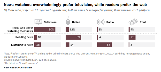
The growing importance of the internet as a platform for reading and watching the news has challenged traditional outlets (like newspapers and TV broadcasters) to optimize their online presence.The number of Americans who “often” get news from print media has now dwindled to 20%; meanwhile 38% go online, and 57% watch TV news.
More importantly for the newspapers, among those who prefer to read (rather than watch or listen to) the news, 59% prefer online news, while only 26% choose print.
 (Image source: Pew Research Center)
The numbers bear out these preferences: in the 3rd quarter of 2015, US newspapers reported that unique website visits outstripped Sunday print circulation figures by 2 to 78 times as much.
Incidental readership
One interesting pattern of online news consumption is “incidental readership”: people who visit a news website to read just a single article, often via a Facebook link or other social media. This incidental readership represents a large portion of visitors, most of whom are not loyal readers and spend much less time on the website.
Interestingly, surveys indicate that many of these visitors do not recall reading any online newspapers. “More people self-report reading newspapers in print than in a digital form,” even though readership statistics show this to be untrue.
All of this presents 2 challenges for news sites. One is to increase retention and engagement among these incidental readers. The other is to rethink information architecture and branding that emphasizes the front page as the central hub, adapting instead to the many visitors who arrive directly on article pages.
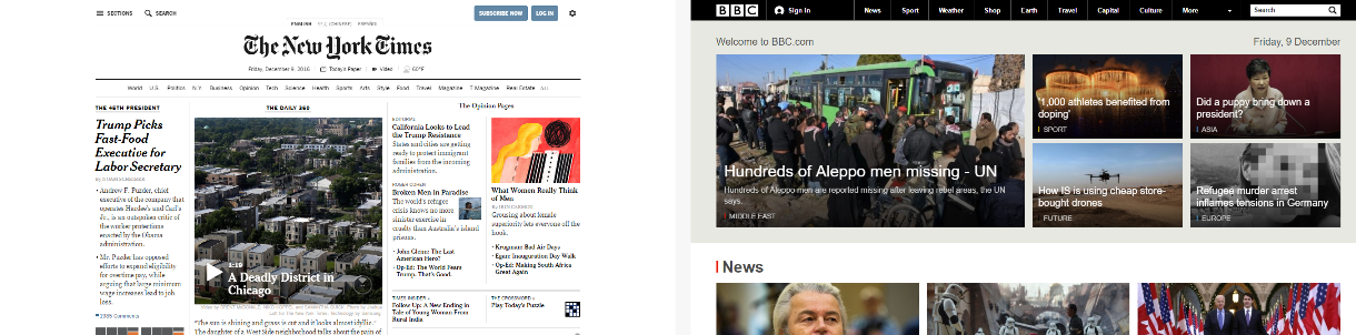
For this edition of UX Wars, we ran usability tests on 2 news websites: the New York Times, and the BBC. Rather than starting testers on the websites’ home pages, as we would typically do, we sent them directly to an article on one of the websites to test the incidental reader experience.
We began the test by preparing each tester with the following scenario:
Scrolling through your Facebook feed, you saw this news article shared by one of your friends. The headline interested you, so you clicked the link to read the rest of the article.
Task 1: How do you usually get your news?
Before our testers started using the websites, we had them answer a few questions about their news consumption:
How do you usually get your news?
About how frequently do you read the news?
Do you ever read online newspapers? If yes, which ones?
Our intent with these questions was to understand each user’s prior experiences and exposure. Not only does this help us account for possible biases, but it allows us to evaluate their tendencies towards certain behaviors.
For example, someone who reads a lot of online news may already have preconceptions about the layout, content, or style of news websites. Frequent news consumers from any source may be more likely to show interest in related stories. Infrequent news consumers may be less attentive to article content.
We also wanted to confirm that our assumptions about news website usage held water. Namely:
(1) that our users were likely to visit the sites via social media links to specific articles, rather than directly navigating to the site’s home page; and
(2) that they were unlikely to be loyal readers of specific online news sites, but instead receive news from varied sources and mediums and read sites like the New York Times or BBC only incidentally.
News consumption habits
Our users for this study showed a range of news consumption habits, which broadly supported these assumptions.
Tanjir from Canada was the biggest news junky, stating that he checks the news first thing in the morning “before even getting off the bed.” He said he relies on mobile apps by CBC, the New York Times, and Google News as well as a desktop app, online newspapers (the NY Times, Times of India, Forbes, and local Canadian papers), and his Twitter feed. Mike, from the Chicago area, was the least frequent news consumer, naming only a single source he used (CNN’s mobile website), about daily.
3 of the 6 users cited social media as a source of news: besides Tanjir, Kyle from Los Angeles named Twitter, and Angie of Las Vegas said she uses Reddit to catch up on news.
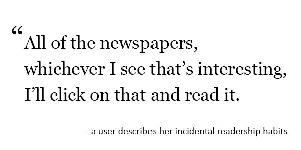
Several people said they watch television news in the morning or evening, and some also used the mobile apps or websites for their preferred network (usually CNN). Only Tanjir said he directly visits any online newspapers; no other user even named any, except for one who stated: “All the newspapers, whichever I see that’s interesting, I’ll click on that and read it.” In addition, 3 people explicitly said that they rarely or never read online newspapers (except incidentally).
Task 2: Give this article a read-through
Next, we asked the users to read the article we had started them on. We gave them the extra instruction, “Please mention any thoughts you have about the content, style, or other observations.”
Pictures
Pictures were one of the most important elements to users on both sites. As one said, “I am more interested in seeing the pictures than reading.” As users scanned the articles, pictures, along with headings and blown-up text excerpts, served as anchor points.

Mike, for example, only read the title and first 2 paragraphs of the BBC article before he began skipping around. As he scrolled briskly through the article, he mainly stopped when he saw pictures or excerpts, and only read text directly before and after these elements.
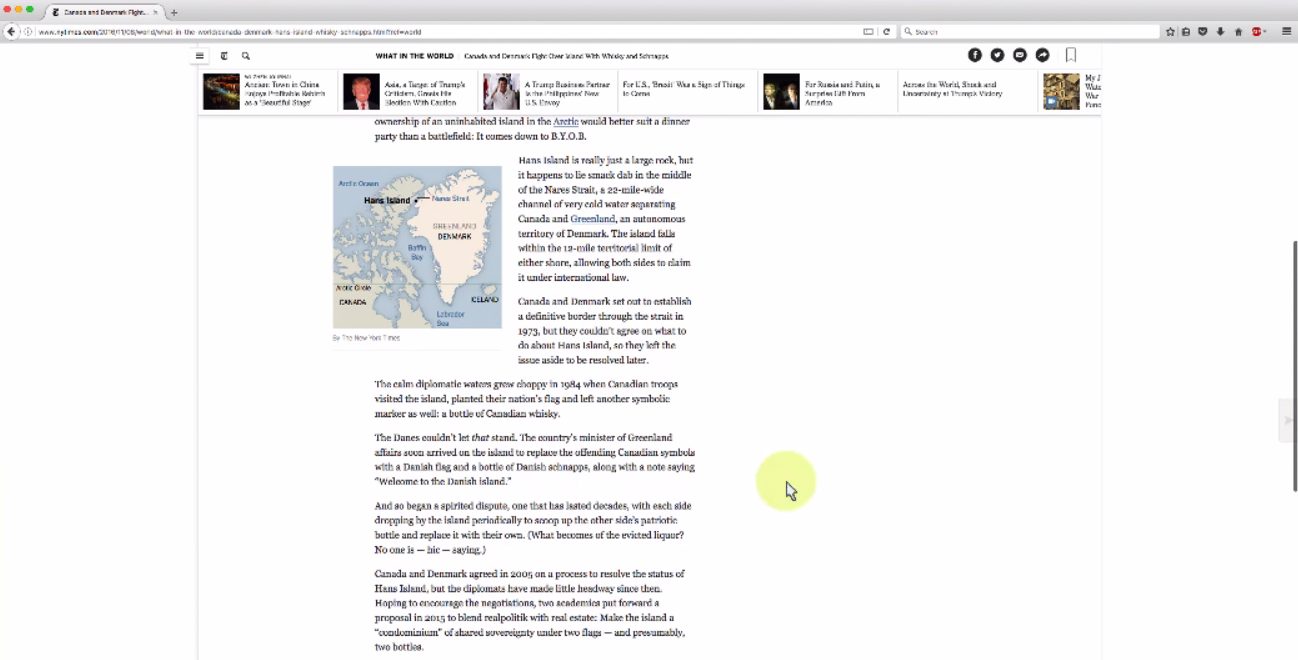
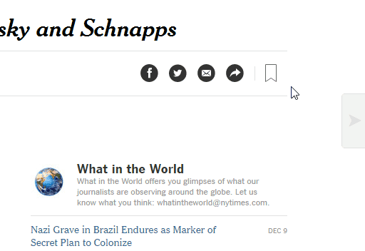
Users were especially impressed with the pictures accompanying the BBC article. “I love the picture quality!” Tanjir exclaimed as he read. Unlike the New York Times, the BBC’s pictures are interactive; they can be blown up and full-screened, which made them more engaging but also caused usability issues.
![]()
A few users had trouble exiting out of the big picture view, accidentally full-screening it instead. And when the top right corner of the picture is a light color, the full-screen icon can be very hard to see.
One user also complained about BBC’s interesting decision to use exact word-for-word excerpts from the article for captions, instead of writing unique captions that added information.
The New York Times’ use of pictures is much more minimalist; they are smaller (but “not too small”), less frequent, and not all are interactive. However, users noted that the handful of pictures used in the article were helpful and “in the perfect place.”
Presentation and content
Angie noted that she appreciated the visual simplicity of the New York Times’ website. “There were no garish colors, there weren’t any ads or video content, that was refreshing to see. And the blank space on either side did a lot for me to reduce the strain on my eyes…I operate on a pretty wide monitor, so that really helped me.” Details like this, on a site where reading is so central, make a big difference to users.
Another user, Sandy, agreed that the visual presentation “doesn’t give the feeling of being clumsy or having too much content on the page.” People also complimented the font as easy to read.
Another thing users on the New York Times notes was the accessible writing style: “Things like territorial disputes, military disagreements, and history can be a little difficult to understand, but the language here is kind of casual – but it’s not informal in any way. It just makes it a little easier to digest and it’s in terms I can understand.”
On the BBC website, users found the writing style engaging as well, but all of them found the article a bit too “lengthy.” Of course, article length varies – and Tanjir did note that “I would still read it til the end because the pictures and story were interesting.”
More importantly, several BBC users felt that the title of the piece did not really reflect the main topic, but was chosen more as an attention-getter. “By the time you reach the middle of the article” you start to wonder when it’s going to get to the bit mentioned in the title, said one user; “you start scrolling up and down, looking.”
For news sites, the balancing act between catchy and accurate headlines can be a usability hazard. Misleading titles cause users to waste their time on irrelevant articles and risk creating a negative experience (though in this case, most users found the article worthwhile anyways).
Task 3: Did you see any other articles or links on this page that interested you?
Since getting visitors to read more articles is a top goal for news websites like these 2, we were interested to see whether our users noticed and remembered links to other articles in the spaces around the main article text.
We also paid attention to which links they mentioned during earlier tasks to see what stuck out to people.
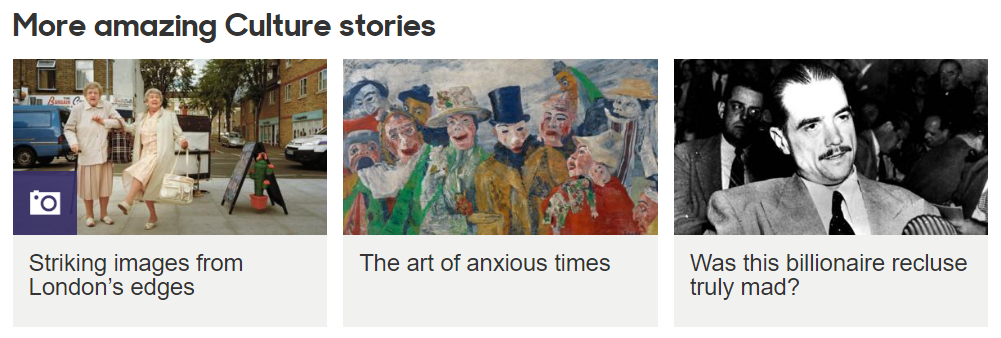
On the BBC, all 3 users remembered linked articles they had noticed while reading. For Tanjir it was a headline about Donald Trump, and another link with an eye-catching picture in the right-hand column. Mike was interested in a link that mentioned Prince, and Carla in one about architecture, in the same right-hand column.
Pictures seemed to make a big difference in catching the attention and interest of the users. All of the BBC’s side and bottom links have a large picture with them, which in some cases was the primary thing that made users want to click to that article.
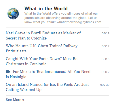
On the other hand, the New York Times had no pictures at all, or very small ones, with each link. 2 out of 3 users on the site didn’t notice any links while they read and didn’t remember any headlines afterwards. When asked this question, both users then found articles they were interested in.
The third user, Sandy, had immediately noticed the top bar just on the page, containing links to the latest stories. She had played around with it, scrolling through it and reading the headlines, before even reading the main article. Afterwards she recalled an article about perceptions of Trump in Asia that had gotten her attention.
She also was the only user to notice a right-pointing arrow button at the edge of the browser that would “turn the page” to the next article. However, she wasn’t sure what the button was for without clicking it, and the hint showing the title of the next article doesn’t show most of the time – making the button more confusing and mysterious than it is useful.
The biggest problem on the BBC was one of perception: some users thought the matriconfusion x of headlines and pictures at the bottom was a spam farm of links to outside sources. The section has strong visual similarity, and analagous placement, to the rows of low-quality sponsored links found on sites across the web, which many people have gotten used to seeing (and avoiding):
“I never liked the links like these,” Mike complained, pointing out clickbait-like links on the page. “I just don’t understand why they have to be there. These are from somewhere else, they’re not BBC links, I think. I’ve seen this with different newspapers and other websites.”
Even though all the links are within the BBC, conditioning by the patterns on other sites caused users to perceive them as untrustworthy sponsored links. Those perceptions cast a shadow on the user’s perception of the site in general, and designers should be careful to consider reactions like these.
Task 4: Try to find coverage of a topic you usually keep up on
Lastly, we asked users to think of a topic they follow, and then find news about it on the test website.
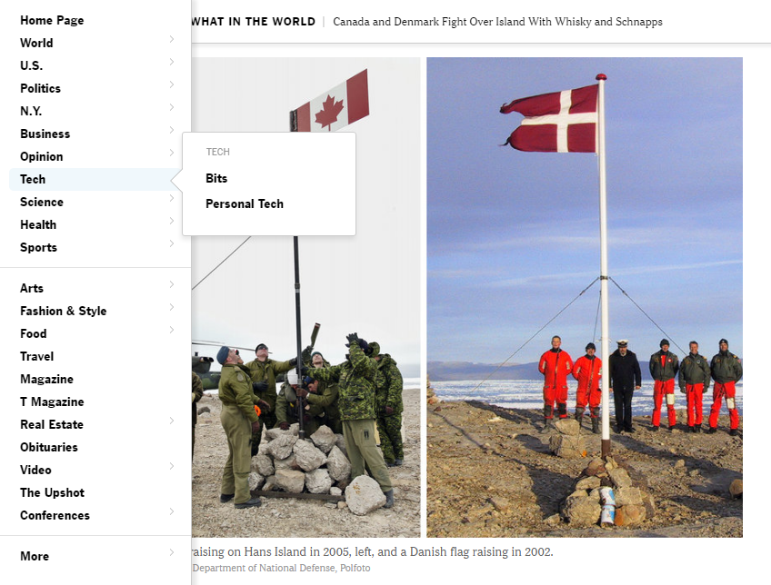
On the BBC website, users had a lot of trouble navigating to new topics. Mike tried to find technology news, but struggled for a while to even get out of the Culture category he had started in. Carla had the same issue: the “Home” link at the top went not to the BBC home, but to the homepage of the Culture section.
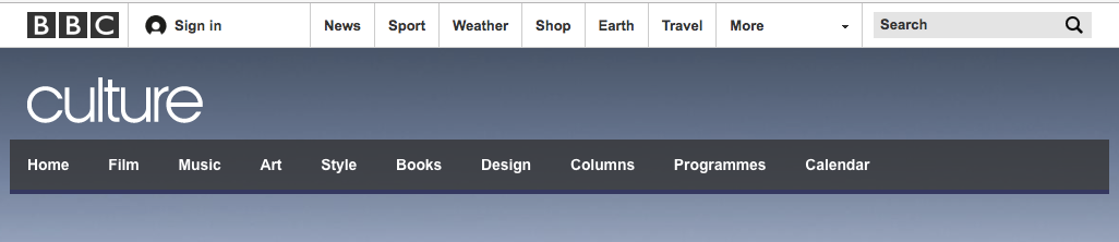
The BBC’s layout uses dual navigation bars, with the primary one along the very top of the website (next to the logo) and a section-specific one below that, hovering over the page banner image.
This system leads to a heavily segmented experience, where each category is bottled up and not so well integrated with other categories. Carla eventually found the top navigation bar and made it to the Weather section; Mike also found it, but could never locate the Tech News (he would have had to choose the “News” heading and then “Tech” on the category sub-menu).
Across the site, at every level, lateral navigation – between sections rather than within them – proved difficult for users; and sometimes, the navigation options needed to make such moves were just not there.
The New York Times, on the other hand, made it easier to move between sections. All of the website’s navigation options are consolidated in one dropdown menu, a hamburger menu labeled “Sections” at the top left of the site.
The options in this menu are very comprehensive, including topline categories and sub-categories linking to all parts of the site. Even though users had to click to expand the menu, the discoverability was not bad: 2 out of the 3 users found and used it, and the third did not need it.
The New York Times site makes it easy to jump sections by other means, with the top bar that offers a sampling of breaking news articles, and a giant footer at the bottom containing links to all of the main sections.
One user faced frustration when she tried to find more election news: below the article was the heading “More Election Coverage from the Times,” with 4 links to related headlines. “It’s only showing me 4 at a time,” said Sandy; “I would like to see a More button and then get to see a list of everything under that.”
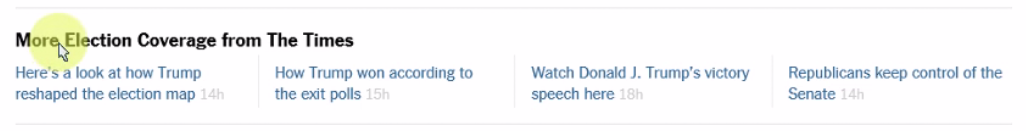
The problem was compounded because the heading itself didn’t link to the Election category either, so there was no way for her to conveniently get there except to go through the main menu again. Still, she said, “other than that I really felt the navigation was quite good and I was able to come to the right place without spending a lot of time.”
Conclusion
The BBC and New York Times websites have 2 very different characters. The New York Times echoes its identity as a print newspaper, with simple black and white presentation and an egalitarian, one-level navigation (like the stacked paper bundles of a print newspaper’s different sections). The BBC, a TV broadcasting company but with a website that focuses on written news, is more colorful, picture-heavy, and navigationally complex.
The BBC‘s visual approach was more engaging and exciting to users, who were attracted to all the high-quality pictures. Their use of imagery paired with catchy headlines attracted users to click through more articles, but also caused some to perceive it as spammy and mistake their internal links for sponsored content.
The New York Times was comparatively less successful in getting users to notice and click through to new articles. However, users respected the more professional and sophisticated look and feel of the site, and Angie said it “opened her eyes” to returning to the New York Times in the future for news (she was one of the users who said she never read online newspapers).
In declaring the winner of this UX Wars edition, it is hard to compare the 2 different kinds of experiences the sites provide. What can be objectively weighed, though, is that the BBC posed more frustrations for users. The confusion over full-screening images, the clickbait-like titles that mislead users, and the difficulty of lateral navigation all combined for a rockier experience. Therefore,
this month’s UX Wars winner is…
![]()
Related reading: