Task 1: Find a deal
Both sites give primary importance to deals on their home pages: discount prices for multi-pizza bundles, special crust types, mix-and-match meal combos, and more. We asked users to find a deal that best suited their needs.
On the Domino’s website, some users were happy with the deals available on the home page but one was miffed that there wasn’t a coupon for multiple pizzas. She clicked the Coupons tab at the top to see more offers, but was frustrated to find that she had to enter her location information to see any coupons.
“I don’t want to do all that before being able to see all the coupons.”
On the Pizza Hut website, users were very satisfied with the variety of deals available. However, Pizza Hut accomplishes this with a rotating carousel of 3 promotional images, and some users had trouble comprehending each deal before the image changed.
“Every time I go back to look at it, it keeps switching so I can’t really read it.”

After choosing a deal (or just picking the regular order channel), users on both sites had to input their location so the websites could identify their local stores.
The Domino’s website chooses each user’s closest store by default, and immediately directs them to the main menu page to start building their order. Pizza Hut, on the other hand, lists all nearby stores, and when users select their preferred store the website takes them back to the home page.
“Oh, I don’t know what that did,” puzzled one confused user. “Alright, I’m still trying to figure out how to get to the order page.” It was 31 seconds before Eric got his bearings again and started building his order.
Read: How we wrote the tasks for this usability test
Task 2: Customize your pizza
Domino’s Pizza Builder interface is compact and simple, but also plagued with some issues of clarity and flow that detract from the user experience.
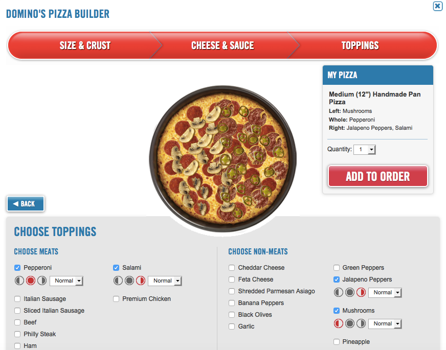
First, the good: pretty much everything fits on the screen at once, especially in the earlier stages of size, crust, cheese, and sauce selection. This makes the process feel shorter and easier.
The “cool” little icons for putting toppings on just one half of the pizza were clear to most (but not all), and users liked how the toppings appeared on the pizza illustration above as they added them.
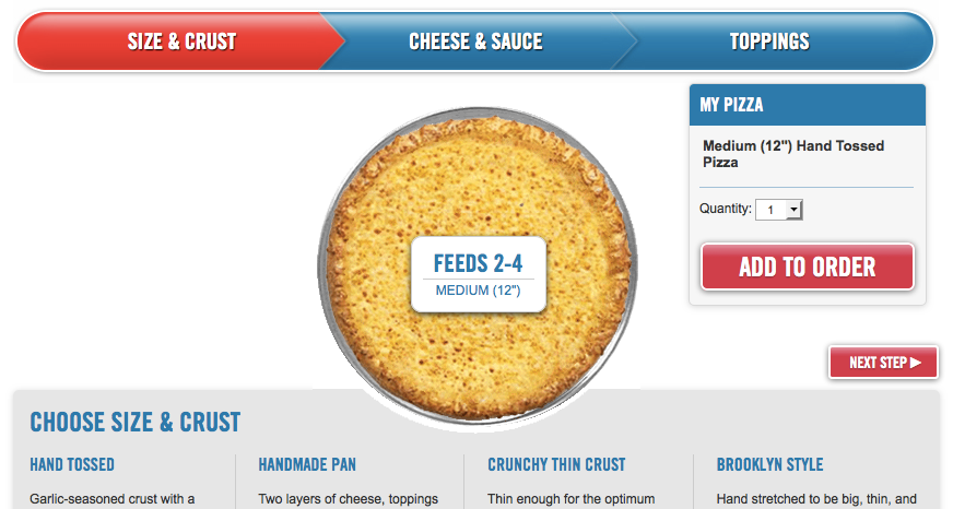
But Domino’s design also contains some blunders. First and most seriously, the earlier stages of the Pizza Builder seriously mis-prioritize the “Next step” and “Add to order” buttons. “Add to order” is large and prominently placed, while “Next step” is much smaller, below the bigger button, and detached from any other page elements.
Many users clicked “Add to order” without paying close attention, and were bewildered to find themselves suddenly back at the main menu page. “Really it should be ‘Next step’ that should have a bigger button,” said one user after realizing the mistake.
Pizza Hut‘s interface compared favorably to the Domino’s builder in a few ways. The image of the pizza was much larger and more realistic looking. One user said while on Domino’s, “They give kind of a hand-drawn picture of the toppings. Not as appealing as the one on Pizza Hut where they actually had, I believe, pictures taken of the toppings and it was placed on the pizza.”
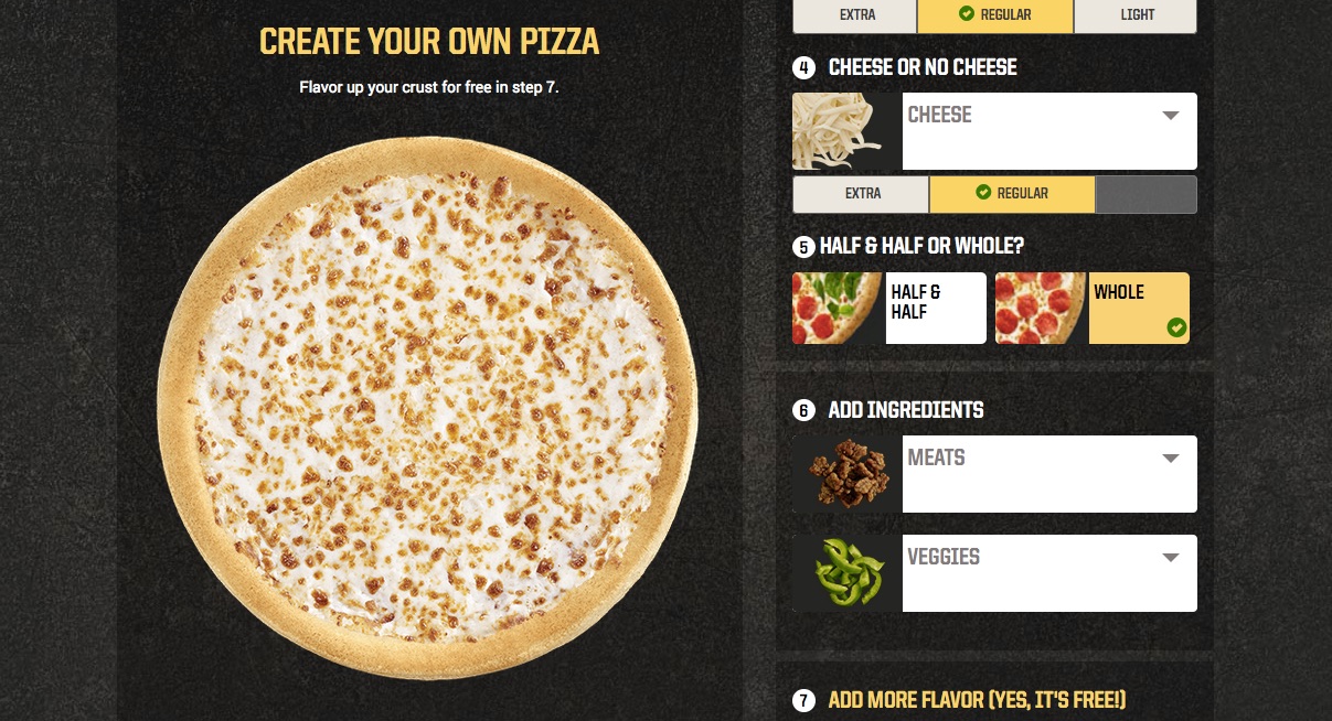
Pizza Hut also provided photos and even descriptions for many customization options and items. Every sauce choice, for example, is accompanied by a picture of that sauce spread over a corner of crust and a zestfully written blurb.
Domino’s has no such descriptions or accompanying photos, which no one who tested Domino’s first complained about, but was a complaint among those who used Pizza Hut first.
“What makes this marinara sauce different from a Pizza Hut marinara sauce? I want to know!”
Pizza Hut‘s design had its own shortcomings, though. All those pictures and descriptions take up a lot more room, and the resulting vertical spread makes the process feel longer. “It’s not as straightforward as Domino’s, I feel like I’m jumping through hoops here,” said one user.
The big pizza on the left also isn’t locked in place as users scroll up and down; instead, the pizza tracks the screen’s movement, jumping to and fro in a laggy, distracting way that annoyed several people.
“I don’t like the way it followed you – the picture of the pizza.”
After building their first pizza, users moved on to make another one or add other menu items. At these junctures, Domino’s relied mostly on popups and the main menu page, which felt haphazard and confusing, if more flexible. Pizza Hut, on the other hand, guided users with a tracker along the top of the screen that left them feeling more confident and sure of what they were doing.
![]()
Domino’s‘ popups were more wordy and often poorly phrased, leaving users to wonder at their next steps.
“Add another item to this coupon? Continue shopping? What does this mean, what is the difference? If I ‘continue shopping’ does my current deal still apply?”
Task 3: Checkout your pizza
Neither website has a fantastic checkout flow. Pizza Hut‘s manages to look extraordinarily plain and monotonous, but is generally straightforward and easy to use. The Domino’s page feels massive and cluttered, and confuses users with an ambiguous “Your information” section:
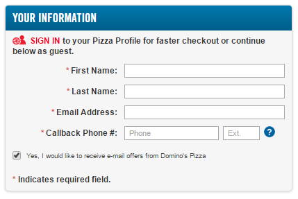
Is this form a sign-in? Is it required? Is it the guest checkout, or is that below? It turns out that this is indeed the guest checkout, and it is required. This confusion aside, the page was usable, but still worse than Pizza Hut.
Task 4: Which would you use next time?
In this final task, we asked users which website they would come back to the next time they ordered pizza online. Some people talked about the look and feel of the sites:
Domino’s was “classic” by some accounts, “outdated” by others. One user appreciatively mentioned the site’s design evoked Domino’s pizza boxes, down to the corrugations of the cardboard.
But another user disliked that the site looked “like a menu or a catalog.” Pizza Hut, on the other hand, felt more like a “professional website,” and had nicer pictures. But some disliked the dark color scheme and over-the-top visuals, and the big pizza that followed people wasn’t a hit either.
“The formatting of the website was very scrambled” said one person of Domino’s. But Jose from South Carolina liked how everything hinged around the menu page: “Boom! Everything’s right there.” And Pizza Hut just felt harder.
“I feel like pizza shouldn’t be difficult. It should be something you just order and you get going.”
The strongest trend, though, was that users mostly preferred the site they used first. Perhaps the biggest lesson is that the website that attracts more visitors and then holds onto them for a full session is more likely to keep their loyalty in the long term.
Read: Setting up a competitive usability testing study
Though Pizza Hut‘s early misstep in dumping users back to the home page would probably do some real damage in this light, Domino’s had too many flaws to beat their rival, from mis-prioritized buttons that disrupt the order flow, to the unclear popups stringing the experience together. Domino’s had the superior pizza builder, but
the winner of this month’s UX War is…

Read more:
UX Wars February: OkCupid vs Match.com
UX Wars August: Yelp vs Zomato
UX Wars September: DraftKings vs FanDuel


