
The following blog post is a guest post by Alex Birkett of ConversionXL.
You might think your website is better than that of your competitors, but until you’ve done some UX research, that’s just an opinion. A competitive UX benchmark might tell you differently.
This article outlines a particular methodology of UX research we call conversion-focused competitive benchmarking (we call it the CUX model). More tactically, I’ll outline 12 guidelines that you can immediately weigh and prioritize for your own site to get a possible conversion lift.
Competitive UX Benchmarking: What Is It?
“Benchmarking” can mean a lot of things, right? You can find the average conversion rate of an e-commerce site, and then compare yours to that of your competitors. But that doesn’t tell you much. You can benchmark your own conversion rate (or NPS, or whatever metric) longitudinally to see changes over time. That’s totally valuable, but it’s not what I’ll outline today.
The competitive UX benchmarking we do is based on Jeff Sauro’s SUPR-Q standardized survey methodology, with a custom added element of ‘message clarity’ in the survey design, and also with a user testing and feedback component.
The SUPR-Q tries to judge a website based on if it is usable, credible, and visually appealing. It has 8 questions (including 1 NPS question), and it is scored on a 1-5 scale. The trust questions vary based on whether or not the site is commerce-oriented. They are as follows:
- The website is easy to use. (usability)
- It is easy to navigate within the website. (usability)
- The information on the website is credible (trust for non-commerce)
- The information on the website is trustworthy (trust for non-commerce)
- I feel comfortable purchasing from the website. (trust for commerce sites)
- I feel confident conducting business on the website. (trust for commerce sites)
- I will likely visit this website in the future (loyalty)
- I find the website to be attractive. (appearance)
- The website has a clean and simple presentation. (appearance)
- How likely are you to recommend this website to a friend or colleague? (loyalty)
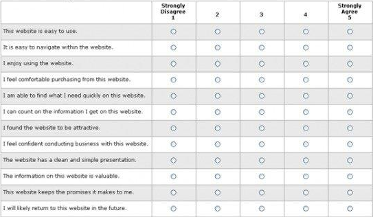
To score it, you average the responses for the first 7 questions and add this to 1/2 of the score for the Likelihood to Recommend question.
Like I mentioned, our method adds a question on a website’s message clarity as well as the user testing component. Basically, we’re quantifying some key UX metrics, benchmarking them against a huge database of possible companies, and then combining that with qualitative user testing and feedback. The whole deal.
Okay, But What Can I Do With That Data?
This data allows you to answer the questions:
- Is your website’s UX behind your competition’s? If so, where?
- How and where to prioritize your website testing roadmap?
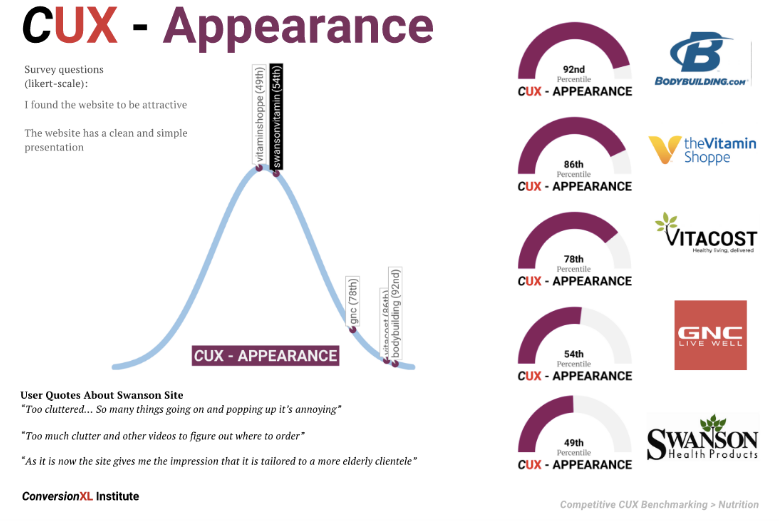
You get cool looking visuals like this:
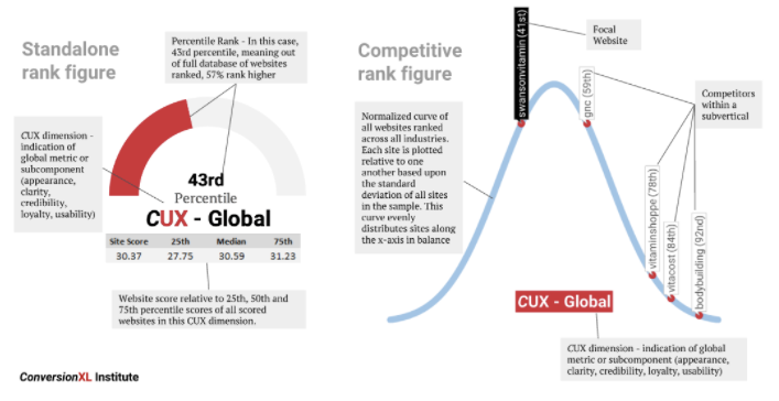
They show you your percentile ranking compared to competitors at a global level of UX perception, and they also show each metric (clarity, usability, etc.). We also add some direct quotes from users to paint things in better context.
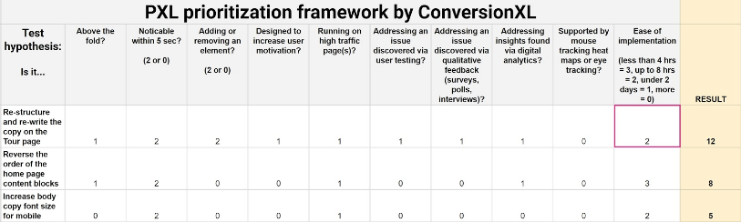
Then you can pop those new insights into your chosen A/B testing framework (*cough* PXL *cough*). You can then prioritize higher opportunity areas (where you’re lacking compared to your competitors.
Enough theory, though. Let’s get into what we learned through all that hard work.
Two Studies, Lots of Insights
We’ve so far published 2 rigorous studies using this methodology, one of which is free to view here. The other is a comprehensive 400+ page report with benchmarks and guidelines across industries.
We used TryMyUI to conduct both of them.
We had 102 people go through the study for the road bike research, and we had 100+ people for each of multiple e-commerce sub-verticals in the larger e-commerce report. I won’t bog you down too much with the specific methodology, but you can read either of those posts, and if you have questions or comments, I’ll make sure our Chief Research Director answers them.
1. Invest in high-quality photography and product images
At a mall, customers can feel your product. They can see it up close and from many angles. Online, you don’t have this luxury, so the last thing you want to do is present only crappy quality images. Invest in some good ones.
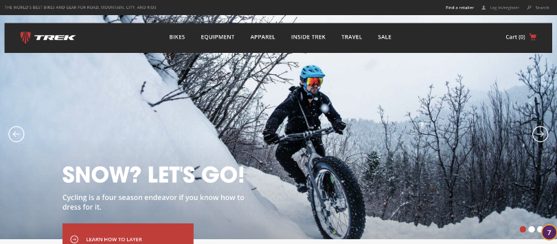
Also, bespoke imagery is usually best. That’s original photography that you commission. You’ll have full control over the depiction and the quality will be great.
2. Bigger is (usually) better
Images, copy, and buttons are made to be seen and understood.
People in our studies said they liked the “nice, large product pictures” on one of the bike sites, and didn’t like the “small menu buttons” and the font being “way too small” on a different bike site (that scored much more poorly).
If an element is too small to be understood, it’s hurting your site.
3. Aim for a clean and simple layout
The phrase “clean and simple” was verbatim from our usability testing feedback. These 2 words were the most commonly expressed in our studies, actually.
A cluttered site made them comment things like, “the layout was too busy for my taste” and “the website was crowded, making navigation a little more difficult.”
This can be especially important for e-commerce UX.
4. When in doubt, follow conventional design placement
Prototypicality is underrated.
It’s fun to be creative, quirky, and innovative. But many times, and with many usability concerns, shoppers just want to be able to buy the way they’re used to. Website optimization is about meeting the expectations of your customers. Conventional design makes it so they don’t have to learn anything new to buy from you.
5. Avoid automatic image sliders
Many usability and conversion experts have written about this. Of course, sometimes a slider works. But more often than not, it’s distracting.
Avoid them if you can. Optimize them if you can’t. Read more in this article on how to do that.
6. Page load should be as fast as possible
The issue we saw across every site, even the most “usable” ones, was frustration with loading times. Whether it was links, images, or an entire web page, people had a problem with waiting.
A direct quote was, “The website was very, very slow to load compared to others.”
Here’s an article that shows you how to tackle the low hanging fruit that is load speed.
7. Optimize images for faster site speed
This is a part of the above guideline, but it bears mentioning because it’s often a problem on sites and it’s relatively easy to fix. Here are Google’s guidelines.
8. Allow for filtering/categories when using search bar to narrow down/simplify search
Especially if you have a lot of items, this helps people narrow down their choices and perhaps notice something they wanted but couldn’t think of. Also, offer auto-complete suggestions.
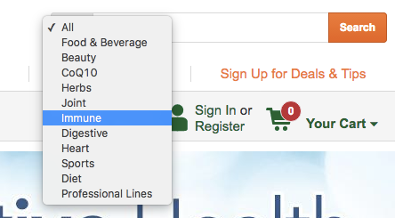
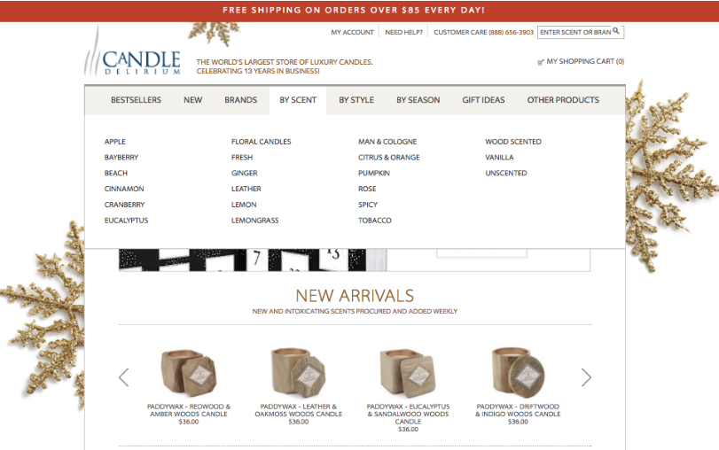
9. Make dropdown menus easy to use and scan
Make things easy to find. A common complaint is that it’s hard to read or scan menu items, or that they are non-intuitively organized. Read up on information architecture. Candle Delirium does it well…
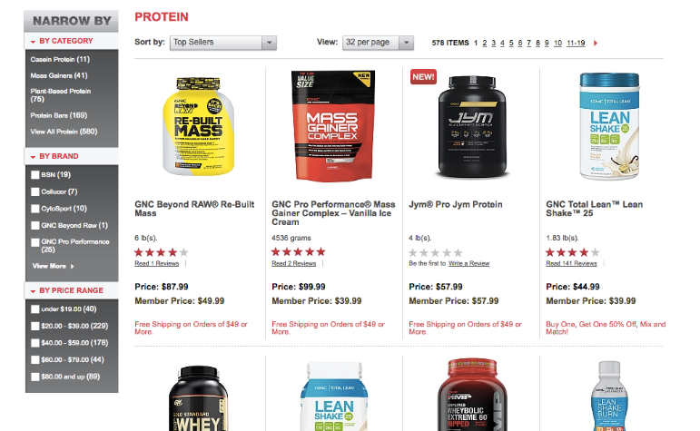
10. Use advanced sorting and filtering (faceted search)
In general, make it as easy as possible for searchers to find items. A straightforward user test where you give the user a defined task (find a pair of size 12 men’s shoes for less than $70) will decide if you have a problem here.
Faceted search, by the way, is different than simple filtering. It’s more advanced and filters by multiple product attributes.
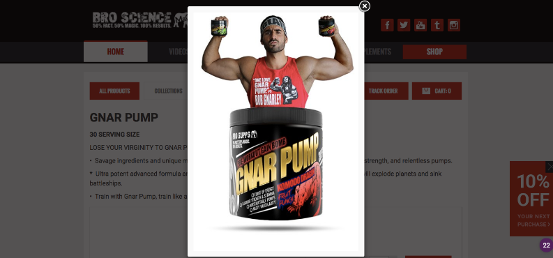
11. Avoid cheesy stock photos

I think stock photos are fine. It’s just the super cheesy ones you want to avoid.
Unless cheesiness is part of your brand, of course. This isn’t a stock photo, but this photo of Dom Mazzetti is funny and on-brand (though would be cheesy on any other site):
12. Ensure your site is secure
When users entered one of the bike sites we studied, the majority of participants were greeted with “an SSL certificate error stating [their] connection was not private.”
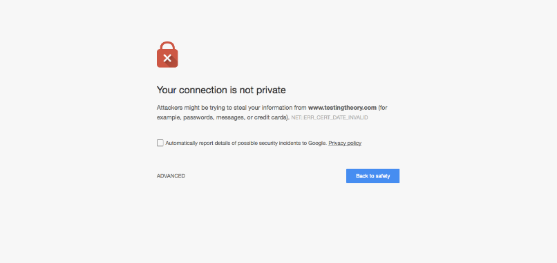
This warranted comments like:
- “Any browser would stop the user from buying products there. No go for me.”
- “I would never purchase from this site now or in the future, even if they fixed it.”
- “IT IS UNSAFE.”
People won’t trust your site if it doesn’t seem safe.
Conclusion
Comparing your conversion rate to that of your competitors is worthless; comparing the UX to that of your competitors is a goldmine of insight and actionability.
The guidelines I presented above don’t really sound surprising, at least from my point of view. But they were all validated by multiple quotes from actual user tested, and from experience and heuristic analysis, they make sense.
Read more: Running a comparative usability test
But, never take these guidelines as a straight up replacement for A/B testing. Who knows what will work with your audience? That’s why we A/B test our websites and our mobile apps. These are suggestions, and they may provide further support for a hypothesis, but you should still test it.
Questions? Fire away and we’ll do our best to provide full answers.
Alex Birkett is a Growth Marketer at ConversionXL. He moved to Austin, Texas after graduating from the University of Wisconsin (go Badgers!). When he’s not optimizing websites, he’s probably reading books, lifting weights, or karaoke jammin’.