


(Image source: The Atlantic)
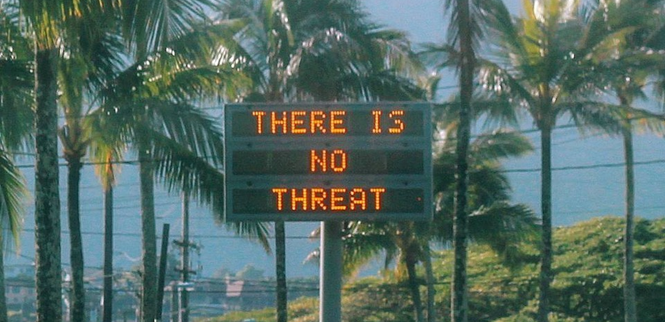
On Saturday morning, as we all know by now, the people of Hawaii were shocked to receive the following message on their cell phones:
BALLISTIC MISSILE THREAT INBOUND TO HAWAII. SEEK IMMEDIATE SHELTER. THIS IS NOT A DRILL.
Of course, the threat was not real. The message, as Hawaii’s Emergency Management Agency confirmed in a new mass text 38 minutes later, had been sent in error.
How could someone make such a grave mistake? On Tuesday we got an answer, when the Honolulu Civil Beat tweeted a picture of the interface used for sending emergency alerts:
This is the screen that set off the ballistic missile alert on Saturday. The operator clicked the PACOM (CDW) State Only link. The drill link is the one that was supposed to be clicked. #Hawaii pic.twitter.com/lDVnqUmyHa
— Honolulu Civil Beat (@CivilBeat) January 16, 2018
Suddenly, it’s not such a mystery. The page is a user experience disaster.
The most important thing that’s missing is any kind of information hierarchy. Nothing is grouped or organized in any logical way. High surf warnings and road closures are intermixed with amber alerts and nuclear attack announcements. Drills and real alerts are thoughtlessly shuffled together. It’s all one big jumbled list.
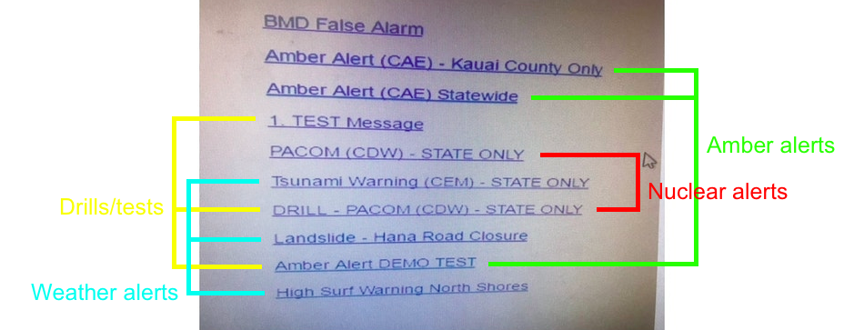
It would seem that the page was not “designed” at all – rather, it appears that each link was simply created as the need for it arose, and then added to the top of the list. (Notice, for example, that the False Alarm message created specifically for Saturday’s crisis is currently the first item).
The other major problem is the word-salad style of the text links. There is no consistency in the wording or formatting, making it incredibly confusing for a human brain to quickly identify and differentiate each item.
First, let’s just look at the link that was supposed to be clicked:
DRILL – PACOM (CDW) – STATE ONLY
The whole thing is written in capital letters, which we know decreases readability. Plus, rather than drawing attention to the important bits, the capitals instead equalize everything: superfluous acronyms like CDW and secondary descriptors like STATE ONLY have the same visual weight as the word DRILL. Now let’s compare it to the link that was actually clicked:
PACOM (CDW) – STATE ONLY
DRILL – PACOM (CDW) – STATE ONLY
The two links are almost identical, with the exception of the word DRILL. We also get more caps, and with every single word shouting at you, it’s easy for that one-word difference to get swallowed up. The signal-to-noise ratio here (i.e., the prominence of the critical information relative to less important “noise”) is extremely low.
1. TEST Message
PACOM (CDW) – STATE ONLY
Tsunami Warning (CEM) – STATE ONLY
DRILL – PACOM (CDW) – STATE ONLY
In between the two is one more shouty, caps-heavy link, adding further noise and preventing direct side-by-side comparison of the PACOM links. It’s also worth noting that right above the real nuclear alert is the word TEST in all caps; it’s easy to imagine how that proximity could have subconsciously influenced the user’s reading of the links.
Now consider that every test link uses a different format and wording: sometimes DRILL, sometimes TEST, sometimes at the beginning, sometimes at the end. There is no common thread that the eye can pick out and search for:
1. TEST Message
DRILL – PACOM (CDW) – STATE ONLY
Amber Alert DEMO TEST
The design of this page truly is giving the user nothing to work with. The human brain needs patterns to accurately discern meaning and function, and this page is devoid of any patterns whatsoever.
Fixing Hawaii’s Emergency Alert System
The first thing that should be done is to separate the drills from the real alerts. This is the most important division on the list, and there is no way that these two types of links should be mixed together.
Making this division would map the page design to the situational needs of the user. Are we running a routine drill? Look in the Drills section. Are we in the middle of a real-life emergency? Look in the Alerts section. Just this one change would drastically reduce the odds of a real alert going out in place of a test one.
Below is a good example of how the page could be redesigned to put similar links together and keep drills and real alerts far apart. This redesign further categorized different types of emergencies, which is another step in the right direction. (It might be better, however, if the nuclear link were at the end by itself, instead of nestled in between amber alerts and weather announcements.)
A more structured list divided by topics with redundancy of words like ALERT and TEST can help. Also emojis can help differentiate topics without deep reading pic.twitter.com/xPTEUgnZTV
— Luca Milan (@iamlucamilan) January 16, 2018
It also starts to clean up the link wording and formatting (for example, putting the words DRILL, TEST, or ALERT at the beginning of every option), but more could be done to standardize and simplify.
STATE ONLY ought to be changed to the more logical Statewide, and with only the first letter capitalized. This seems to be the least critical piece of information, and also probably the default scope of most of the alerts for the state’s emergency warning board. De-emphasizing it lets the eye focus on more important information.
Other word choices could also be changed for the better. Why, for example, is a ballistic missile threat referred to with a series of acronyms, and nothing that directly says “ballistic missile threat”? Compared to more straightforward links like High Surf Warning North Shores, the PACOM ones seem incredibly oblique.
The last thing that would help, which the redesign above takes a stab at, is adding some non-textual visual cues. Colors, icons, and other visual hints all help the user to discern meaning in less time and with more certainty. Perhaps, for example, the nuclear link could be red, or have a special icon, due to its unique seriousness.
Friction
One thing I’ve seen a lot of people suggest online is that there should have been more “friction” in the design to prevent this action from being completed so quickly. Two-step, password-protected, and multi-personnel confirmations have all been tossed around.
These suggestions may be off-the-mark. They make sense as methods for preventing false nuclear threat alerts; but they are an over-correction that is too mindful of last weekend’s mishap, while forgetting the real reason the link exists.
That reason, of course, is to warn the people of Hawaii of real incoming nuclear missiles. Making this action harder or lengthier when every second of forewarning could save more lives is not the right answer. In the unthinkable case that that link actually has to be used, the operator will likely be under extreme stress; if they have to remember special passwords or get another staff member’s countersignature, the cost of the delay could be tragic.
In other words, let’s not get carried away by the story of the day and forget the bigger picture. The right redesign of this system would serve the total range of situations for which it exists, not the one whose recentness has made it the most vivid in our minds.
Ultimately, friction is only a strategy for recovering from a mistake. A well-designed user experience for this page would make the right choice obvious to the user in any circumstance.

You may be interested in:
Messenger Madness: How Facebook’s basketball game nails mobile UX