User testing of your designs during the prototyping phase can save a website launch or product launch from going horribly wrong. It’s far better to catch a costly UX flaw before it’s implemented and goes live, than to fix it after real sales have been lost, or real customers upset.
The first step is writing a good task script. Running a usability test with poorly written tasks is like playing an out-of-tune piano: even if you hit all the right notes, the outcome will still be all wrong. The importance is all the more critical for prototype and wireframe usability testing, since users will require careful instruction to successfully navigate the limited functionalities.
Below I walk through a task script we used to test a non-interactive InVision prototype of the TryMyUI customer dashboard. Along with each task is my commentary on why we included it and how we chose the wording.
Read more: How to write tasks, Vol. 2: E-commerce usability testing
Scenario
You are a web designer trying to test out your designs with users. You have just signed up with TryMyUI…
NOTE: This test contains only images of webpages. None of the buttons or links work; you will only be able to look at each page. Use your arrow keys to move from one page to the next when asked.
The scenario we used for this test had 2 parts:
- The first contained the “story” part, the little bit of exposition that gives the tester a purpose and a jumping-off point for the rest of their experience
- The second included specific instructions about what the tester should expect and how they will be able to interact with the prototype
The second part is important for a wireframe or prototype test so that testers are aware of the limitations of the interface. Otherwise, they may spend the duration of the test carping over buttons and links that don’t work or content that’s missing, rather than giving useful feedback on the elements that are there.
There’s a variety of prototyping tools, so your instructions will be different if you’re testing an InVision prototype versus a Balsamiq one, for example. Make sure you cover the unique aspects of your chosen platform.

Task 1
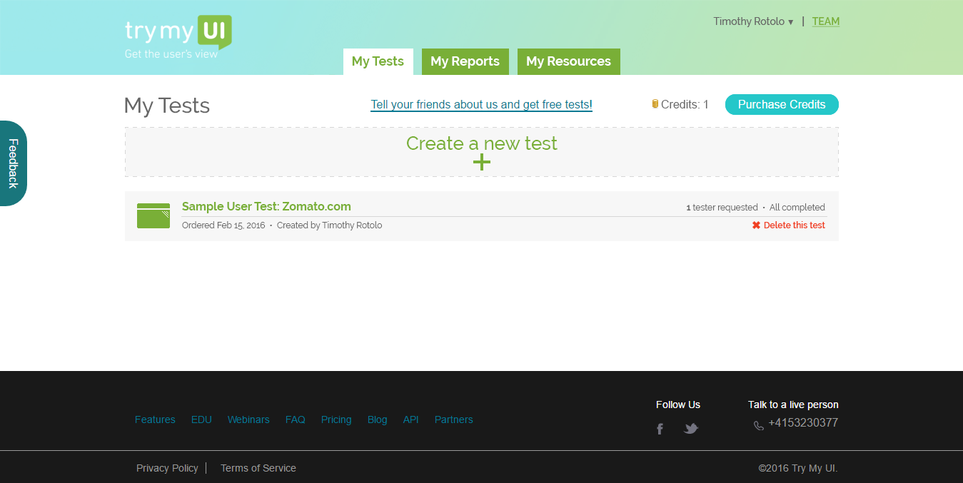
Describe your general thoughts about this page. What information are you seeing? What can you do on this page?
This first task is an approximation of our Impression Test, which I felt was not quite suited to this test. Usually, impression testing is a great gauge for more established e-commerce websites. Since we were testing a logged-in web app dashboard and not a marketing page, it was more useful, and appropriate, for users to get an understanding of the page without the haste of a typical online passerby.
We posed these questions to let users orient themselves as they started the test, and to see whether it was obvious what the page was for and what it showed.
Task 2
What do you think you would find in the “My Resources” tab?
 After asking about broad impressions, we started zeroing in on specific parts of the UI. “My Resources” is a navigation element we have considered adding to the dashboard, so we wanted to gauge whether users would understand it. By asking what they expected to find, we were able to see if the element communicated what we intended.
Even though we hadn’t drafted a mockup for that page yet, we were still able to get conceptual feedback through this task.
Task 3
What would happen if you clicked on your plan type, “TEAM”, on the top-right?
We continued to explore reactions to specific parts of the design with this next task.
Our wording here was explicit about what the text link “TEAM” meant in this context. It’s usually best not to explain elements or give away information that’s not in front of the tester on the screen; however, in this case a real-life user would absolutely know that they had purchased a Team Plan and recognize what the link referred to.
As you write your tasks, remember not to “lead the witness” by telling too much, but also don’t leave them in the dark about information they would realistically know. Real user experiences happen with context, and real users are not clueless.

Task 4
What do you think “Sample User Test: Zomato.com” is? What will happen when you click it?
The last thing we asked about on this page was the example user test. Again, we didn’t have a page in the prototype for this, so we stuck to asking users about their expectations. All we needed to know was whether users could gather some conclusions about what information the link might offer.
Task 5
Move to the next page on the prototype using the right arrow key. This is how your dashboard will look after you have run many user tests. (Please move to the next task, but stay on this page.)
This task was written solely to provide exposition. It is composed of 3 parts:
- Instructions for changing pages
- Information about the new page
- Next action to take
This was the first time in the test that the user would be moving on to a different page in the prototype. Although instructions for changing pages were included in the scenario, it’s been our experience that some testers forget or weren’t paying close attention while reading these.
To avoid confusion and lost time, we repeat the instruction here in the task, where the tester will apply the knowledge immediately. Now that they’ve done it once, they are unlikely to forget again.

The rest of the task provides the necessary information for the tester to understand what’s in front of them, and then nudges them on to the next task, clearly stating not to change pages as they change tasks (to prevent any confusion).
The big lesson from this task is to try and think of all the possible mistakes and misunderstandings that could arise, and preempt them by being extremely clear. It may help to have a friend run through your script and see where they get tripped up or need more info.
Task 6
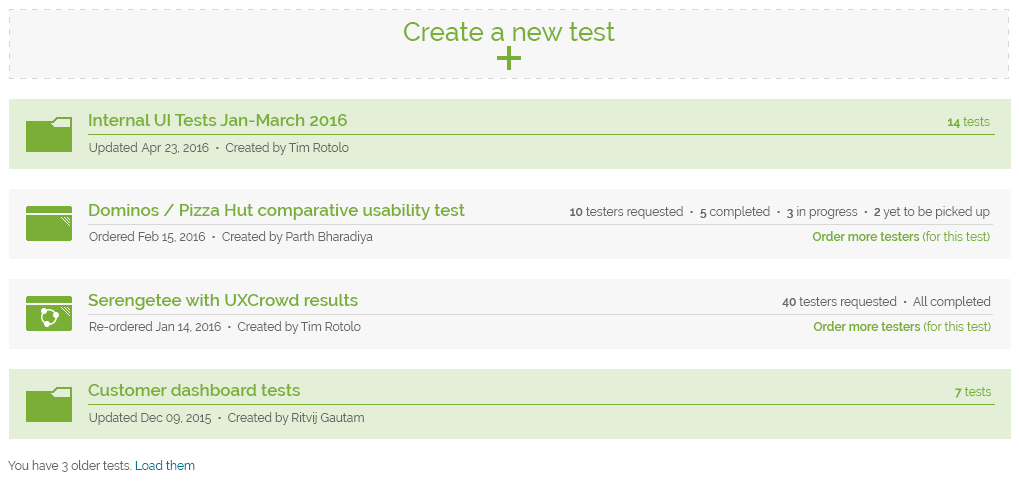
What different kinds of information do you see?
This page displays a lot of new content, with lists, titles, labels, and icons. Before asking about specific pieces of the design, we wanted to see if users could construct a mental framework for what they were looking at and figure out what different elements meant.

Task 7
(Note: The green list items are folders containing many user tests; the gray list items are individual tests). What do you think are some ways you could interact with the tests and folders?
Task 7 begins with a brief answer to the question posed in Task 6. (All the testers had more or less figured this out anyways, but it is still helpful to confirm their conclusions so they feel confident going forward.) Then we asked them to elaborate on what actions they thought may be possible.
This is a nudging technique we regularly use to make sure all the testers have fully explained what’s in their heads. The more talkative ones had already done this during the previous task, but we included this follow-up to squeeze everything out of the ones who hadn’t been as forthcoming.
Essentially, the technique is to ask almost the same question as before but in a different way. Since there’s no action to take – this task is just a question – the only way to complete the task is to talk. In this way, you force the tester to stop and reflect, instead of barrelling forwards with little explanation.
Task 8
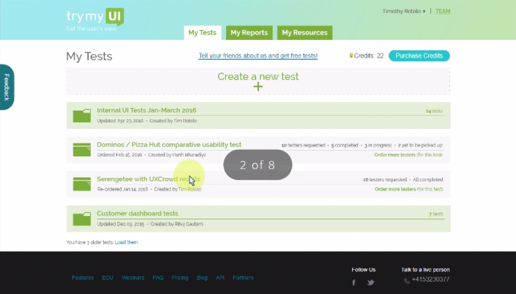
Move to the next page (page 3 of 8). This shows what would happen when you hover over the test icon for “Serengetee with UXCrowd results.” What does the white symbol indicate?
 Here again we had the testers move on to a new page. To make sure they were in the right place, we added the clarification, “page 3 of 8.”
This task follows the familiar pattern of:
- Instruction
- Information
- Action/question
After instructing the testers where to go in the prototype, we provided them information about what they were looking at, then prompted them with (in this case) a question to answer about it.
Task 9
Move on to the next page. This popup would appear when you click the white symbol. What can you do in this popup?
Tasks 9 and 10 follow the same pattern. Instruction: move on. Information: this is what we’re showing you. Question: what do you perceive about it?
Task 10
Move to the next page (5 of 8). When hovering over a test, the round green icon on the left will appear. What do you think it will do?
Since this was a non-interactive prototype, almost every task relies on questions rather than actions. Some good types of questions to ask for testing a non-interactive prototype include:
How would you go about…
What steps do you need to take to…
What do you think will happen when you…
Is anything missing from this page?
Is the information here useful/clear? What questions do you have?
If your prototype is interactive, you have the flexibility to make testers perform actions instead of just answering questions. Some of your tasks will be written more like the tasks for a live website or app.
However, you will still need to include specific instructions about what does and does not work, and how to interact with your prototype. Mixing in plenty of question tasks like the examples above will also be helpful.
Read more: Writing usability testing tasks
Task 11
Now move to the next page. If this were the icon instead of the one in the previous task, what would you think it is for?
Task 11 shows an alternate version of the UI shown in task 10. We ask users to re-assess what the element does in light of the alternate design.
Comparing 2 designs in this way is a good way to do a qualitative A/B test. Make sure you show some users Design A first, and some users Design B first, to control for order bias.
![]()
Task 12
These buttons are for moving the corresponding test into a folder. Which of the two more closely represents this function?
After showing users both of the icon designs and hearing what they thought, we confirmed the actual function of the icons at the beginning of Task 12.
Based on this new information, we gathered more feedback on which icon users found more suitable.
Even without this task, we could draw some conclusions about the 2 icons based on the answers from Tasks 10 and 11. Still, posing the question directly allows testers some additional reflection and renders a quantifiable verdict.
Recap: Full task script
Scenario – You are a web designer trying to test out your designs with users. You have just signed up with TryMyUI…
NOTE: This test contains only images of webpages. None of the buttons or links work; you will only be able to look at each page. Use your arrow keys to move from one page to the next when asked.
1. Describe your general thoughts about this page. What information are you seeing? What can you do on this page?
2. What do you think you would find in the “My Resources” tab?
3. What would happen if you clicked on your plan type, “TEAM”, on the top-right?
4. What do you think “Sample User Test: Zomato.com” is? What will happen when you click it?
5. Move to the next page on the prototype using the right arrow key. This is how your dashboard will look after you have run many user tests. (Please move to the next task, but stay on this page.)
6. What different kinds of information do you see?
7. (Note: The green list items are folders containing many user tests; the gray list items are individual tests). What do you think are some ways you could interact with the tests and folders?
8. Move to the next page (page 3 of 8). This shows what would happen when you hover over the test icon for “Serengetee with UXCrowd results.” What does the white symbol indicate?
9. Move on to the next page. This popup would appear when you click the white symbol. What can you do in this popup?
10. Move to the next page (5 of 8). When hovering over a test, the round green icon on the left will appear. What do you think it will do?
11. Now move to the next page. If this were the icon instead of the one in the previous task, what would you think it is for?
12. These buttons are for moving the corresponding test into a folder. Which of the two more closely represents this function?
Final notes
If you’re used to testing live websites or apps, writing the tasks for a prototype or wireframe usability test can take some adjusting. The key is to consider all the special circumstances and account for them in your instructions, so testers can spend their time giving feedback and not fretting over how to use your prototype.
For more usability task-writing tips, check out our article on writing usability testing tasks for e-commerce sites.
How to write tasks, Vol. 4: Remote focus groups for marketing videos


