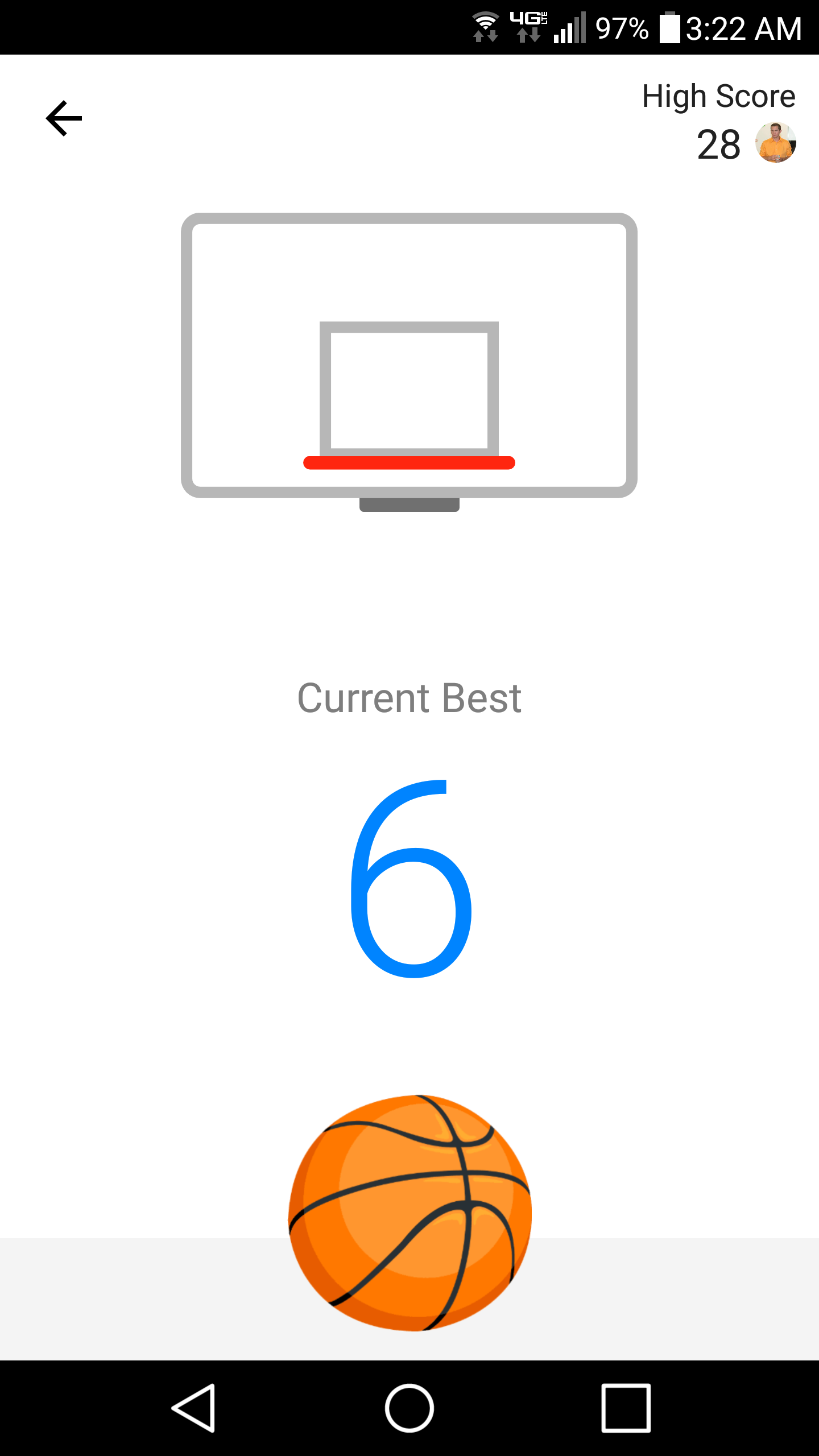
In celebration of March Madness, Facebook’s Messenger app has released a hidden new basketball game – and the game nails mobile UX in all the right ways.
Below is a short clip showing the gameplay in action:
The game is incredibly simple, and at the same time highly addictive. What exactly about the user experience makes the game such a success?
1. Visual simplicity
In terms of visuals, there’s almost nothing there. What is there accomplishes a lot.
A large basketball sits at the bottom of the screen, brought to the foreground by a subtle gray slab of “ground” which it overlaps. This layering immediately suggests depth to the human eye, which then interprets the top edge of the gray rectangle as the juncture of floor and wall (the plain white background).

At the top of the screen hangs a bare-bones “basket”: two nested gray rectangles, a thick red line in between, and a dark gray patch below.
This dark patch finishes the job of establishing depth perception: it is the shadowed bit on which the rest of the basket rests its weight; it is where the basket connects to the “wall.”

Add in the relative size of the ball to the basket, and the game’s simple design achieves a realistic, predictable approximation of real-world depth, breadth, and height. Given that the game experience depends on the faithful replication of shooting a basketball, all this is critical.
In the whole design there is literally nothing extra. Everything on the screen serves a purpose. Notice that the basket doesn’t even have a net. Why not? Because it isn’t necessary to establish that it’s a basket. The backboard frame, the inner rectangle, and the bright red rim comprise the bare minimum to make the ensemble easily recognizable. A net, as essential as it seems, would have added over-the-top visual complexity.
It is impossible for the brand-new user to be confused. There is only one thing to do: shoot the ball. With just 6 elements, the game design communicates everything the user needs to know to get started.
2. Pleasing interactions
The game offers no instructions, but the only obvious option is to try and move the ball with one’s finger. Since there are few possible interactions and the cost of experimenting is low, the user can easily discover the mechanics of the game. Drag the ball, and it launches “forward” and “upward,” shrinking as it arcs towards the back wall.
It’s not just the arcs that mimic real life. When the ball hits the rim, it bounces playfully with physics that perfectly recall the movements of a real basketball circling a real rim (translated, of course, into 2D).
Each shot also returns immediate feedback to the user. Successful shots summon encouraging emojis (including thumbs up, flexed arm, and raised hands) that hover briefly over the basket. Misses similarly call up emojis of glum faces. This varied but consistent feedback keeps things from getting monotonous and adds interest and humor.
Additionally, each successful shot adds to a running tally of consecutive successes, which counts up in the center of the screen as the game progresses. It is this score that provides the main objective of the game.
3. Replay value
The last component of the game’s UX formula is addictiveness. The interaction style lends itself to repetition: the quick, calculated swipes differ only slightly from each other, and the pacing of the shots is rapid enough that the user can easily get into a rhythm.
And there is no real break between games. As soon as you miss a shot and the score counter resets, there’s a new basketball waiting to shoot. No “Game over,” no “Try again” button to press; you just keep right on swiping (we know from Tinder how addictive swiping can be).

In this case, the motivation to keep swiping is the score, and the game is constantly reminding the user of the number to beat.
For the beginner, it’s their own high score, which is shown at the end of each game in bright blue digits. For users who’ve gotten the hang of it, it’s the high score among all group chat members. That high score, and the friend that holds it, is permanently shown in the top right-hand corner.
This harnesses the user’s competitiveness to drive them to keep playing so they can beat their friends, and it can be quite effective as chat members vie to capture or raise the top score.
Lastly, the difficulty of the game seems perfectly fine-tuned to encourage obsessive play: it’s actually pretty tough to set a new high score, but it doesn’t seem like it will be so hard. It feels just out of reach – in fact, you can probably do it if you play just one… more… game…
You may be interested in:


