Few doubt the importance of doing user testing on your mobile websites and apps. The web is increasingly going mobile, with TechCrunch announcing on November 1st of 2016 that 51.2% of internet usage worldwide was now through mobile devices. In the US, 76% of the market accesses the web through both mobile devices and computers.
For virtually any business, providing user-friendly mobile platforms is at least as important as providing usable platforms for the computer. The problem is that doing user testing for mobile products has always been comparatively much more challenging.
Challenges of mobile user testing
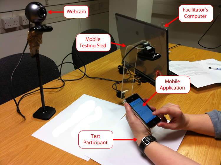
Part of the problem is that many solutions (particularly the common DIY methods) rely on external cameras and other hardware that is expensive, complex, and ultimately affects the accuracy of the results and quality of the data. Take a look at this example mobile user testing setup from UsabilityGeek (you might have used a similar setup yourself):

Facilitating a test along this model is a lot of work. Even just building a workable mobile testing “sled” (a contraption for mounting an external camera over the device to capture the screen) is extremely tricky. UX Mag offers these guidelines for creating your sled:
- The sled must be light and easy for test participants to hold.
- The sled should not slow users down or get in their way.
- The sled should accommodate different sized devices so that you can use test participants’ own devices.
- The camera mount should ideally be adjustable to accommodate user preferences and different devices.
- The sled should allow users to easily switch device as well as orientation i.e. portrait to landscape view without having to move the camera position.
- The whole sled set up must still be stable and not move during testing.
Sound difficult? And that’s just to get video of a smudged screen partially blocked by at least one of the user’s hands, hopefully without any glare, as the user attempts to re-create a normal experience while surrounded by UX Researchers, using a device that’s not their own encumbered by external hardware.
Read more: Why remote user testing beats on-site testing
Collecting better mobile user testing sessions
Okay, okay, so mobile user testing isn’t perfect. But technology is always on the move, and we’re very proud to announce that TryMyUI’s new mobile solution is remote, flexible, low-impact, and doesn’t use any external hardware.
Instead, we exclusively use native mobile technology to capture the user experience on phone and tablet.
Take a look at an example video recorded with our new software below:
Users record their session with TryMyUI’s tester app. The app records directly from the tester’s device screen, so you get high-quality, full-screen video showing everything that happens.
It taps into their microphone to provide their voice as they use your product.

It also records every gesture they make – taps, swipes, pinches, or any contact with the screen. This is the critical piece that glues together what’s happening on the screen, and which is lacking from other screen recorder tools.
Like the cursor on a computer, gestures on mobile are the key to understanding users’ interaction with their device.
You won’t have to make inferences about where users tapped and touched, and how many times. And you won’t have to struggle to observe hand and screen at the same time. Full gesture representation integrated right into the user videos makes it 100% clear.
The instructions bubble
All of this happens in the most natural way possible. Testers open up your mobile website or app on their own device, where all the settings and quirks are familiar to them, and walk through the tasks, guided by our unobtrusive little “UI” bubble.
 Most of the time, the transparent green bubble just hovers on the side of the screen wherever the user leaves it. It can be dragged around anywhere on the screen, so each user can choose where to put it based on their personal preference and on the layout of the product being tested.
When the user taps the bubble, a popup opens showing the instructions for the current task and buttons to move forward and back. It’s extremely simple and lightweight, just enough to keep users on track while leaving the product itself as the main focus.

In creating this bubble UI, we were inspired by the Facebook Messenger app, which uses the same bubble-and-popup UI to float over and around the edges of more than a billion people’s phone and tablet screens. The ease of this model, and its familiarity to so many people already, made it a great model for presenting instructions to mobile testers in a flexible and low-impact way.
What can I test?
You can test Android mobile websites, Android native apps, and iOS mobile websites just as easily as you would a desktop website with TryMyUI. When setting up your test, just pick “Live site” for a mobile website, or “Mobile app” for a native app; then choose your preferred device type.
For testing iOS native apps, you can add our SDK to your app to test it. We are also working on an SDK-less solution in which you can upload your IPA file so that it can be directly tested with the TryMyUI tester app.
Read more: Workarounds for testing Android APKs and iOS prototypes
Mobile tests cost 2 credits per result on a Personal plan, or just 1 credit per result on a Team or Enterprise plan. Get started with your mobile user testing strategy here:
www.trymyui.com/plans


