
The role of UX, as commonly taught, is to benefit the user. This typically means easy-to-use interfaces, intuitive flows, ethical interactions, and a coherent, visually attractive design. Measuring the impact of your UX is done by collecting quantitative and qualitative data via usability testing and other user research methods.But how do we measure the impact of UX beyond a person’s identity as a user or a customer? How can we prove that UX is actually making a positive impact on the world, and not just on the company or the user?
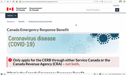
Recently, the Canada Revenue Agency (CRA) designed an online portal to provide aid to Canadian citizens who had lost their jobs or were in a 2-week (unpaid) quarantine due to COVID-19. Upon its release, the portal garnered universal praise and gratitude from Canadian citizens.
The Canadian Emergency Relief Benefits (CERB) portal was user tested with TryMyUI, and we want to share their success.

User testing in the time of COVID-19
COVID-19 has forced a complete reimagining of almost every professional workflow. Team members that used to sit within feet of each other are now miles away. Every single one of those meetings that “probably could have been an email” are finally an email. Physical interaction has ceased.
Read more: 5 reasons why remote usability testing is easy as pie
Virtual interaction, meanwhile, is flourishing. The role of UX has never been more relevant or crucial than in a time of lockdowns, stay-at-home orders, and quarantine. Further, as a recession looms, the impact UX can have is as much that of relief and comfort as it is revenue and brand awareness.
We’ve already discussed how financial institutions can design their digital products and services to offer support, transparency, and relief in the past.
But what does impactful UX look like during a pandemic? What can a government agency do to provide a sense of relief with their design?
The most positive UX success story of the year
Pause and consider, as a UX designer, the task at hand for the CRA team: the CERB would act as an application for financial aid, a representative of the Canadian government, an instructional manual for navigating a global pandemic, and ultimately, a much-needed source of hope in a time of dire need.
The stakes are extremely high and time is very limited.
Setting up the test from the UX perspective
Where to start with usability testing for a portal that tens of millions of Canadians of all walks of life might use? Your test demographic is extremely broad:
- Canadian citizenship
- Fluency in English, Spanish, or French
- Age 18 years or older
- Has had employment and/or self-employment income of at least $5,000 in 2019 or in the 12 months prior to the date of their application
(Note: These would be example demographics to screen for in a usability study, not the requirements to receive aid via CERB.)
An extra consideration: this is an audience with varying levels of technological savvy, who are entitled to, and dependent on, government aid to survive a pandemic.
When it came to writing the task script for the usability test, in order to capture the huge demographic swathe and various life contexts of the users, the CRA team kept it broad.
You were laid off from your part-time job because of COVID-19. You have been working for less than half a year. What support can you get from the government to cover your loss of income? What did you find?
Rather than forcing users through a specific, narrowly defined flow, they chose to allow testers to wander and navigate through the portal based on their own intuition and needs. We’ll see why below when we take a look at the design itself.
A simple, fast, and informative user flow
Given the variable tech savviness of the user base, being “cute” or clever with the designs would not do CRA any favors in this context. To ensure that users with low computer skills could successfully use the site, the supreme rule had to be “KISS” (Keep It Simple, Stupid) – no reinventing the wheel.
Read more: Overcoming the curse of knowledge – UXspresso with Spiralyze
 The user flow couldn’t take as long as most online services to use or design, either. Taking a lot of time to design, test, and implement would leave more people in need without help. But rushing the job could create a product that doesn’t inspire confidence, creates confusion or mistrust, and could weaken the expert authority of the Canadian government during the crisis.
Additionally, making a form or application process unnecessarily long is a great way to frustrate users who came to you for help.
It’s… a tricky situation.
Learn more:
Headers, prompts, and details
The CERB is a simple webpage with a few key headers (“Who is eligible,” “How to apply”), each with a brief summary of important information needed to continue the process. Even if users skip straight to the bottom, there’s a two-question survey that will tell them where to go next based on their answers.
The rest of the application follows this general style: informative headers with simple questions and answers below to steer users through to completion. Depending on your demographics and situation, it can be as quick as two minutes.
Remember the task from above? The prominent headers and definitive prompts at the bottom seem tailored to just the types of behavior most users would exhibit when visiting the page. They want aid, fast, and without being demoralized by the tedium of bureaucracy.

Beyond “user” experience: the human impact of UX
After the portal went live, the positive reviews started to roll in – to such an extent, in fact, that its success became a news story. What did users have to say about it?
“So easy I thought it was fake” is a resounding endorsement of the CRA team’s designs (if also a hardnosed commentary on people’s expectations of government websites). From the Financial Post,
“‘It’s so easy I thought it was fake,’ [an] applicant told the Post, explaining that all he had to do was log into his Canada Revenue Agency account, click on the appropriate link and answer three questions before getting an approval message from the CRA saying the $2,000 benefit would be in his account within three days.”
We’ve written before on great charitable / service-oriented UX, but this is on an entirely different level. Other user reactions and commentary:
“A four click application, including login, and there is my confirmation right on screen: You have successfully applied for the Canada Emergency Response Benefit. Four clicks!” (Source)
“I started the application at 4 a.m. and finished at approximately 4:02 or 4:03 a.m.” (From the Financial Post article above)
This is the measurable, definable real-world impact of UX.
This went beyond user experience. This was designing a system to get people the aid they need during a global crisis. TryMyUI is honored to have the CRA using our platform for user testing their Emergency Response Benefit portal, as well as their various other COVID-19-related user flows.