The TryMyUI Recorder has a brand new look! We listened to lots of feedback from our customers and testers about how it could work best, and after months of designing and testing a totally new version, the updated software is finally live.
Below, we’ll briefly show you how it looks and works, and the biggest benefits of the new redesign.
Modern look and feel
Our old software was showing its age, and part of the goal of this redesign was to give the recorder a modern, fresh look. We updated the color palette, cleaned up borders and margins, sharpened corners, and flattened icons and buttons.
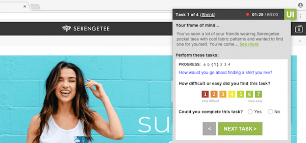
Above, on the left, the fully expanded view is shown, with the task instruction and progress marker, plus task usability and task completion questions, and the frame of mind at the top for reference. All the same elements are there from before, but with a much cleaner and more organized look.
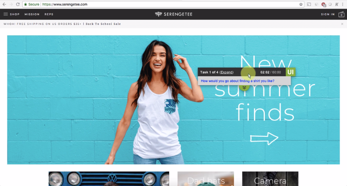
On the right, you’ll see the mini view after testers have clicked the “Shrink” button. Testers can minimize the recorder down to this size while performing the tasks so that it doesn’t block the webpage.
Full-screen browser
The new recorder hovers over top of the browser window, instead of showing in a parallel window to the left. This means that testers can view the test website full-screen at all times, without any changes due to resizing the browser.
The recorder always stays at the front of the screen, so you’ll never lose sight of which task they’re working on.

Additionally, testers can drag the recorder around their screen to reposition it throughout the test, making sure that it’s not in the way of their experience.
Streamlined preliminary tasks
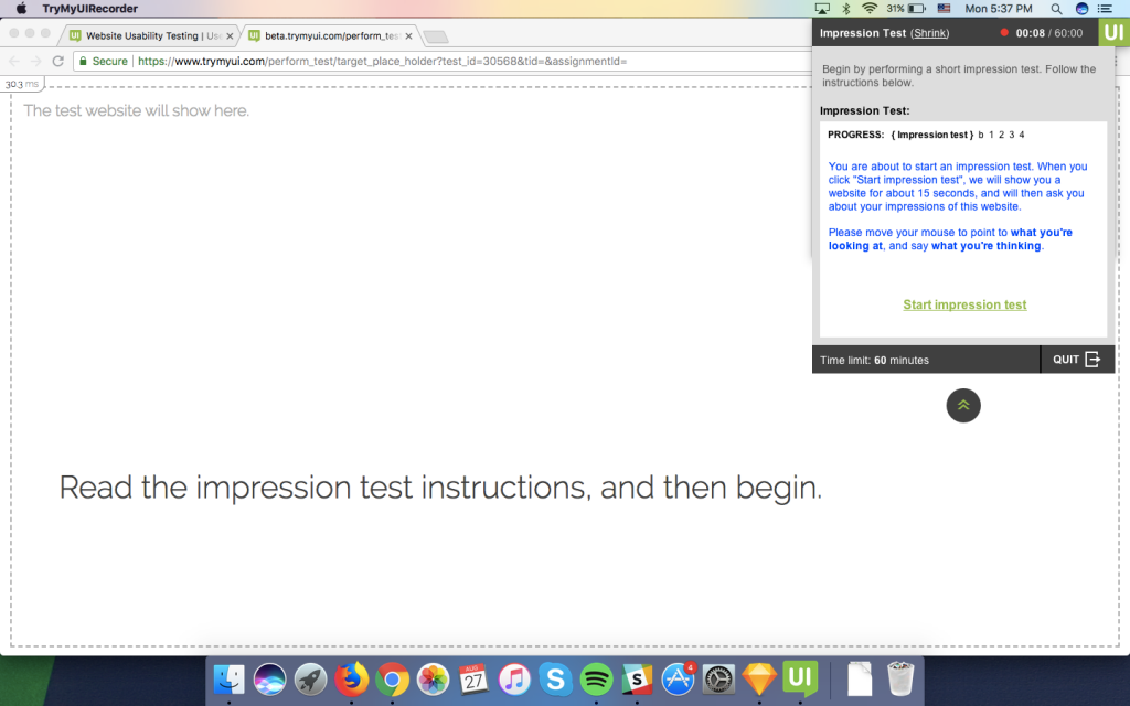
We’ve also simplified the flow of the preliminary tasks, including special criteria and instructions, the impression test, and the frame of mind reading.
Before, these tasks often had testers bouncing back and forth between the browser and the recorder panel. This rather complicated flow sometimes led testers to accidentally skip over parts of the test. With the new design, they have been streamlined to ensure that nothing gets skipped and testers can complete these steps quickly and effortlessly.

All key actions have been moved into the recorder panel, so that testers won’t have to go back and forth. We kept the instructions on the browser page to a bare minimum to focus testers’ attention in the right place.
Better tests, better experiences
With the release of this new recording software, we are confident that the quality of usability testing results you collect will be even greater, enabling you to create ever better experiences for your users.
Of course, no design is ever finished, and we will be continuing to make adjustments and improvements to our recorder as needed. We would love to hear your feedback, so let us know the difference this redesign is making in your research!
We also recommend you read more about:


