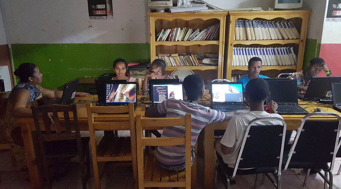
How do you explain the concept of UX to students who have only been using computers for 6 weeks?
Solution 1: Show examples of “good” and “bad” websites. One constant challenge at our location, however, is reliable access to internet.
Solution 2: Analyze Facebook. But we can only load the mobile site completely.
Solutions 3–5: Employ simulations, skits, and drawing. But as our classes continued, the concept of UX became increasingly confusing and vague.
It was then that I realized UX is luxury. It’s virtual customer service; it stems from the ambition to predict your users’ needs and desires and provide for them before they even arise. Here in Madagascar, things don’t work for you. It is up to you to fit your needs to the minimal parameters of service you can find.

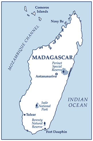
I’m writing to you from Madagascar. Yes, Madagascar: land of lemurs and vanilla. I work for Code for Humanity, an organization catalyzing entrepreneurial ventures and employment opportunities for our students in Nosy Be.
Despite the lack of Silicon Valley glamour, our classes are constantly animated and our students grow more confident each day. A few have never used the internet before, much less a computer, but are now debugging JavaScript.
For the last few weeks of class, our students have been in ateliers or workshops. Each student must create a website utilizing HTML5, CSS, and JavaScript to complete the course. The students choose the topic of their websites, ranging from personal websites to business ideas such as children’s clothing boutiques or an online market for weavers. One student used his website as a place to store his research of universities and scholarships while another created an online resource for Malagasy music.

Adapting UX to Nosy Be
Each website was as unique and creative as its creator, but the lack of UX design was apparent. We had the opportunity to connect with TryMyUI EDU and the idea of usability testing has captivated this audience because it reminds our students that websites can and should offer customer experience.
Inspired by our students’ resilient and creative solutions to Madagascar’s lack of reliable WiFi, transportation, and electricity, we re-examined the concept as a class and began to fit it to our needs.
We broke UX design into 4 specific elements: aesthetics, organization, interaction, and usability.
The strongest websites, we explained, use these 4 elements to tell their stories. Certain color schemes are symbolic in Sakalava culture and should be used accordingly; for example, red and white are used at sacred sites because they symbolize gold and silver – the elements of the Sakalava people. Websites that are clearly organized allow clients to order efficiently and quickly from village weavers. Maps, photo galleries, and mouse-over actions draw in your user and highlight the information you want to showcase.
Perhaps the concept of user experience design is more for the user; it aims to provide the most pleasant experience for the consumer. But then, how do you explain the concept of UX design in Madagascar?
The short answer: you don’t. Instead, you remind your students that every website has a purpose, a reason why it exists and UX design is about telling your story as strongly as you can.
Have a look at the work of Code For Humanity’s graduating class.
You might be interested in:


