Every time I go to the gym, I step on the scale and check my weight. Then I see if it’s gone up or down from the last time. Depending on the net change, I know that either I’m doing the right things and should keep it up, or that my regimen isn’t working and I need to think about a different approach.
Knowing this is critical to making predictable improvements. Without that number from the scale week after week, it’s a lot harder to tell how effective my efforts have been.
Usability testing is the same way. Every week we work on improving the product, iterating to make it smarter, sleeker, easier to use than the last version. But if you aren’t stepping on the scale every week or month and comparing usability scores, completion rates, task difficulty – how do you know if any of it is really paying off?
UX Sprint: The iterative, interactive data log
Our new UX Sprint feature is aimed at helping you engage in an iterative usability testing cycle that supports and builds on your design progress to measure the impact of your work and point the way forward.
UX Sprint allows you to run new “sprints” of your usability tests, passing the same set of tasks to a new batch of testers to perform and then comparing user testing metrics between new and old testers to show how the usability of your designs have changed since the last tests.

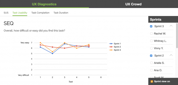
Here, data from the Single-Ease Question measuring task usability is shown for two different sprints. It’s immediately apparent from this graph that Sprint 3 has improved upon Sprint 2 in most areas, particularly in Task 6.
This information (1) shows that changes made between the second and third rounds of testing were effective in improving the user experience in these portions of the user flow, and (2) allows you as a designer to demonstrate that impact to decision-makers.
The graph also shows that Task 8 has actually become more difficult since the previous sprint, a good sign that more work may need to be done on that part of the experience and that perhaps recent changes have not had the desired effect.
Other tabs show sprint-to-sprint comparisons of system usability data, task completion rates, and task durations. All of these can be used to identify the effectiveness and impact of design decisions in each iteration, as well as to set targets for upcoming sprints: for example, increasing your SUS score by 3 points, or decreasing the time it takes to complete Task 4 by 10%.
Using UX Sprint
To use the new UX Sprint feature, just order more testers for a usability test you have already run. The new testers will automatically be treated as a new sprint (and the original testers as Sprint 1).
When you get your results back, go to the UX Diagnostics dashboard below the written survey responses to see how the data from this sprint compares to the earlier testers. You can view multiple sprints together, toggle between sprints, or check out the details for individual testers from any sprint.
Read more: Inform your usability testing analysis with quantitative data
UX Sprint is available for Team and Enterprise accounts. Don’t iterate blind – sign up now to start sprinting smarter and working more effectively towards the perfect UX.
After all, if you’re spending hours at the gym, why would you not step on the scale?


