


In anticipation of the continuing 2020 Democratic candidate debates, TryMyUI is excited to bring the Democratic ruckus with a UX War between the five leading (as of polling in mid July when the tests were conducted) candidates for the 2020 Democratic party presidential nomination.Let’s meet our candidates (in alphabetical order):
 Biden, Joe: Former vice-president (47th, 2008-2016), former Delaware senator (1973-2009), and noted lover of trains (more on that later) Joe Biden wants voters to believe that “our best days still lie ahead” and benefits from well-established name recognition.
Hometown: Scranton, Pennsylvania
Website: https://joebiden.com

Buttigieg, Pete: Two-term mayor of South Bend, Indiana since 2012 and retired Navy Lieutenant (served 2009-2017), Pete Buttigieg is the youngest (aged 37) candidate and the only millennial in the mix, promising “a fresh start for America.”
Hometown: South Bend, Indiana
Website: https://peteforamerica.com
 Harris, Kamala: Former attorney general (2011-2017) and current senator of California (2017-present), Kamala Harris is “for the people” and has been working in law since the 1990s. Harris made herself a front-runner in the crowded field with her performance during the first debate.
Hometown: Oakland, California
Website: https://kamalaharris.org
 Sanders, Bernie: The longest-serving independent member of Congress in US history (1977-2015; 2016-present), Bernie Sanders is urging voters that it’s “Not me. Us” in his second bid for the nomination.
Hometown: New York City (Brooklyn), New York
Website: https://berniesanders.com
 Warren, Elizabeth: Current and first female Massachusetts senator (2013-present) and first special advisor for the Consumer Finance Protection Bureau, (of which she is also billed as a co-creator), Warren assures voters that she “has a plan for that!”
Hometown: Oklahoma City, Oklahoma
Website: https://elizabethwarren.com
The Test:
We recruited 10 remote desktop testers from the great country of Canada. Why Canada? In preliminary testing with Americans, we noticed a not insignificant amount of political bias for and against various candidates. We selected Canadian testers to help minimize these biases, while still getting users who had some familiarity with the US political system.
Because online campaigning is still in its relative youth, the test was kept to a fairly simple 6 tasks driven by a common scenario:
You haven’t really kept up with [insert candidate]’s political platform, but you keep hearing people talking about [her / him] and want to inform yourself. So you decide to visit [her / his] site to learn more.
(Note: this is an independent usability test for a political candidate’s website. This test has no affiliation with any political entity and we request that you please review it objectively based on experience, design, and ease-of-use, regardless of your personal political opinions).
The tasks:
- Where would you go to learn more about [candidate]’s platform?
- Can you find out if [she / he] has any political positions or stances on public education and teachers?
- You’ve learned a little about [surname]’s political platform, but what about the candidate [herself / himself]? Find out some background information on the candidate.
- You’re warming up to [candidate] and want to receive updates from [her / him]. Join [her / his] mailing list (do not use a real email).
- You’re on the list to receive future updates, but are also curious about seeing [her / him] speak. Find out where and when [she / he] will be speaking.
- You’re convinced and want to support [her / his] cause. Proceed to donate (stop when asked for billing info).
Note: Task 2 was selected because we found it to be a universally non-divisive subject and something very common in the US-political conversation.
The scenario and tasks were presented to testers after the impression test, in which we display the homepage of the site without context for 15 seconds, and then ask the testers to tell us how the site made them feel, what purpose they think it serves, words and phrases they remember, etc.
After completing the tasks during their video session, we asked users to respond to the following written survey questions:
- Did the website reflect a clear message from the candidate? If yes, please describe that message in a single sentence.
- What did you like about the website? (Remember, please set aside your personal political views and just talk about the design of the website itself).
- What aspects of the website could be improved?
- Did the website make you more inclined to support the candidate, less inclined to support the candidate, or not affect your level of support for the candidate at all?
- Have you seen other political candidate websites? If so, how did this one compare? Setting aside any political preferences, please be specific about what you see as better/worse about this website versus the other(s).
The scoring methodology:
Due to the nature of the tests, we’ve decided to use the following methodology for ranking the candidate sites.
PSSUQ: The Post-Study System Usability Questionnaire (PSSUQ) is a standard metric for quantifying the user experience of a website. Testers rate a series of 16 questions using a 7-point Likert scale, for a total score of x out of 100. The PSSUQ was created specifically for scenario-based usability testing like this UX War.
We awarded points as follows to the top 3 candidate websites:
- 3 points for the highest PSSUQ score
- 2 points for the second-highest score
- 1 point for the third-highest score
Statistical note: we decided to use a truncated (trimmed) mean for the PSSUQ scores, eliminating the highest and lowest 10% from the sample. This insulates overall scores from outliers, and presents a more accurate measure of central tendency.
Task Completion Percentage (TCP): As part of all user tests with TryMyUI, we measure the percentage of tasks that are successfully completed by testers. For this study, we then averaged the performance on all 6 tasks into an overall task completion percentage. Just like the PSSUQ scoring, we awarded points to the top 3 performers.
- 3 points for the highest Task Completion Percentage
- 2 points for the second highest TCP
- 1 point for the third highest TCP
Support Conversion: Arguably, the most important aspect of political candidate websites is the conversion rate of support. How many visitors are now more likely to support the candidate and thereby potentially donate to the campaign?
We used the following scoring system to measure each website’s support conversion:
- 1 point awarded per tester that plainly stated they are MORE INCLINED to support the candidate based on their experience on the website
- .5 points awarded per tester who stated that they are interested in learning more about the candidate based on the site, but not yet committed to supporting them
- 0 points awarded for testers whose level of support was not affected
- -1 point per tester who plainly stated that they are LESS LIKELY to support the candidate based on their experience on the website
Each candidate’s support conversion score was added to their total score, instead of receiving a predetermined number of points for being highest, second highest, or third highest. We felt that any amount of conversion success should be awarded points since, to reiterate, this is the primary objective of a political candidate website.
Also taken into account were the non-quantifiable user comments, both negative and positive, from the test videos. After more than 60 tests, we found a number of common elements that testers identified as important for a political candidate’s website, but are not as easy to assign scores or award points for.
Ultimately, the subjective user experience of the website is the most important metric, but also the most difficult to rank candidates by. And so, we decided to use the scores described above as an approximation in order to distinguish placement of virtually equal sites (as you will soon see).
These were all very, very good sites, as they should be. But, there must be a winner, and there must be losers, and every website can be improved in some way.

But first! The biggest threat to democracy in 2020…
Before we dive into the final rankings, we have to address something just as potentially disastrous to the 2020 Democratic presidential candidates as Russian interference or DNC meddling… Mobilize.us
4 of the 5 Democratic nominee websites use this third-party site for their events page. Unfortunately, there is no obvious way of navigating back to the candidate page other than the “back button” in the browser, or clicking back to the original website tab, depending on which implementation the candidate site used.
That might not seem like a big deal, except that Mobilize.us uses the candidate’s logo in the top left, and is actually a clickable redirect just like many other websites have, and just like these candidate websites have. But the redirect just refreshes the Mobilize.us page and doesn’t link back to the candidate’s website.
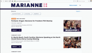
Using Marianne Williamson’s site as an example, you can see that once you are redirected to the mobilize.us page, there is no clear way back, even with the clickable MARIANNE2020 logo, which we repeatedly, angrily, clicked.
Mobilize.us absolutely destroyed task #6 (donate), and it’s hard to blame the candidate site itself for that shortcoming since the presence of the logo reflects a learned behavior that UX designers have been instilling in users for decades: click the logo to go to the site’s homepage.
Based on task 6’s completion percentage and the time it took to complete, we learned the following:
- The best results were from the candidate site that chose to have Mobilize.us open in a new tab, meaning testers had to close that tab to get back to the candidate page again, averaging a task duration time of 108.7 seconds and, eventually, a 100% completion rate.
- Significantly worse results were from the candidate sites that redirected to the Mobilize.us site in the same tab, meaning testers had to use their browser’s back button to navigate to the candidate page again. These sites averaging a task duration time of 134.7 seconds and a 95% completion rate.
If anyone reading this has any control over either the Mobilize.us site or any of the Democratic nominee sites, please address this issue. It’s a matter of national integrity.
The Rankings:
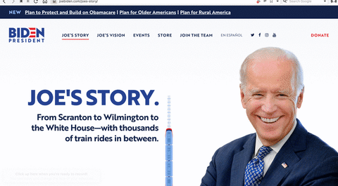
5. Joe Biden, joebiden.com

Oh, Joe. Going the standard approach just isn’t enough in 2019, and possibly won’t be enough in 2020. The key insights gleaned from the joebiden.com videos and comments were equal parts praising the usability of the site and fuming at the impersonal emphasis on donation.
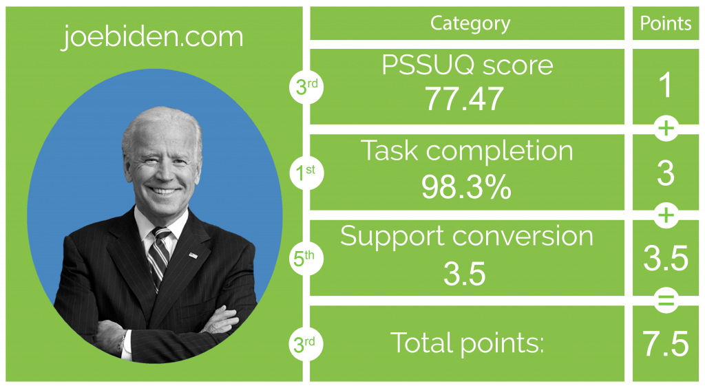
At a quick glance, Biden’s site seemed like a top three contender: his PSSUQ score was third, and his TCP was first. His site is exceptionally well-designed in terms of usability, but unfortunately, political candidate sites need more than functionality.
The “spam-like” donation banner that pins itself to the screen was heavily criticized, leading to Joe scoring a measly +3.5 support conversion, and that’s after he received a negative support vote. Out of 50 tests across all candidate sites, Joe’s site was the ONLY site that made a user LESS LIKELY to support the candidate; that specific tester cited the “whole donation scheme” as “put[ting] me off, quite frankly.”
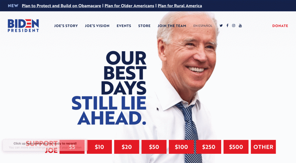
Aside from the donation shortcoming, most agreed that while the site was easy to use, it was also static and dated (his landing page doesn’t have any animation, for example). Many wished for more on Biden’s voting history, as well as videos of the candidate speaking and interacting with voters.
Worth noting for all you trendy designers out there, Biden’s site does feature a killer biography section with a delightful bit of design: a train traveling along a railway as you scroll up and down.
Joebiden.com opted for the suboptimal “back button” method when dealing with their Mobilize.us events page, which also hurt his standing a little.
Most insightful feedback from testers:
It’s, well, bland and doesn’t have charisma. It looks artificial. Perhaps more colors, in tones that are NOT red and blue. More colourful pictures and interactive videos would be nice. It looks a little static.
Mostly, I think the donation options are too bold and send the wrong message; especially the donation pop up right after subscription that says “elect Joe Biden”. It feels cheap and of bad taste to associate so crassly “election” and “money contribution”. The message is clearly “buy yourself a president” and I don’t feel this is the sort of message Biden actually wants to put out there.
Navigation back from sub-websites such as the donation website could be improved upon. I remember that I did not see any direct link on the donation page to enable me go back to the home page. I had to use the back button on my web browser.
Also, a lot of the value proposition page is quite long to the bottom (about 6 pages or scrolls down) which makes it easy for a visitor to miss out on key messaging points on the website as people often stop scrolling down after the 3rd of 4th page.
The owners need to move the very key information up by 3 pages at the least.
4. Bernie Sanders, berniesanders.com
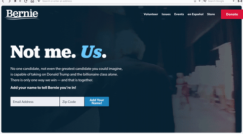
Sanders’ site is a strong contender in many statistical regards. It finished first in the PSSUQ score, the TCP was initially* competitively placed, and Sanders garnered a good amount of support from testers (+5 conversion, which was the third most overall).
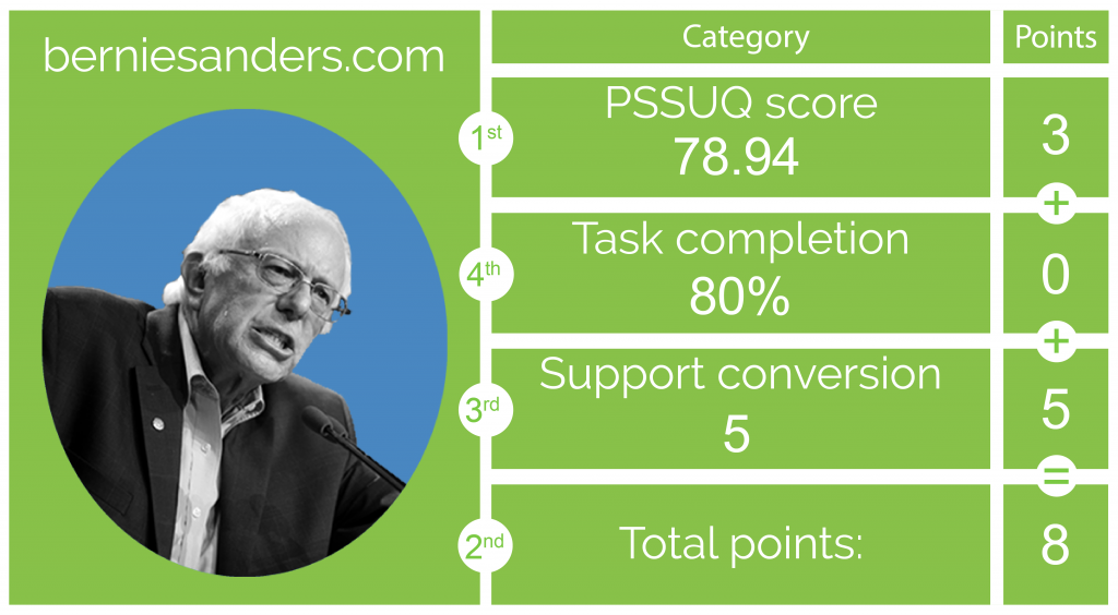
In fact, Sanders’ site would have tied for second place if we were following the numerical methodology alone. Unfortunately, the more subjective UXCrowd and general comments were not as friendly to him as they were to the top three candidates. And then there’s task #3…
*The glaring problem that only his site suffers from: no biography section. This crashed his TCP (Task Completion Percentage) since task #3 could literally never be completed. Many users across all 5 website tests stated that knowing who candidates are is important to them, and a remarkable 90% of testers suggested that berniesanders.com would be improved with a bio section.

Delightful addition? The favicon. It’s a bird, referencing an incident from his 2016 rally in Portland when a bird landed on his podium in the midst of his speech. But now it’s sporting Bernie’s haircut. Unfortunately, you only really notice it if your browser theme is the right color and/or you don’t have that tab active. Either way, we found it to be the most delightful feature of any candidate’s site.
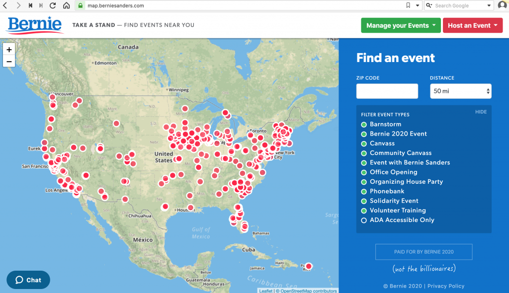
Sanders’ site notably did not use Mobilize.us, but unfortunately, his events map substitute suffered from the same “back button” reliance despite the logo in the top left. In fact, this task averaged 10 seconds slower on Sanders’ site than the task duration time of the Mobilize.us “go back”ers, clocking in at 144.7 seconds.
Most insightful feedback from testers:
I don’t believe there is much that needs to be improved; maybe the beginning home page, maybe more like a slide show of pictures than a video. It kind of is busy and it’s the only thing I wanted to focus on rather than the website itself.
I absolutely did not know where to look to find more background info about the candidate (a biography or something like that). Finding his taxes was easier than finding what is his political experience.
I found that the events lacked information (and I would want to know more about the jargon, i.e. Bernstorm). It looked like things I should have known already, made me feel like I didn’t know enough.
I would have liked a more succinct, maybe PDF, clear platform instead of having to go back and forth between issues.
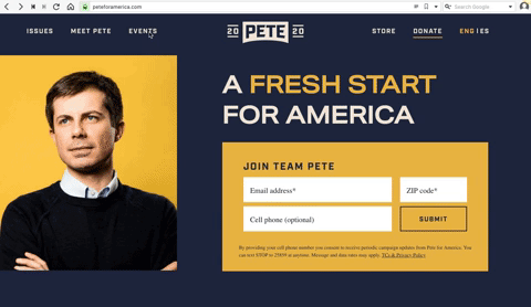
3. Pete Buttigieg, peteforamerica.com

Millennial, fresh, Buttigieg. Peteforamerica.com was regarded as the most contemporary of all the sites and also the least political, to the point that the impression test step had users wondering if this was going to be a collegiate site of some sort with its gold and navy blue theme.
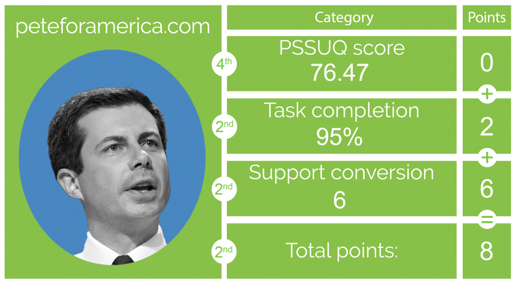
Turning to the numbers side of things, although he suffered in the PSSUQ score, finishing fourth, Pete’s site was competitive in the TCP and managed to convert the second most supporters (+6).
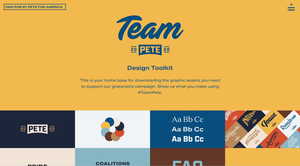
Peteforamerica.com was arguably the most visually unique of the 5, with many comments being quite positive on the slick presentation. Notable for any graphic designers out there, the site also features a downloadable design kit for anyone interested in creating Pete Buttigieg designs and sharing them under his promoted hashtag. A thoughtful addition unique to the site.
It is difficult to stress how close the top three candidates are in terms of usability, appeal, and support conversion. What holds peteforamerica.com back from toppling our top two Democratic candidate sites, however so slightly, was the consensus that the site, while fun, was more difficult to navigate than others and perhaps a bit on the wordy side.
Pete’s site also suffered greatly from the Mobilize.us imbroglio, opting for the unfortunate “go back” method of recovery, which was especially brutal for an otherwise admirable design.
Most insightful feedback from testers:
1) Each page displayed needs to have a clear method of returning to the home page or other navigation
2) When scrolling down the main page and hovering over the 3 main focus areas, the font shimmered and resized – it was very annoying and made me feel slightly ill
3) Recommend including a pronunciation guide to his last name
Visibility and linkbacks. There’s lots of content on the pages, so menu / newsletter / donate gets buried, and when you click on them it’s hard to get back to the actual website. Also, “Issues” didn’t scream platform and policy to me as a header.
2. Elizabeth Warren, elizabethwarren.com
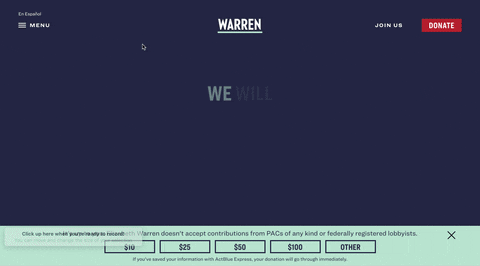
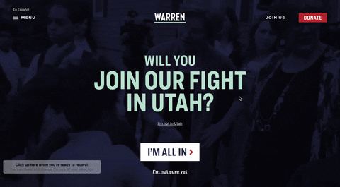
Despite what is probably the worst interactive element on any of the tested websites (more on that later), Warren’s site comes out strong because it makes Warren into a personable candidate that testers could really connect with. Notice, too, the website identifies your locations and prompts visitors to join the fight in whichever state they reside. For TryMyUI, we are prompted to “join the fight in Utah.”
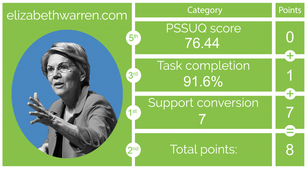
Bizarrely, even though Warren’s site scored the lowest on the PSSUQ, she received the most positive overall feedback by an absolute landslide. Her site’s TCP was fourth, but she managed to convert a whopping +7 supporters, the highest of all the candidates.
About that previously mentioned atrocious design element… In the gif above, you can see how when scrolling down the home page, you suddenly hit a carousel that only moves if you continue scrolling… and it moves horizontally at that. You can’t get past the carousel until you’ve scrolled through the whole thing.
Testers called it “too big” and “distracting,” and regularly paused to understand what was happening. Unique? Sure. But unique rarely equates to great when it comes to interaction design.
Common feedback for Warren was that the site featured clear, easy-to-read text and color schemes, while also mixing in a good selection of videos. Obviously, the mandatory carousel was a hurdle, and the transparency of the blue over the homepage’s video was a bit too heavy, muddling the video content for many testers. But Warren’s presence made the website a winner.
Elizabethwarren.com also chose the dreaded “go back” to navigate away from Mobilize.us.
Most insightful tester feedback:
The outline of where to find specific topics she would like to reform, for instance when I was asked to look for her stand on teachers and students, I had to scroll all the way down at the bottom to find something which I had to read the entire paragraph. So perhaps BOLDEN the topic.
The listing of events where people can see Warren should definitely be improved, and the homepage could use a bit of work to make it less busy so that when people scroll, the page goes down rather than across at the portion about her issues. As I said in my testing, this could be confusing for people when they are trying to use the site.
1. Kamala Harris, kamalaharris.org

Kamalaharris.org came out strong in all aspects, delivering a clear and impactful message with a respectable visual design. The impression tests were consistent: testers understood who the candidate is and what she wants to do, and many even noted how appealing the visuals are.
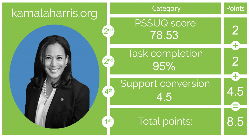
Second in both the PSSUQ and TCP rankings, and fourth in support conversion (+4.5), kamalaharris.org took the best bits of the other four sites and combined them into one. The design was almost as well-received as Pete’s site but maintained the classic, presidential professionalism of joebiden.com.
Her conversion rate may not suggest it, but tester comments reflected a similar level of personability to Warren’s site, and obviously, her PSSUQ score was very near to berniesanders.com (a mere .41 behind).
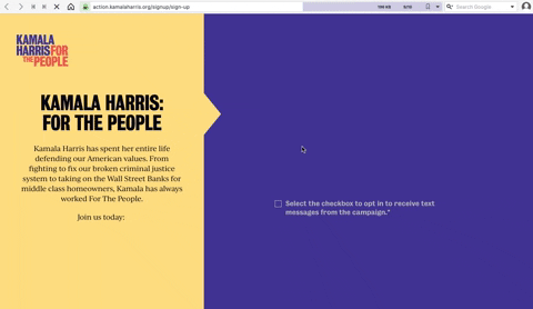
The most notable problem dogging Harris’ site was the newsletter. 30% of users reported having difficulty joining the newsletter, or wishing for confirmation that they had indeed signed up at all. Notable, too, was that Harris’ website lacks video content. Interestingly, this didn’t seem to affect tester opinion of her personability or credibility.
How did Harris’ site handle the Mobilize.us rigmarole? Her site was the only candidate site with the “new tab” approach, which as we established, is easier to navigate than hitting “go back.”
Most insightful tester feedback:
I thought that signing up for a simple newsletter was a little bit complicated. I wasn’t sure if I had actually joined a mailing list, when giving the option to pass on my personal information.
The reason why is because once I did so I received no confirmation, as in “Thanks for joining”, as an example, but instead brought to a donation page, and it appeared I could only join the mailing list if I made a donation.
Something that was strikingly missing was video. Maybe i missed it, but there was no video of Harris. It would be worthwhile having a few videos of Harris address the user and speaking directly to them.

The secret to a successful candidate website
The most important takeaway from this UX War is how close the scores are despite some very unique and original choices in design. How do we explain that?
Based on many of the user comments, and especially when reconciling Warren’s lower usability score with her huge conversion rate, it’s clear that the most important aspect of a candidate website is how well the candidate is presented to the visitor.
This type of site-subject transparency isn’t nearly as important on e-commerce or business sites, where coherent design for completing simple tasks is much more important than knowing lots of background information on the company or their business practices.
But this speculation isn’t to downplay the importance of design for political candidate sites. Indeed, it’s the designer who is playing the crucial role of storyteller and serving as the handshake between the candidate and the visitor.

This is perhaps most clear with peteforamerica.com and kamalaharris.org. Both sites have a unique and memorable style that served the purpose of visually reflecting the traits of the candidate they represent.
Pete is relatively young, calling for a “new generation of leadership,” and so his site is trendy and features some very contemporary design elements. Meanwhile, Harris is a wave-maker with a strong presence, and so her site should reflect boldness and character – which it was noted as doing.
On the other hand, elizabethwarren.com had smashing success with support conversion even though her PSSUQ was the lowest. Further, the praise for her bio was geared towards her performance in videos, which many testers considered to be “warm” and “sincere” more than the design itself, unlike Biden’s site which is designed very well but lacks the personal touch of Warren’s.
If we’re to learn anything about candidate websites from this study, it’s probably that people respond to transparency in the person more than anything, and they care much less about clever or delightful designs.
Also, Mobilize.us is an absolute terror for usability scores and needs to be stopped.
The best comment about the Mobilize.us fiasco came from a peteforamerica.com tester, who spent a few minutes browsing around before finally sighing and resigning from the task altogether, saying:
Well, I’d love to donate to your cause, Pete, but I can’t figure out how to get back to your donation page!