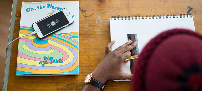
While Dr. Seuss may have primarily intended to provide life lessons through his picture books, his rhyme-infused wisdom perfectly applies to UX.
1. “You’ll miss the best things if you keep your eyes shut.”
from I Can Read With My Eyes Shut!
First and foremost, to create and maintain a good user experience you must be open to feedback. Do you understand how your users are interacting with your site? What are the flaws in your design?
Being open to outside input, new ideas, and new findings drives the best UX design. In addition to improving your product, collecting and analyzing feedback will lead to an increase in revenue for your organization.

2. “Oh the things you can find, if you don’t stay behind!”
from On Beyond Zebra!
Design is never done. User expectations are constantly evolving. The technology they are using is constantly evolving. Therefore, your design needs to be constantly evolving as well.
One example of evolving to meet the needs of users is Gallup’s Presidential Job Approval Center redesign. When external events caused a major shift in their user base, their UX team took initiative to test and improve their designs. Recognizing the different needs and mindsets of these new users, Gallup was able to make effective design changes and improve engagement.
3. “A person’s a person, no matter how small.”
from Horton Hears a Who!
Don’t just be user-centric, be human-centric. Make your designs accessible to every kind of user. Carefully consider the priorities and challenges of different user profiles. Plan for edge cases.
To create the best designs, UXers need to be mindful of human psychology and behaviors. What is innate to most? What is a challenge to some? How can you make sure that those who may struggle in certain areas can use your product with ease, while also appealing to your primary audience?
Keeping people in mind when you design your product will lead to a user experience that is both successful and delightful.

4. “The more that you read, the more things you will know. The more that you learn, the more places you’ll go.”
from I Can Read with My Eyes Shut!
Just as design is never done, learning is never ending. There’s tons of great UX-focused publications and authors that are always pushing the conversation further and increasing our collective understanding.
The more you read about industry trends and research, the more knowledge you’ll have to apply to your design work. Staying curious will propel you in new, innovative directions and keep your work fresh.
Read more: 10 UX authors you should be following on Medium
5. “Think and wonder, wonder and think.”
from Oh, the Places You’ll Go!
Stay creative. Look for inspiration. Maintaining a sense of wonder in an ever changing industry like UX is imperative to success. Sources of inspiration need not be confined to other web and app designs. Architecture, biology, photography, creative writing, and more can all serve as a muse for your next UX breakthrough.
From taking a walk, spending time playing your favorite instrument, or drawing — finding time to wonder and think will get your creative juices flowing and spill over into your work.
6. “If you never did you should. These things are fun, and fun is good.”
from One Fish Two Fish Red Fish Blue Fish
Innovate to create experiences that are novel and create delight. Try doing something different. Use an animation you haven’t tried before. Take advantage of new tech like A.I. to predict users’ needs. Little details can make your designs enjoyable instead of just usable, and add delight to the users’ experience.
Ensure that users feel prepared, confident, and competent when using your product. Usability is great, but it’s truly the little things in design that can make people love an experience.

7. “Sometimes the questions are complicated and the answers are simple.”
Oftentimes, the problems we are solving with design are complex, multi-step, and difficult to explain to people. Rather than get overwhelmed, as a UX Designer you have to identify what’s essential for users to do and to know, and tune out the rest.
It’s easy to try and cram too much in, but the answer to design problems frequently is to cut out as much as possible, even if that means taking on the burden of the complexity yourself.
Read more: Redesigning an interface based on user goals
8. “I’m sorry to say so. But, sadly it’s true. That bang-ups and hang-ups Can happen to you.”
from Oh, the Places You’ll go!
No one’s work is perfect. Anyone in UX design is going to have blind spots, and furthermore, it will always be hard to see those areas yourself. To you, your designs make perfect sense, because you know what everything is and how everything works. But do a bit of usability testing, and you will always find ways to improve your designs.
Remember that getting critical opinions in your UX research is a good thing, and avoid becoming defensive. It’s natural and expected for your work to have some room for improvement. Through negative feedback, you can make a better product and become a better designer.
9. “I meant what I said, and I said what I meant”
from Horton Hatches the Egg
It might be tempting to watch through your user testing videos and dismiss certain parts of the testers’ responses. “Users wouldn’t really do that.” “Most people would see that button.” You’re the designer, you know better than them – right? Wrong. You are not your user, and the things users “get wrong” or don’t understand can be surprising.
Even when findings are unexpected or catch you off guard, it’s important to take seriously what users say during tests, and explore why they reacted that way.

10. “Think left and think right and think low and think high. Oh, the thinks you can think up if only you try!”
from Oh, the Thinks You Can Think!
Collecting user feedback is only the first step towards improving your designs. Listen to what users say, and analyze what it really means. Sometimes, they might request a certain feature, or suggest a particular fix. But don’t take their solution for granted!
Consider what the actual problem is that needs solving, and why they believe that feature or fix will solve it. Then, put on your designer hat and think about what’s the real best solution – which may or may not be the same as what they suggested.
The user may know better than you what the problems are with your product, but you know better than them what the options are to fix it.
11. “You have brains in your head. You have feet in your shoes. You can steer yourself any direction you choose.”
from Oh, the Places You’ll go!
Now, with all of these Seuss-inspired lessons, how you use them will depend on your situation. Maybe for your company, a UX success would just mean focusing on being human-centric and adopting best practices from other companies in your industry.
Maybe it would mean trying new things and pushing the UX envelope in your space. In any case, remember to open your eyes, wonder and think, find delight, provide simple solutions to complex questions, bounce back from bang-ups, and, most importantly, embrace and build on users’ feedback.
Oh, the places you’ll go when you design with users in mind. So innovate and push boundaries – it’s all up to you!


