


A first impression can make or break any pursuit. The first moments in an interview can impact whether you land the job. This article’s headline either intrigued you to continue reading, or pushed somebody else to move to the next story. And the first few seconds on your website will decide whether users stick around, or leave.
It all boils down to the first 15 seconds.
The average amount of time people spend on any webpage is 15 seconds. By then, they will formulate their first impressions based on a handful of critical components – colors, layout, images, load time, information architecture and other factors. This initial perception influences the rest of the user’s experience on the site.
In this article, the TryMyUI team will share our guide to analyzing and understanding users’ first impressions of a website. We will identify (1) how the impression test works, and (2) insights we have gathered from dozens of recent Trymata user tests.
What is an impression test?
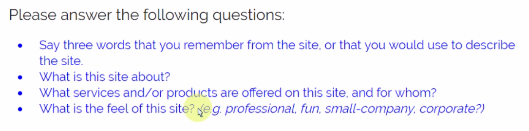
TryMyUI’s impression test is a twist on the “five second test” – our way of gauging web visitors’ first impressions of a website. First, users spend 15 seconds on your home page or landing page, taking in your virtual best foot forward. After the 15 seconds are up, your page is hidden and replaced by a set of questions:
- Say 3 words that you remember from the site, or that you would use to describe the site.
- What is this site about?
- What services and/or products are offered on this site, and for whom?
- What is the feel of this site? (e.g. professional, fun, small-company, corporate)
Testers respond to these questions, talking about what they saw and what they think of the site after this initial exposure. It’s a great way to see if your landing page is communicating the right things to visitors when they first arrive.
After combing through our archives and watching a mountain of impression tests, we gathered 5 key takeaways that the impression test offers. These lessons highlight how design impacts users’ perceptions of your brand, and how you can design a page that gives the best possible first impression.
Read more: Deciphering users’ first impressions
1. What users see
In the first phase of the TryMyUI impression test, users look around the site landing page for 15 seconds. As they do, we learn what catches their eye.
Unsurprisingly, we noticed prominent textual and graphic elements in the middle of the page attracted users’ attention. We also saw that many users quickly checked along the top of the page for information, even when those elements were not visually prominent.
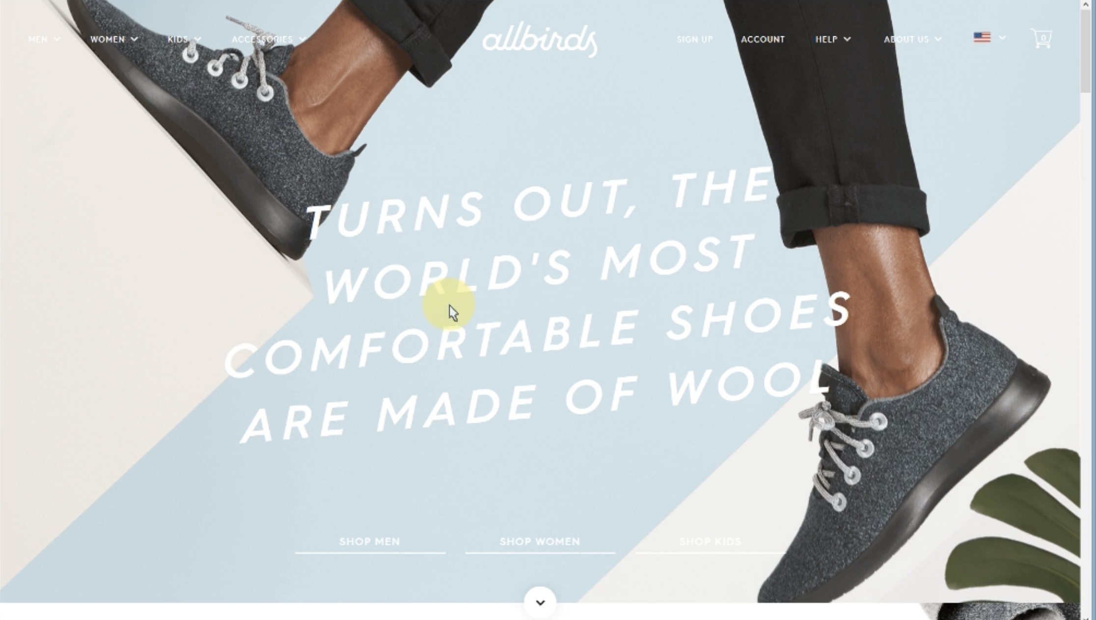
During an impression test of shoe seller AllBirds’ website, users were drawn to the center area of the home page, where a catchy tagline appears over a tightly focused image of two leaping, shoe-clad feet. “Turns out, the world’s most comfortable shoes are made of wool,” the tagline declares. Every user first gravitated to this central display, many of them reading it out loud.
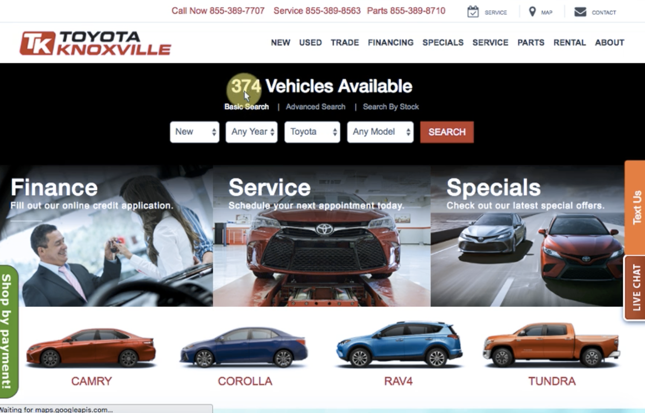
But another trend we saw was less obvious. Many users, soon after landing on the page, move directly to the top of the screen to scan for information and options. On the Toyota Knoxville website, for example, the central element on the home page is a search bar with an interactive counter showing the total vehicles available. After focusing on this, several testers immediately jumped to the top of the page and read options like “Call now, Service, Parts” and the navigational menu items.
On a number of sites, we observed users apparently searching for an information scent – not just scouting out what the site offered, but also what steps they might be able to take on the site.
The Domino’s website actively encouraged this type of scanning, using a popup to point to their “Sign in & earn rewards” link at the top of the page. The eye-catching nature of the popup, plus the animation of it showing up on the screen, influenced users to pay attention to the specific action Domino’s wanted to emphasize to users.

The immediate effectiveness of the popup in creating an information scent for the user could be seen in the following tester quote from this impression test: “I guess I go here. Pizza Profile. Order Online.”
A successful design that catches users’ eyes and creates a strong information scent can inspire people to stay on the site. The Greats home page combines compelling and simple central elements with easy-to-follow navigation items just below the fold; we very quickly saw this pay off during the impression test, with one user stating he was “definitely interested in looking deeper.”
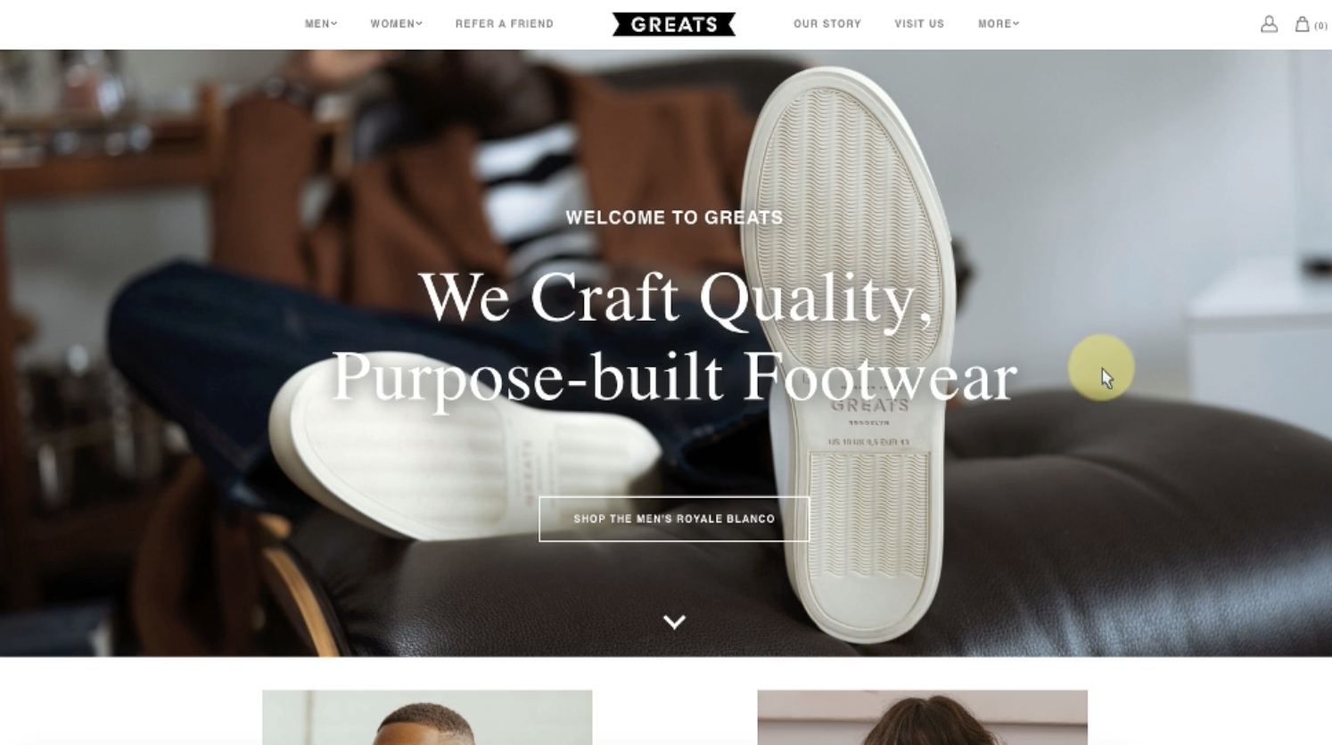
Greats’ smart home page design hooked users into staying on the site past the first 15 seconds — and potentially continue on to buy the shoes.
From the first phase of the impression test, it is clear that an appealing design combined with a strong information scent can not only intrigue users to stay on the site, but cue them to begin down the path to an eventual purchase.
2. What users remember
In the next phase of the Impression Test, we give users four prompts. The first is, “Say 3 words that you remember from the site, or that you would use to describe the site.” Users’ answers to this question reveal what elements and attributes were most memorable after just 15 seconds.
We found that the most remembered words typically represented the types of products offered, the types of actions available, and/or characteristics of the brand.
One big contrast we noticed across many impression tests was between sites that relied more on text to communicate their purpose, and sites focused more on imagery to influence users’ impressions. These two strategies subtly affect how users build an understanding of the site.
AllBirds’ tagline, for example, quickly summarizes exactly what the site does in strong, clear language. When testers listed the 3 words they remembered from the site, many recited “wool,” “shoes,” and “comfortable” – showing how effective that tagline is. This strategy makes sense for AllBirds because they have just one type of product.
Conversely, Minted, an online marketplace for diverse products by independent artists, leans on images instead of text to communicate the variety of their offerings.
Minted’s homepage has very few prominently featured words or phrases. While one “mission statement”-type quote is included at the top center of the page, it is long and wordy and the font isn’t easy to read. Testers ignored the quote entirely. The company’s use of imagery, however, successfully implies what the site has to offer.
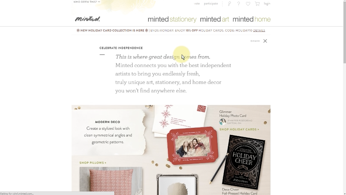
Testers consistently labeled the site “artsy” or “artistic” (or “whimsical,” in the case of one tester) because of the site’s visuals and appearance. The collage-style of images on the site, the soft color scheme, and the unique font choices all painted that picture for users.
Users also recounted some of the different types of products showcased – from “pillows” to “frames” and “greeting cards.” Just by relying on visual design, Minted was able to successfully communicate its art-centered brand and an idea of the variety of their products.
The answers to this question show how clear, explicit text and subtle visual cues can both quickly inform users of a site’s purpose and identity. They also show that successful design can look very different depending on the company — it all depends on the story being told.
3. What users expect
The next question – “What is the site about?” – helps us understand what users expect based on their initial exposure to a site.
While the first question showed how a user understands the company, the second helps us understand how they expect to interact with the company from the first impression of the website.
For Domino’s, most users already know exactly what the business does and that what their product is. The company builds on this familiarity by using the space on their home page to embrace users’ expectations of what a pizza company’s website can do, but also to challenge and further shape those expectations.
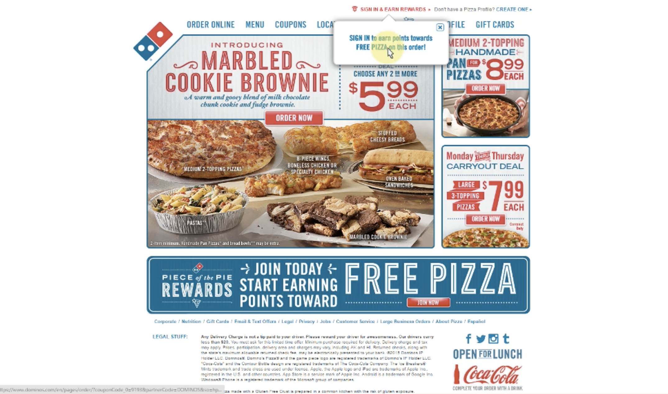
Pretty much everyone expects to find coupons and deals when ordering pizza delivery. Domino’s embraced this expectation by covering the home page with deals, coupons, and promos. This is good for the users because it fulfills their expectation of saving some money on their order, and it’s good for the business because it encourages users to get started on their order.
The other major thing Domino’s uses its home page space for is to advertise some of its lesser-known products. Right in the middle of the page, in the foreground of the biggest picture, are brownies, pasta, sandwiches, and chicken. Since users already know that Domino’s sells pizza, the company is able to use this valuable space to feature other items they want to sell more of.
When answering the impression test questions, several users mentioned being able to buy not just pizza but desserts and sides as well. Clearly, this gamble paid off: Domino’s was able to shape users’ expectations of their site and brand with their design.
From the second question we learned that successful designs build on user expectations, by looking and behaving in ways that visitors have come to expect from similar sites and brands. By recognizing users’ expectations, companies also have the opportunity to further shape and grow brand perceptions.
4. What users understand
The next question – “What products or services are offered and for whom?” – helps us understand the conclusions testers draw from a site.
The conclusions users draw about products and services offered help us to understand whether they find the company to be a good fit for them.
In an impression test of t-shirt and accessories seller Serengetee, we saw how users were able to come to these conclusions based on the site’s imagery. While the home page image doesn’t explicitly show a variety of products and accessories, users drew the conclusion that the company sells more than just clothing from the general feel of it.
“I would say it is a clothing site, selling various items,” said one user. “Maybe not constrained to clothing…there was a girl with her back turned wearing a hat and trendy clothing, so I would say it is a store that sells not just clothing but all types of apparel…maybe hats, necklaces, shoes…maybe even skateboards.”
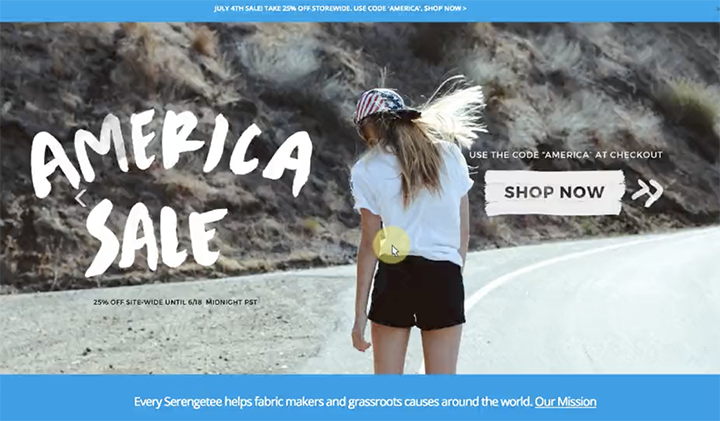
The same user went on to clarify that he imagined the site’s products might include “anything that can be associated with this new kind of adventurous lifestyle that’s trending right now with people of this age group.” By designing a home page that identifies its brand with not only products but a lifestyle, Serengetee signals to its target users that this is a website for them.
One important method users rely on to determine this is by comparing what they see on the site to other websites they’re familiar with.
During the Greats impression test, one user started forming an understanding of the company by comparing it to other brands he knew, like Vans and K-Swiss. “They’re K-Swiss-like,” this user said. “When K-Swiss was out, they were simple color, simple design, with the flat strip of the rubber sole and the suede tops.”
By comparing it with familiar brands, the user is not only identifying a product category, but also identifying an audience – that is, people who wear Vans and K-Swiss would also wear these shoes. Later on, he adds that the target audience is near his age range: “I want to say it caters more to millennials.”
These examples show us not only whether the company’s home page design helps testers understand the products available, but also how the design frames testers’ opinions of the company.
By drawing a conclusion about the products offered and who they are offered for, users start to decide whether or not this is a site that will help meet their needs or provide what they are looking for. Good landing page design uses familiar imagery and other elements to communicate both of these answers.
5. How users feel (about the brand)
The final question – “What is the feeling of the site?” – helps us understand whether the first impression was a branding success.
During this step, testers identify core brand traits, values, and characteristics. The “feel” of the site is typically heavily related to the original 3 words users associated with the company on first sight.
In the AllBirds impression test, users called the site fun, recalling the image of the person jumping in the background to reinforce the feeling they described of youthful energy.

Not everyone has a positive first impression. Another user from the AllBirds test called the site “amateurish” and didn’t like some of their design decisions, such as the color choices and the hand-drawn illustrations used further down the page.
While the low-contrast color choices does objectively harm the readability of the text, factors like the hand-drawn illustration style are of course more subjective. Sometimes, even when the demographics match, not everybody will identify with your brand. But design that is aware of the target audience and their preferences will still appeal to the right crowd.
In the Minted test, users took away the impression that the company’s brand was artistic and centered on providing unique, personalized products – a place to get things that stand out from the crowd, perhaps. In the words of one tester, Minted gives users “the ability to do something different” or “out of the box.”
This perception transcends products and services to give users an impression of what a brand is really about at a higher level. If users come away from the first 15 seconds on your site with that kind of understanding, your design is a success.
This final question enables a better understanding of what makes for a successful first impression. Designs that are clear and communicative, show character, and demonstrate the personality and priorities of the company accurately convey message, purpose, and brand to users.
Conclusion
While 15 seconds may not seem like a lot of time, these websites showed within that time that users can not only judge what the company is about, but make a decision on whether the company is for them, and begin planning their next action.
Users come to these conclusions very quickly, and generally subconsciously. The visual factors, the prominent words, and similarities to other brands all allow users to gather rapid conclusions about the purpose of the site and whether it will meet their needs.
The questions of the impression test force the user to dig into the specifics of their memories and impressions. Through this process, the UX researcher is able to peel away, layer by layer, the observations and thinking that went into those subconscious conclusions, and see how their home page designs shape users’ first impressions. By uncovering these thought processes, we can learn the best way to make the best first impression on users.

You may be interested in:
The need for prototyping tools and testing: Best tools for you