


A UX designer is said to wear many hats, but what about the product or experience they’re designing? Surely not every industry that utilizes UX (which should be all of them) will be treated and designed the same way…
Right?
So let’s take a look at some of the most common user experiences you’ll find in the digital space, what they look like, and some suggestions for how to run usability tests on them.
E-commerce UX
For businesses in the 21st century, the trick is no longer getting people through the door, it’s keeping them on the page. For e-commerce UX, the trick is not only flipping visitors into customers, but retaining those customers as well.
Good e-commerce UX is typified by a simplistic and minimally intrusive design that highlights without overshadowing. This type of UX is graded not by how inspiring, trendy, or awe-striking the design is, but how usable the systems are. Coherent user flow trumps clever design every time in e-commerce UX.
When testing the usability of your e-commerce site or app, you’ll want your focus to be in two areas:
- Can users quickly find what they want?
- Can users successfully make a purchase?

We’ve shared insights on writing a usability test for e-commerce UX before, and that wisdom still stands. The most important consideration is intuitive navigation. The user needs to understand how to buy at every step of the flow. Big picture branding notions like “why to buy” is up to marketing.
Checkout these user experience software examples to add to your e-commerce arsenal!
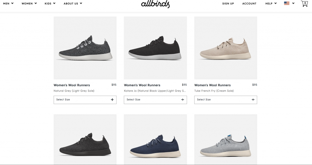
E-commerce showdown: Allbirds vs Greats: UX Wars
It sounds simple, and it is, but it’s far from easy. With something as important as e-commerce UX, we recommend iterative testing of small design tweaks to find out what works best, using the SUS psychometric. You’d be amazed at how the smallest changes can make the biggest difference.

Customer Experience (CX)
Some of these terms have a much broader scope than others and can actually incorporate one another. This is the case with so-called Customer Experience design. CX is a newer term conceived to reorient the philosophy of design by making it inclusive to the more traditional corporate team.
Whereas UX is narrowed to the experience of users, CX includes sales, branding, marketing, customer support, and all the other intangible aspects of a business that a customer might encounter. Don’t get too confused: UX is a skillset, CX is a philosophy.
For UX designers, especially those designing e-commerce UX, usability testing for CX turns more internal than external. You could be testing any of these other types of user experience, but only in your own, technical way. Customer Experience has concerns that are far-reaching, but must also appreciate UX as being integral.

You’ve heard “silo culture,” a segregated company environment; silos are the bane of CX. A company or businesses with successful CX has a cohesive image and experience across all customer-facing aspects. In order to do this, cross-team communication is necessary. Everyone needs to be on the same page.
Even if you aren’t personally in a position to enact that sort of change, dipping into the marketing team sphere or chatting with customer service representatives in the kitchen can be insightful for doing what you can to foster CX growth in your company.
Try running a website impression test in your next usability study. Get the feedback from users, and use that to inform the CX of your company.

Mission-driven UX
In contrast to e-commence UX, Mission-driven UX (or Mi-dUX) must be extremely self-aware of the mission that it has been designed for. The term “Mission-driven” probably has positive connotations attached to it, like with charities or NPOs. But the term can also be applied to, say, a political design.
Back in July, we ran usability studies on political candidate websites and learned the most important aspect of design across all 5 sites: the most usable aspect should be the donations flow. The candidate websites existed to solicit donations, some more overtly than others.
One of our recently named “Favorite UX of 2019” websites was a Norwegian charity focused on recruiting donators to protect the Amazon. Save the Rainforest excelled in creating a straight-forward donations flow, but also went to the next level in the website’s ability to make the user a part of the mission itself.
By dropping the users into their panoramic jungle filled with information and actual images and clips, Save the Rainforest immediately engaged the user with its mission. It also maps-out slices of property that users could be “guardians” over (including having their name on a the virtual map), if they chose to donate.

Think of testing the usability of Mi-DUX websites and apps as a combination between donation solicitation and branding. If people believe in your mission (branding), they will donate. When they donate, they will need to do so in as few steps as possible.
Try our latest SUPR-Q with NPS features to get to the bottom of how appealing, usable, and credible your Mi-DUX is. Credibility is especially crucial for Mi-DUX.

Financial UX
Financial UX (or FinUX) is a topic we’ve tore into before. Websites and apps that focus on banking, investment, retirement, paystubs, etc. or any that are part of the financial tech industry all fall into the FinUX category.
Financial user experience is a combination of Mi-DUX and e-commerce UX in that it must pitch itself as being a solution to real world problems, but it also wants continued business. Often, as we hammered in our financial blog post, FinUX is riddled with Dark UX practices. From obfuscating important information to misleading reports, dark UX in financial UX is a potentially life-ruining prospect.

Look at something like my.guideline.com, which is a retirement savings service. It’s minimal, lots of space, and says in very clear language what something is and why it is that way. Less is more with my.guideline, and the vast majority of FinUX doesn’t have to be paragraphs of complexity.
If you’re looking to test your own financial UX, some concerns shared with e-commerce and Mi-DUX apply:
- Do users understand what this product is?
- Do users understand what is required to sign-up for my services?
- Is my design trustworthy?
Like with Mi-DUX, our SUPR-Q + NPS will most likely be the right choice for your financial UX! Most financial institutes have a lot of dosh to throw into projects, and so their website or app should be established enough to be usable, if not particularly ethical.

Learn more: user testing for a better product and user testing a new product
Dark UX
Speaking of ethical, we end with dark UX. This experience is marked by exploitive, manipulative, and/or dishonest methods of interacting with the user. Often, it’s to gather data (such as an email), trick the user into taking actions such as subscribing to newsletter, or at worst, opening vulnerabilities in the users’ system.
Dark UX is often referred to as unethical design, and we’ve written before about dark UX as it relates to notions of ethics in the UX industry. Spoiler: all UX is inherently unethical. However, there are degrees that elevate (or perhaps lower?) typical UX to dark UX.
The scary part about dark UX is that it can occur anytime, anywhere, even from otherwise trusted sources. As we argued in our previous ethics post, there is virtually no system of rules or ethics in-place to hold dark UX accountable.
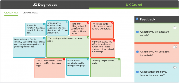
Finding dark UX in your own design is often a natural by-product of usability testing. By utilizing both the qualitative video/audio feedback, and especially with the UX Crowd, you will certainly uncover gripes and grievances with your GUI and else.
For example, in our joebiden.com test, as a part of the previously mentioned presidential candidate study, testers verbally responded to the “sleazy” nature of the donation emphasis. It was even voted it as being a major concern in the UX Crowd feature.
Obviously, UX designers have a lot to think about when designing, researching, or testing usability. They have to remain versatile and understand the nuances of the industry and how to communicate them effectively . After all, UX is a bird of many feathers.