User experience design & website usability research is a booming industry that is making a noticeable difference in the e-commerce sphere. There are up to 3 million e-commerce businesses worldwide, and the most successful ones invest in UX. Most of them also apply SEO tactics to gain a competitive advantage.
“SEO!? That’s a marketing thing. I thought this was a UX blog?”
Well, your website needs to be ranked high on the SERPs (Search Engine Results Pages) to ever be experienced, right? Think of it like website impression testing: customers form opinions quickly and likely never scroll past the first page of Google. Where does your website currently rank?
SEO, marketing, and UX design
In the past, SEO has been a uniquely marketing concern while UX design has often been a siloed team of misunderstood creatives and researchers.
But did you know that, apart from boosting your exposure and generating greater traffic, SEO can also compliment your UX efforts?
A major mistake marketers & UX designers make is considering UX & SEO as mutually exclusive practices. They actually go hand-in-hand, ensuring that both search engines and customers are happy.
UX and SEO are each highly user-centric and focus on providing seamless buyer journeys.
So, here are a few simple tips on how to combine SEO and e-commerce UX to benefit your online business.

Creating a user-friendly website structure
When building your website structure, making it clear and intuitive is obvious. E-commerce sites often include lots of pages and products, and logical organization, such as by their similarity and theme, will not only help users understand your website content but it will also help Google crawl index it.
Simpler website architecture provides better user experience and better SEO, especially for e-commerce UX. Excellent user experience begins with your online store’s intuitive navigation. It has several important components.
1. Homepage
Your homepage is where most of your visitors will land. It points them in a certain direction and helps them find the desired products. This is the perfect place to emphasize your hottest deals, sales, new products, fresh content, or special feature.
By seeing these features, customers will immediately understand whether your site is right for them and where to click to find the intended products.
Read more: Impression testing and the “five-second” rule
2. Less is more with menu categories and subcategories
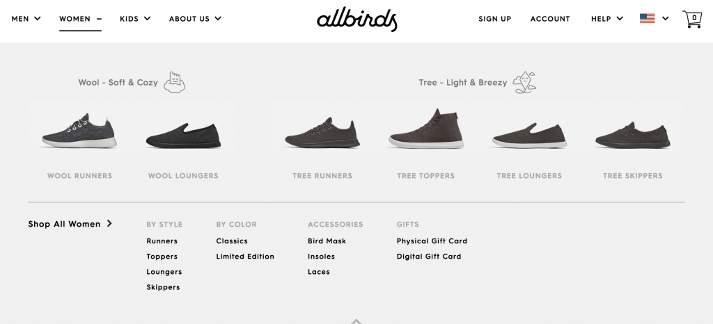
After landing on your site, many visitors will go to your main menu to find the right product categories. The idea is to keep your main menu simple. Don’t clutter it with too many categories. Their number should be somewhere between 3 and 10, depending on your online store’s size.

As for the names of your categories, make them clear and always include relevant keywords. This will make it easier for your customers to find the desired items, while search engines will be able to crawl and index your site faster.
Once they find the main menu, customers will click on the preferred category to dig deeper into your product offering. This is where they will come across your secondary dropdown menu. Just like with organizing your main menu categories, your subcategories should be classified in a logical order and optimized for the right keywords.
3. Search capabilities
Some e-commerce UX doesn’t even offer things as basic as a search box. If you’re selling 5-10 products, that’s all fine & trendy. But, if you offer an entire catalog of products with numerous product pages, adding search functionalities will significantly improve user experiences.
Users who already know what they want to buy will become frustrated if they can’t quickly locate their desired product. By adding a search box and providing auto-complete options, you will increase users’ average time on your site and maximize conversion rates.
 4. Product filtering
If you’re running a large online store, you provide product filtering options. In other words, you should let your customers choose products based on their colors, prices, sizes, etc. This allows your customers to find the right products faster.
Even though they improve user experiences, filtering options may compromise your SEO efforts. One of the major problems you may face is duplicate content. However, you can prevent these problems by using noindex tags to tell Google what pages not to index.
5. Breadcrumbs
Customers should always know where they are on your website. This is where breadcrumb navigation can help. Just like in Hansel and Gretel, breadcrumbs on your website create a visitor’s journey and tracks their location on your site.
It also increases your interlinking efforts, improves on-page keywords, and reduces the number of clicks users need to find certain pages.
Always include the full browsing path and make sure the titles match your menu titles. Breadcrumb menus are important to Google’s crawlers, too, as they help them properly understand your site’s hierarchy.

The interplay of UX copy and SEO marketing
Writing UX copy is one of the least talked-about aspects of UX design & research. Although UXers should be well-equipped to write a usability test, e-commerce UX teams also need to be familiar with their company’s products.
Although it is unreasonable to expect UX designers to write actual product descriptions, knowing what the content is going to be, preferably verbatim, will be key in unifying UX with SEO in many key ways.
Read more: How to write tasks for e-commerce usability testing
6. URL structure
Your URL structure should be in line with your navigation structure. If your URL structure is illogical or complex, it is harder for your customers to sift through your products and find the content they’re interested in.
To build SEO- and user-friendly URLs, you should insert hyphens, use fewer than 70 characters, optimize for relevant keywords, and ensure that your URLs are understandable.
7. Have an internal linking strategy
Internal linking is one of the most valuable SEO tactics you can practice. Google uses internal links to quickly find new content. Let’s say that you create a new product page and don’t link to it from another page on your site. If the new page has no backlinks, Google’s crawlers won’t be able to find it.
Internal links benefit your PageRank. With the rising number of page internal links, your PageRank will also grow. If numerous internal links are pointing to the same page, this means that the relevance of this page is high and easily searchable.
Interlinking is also immensely important for e-commerce UX. It helps find relevant content fast, engages customers, and encourages them to stay longer on your website.
There are numerous ways to build an internal linking strategy:
- Competitor research isn’t just for usability; analyze your competitors’ interlinking strategies to orient your own
- Optimize your anchor text for relevant keywords, such as “leather goods” vs more specific terminology like “leather bags“
- Create high-quality blog content, such as DIY guides, instructional videos, comparison reviews, lists, how-to articles, case studies, and link back to related product and category pages
- Link product pages to your valuable content, category pages, and other relevant category pages. For example, if you’re selling glass paint markers, you could link to your blog post about painting wine glasses, and to your product page of blank wine glasses.
8. Write descriptive title tags
Even though they don’t seem like an important UX element, title tags may impact e-commerce user experience on many levels. Because it’s the first thing users see in the SERPs, they decide whether the page is relevant to them or not.
By writing original and optimized title tags, you will grab your potential customers’ attention and, therefore, improve your website traffic.

To optimize title tags for e-commerce UX, always use relevant keyword phrases. Insert them naturally and organically in your copy. They should be placed close to the beginning of the title tag because search engines determine the priority of words based on their placement and tend to shorten lengthy title tags.
Above all, you should make your title tags informative. For example, instead of labeling all your men’s shoes with the title “Men’s Shoes,” write more comprehensive title tags that will contain a brand name, sizes, or material, such as “Leather Shoes for Men | Tommy Hilfiger.”
Finally, keep your title tags sweet and short, under 60 characters.

UX and SEO have two seats at the same table
At the end of the day, UXers and marketers are on the same team. They are both integral pieces of the customer experience ecosystem. If anything, UX and marketing have more in common and more to gain from collaboration than the various other parts of the CX circle.
Next time you’re working on your e-commerce UX, Slack a marketer. Get in the know, and get them up to speed, too!
Read more: E-commerce UX best practices: 12 guidelines from 2 original studies
Keith Coppersmith is a business and marketing expert who has experienced both the rise and fall of many businesses. As a regular contributor at BizzmarkBlog, he enjoys writing and providing insight into the marketing industry based on both practice and theory.


 4. Product filtering