Task 1: Impression test
We started off the tests by having users take a quick peek at the homepage and then answering some questions about their first impressions and what they remembered from the page.
Users described DraftKings as fun and exciting, and tended to recall words like “daily,” “play now,” “fantasy,” and “cash.” FanDuel focuses on similar buzzwords – testers for the site recalled words including “leagues,” “play,” “money,” and “fantasy football.”
Users called FanDuel‘s design modern and clean, and said it felt “trustworthy.” However, Eugene from Seattle suggested that it didn’t look like a homepage, but rather seemed more like an info page, and wondered whether he had actually started on a page somewhere deeper in the site’s hierarchy.
Neither site really dominates this first task; DraftKings chooses to put the emphasis on tone and atmosphere, pushing “How it works” information below the fold, while FanDuel opts for a more bland, utilitarian design that puts explanation front-and-center. While that might make for a slightly quicker digestion of the site’s premise, it also doesn’t draw users in and fire them up the way DraftKings’ grandiose stadium imagery does.
The two competitors are tied after the first task.
Task 2: Sign up for an account
As users sign up, DraftKings makes one of the cardinal errors of account creation: hidden password requirements. Users fill out all the fields and click “Sign up,” only to get a big red box proclaiming that their password will need both letters and numbers – a fact that was not previously mentioned. Remember, if you’re going to put requirements on your users’ passwords, tell them what those requirements are in advance.

FanDuel‘s signup process is quite straightforward, and presented no problems to users. It’s at this point, too, that the visual differences between the two sites are really cemented. FanDuel is minimalist, flat, and modern-looking, whereas DraftKings has a more unpolished, old-web style to it.
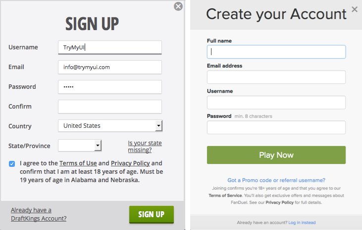
FanDuel‘s signup feels simpler, and less cluttered. In their haste to minimize the number of fields, though, FanDuel has done away with password confirmation, and not replaced it with something else (“I hope I got that right,” said Jeanine from Phoenix after methodically typing hers in character-by-character).
FanDuel may have pared their signup down a little too much, but DraftKings’ lack of password guidelines still loses it this round. FanDuel pulls ahead.
Task 3: Choose a fantasy contest to enter into
Once your logged in, both sites center around a “lobby” where users can browse and enter upcoming contests.
Here again, FanDuel’s modern design isn’t exactly doing it any usability favors. Unlike DraftKings, whose smart use of contrast, color, and relative size creates a clear flow and prioritization on their page, FanDuel‘s lobby feels overly dispersed and lacking in focus. The page makes no strong statement about what’s important or where to look, and the understated appearance of the contests table leaves users poking around for longer.
A good example of how FanDuel’s light touch detracts from their UX is the sport icons to the left of the contest listings:
DraftKings‘ icons are bold, unique, and easily distinguishable. Even in the zoomed-out screenshot of the lobbies above, you can tell the difference between the football and the baseball. FanDuel‘s icons all consist of the exact same blue flag with delicate footballs or baseballs inside, effectively minimizing the impact of the information to be transmitted (read about signal-to-noise ratio in design). It can be said in FanDuel’s defense that contests from multiple sports are never shown together, but then why have the icons in the first place?
For presenting a clearly organized and weighted flow that leads users towards the next step of their fantasy journey, DraftKings wins this round and gains the lead over FanDuel.
Task 4: Create your lineup
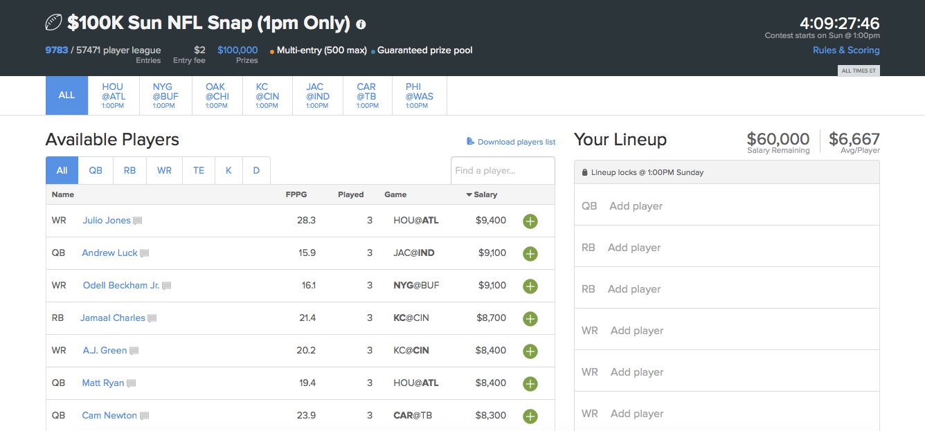
So far, DraftKings’ slightly dated but bolder, energetic design has proved more effective than the sedate modern minimalism of FanDuel. When it comes time for users to put together their lineup, though, FanDuel hits on a design that finally works.
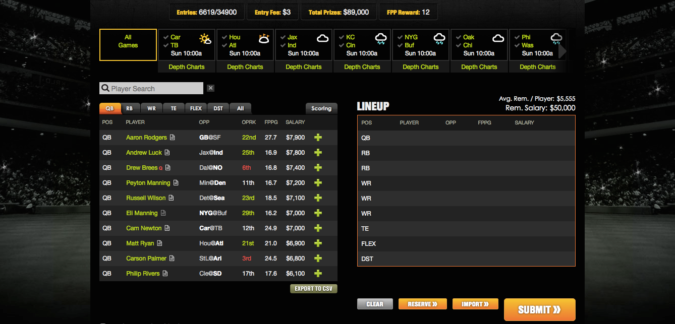
In terms of mechanics, the two sites handle this task in an identical fashion. There is virtually no difference between how each one works in a functional sense. But FanDuel makes nice use of the page’s space with large text, big tables, and emphasis reserved for a single action: the green plus buttons.
DraftKings, on the other hand, messily crams too much into too small a space. As it does across the site, their page design scheme creates atmosphere and energy, but at this step that ultimately causes a drop in usability. While it works, a few users did have trouble reading some of the smallish text, especially column titles like “QPRK” and “FPPG.”
The use of green for several different elements on the players list also distracts from the plus button, the page’s primary action, and some users thought clicking a player’s name would add that player to their lineup, which it does not (it opens a player profile popup).
There is also no explanation of the icons to the right of the players’ names, unlike on FanDuel where a legend clears all of that up:
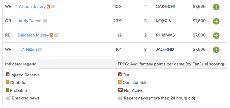
The only mishap for FanDuel is a glitch that occurred for one tester, which reset the players list to the top after every few scrolls, making it almost impossible to create a lineup except by using the search bar. While it doesn’t seem to be extremely common, when it does occur it completely impairs the user experience.
A glitch isn’t enough to make FanDuel lose this round when its usability is otherwise superior, though, so FanDuel takes this one.
Bold and clunky, or sleek and boring?
In a lot of ways DraftKings and FanDuel are extremely similar. Functionally, they are almost indistinguishable from each other; the big difference is in their visual style.
Over the course of this UX War the two have traded the lead as each shone or stumbled in different stages. So which one was best overall? Which one creates the best experience for the fantasy sports player?
FanDuel‘s visual style is clean, modern, and somewhat muted; it’s light on contrast and mellow on color palette. The site is very much in line with today’s trendier design ideas, but it can feel a bit lifeless. DraftKings, on the other hand, has a slightly dated design that can often feel busy and jam-packed, but also full of energy and excitement; it’s bright-colored, heavy on contrast with lots of black and white, and sometimes frames its UI in images of shining stadium lights (“I like how it puts you right on the field with that background photo,” commented Allan from Minnesota).
DraftKings creates an energy and fun that FanDuel doesn’t really capture, and while in terms of usability the two sites are practically neck-and-neck, DraftKings just feels a little more like, well, football.
This month’s UX Wars winner is…
Read:
UX Wars February: OkCupid vs Match.com
UX Wars May: Expedia vs Priceline
UX Wars August: Yelp vs Zomato


