Scenario: You’re planning a family vacation to Washington, DC this summer over July 4th weekend. Your plan is to arrive on July 2nd and leave on the 8th. You’ve come here to book your flight and a hotel for the trip.
(Image source: Lonely Planet)
Task 1: How much will a mid-range flight/hotel package cost?
A lesson in clarity…
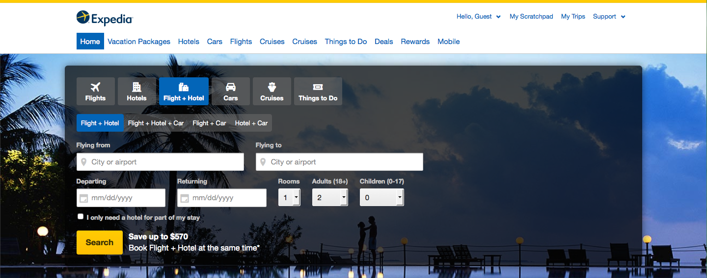
Expedia makes this search very easy: flight and hotel combination packages are the default search type when the home page opens. Other options, for users who need either more or less, are obvious and clearly labelled.
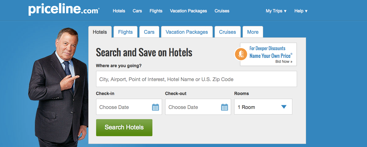
Priceline, on the other hand, offers users a hotel-only search by default. Flight/hotel combinations are available as an option under the Flights tab (but not the Hotels tab, oddly) and in Vacation Packages as well, but this was enough of a barrier to complicate the process for users.
Kennedy from Phoenix advised in his written responses afterwards that the site should “add a tab that’s labeled Flights and Hotels” to clear up the confusion – a Vacation Packages search with 0 results had earlier left him wondering if he was even looking in the right place.
Once users got to their search results, the task was not difficult on either site. Neither offered the kind of exact price filtering several users were looking for, that would have allowed them to set explicit minimum and maximum rates and throw out the rest of the results. But price sorting was available on both, and users found that $700-800 per person was generally a reasonable price.
Both sites were very clear about what the listing prices represented and included, a fact which was appreciated by users. Expedia takes round 1 with a more straightforward experience.
Task 2: Select a hotel in walking distance of the National Mall & other main sights.
Specificity is difficult
This time it was Expedia that left users wishing for a feature the other site already thought of. “It would be nice to have the option to narrow my hotel choice by nearby attractions,” Barbara from Chicago commented.
There was a filter for neighborhoods, which helped; but as another tester pointed out, “If I’m not familiar with the area, I don’t know what the neighborhoods are.” And there’s nothing that describes or defines them on the site.
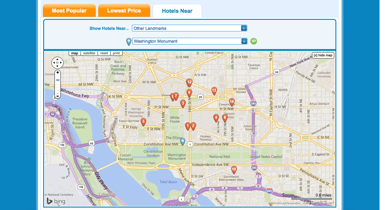
Priceline, on the other hand, prominently features a Hotels Near… tab at the top of the results page, which allows users to winnow down their list of prospective stays based on closeness to a comprehensive list of landmarks.
This is exactly the feature Expedia’s users were looking for, though they probably would have wanted it to work more smoothly than Priceline’s does. The list of landmarks, for example, is so long that finding anything takes lots of scrolling through dropdowns; also, the dropdown categories themselves don’t make much sense (hint: you won’t find the Washington Monument under Parks & Monuments).
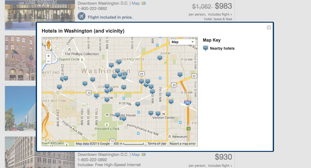
Expedia does have a map feature, but it has no options for filtering, and the map itself is quite small – much more screen space could have been allotted to it, especially considering that every user relied on it at some point to determine hotels’ closeness to DC landmarks. Since there is no search, users had to look around for the map labels, which aren’t always visible at different zoom levels.
Priceline did well to make their map much bigger, but it is also clunkier: the popups for the hotels are awkwardly sized and positioned, and stick around for too long, becoming almost as annoying as they are helpful. Priceline still wins this round, but not by a lot.
Task 3: Choose a flight that suits your plans.
Unavoidable confusion?
The two sites handle this step in opposite ways. Priceline automatically selects the cheapest flight (going both ways) matching the user’s travel dates and specified airports, and offers the opportunity to review and select other flights. Expedia does not select any flight by default, but presents the user with a broad list of departure and return flights on or near their travel dates.
Both methods are the cause of some confusion with some users. On Expedia, Chicago Barbara picked her return flight without realizing it, then had to go back and start over so she could choose a round trip arrangement instead of getting 2 mix-and-match flights. Charles from Atlanta, on the other hand, thought he had selected both flights after only choosing his departure trip.
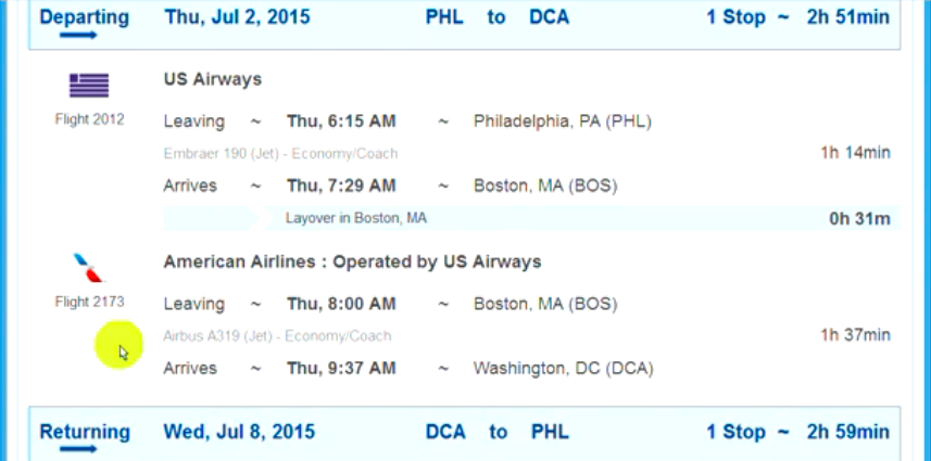
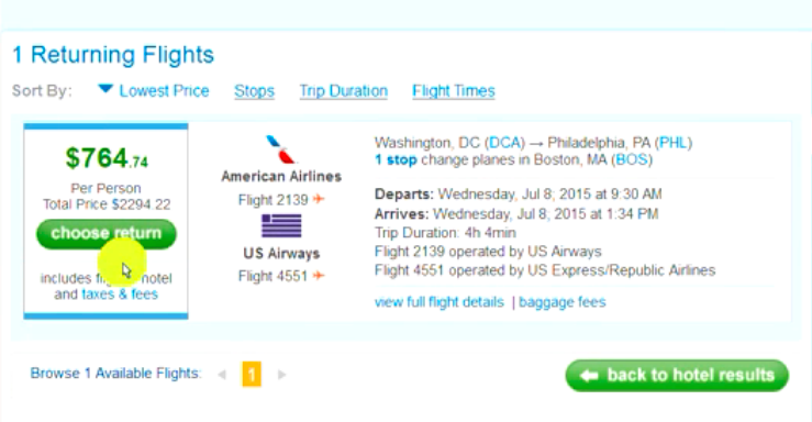
Priceline‘s system seems somewhat prone to misinterpretation too. Ivy of Philadelphia puzzled over how to select one of the 2 flights she saw listed under Departing (they were actually the 2 consecutive legs of a pre-selected flight with a stop). Then, when picking new flights, she thought the Choose Return button was for viewing a list of return flights to choose from – not a confirmation of the single result showing to the right.
Priceline caused more serious issues for the one tester that ran into them, but those issues were also less likely to arise than the ones that Expedia testers came across. So it looks like Priceline ekes out ahead on this task too.
A draw?
One thing that stuck out about the Priceline tests in a general sense was that it seemed to just work less well. Ivy’s 1 flight option for returning from DC to Philly on July 8th, shopping a month and a half in advance, is not even the worst example of this.
Kennedy’s search for a flight + hotel vacation package in Task 1 returned no results, and for the remainder of the test he had to look for and book his hotel and flight separately. Yet there were options for both on the days of his planned trip; so why did the vacation package search come up empty?
These seem like glaring errors in the core functionality of the product, and are suspect to say the least. Due to the extent that issues like this had a considerable negative impact on the entire experience, Priceline must be docked points.
This month’s UX Wars winner is…
Recommended Reading:
UX Wars April: Spotify vs Tidal
UX Wars March: BeerAdvocate vs RateBeer
UX Wars February: OkCupid vs Match.com


