The holiday shopping season has begun, and as we all scramble to buy gifts for our loved ones, we decided it would be worthwhile to round up some of the e-commerce sites with the best UX.
These stores provide an effortless shopping experience excelling the typical, from search to checkout.
1. Wayfair: Detailed onsite search
The UX of home goods seller Wayfair’s onsite search is a bit of web design we are particularly grateful for.
When users search for an item on Wayfair, the first thing they’ll see is a row of suggested subcategories to help them find exactly what they’re looking for.
For example, if you search for “stools,” an illustrated row of product categories like Bar Stools, Garden Stools, and Office Stools appear above the search results. It’s easy to narrow your search down and weed out marginally-related results.
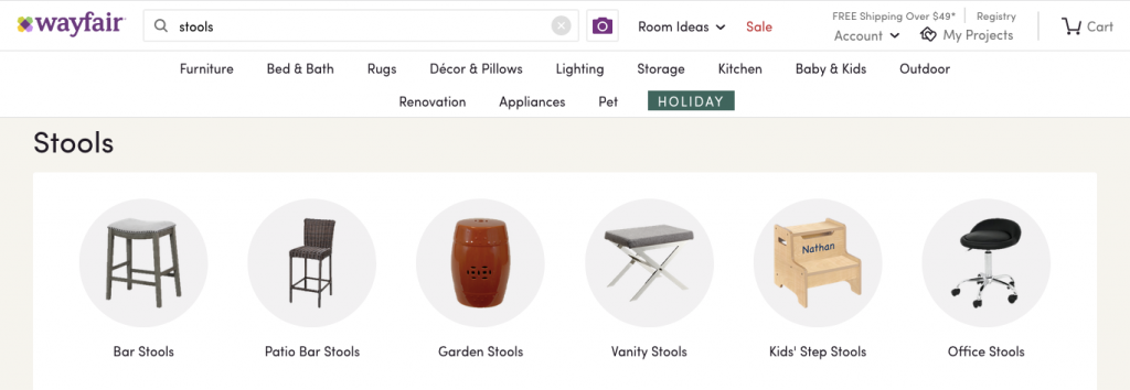
“Chunking” results into different areas of the house like this is great UX because it saves work and mental exertion for the user.
Instead of immediately presenting users with an endless scroll of inventory, it gives a smaller number of options, complete with pictures, that help users take a big step towards the right product.
It’s easier to digest and less overwhelming than a simple product list, and ultimately users will find their perfect product faster.
Of course, you can also just scroll down and see everything that matches the original search term. Here too, Wayfair’s UX exceeds expectation.
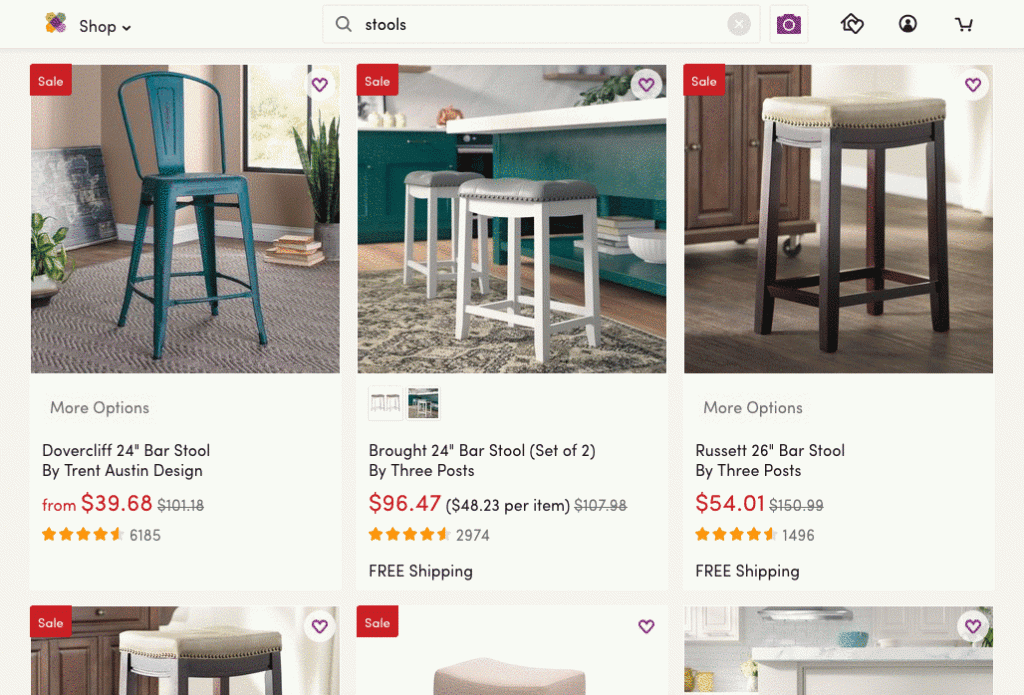
Hover over any of the results, and there’s a “Quickview” button over the picture.
Clicking it opens a modal window with product images, videos, details, star ratings, and the add-to-cart flow—without ever having to leave the search results page.
This useful feature allows users to easily and quickly compare products without having to open countless new tabs, or go “pogo-sticking” back and forth on the site.
There are more reasons why Wayfair’s UX is great, from smart search results to easy-to-use filters, all of which we’re thankful for in this season of online shopping!
2. Lulu’s Fashion Lounge: Building trust
Online retailer Lulu’s has one feature that makes it stand out among e-commerce stores, and apparel shoppers will be especially grateful for it.
When customers are viewing the product page for a piece of clothing on the site, a feature called “Fan Photos” sits in the bottom right of the screen.
Fan Photos allows users to see photos of other customers wearing the item, as well as reviews that accompany each photo.
Not only are these photos and reviews in an easy-to-find place (instead of being way at the bottom of the page), they are right next to the images of the store’s model, making it even more useful for people to envision the clothes in real life—and trust what the store is showing them.
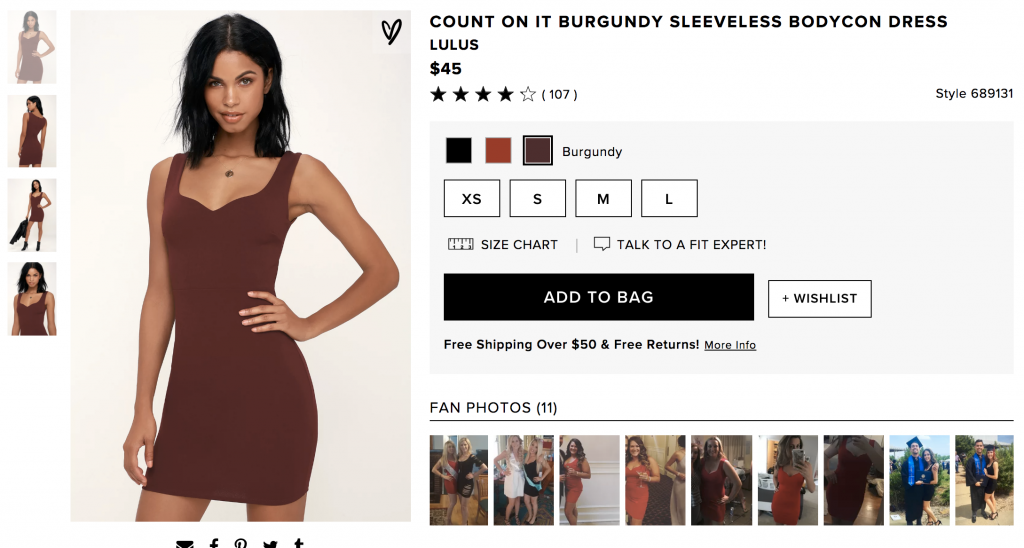
While many other retailers include reviews/ratings sections, the photo gallery on Lulu’s actually shows users the real quality and fit of the product. These customer-uploaded images provide an honest look at the article of clothing being considered.
Not only does this help customers feel confident in buying something without trying it on, it increases their confidence and trust in the e-commerce site overall.
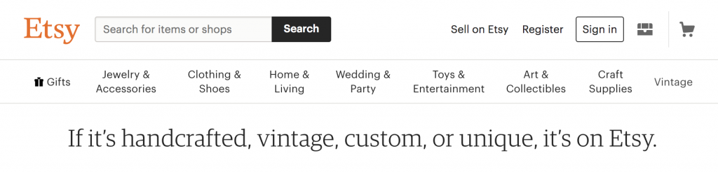
3. Etsy: Navigation
For a site that specializes in the unique and custom-made, Etsy’s navigation simplifies its vast craft-warehouse in a simple and elegant way.
With some 1.98 million sellers and more than 50 million products, this craftspeople’s marketplace has the capability to be a navigational nightmare for users.
However, the e-commerce site uses robust, thoughtful categorization with multiple cascading tiers to provide a delightful, common-sense customer experience.
At the first level is the main navigation bar along the top, with 8 options. Each option is an umbrella that combines multiple related categories in order to minimize the total number.
For example, you could easily imagine clothing and shoes being their own items; but by bucketing them together, Etsy keeps this navigational layer simple when it could be overwhelming.
Read more: 5 psychology principles for better UX design
Furthermore, hovering over the different menu items opens up a secondary dropdown menu with useful subcategories – each of which has its own breakdown to the right. Just check out the “Jewerly & Accessories” section below:
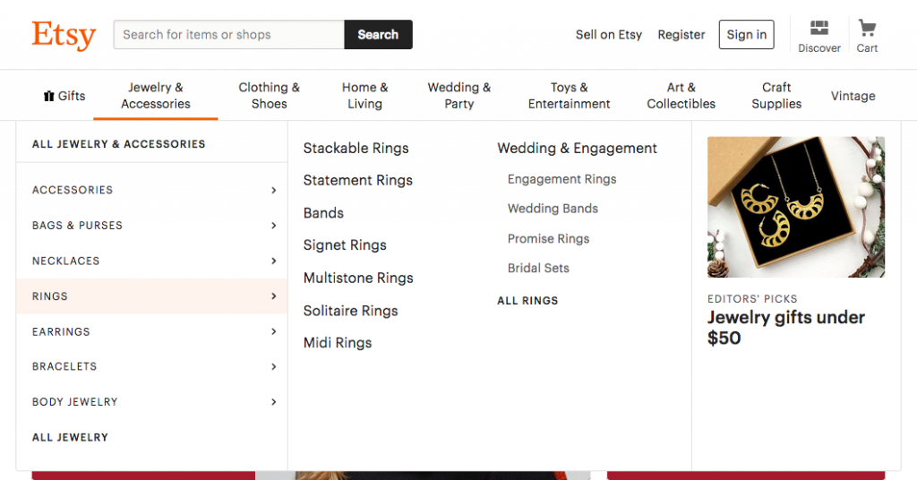
This multi-layered navigation hierarchy is logical, easy to figure out, and allows the user to very quickly get deep into the site, where the products they’re searching for reside.
Organizing their massive and diverse warehouse of goods this way makes browsing Etsy a much more user-friendly experience.
4. Amazon: Browsing history
Amazon is the top dog of e-commerce, and while not perfect, they have made many good UX decisions that have helped them get there. One I wanted to highlight for this article—one I found particularly useful this holiday season—is their “Browsing history.”
As I find gifts for family members, I often hesitate to move them to my cart because I’m waiting on a second opinion.
Amazon plans for the “researchers” among us with its browsing history feature.
“Browsing history” is a useful archive of recently viewed products that removes the burden of saving or favoriting links from users’ shoulders.
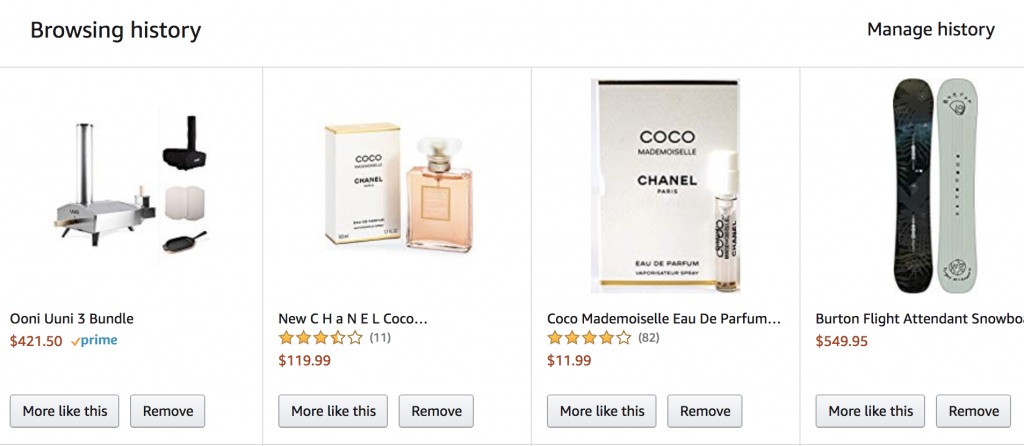
By anticipating users’ hesitation to add items to the cart, Amazon’s browsing history feature provides a helping hand just when they might be trying to remember the product they were looking at the other day.
Anticipating users’ wants, preventing hang-ups, and doing the user’s work for them all make for great e-commerce UX.
Read more: E-commerce UX best practices: 12 guidelines from 2 original studies
I like this feature because it gives me flexibility when thinking about a purchase, instead of punishing me for taking a step back or getting distracted.
Automatically saving previous searches turns multi-session shopping into a seamless experience for customers by allowing them to pick up right where they left off.
5. Society6: Prediction of user flow
Society6, an art and decor retailer, makes it easy for users to locate products with similar designs to the one they’re viewing, enabling them to collect matching pieces with ease or find something they like even better.
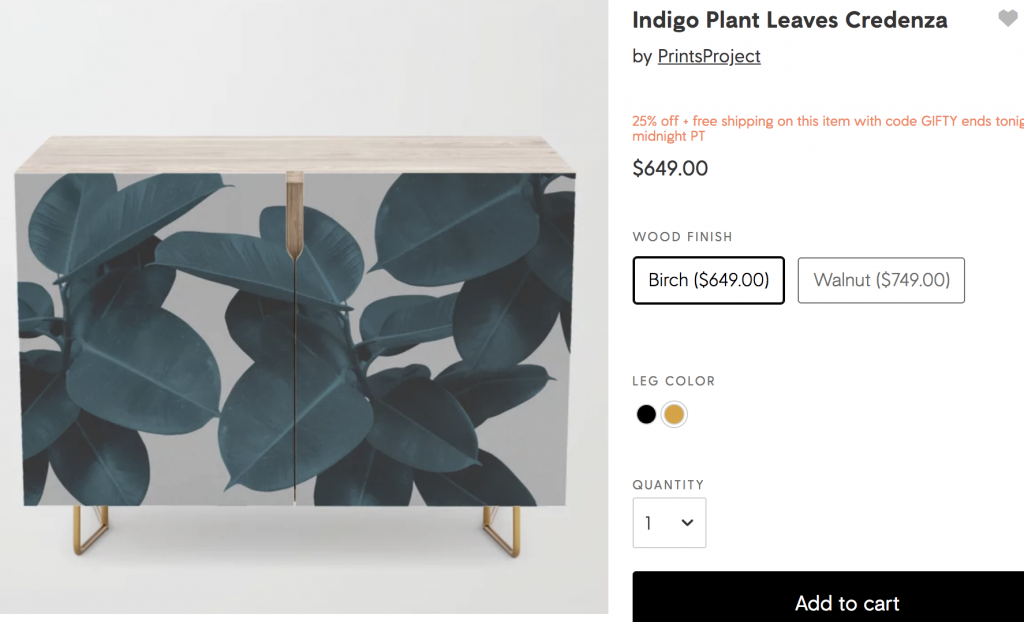
Below the main product information section (above), users can see “Shop this artwork” (below): a gallery of products featuring the same pattern used in different ways.
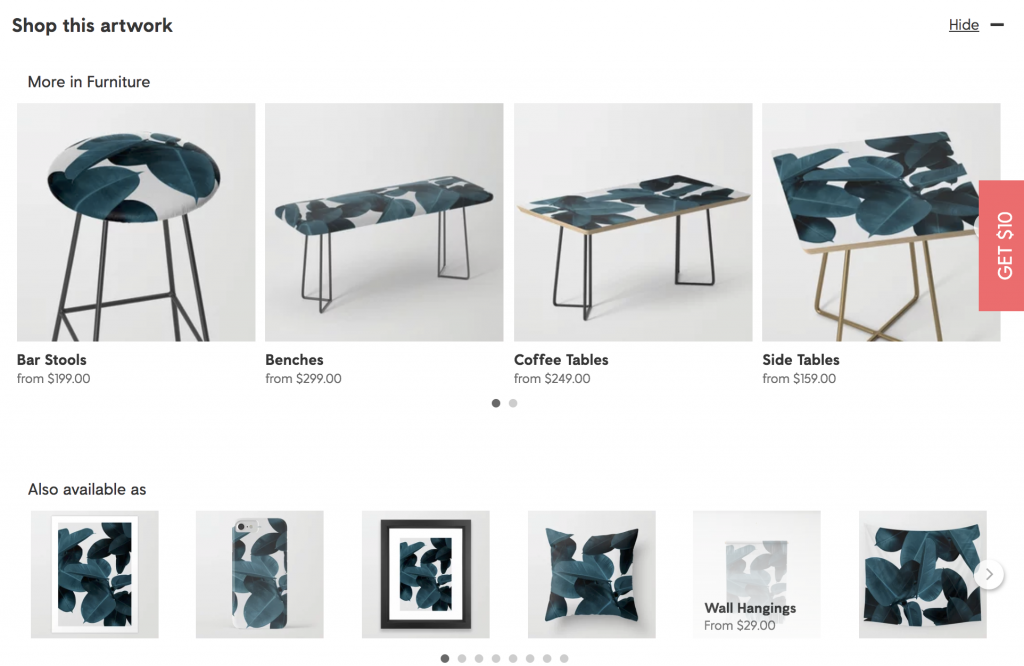
So if someone is looking at a pillow with a certain design or artwork, Society6 will also show them bar stools, comforters, and tapestries with the same or similar imagery.
With this feature Society6 anticipates user needs and desires.
The “Shop this artwork” feature is helpful for customers planning out a design for a room or home, or for return customers looking for patterns that match a previous purchase.
Instead of only suggesting similar types of items, suggesting similarly styled items gives customers a better understanding of what is possible with their home decor.
6. Hardgraft: Maximizing minimalistic style
The minimalist display style that high-end accessory retailer Hardgraft uses to showcase its product is luxurious and charming.
All the products appear on the homepage, and as the user’s cursor hovers over a product, the name, the price, a size picker, and an “Add to cart” button appear.
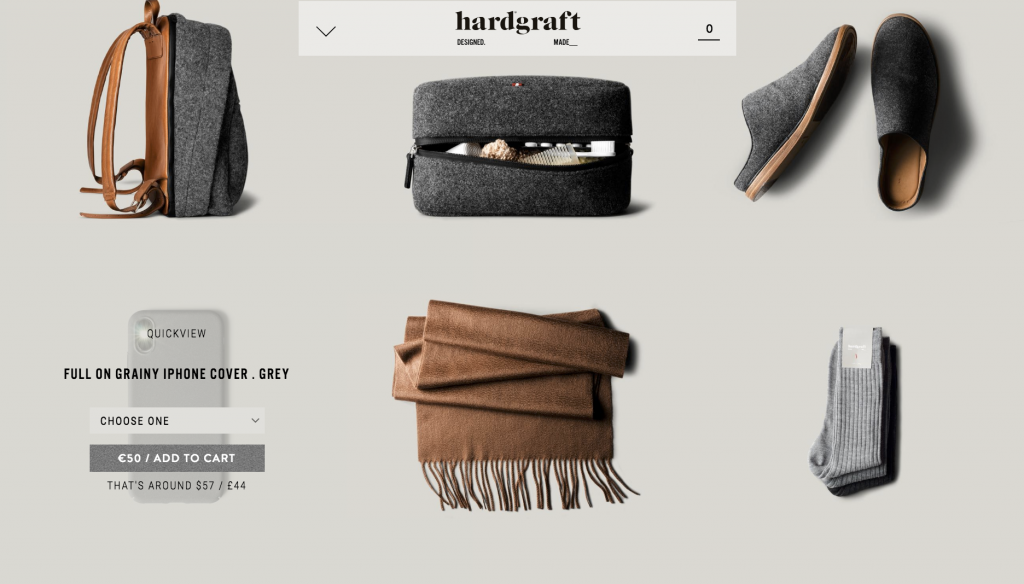
This layout, combined with the hover functionality and the “quickview” that’s also available, enables users to browse through Hardgraft’s inventory and get a feel for what the brand is and what it represents. not leave the main gallery to learn about the item.
Hardgraft is a high-end brand, and the design style they’ve chosen for their website conveys this very well. It is actually not the most usable design – nor is it meant to be. The bare, minimalist layout and the high-definition photography forces users to really look at the products and see the colors, textures, and materials.
This is a design that tells a story.
Moreover, it translates the feeling of a high-end store of the real world to the web, a feat that involves not word-for-word translation but rather the recreation of a feeling, an impression.
Hargraft is e-commerce design and branding on its own terms, and somehow it works. The site isn’t perfect, but it is an enjoyable and memorable shopping experience.
Learn more:
Conclusion
With flashy holiday sales all around begging for our attention and money, it’s refreshing to visit an e-commerce site with great, well-designed UX.
From perfectly placed photos of products in the real world, to navigation menus and search bars that practically drop what you’re looking for into your lap, the UX design elements from the websites above are something to be thankful for amidst the commercial din of the holidays.
But these are far from the only e-commerce sites that do UX right. What store websites have you visited recently that served up a delightful experience? Tell us in the comments.