
“If you are looking for something to buy, you are more often than not looking for it on Amazon.” Thus spoke Alphabet (Google) Executive Chairman Eric Schmidt. In an age when people are buying everything online, Amazon is synonymous with online shopping. But Google has been mounting their challenge with Google Express.The two do not follow exactly the same model: while most of the products you see on Amazon are supplied by the company’s own warehouses, Google Express delivers products through their retail partners including Costco, Target, Whole Foods, and more.
We did remote user testing on the two competitors to see which one provides a better shopping experience for users. Here was the scenario we gave testers:
You’re running low on a few key office supplies, so you’re doing some online shopping to stock up for the next few months. You came to Amazon/Google Express to buy notepads, sticky notes, and pens.
Task: Find everything you need
For the first task, we gave users a shopping list and lots of leeway to check off each item as they saw fit. Rather than divide this up into several tasks and handhold them through the process, we wanted to see how users would naturally go about picking everything.
Find everything you need and put it in your cart. Try to save money but get quality products. Shopping list:
– At least 5 notepads (legal pad style)
– At least 300 sticky notes (3×3 inch, 2 or more colors)
– At least 20 basic pens
We gave enough specifications that the testers wouldn’t be perfunctory about it and would pay attention to detail. We also chose quantities that would force them to fiddle around with the number of orders and weigh different options.
Choosing a pathway

On Amazon, 2 out of 3 users began with the search bar. All three were familiar with Amazon, but the two who said they shopped weekly or almost weekly searched, while the one who only shopped every few months opted for the Departments dropdown.
The design of the page encourages searching as the primary means for finding a product. The large search bar, which stretches across much of the page’s width, is the most prominent element on the top bar. Meanwhile the product categories are all hidden under a single menu item.
Most of the rest of the space on the home page is dedicated to promoting Amazon’s special offerings (Echo, Kindle, Amazon Video, Prime) and a few things that might catch the eye of a more casual browser. But if someone knows what they’re looking for, the most obvious action is to search.

On Google Express, the search bar is a less obvious choice, as it looks separate or disconnected from the rest of the interface. The way it sits above the Google Express navigation bar, next to the regular Google logo, implies to some eyes that it’s not a search within Google Express at all. Only one user chose to start with the search bar.
The other two had plenty of routes to choose from. One began by investigating the menu items along the top navigation. To Mike from Dayton, “Home, Office & Pets” seemed like the obvious choice – but nothing in the dropdown even mentioned office supplies. A click on “View all” solved the problem.
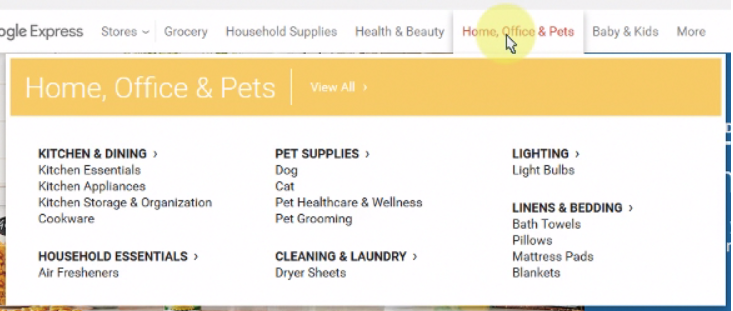
The other user, Susan, watched the rotating row of store icons at the bottom of the screen before clicking through to the Google Store out of curiosity. She, too, then struggled (for 15 seconds) with the “Home, Office & Pets” dropdown before just clicking on the menu tab itself. (In the post-test survey, Susan wrote, “Figuring out where to start was confusing. I wasn’t sure how the store worked.”)
Amazon doesn’t exactly nail the category breakdown either. In their Departments dropdown, office supplies don’t fit logically into any of the categories given. So where did Amazon put them? Oddly enough, under “Electronics & Computers”:
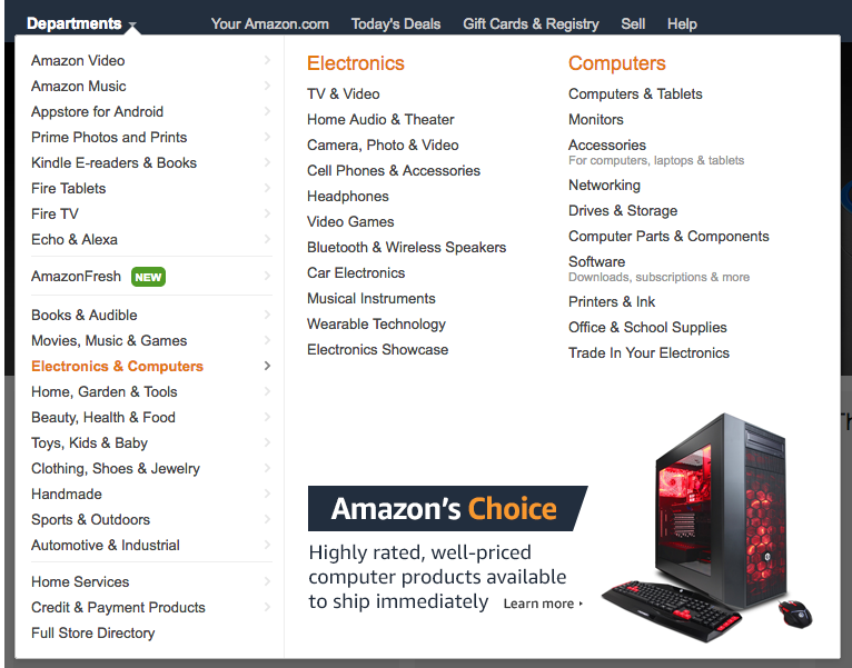
It took Colleen 51 seconds to find that one.
Product listings
Once users had searched or navigated their way to the product listings, Amazon had few usability issues. The biggest complaint anyone had was that there was no “Add to cart” option directly on the search results page, because they already knew which item they wanted.
It was so easy for users to make their pick without clicking into the product details pages because Amazon shows so much detail up front. Whenever possible, the search results show the full title of every product. When it’s necessary to truncate them, the titles are cut down to 75 characters.
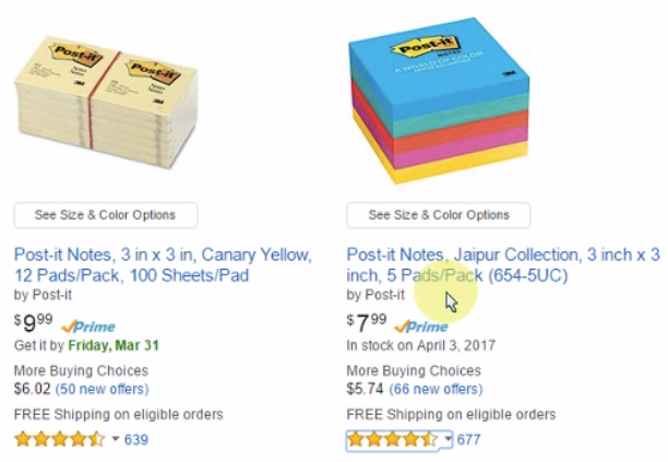
That’s a lot more than Google Express‘s 45-character limit, which is applied all the time no matter the browser or screen size. That means a lot less information is readily available; compare the Google Express listings for post-it notes below with similar ones on Amazon above.

All the details are lost. To compare products, users have to click into each one and see, for example, the dimensions of the post-its, the number of pads per pack, and the number of sheets per pad. “I’m having a little bit of difficulty seeing the exact details of the product,” said one user trying to choose between two similar items.
Furthermore, Google Express’s truncation method cuts out the middles of the titles in favor of the ends, which often contain useless space-wasting product ID numbers (like “654-5SSUC” above).
The other factor that makes it hard for users to compare and narrow down options from the results page on Google Express is the low accuracy of the search. Odd as it is for a company that built its name on search, the relevance of the results was much poorer than on Amazon.

Above is the first row of results for the search term “legal pads.” Out of 6 products, only two are even potentially matches, and only one of those even shows the words “legal pads” (truncated) in the title. That one is the assorted floral pack. “Why am I getting non-legal pads in this?” wondered a frustrated Mike.
Product details
When users actually clicked into the individual products to see the details, the same trends from before continued. Amazon offered lots of information, while the entries on Google Express were often pretty sparse.

The page above, for example, offers exactly 2 specifications (Size: Legal, Color: White) of the product in question. This screenshot also demonstrates another recurring frustration: the quantity dropdown caps out at 1. Several other products only allowed users to order 1, 2, or 3 units – less than were needed for the test.
This was the point at which Mike reached peak exasperation. Having found a suitable product, only to be inexplicably limited to ordering just one, he exclaimed, “Wow, who knew? I didn’t think it would be this hard. I just want legal pads, that’s all I want.”
Amazon‘s product pages were totally satisfactory for the most part. One user was confused when trying to change the pack size of her pen order because the unselected options show in a grayed-out style that makes them look unavailable. She was surprised when she clicked the 20-pack option and it actually worked.

Getting around
Amazon users didn’t have much trouble hopping from one item to the next on their shopping lists. Colleen, who didn’t use the search bar, was sometimes held up by Amazon’s enormous lists of categories, sub-categories, and sub-sub-categories: “It’s a bit overwhelming here, so let me start over from the beginning and go through one by one.”
Google Express was tough on users because they didn’t really understand how it worked. The hierarchy between Google Express and its retail partners is unclear. For example, the search results page is divided up by store (Walgreens, Costco, Staples, etc.) and each store has a list of matching products. Users can click into stores to see the search results from that retailer alone.
One user wondered why they couldn’t see all the matching results in one place. Another admitted, “I honestly am not sure how Google Express works and what are the advantages of it…It just seems like an extra step.”

In a related issue, Google Express also doesn’t really know what it wants the search bar to be. Every time users click somewhere new, a filter is added into it, almost like a breadcrumb. When users navigate to the “Notebooks & Notepads” category, a filter is added. When they click on a product from Costco, a Costco filter is added.
In many cases, users didn’t even realize this was happening, and the filters inadvertently affected their next search. So, for example, Mike (poor Mike!) tried to make a new search after looking at a Costco product, and his results were all limited to Costco offerings.
By mashing up navigational steps with the search function, Google Express makes choices for users that they didn’t want to make, and muddies the identity of the search itself.
Conclusion
We wrapped up the test by asking users how they felt about the two brands and about shopping on each website.
About Amazon, users said: “To be honest, I love it! I like searching for products on Amazon as I always find good products at a reasonable price.” “It is a simple place for me to find most of the regular items that I want.” “My first stop for online shopping is Amazon.”
Users’ impressions of Google Express were not as rosy: “I think it is okay. I feel like sometimes there aren’t as many items available.” “I would prefer to go to the specific store I wanted rather than go to Google Express.” “I probably would have exited and gone directly to a site like Staples.”
We should remember that users’ prior experience on Amazon predisposes them to favor the site – they already have familiarity with the layout and functionalities and have become accustomed to using it, whereas Google Express was a new experience for most.
But this is a real-world challenge that Google Express must overcome in its design, not just a methodological quirk. User expectations are a big part of usability, and Amazon has already set the expectations for sites like these. Most people who give Google Express a try will have used Amazon before.
Anyways, Google Express‘s usability problems go well beyond mismatched expectations. UX missteps from search, to navigation, to the level of product detail and the clarity around the site’s fundamental organization are why
the clear winner of this UX Wars edition is…
![]()
Related reading:
UX Wars (Mobile): H&M vs Forever 21
UX Wars: New York Times vs BBC
UX Wars: Twitch vs YouTube Gaming