Naturally, businesses want to make their products and services as accessible to as many people as possible. But technological capabilities and relative connection reliability have consistently stood as roadblocks to achieving that level of accessibility.
This article discusses how progressive web apps (PWAs) have emerged as a solid solution to provide faster, seamless, and more reliable user experiences at less cost, and provides tips on how to design your PWA for better cross-platform user experience (UX).
Learn more: user testing better products and user testing new products
What are PWAs?
A Progressive Web App (PWA) is a browser-based web application using modern web capabilities to deliver an app-like user experience on any device. Essentially, with PWAs, you’re able to perform functions normally reserved for native apps.
Benefits
1. Reduced friction
Businesses need to reduce friction as much as they can to prevent consumers from bouncing. So by taking away the need to download an app to access a product or service, businesses are making it easier for consumers to use their products. Add to that users’ growing app fatigue, and you can see why PWAs have become increasingly popular.
2. Speed!
A recent Google presentation showed that PWAs have a less than 1-second median load time—4x faster, and with 10x less data than a native app. Additionally, PWAs are able to work offline and in low-bandwidth environments. As pointed out by Ionic Framework, this means that more users and devices can enjoy the speed of PWAs without losing the quality of an experience.
3. Cost-Effectiveness
PWAs’ device agnosticism allows companies to build one great web experience, and repurpose it to be deployed across different devices and channels, at a lower cost. Prior to the PWA concept, businesses had to build separate native digital experiences in addition to their website.
4. Discoverability
Because PWAs are built on the web, all content within it can be indexed by the web, allowing it to be more searchable and discoverable, while also benefiting a business’ SEO. This has become increasingly vital as users continue to lean towards mobile search. PWAs even allow for easy installation on devices’ home screens – a much easier process than finding and downloading traditional native apps.
The numbers
There are plenty of reasons why the industry is bullish on PWAs. Here are some stats to give you a glimpse as to why:
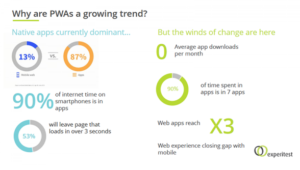
- 53% of users will leave a page that loads in over three seconds. This makes PWAs’ faster loading speeds ideal.
- Mobile traffic (excluding tablets) now accounts for 47.96% of all internet traffic.
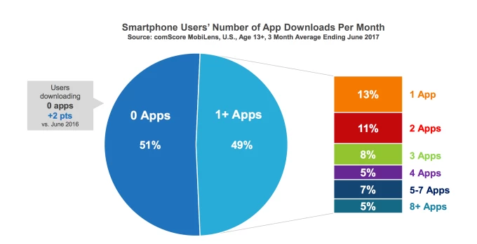
- A recent survey found that 51% of US consumers downloaded zero apps per month.
- 13% of smartphone users only download one app per month (see below), pointing to the increasing acclimation to PWAs.
- It’s forecasted that by 2020, half of consumer-facing apps will be PWAs.
As the performance gap between building natively and the web continues to close, PWAs will continue to gain favor among businesses and their customers. Keeping up with the continual digital transformation used to be much more costly, but PWAs provide the triumvirate of being faster, easier, and less expensive to do so.
How to design PWAs to optimize UX
Now that you have a basic understanding of what PWAs are and what they do, here are some tips on how to design one that boosts user experience.
1. Use a checklist
Now, it’s important to note that the checklist you’ll be using will depend on the quality of PWA you’re shooting for. But for a baseline PWA, Google recommends a checklist that could look like the one below:
 Site is served over HTTPS
To test: Use the Lighthouse tool to verify “Served over HTTPS.”
To fix: Implement HTTPS and see letsencrypt.org to get started.

Pages are responsive on all mobile devices
To test: Use Lighthouse to verify “Yes to all” of “Design mobile is friendly.” You can also check our Mobile Friendly Testing app.
To fix: Implement a responsive design or adaptively serve a viewport-friendly site.

All app URLs load offline
To test: Load PWA pages while airplane mode is enabled. Use Lighthouse to verify the start “URL responds with a 200 when offline.”
To fix: User a Service Worker.
Depending on your needs, you can find different kinds of PWA UX checklists online. Google provides a comprehensive guide for base PWAs to exemplary ones here.

2. Focus on load times
To ensure that users enjoy fast, rich and reactive web experiences, Google recommends the following:
PRPL pattern
PRPL stands for: Push critical resources for the initial URL route, Render initial route, Pre-cache remaining routes, Lazy-load and create remaining routes on demand. This pattern helps structure and serve PWAs. It also optimizes minimum time interaction, and ensures maximum caching efficiency.
Service worker caching
This is a script that your browser can run in the background, even as pages aren’t open. And because service workers are excellent at caching, it allows your PWA to serve nearly instantaneous responses even on slower networks.
![]()
Server-side rendering
With this, users get content faster even when JavaScript is either disabled or fails. This also allows search engines to easily index it.

3. Stick with simple fonts
The main goal of PWAs is to make products and services more accessible to users. So instead of using fancy fonts to give your PWA character, focus on enabling users to interact naturally, sans additional visual distractions. Remember, fonts should be used to deliver messages, not be the focus of attention.
4. Make it user-centric
Again, it’s all about helping the user get to their end goal – as fast and as easily as possible. For example, for every significant interaction, make sure that user progress is shown, and provide quick cues to address user needs. As well, make sure each item in your PWA serves a purpose. Less is more usually makes for better UX.
5. Offline functionality
PWAs’ ability to work offline is one of its major assets, so make sure that its key features are available – this includes the caching option. Think of going offline as an important part of enhancing mobility. Your users will surely thank you for it.
6. Make it seamless
Loading instantly is one thing, providing a smooth experience throughout use is another. Make sure that transitions are smooth and seamless, and that there is no downtime. This is particularly important when users are submitting forms or processing payment. Clunky transitions during these types of instances is where users often bounce, so make sure to always keep this in mind when it comes to your design.
![]()
7. Be iconic
When your PWA is added to a user’s home screen, you want it to blend well with native apps. Apart from making it a natural fit, you also need to ensure that it’s flexible to the requirements of different platforms like Android, iOS, and Windows.
8. Make it shareable
Because PWAs don’t provide easily accessible URLs, you need to make sure that users can still easily share whatever page they’re looking at. To do this, you can implement a share button that allows users to copy the URL to the clipboard. But if you’re going with social sharing buttons, make sure to delay the loading of the third party JavaScript until after the page’s primary content has loaded.

9. Ensure flawless touch interactions
As a rule of thumb, touch interactions should be implemented flawlessly, or not at all. So because advanced touch interactions like pull to refresh and swipe to dismiss are notoriously difficult to implement, it is recommended that you stray away from them.
Instead, you can use a bottom navigation bar, which doesn’t suggest the possibility of advanced touch interactions.
10. Avoid classic web design
Classic design typically feature things like links in text and static elements on every page such as headers and footers. Because these elements are used sparingly in native apps, you need to match your PWA’s design accordingly. So instead of using links, for example, use careful placements of buttons and other tappable areas.
Some of the best PWA examples
Now that we’ve seen how and why, let’s look at PWAs that hit all the marks.
Starbucks
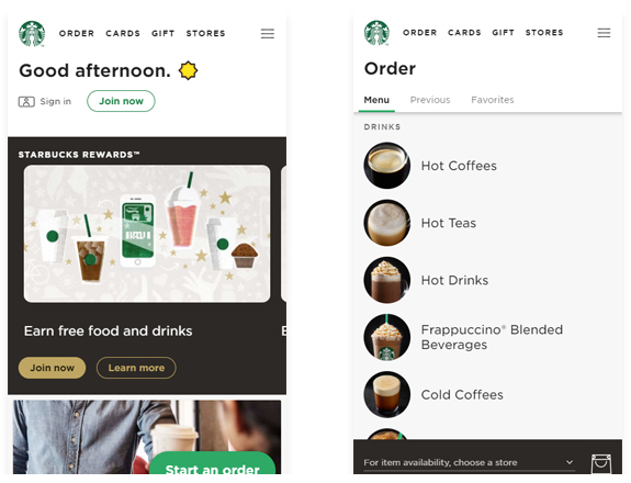
Starbucks’ PWA features its web ordering system, which provides a similar experience to what you can get on the native app. It allows users to browse the menu offline, customize orders, and add items to cart. Then, once users are online, they can view location-specific pricing and place their orders.
It is perfect for customers who are on the go – and for those who could be transiting through areas with less than reliable connections. Since launching its PWA, Starbucks has doubled the number of web users who place orders daily.

The online news magazine’s PWA does a good job of minimizing data usage to deliver its slick and fast browsing experience. Their PWA has also allowed Flipboard to deliver an experience similar to their native app to desktop users.
Uber
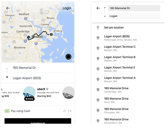
The ride sharing company rebuilt Uber web as a PWA to cater to emerging markets where connections may not be as reliable. By allowing a ride to be booked on low-speed 2G networks, Uber has made it easier for people everywhere to use their service. Additionally, the PWA works on lower-end devices which may not be compatible with the native app, and is also super lightweight.
Conclusion
From loading speed and reduction of friction, to offline functionality and ability to work with slower internet speeds – PWA makes a lot of sense for businesses, especially considering the reduced cost of building a single PWA for multiple platforms and devices. It’s clear to see why PWAs are primed to replace traditional native apps in the near-future, offering a smoother and more accessible user experience.
Which company’s PWA has impressed you the most? Sound off in the comments below.

Aaron Chichioco is the content editorial manager of designdoxa.com. His expertise is not only limited to topics about Web/mobile design and development, but digital marketing, branding, and eCommerce strategies as well.
You can follow Aaron on twitter at @Aaron_Chichioco


