It was her big moment. Miss Colombia stood on the stage adorned with sash and crown, thunderous applause filling the arena in celebration of her victory. Then it all fell apart.
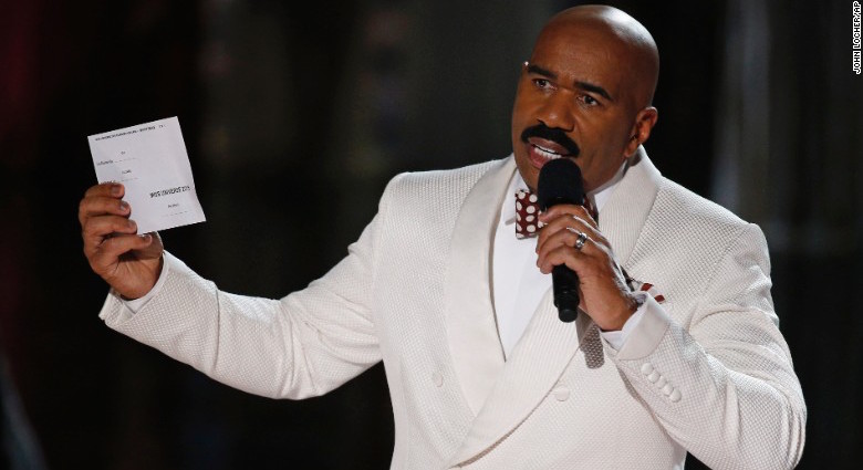
How did experienced TV host Steve Harvey make the terrible mistake of announcing the wrong winner of the Miss Universe pageant? A look at the winners card sheds some light on the answer.
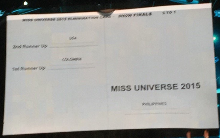
The card that Steve Harvey misread is a paragon of bad design, and it’s easy to see how he could have misinterpreted it.
Information architecture
The card is unnecessarily and confusingly split into left and right halves, even though all the information could have clearly fit on just one side, in a single vertical column. This would have made for a much more logical flow of information: a coherent list of all 3 women together, in order of their final ranking.
White space
Instead, there is a large white space below the 1st runner up, implying a finality that causes the eye to stop after reading it. Then there is another large white space on the right side, pushing the winner down to the bottom right of the card.
Copy
The wording makes matters even worse, because “Miss Universe 2015” is not just the title of the winner; it’s also the name of the pageant. With “Philippines” written so small beneath this, it’s easy to shrug off the entire right side of the card as wholly extra – just a blank page to fold over the winners’ names with a bit of branding at the bottom.
Fit to task
And this interpretation could make sense, because when the announcement is made, only the 2nd runner up and the winner are named. The 1st runner up is skipped over because announcing her would give away the winner by process of elimination. Therefore, when making the announcement, only 2 names are necessary – and the left side contains exactly 2 names, one of which even says “1st” before it.
Typography
Poor typographical decisions add to the confusion: “Miss Universe 2015” appears in all capital letters, breaking consistency with the “1st Runner Up” and “2nd Runner Up” style on the left and making it easier to misinterpret. The country names are oddly small, misaligned with the corresponding titles, and also in all caps, making a word like “Philippines” much harder to notice by removing the unique contours of the letters.
All in all, practically nothing on the card effectively communicates what it is intended to. It obscures the important information, misdirects the reader, and makes what should be a straightforward task more complicated and confusing than it ever ought to be. In this case, bad design ruined Miss Universe.
You may be interested in:


