A/B testing is a great way to objectively evaluate multiple different design options for the same user interface or user flow. Whether you already have a favorite among your designs, or the choice is completely up in the air, putting the different options in front of users and seeing what they prefer provides invaluable evidence to inform your decision. With A/B testing, you can ensure that you move forward with the design that is the most user-friendly.
If you’ve created two or more design variants and want to A/B test them, there are a few ways you can do so with Trymata’s usability testing tools. We’ll walk through each of them below, with all the details you need to create your own A/B testing usability study.

A/B testing methods with Trymata
There are 3 possible methods for setting up an A/B test with Trymata’s testing platform. At various times, our own design team has employed all 3 options; each one has its own pros and cons, but all of them can help you collect useful insights into the comparative usability of your designs.
Below, we’ll outline the 3 methods, with tips for how and when to use them, and some ideas and examples for writing the scenarios and tasks. Then, we’ll discuss how to pick the method that is best suited for your research project.
For the sake of simplicity, the descriptions below will assume a comparison between just 2 design versions. However, the same principles will also apply if you have 3 or more different designs to compare.
Side note: For those not already familiar with Trymata prototype testing, we are compatible with all major prototyping tools (including, but not limited to: InVision, AdobeXD, Figma, Balsamiq, Justinmind, and more). In general, to collect feedback on a prototype, all you need to do is set it up on your platform of choice, and then copy and paste the share link for the prototype as the URL for your Trymata test. Your prototype may be static or interactive, so long as you set the proper expectations for the testers in your scenario and tasks.
Read more: InVision prototype testing with Trymata

Method #1: Same test, two links
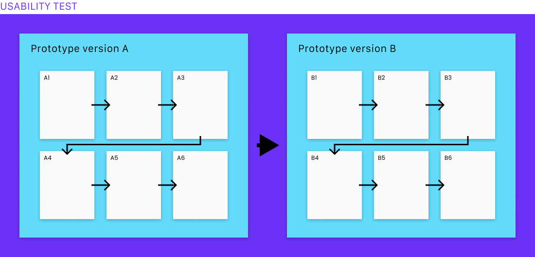
For this option, first get both of your design variants all set up on your preferred prototyping platform. Generate the share links for each of the prototypes, and have them ready.
When creating your Trymata test, copy the share link for the Version A prototype, and paste it as the starting URL for the test. Users will begin their session on this prototype. (We won’t be using the link for the Version B prototype until a later step, so continue on for now).
When writing your task script, set up all the tasks and questions you want users to complete as they interact with the Version A prototype.
Read more: Writing user testing tasks for prototypes
Once you’ve written all the tasks for Version A, add a new task that will come after them. In this new task, we’re going to provide the link for Version B, and instruct the users to treat it as a new starting point.
Integrate the Version B prototype URL right into the text of the task. It can be something like this:
Click the link below after reading this task fully. It will open a new prototype on your screen, containing alternate designs to the ones you have just been viewing. In the next several tasks, we will have you try out these designs, and compare them against the earlier ones. Here is the link:
www.prototype-version-b-link.com
Any URL in a Trymata task is automatically hyperlinked during the test. When users click the link, the new prototype will open automatically in a new tab in their browser.

Now, continue to add tasks that the users will perform on the Version B prototype. You may want to re-use the exact same series of tasks as you’ve written for Version A, with the exact same wording. (If you do, you can include task usability and completion metrics for both, and compare the performance of each version quantitatively as well as qualitatively.)
Alternatively, you can write your tasks in a way that refers explicitly back to the first version, and invites comparison between what the users are seeing now and what they saw previously. For example:
This page is a different version for how the checkout could look. How does it compare to the checkout design you saw earlier during this test? Do you feel that it is better, or worse than the other design? In what ways?
This strategy can help users to understand exactly what they’re looking at and helps to draw out their thoughts and critical reactions to the differences between the designs.
In general, re-using the exact same series of tasks is best suited for tests of functional, interactive prototypes where users can navigate around and perform actions. On the other hand, a task style that explicitly invites comparison between the design versions is best suited to tests of static prototypes, in which users cannot take actions, and so are only looking and then speaking aloud about their thoughts, impressions, and reactions.
Read more: Comparative usability testing

Eliminating order bias in your A/B test
When using this method for A/B testing your prototypes, keep in mind that the order users see the designs in will affect their relative opinions of them.
To control for this bias, create two test setups: one in which users start on Version A and then visit Version B, and one in which users start on Version B and then visit Version A. Have an equal number of users take each test. Since there’s no way to eliminate the bias from any individual user’s perspective, this solution will instead equalize the bias in the dataset.
Read more: Bias in user testing
Creating two test setups, as described here, can be done very quickly with Trymata: after the first one has been created, in the top-right corner of the page for that test, click “Duplicate.” This will copy all of the setup parameters, tasks, questions, and all other features into a duplicate test, and then all you’ll have to do is switch the links for Versions A and B.

Method #2: Same test, one link
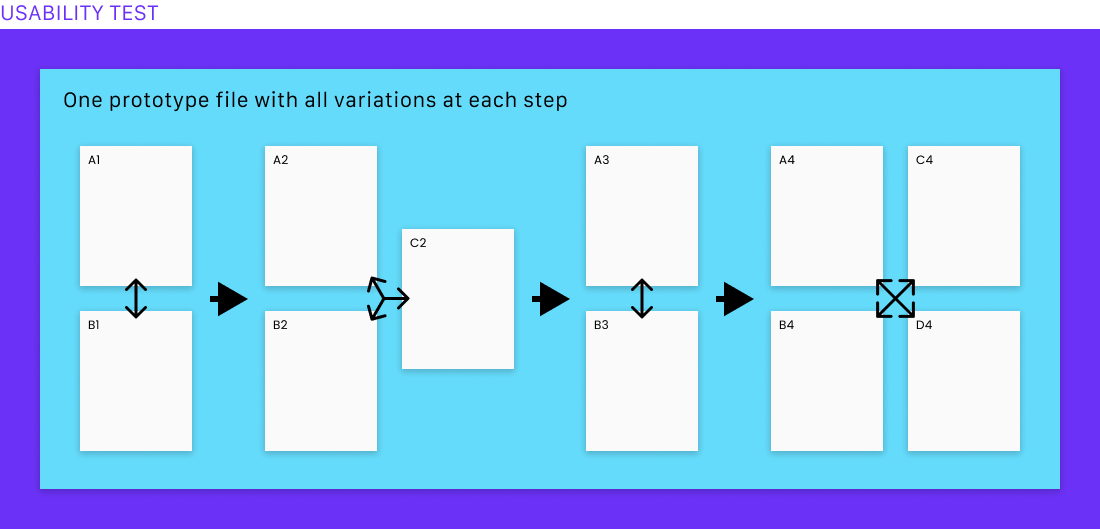
This method of setting up your A/B test is like the first option. The key difference is that instead of having a separate link for each of your prototypes, you’ll combine all your design variants into a single prototype project, with just a single link.
There are a few ways to do this, depending on the designs that you have. If the different versions comprise wholly unique flows, for example in which the changes on one page have cascading effects on the pages that come after, you should put all the screens from Version A in order in the prototype, followed by all the screens from Version B coming in order directly afterwards.
On the other hand, if all of the screens from each version are directly comparable with each other at every step of the user flow, you can instead show the variants for each step back to back (for example, both of the home page designs in a row, followed by both of the search designs, followed by both of the product listing designs, etc.)
This option is useful especially if you have different numbers of variations for different steps of the flow – for example, if you have just 2 designs for the search function, but 4 or 5 design options for filtering the results, and perhaps 3 designs for the layout of the product details pages.
When setting up your Trymata test, you’ll just copy and paste the link for the prototype containing all of your screens into the URL field for the test. All the rest of this method comes down to how you write your scenario and tasks.
Scenario and task writing
In the scenario, in addition to the “story” part of the scenario (e.g., “You and some friends want to take a trip together next month and are researching different cities…”), provide some extra detail about how the test will work. You might write something like, “During this test, we will show you multiple design options for each page and ask you to compare and contrast which ones you like best.”
Then in your tasks, make sure to describe exactly how you want the users to interact with the prototype. Here again, you have choices for how to facilitate this style of A/B testing. For example, you could have the users view just one screen per task, and speak about their thoughts as they go:
Click anywhere on the page, or press your keyboard’s right-arrow key, to move to the next page. This is a different design for the same page you were just looking at. Describe your thoughts about this design. Which of the two do you find more visually appealing? Which one do you think would be easier to use, and why?
Or, you could have the users view all variants of the same page or element during a single task, and only then compare them, side by side:
Click anywhere on the page, or press your keyboard’s right-arrow key, to move to the next page. This page shows one version of how the color picker could look.
Take a moment to view and understand this page, and then move forward in the prototype again by one more page. This is another version of how the color picker could look.
Which one would you prefer to use? Why? (Feel free to move back and forth between the 2 pages to look at either of the designs again.)

Method #3: Separate tests for each version
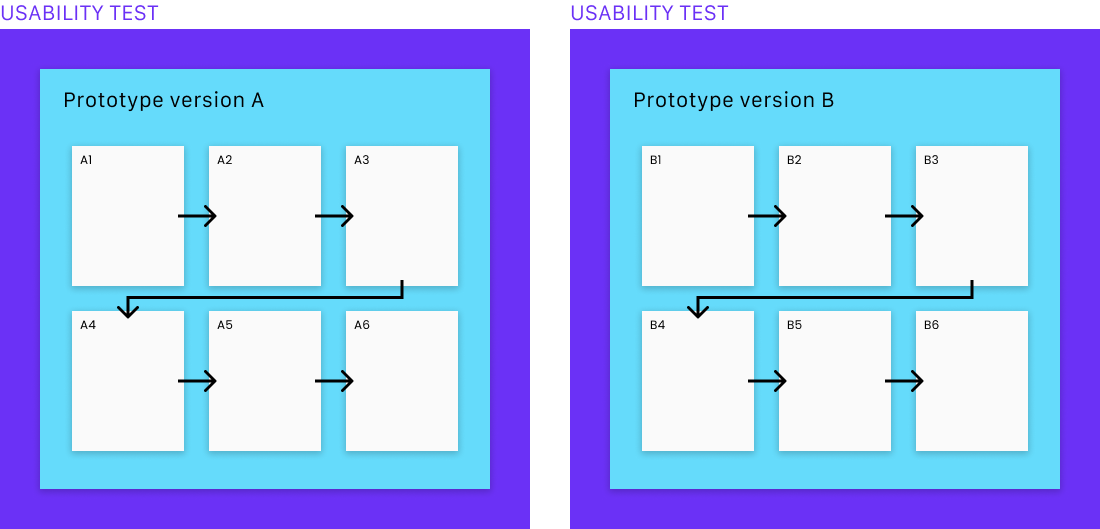
The last option is to set up a separate Trymata test for each of your design versions and have a separate set of users give their feedback on each one.
With this method, you would start by creating a usability test for just the Version A designs. Copy the Version A share link from your prototyping platform and paste it in as the URL for your Trymata test.
Write your scenario and tasks, and add any questions, surveys, and other features that you want to include in the test.
Once you’ve finalized the Version A test, create a duplicate of it (you can find the “Duplicate” option in the top-right corner of the test’s main page). Clicking “Duplicate” will copy all of the setup parameters, tasks, questions, and other features into a duplicate test, and then take you directly into the editing view for the new copy.

In the URL field, swap out the link to the Version A prototype for the Version B link. Then, make any necessary changes to the scenario and tasks so that they will fit the new designs. As much as possible, you should try to use the exact same task order and wording for both tests, to keep the results directly comparable. However, if the flows do not proceed in an exactly analogous way, or if certain tasks will be performed by a different means, you may need to re-order or slightly edit your tasks. Try to change them only to the extent absolutely required.
Now you have two separate tests for your two prototype versions. When you launch them, each one will be sent to a different batch of testers, who will generate independent sets of data that you can compare directly.
Conclusion
The usability test creation process on Trymata has been designed to flexibly support a wide variety of different test setups. Whether it’s an A/B test, a competitor test, an ad impressions test, or any other testing strategy for prototypes, websites, apps, or whatever interface you’ve got – there’s always a way to do it with Trymata.
Sign up for a free trial today to see how we can support you in your UX research or schedule a call to talk with one of our team members about your testing needs.


