
Creating effective, high-converting landing pages is a critical piece of most companies’ marketing efforts. Landing pages help marketers process new leads, attract signups for events, increase requests for special resources, and more.
This month, we decided to take a closer look at some of the tools available for building landing pages. Lander and Instapage both allow users to quickly assemble landing pages in a WYSIWYG (What-you-see-is-what-you-get) editor: no coding required, just direct manipulation of the page elements.
We did two rounds of usability testing on each website with experienced marketers to see which platform provided the better UX, and found that while each one offers a very similar service, the two experiences are very different…
Task 1: Impression Test
We started the tests with an Impression Test, in which we expose users to the home screen for 15 seconds, then ask a series of questions about what they remember.
On Instapage, people recalled words like conversion, marketing, and landing page and described their impression of the site as clean, informative, and user-friendly.
In general, it was pretty clear what the site was for: “It’s about setting up a page where people can register for an event or promotion,” said one user. But some people also felt the page was boring and non-descript: “Truthfully, it was not memorable.”
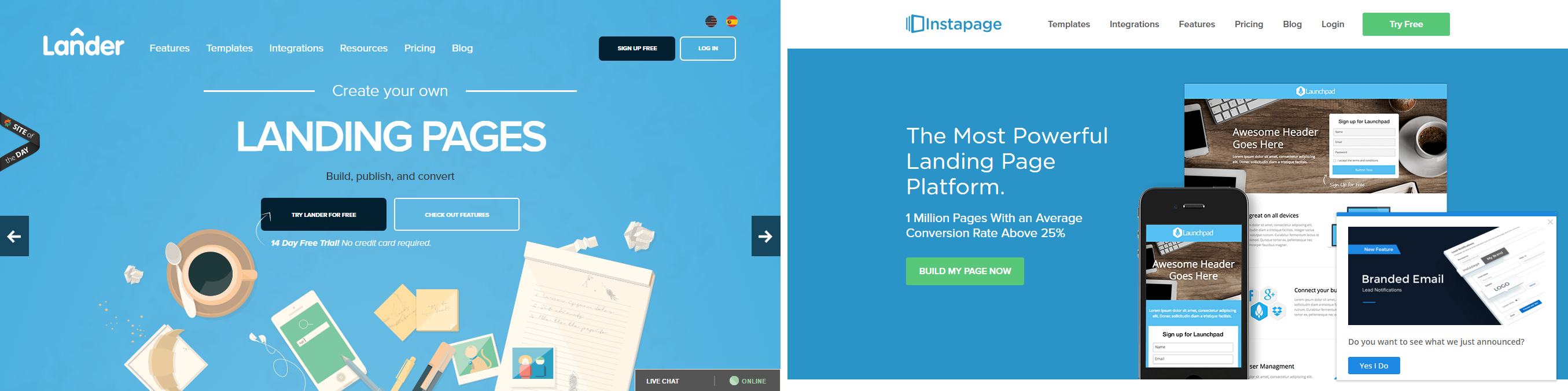
Lander‘s home screen is much more whimsical than Instapage, decorated with an array of stylishly rendered notepads, markers, and breakfast items. Users were much more likely to describe it as fun, while Instapage was more frequently called corporate.
It was also slightly less obvious what the site provided; although “Landing pages” is written in large font across the center of the page, one user noted that “I would have expected to understand even quicker that this is for marketing purposes.”
However, more users on Lander remembered key catchphrases from the home screen, including “Build, publish, convert,” “Built by designers,” and (inaccurately) “Marketers trust us.”
Though not quite as clear as Instapage, Lander pulls ahead in this task for a memorable and effective home screen.
Task 2: Sign up to get started
Both websites have easy signup flows, but Instapage‘s is the most straightforward: “It could not be simpler,” as Mark from Seattle put it.
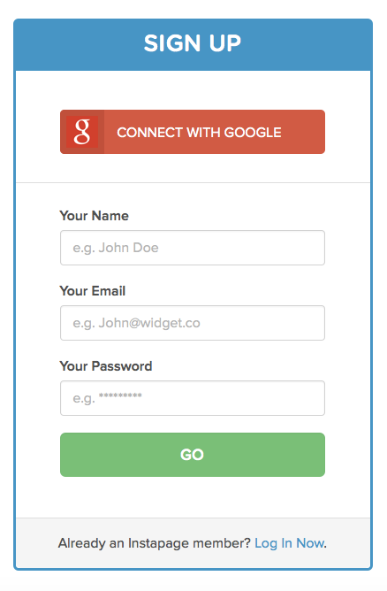
It wasn’t quite so simple for everyone, though: there’s an 8-character requirement for passwords that isn’t initially mentioned anywhere, and a few users had to go back and change it after getting rejected.
Lander‘s signup form is also simple, though with 2 more fields than Instapage. The way passwords are handled is unique and makes sense – as you type it in, the progress bar below the field reflects the strength of the password:

There are few strict requirements; if a password doesn’t contain diverse characters, the user can still continue, but with the warning that their password is “weak, but works.” Thus, it is up to the user to consciously decide how secure they want their password to be, and they can use their normal password if they prefer.
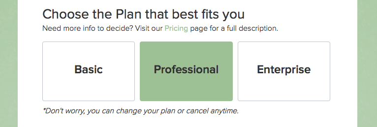
At the end of the form, Lander adds one more step that complicates the process – users must choose a plan type. No information is provided about any of them, so users who haven’t looked into the site’s plan options already have to either disrupt the flow to learn more, or just guess.
Instapage fumbles on the password requirements, but Lander makes signup a bit harder than it needs to be, bringing the matchup to a tie.
Task 3: Create a landing page
On this task, we asked users to take their time and build a landing page for a professional conference, complete with a customized title and body text, a signup form, and an image.
The two sites’ landing page builders are starkly different. In an echo of the previous task, Instapage‘s UI is pared-down and minimal, while Lander offers a much broader and more complex set of features. Both approaches have pros and con.
Instapage uses the whole window to display the landing page, with a toolbar along the top:

In addition, when the user clicks on an element on their landing page, more editing options will display just above or below it. Confusingly, however, the options in the top bar sometimes also change, offering different (or sometimes the same) options.
By fragmenting possible actions in this way, Instapage actually makes the experience more difficult for users – several times, people overlooked the options on the page while they searched the top bar for something. The pared-down number of editing options also caused some things to be harder to find. A number of users struggled to edit the text on their buttons, which was grouped under “Button style.”
Still, the overall experience was very positive for most users. “I really like how everything is draggable and droppable. It’s awesome. I’ve never seen a builder this easy.”
Lander, on the other hand, shows a multi-column editor to the right of the page with a large variety of tools and long lists of customizable features.
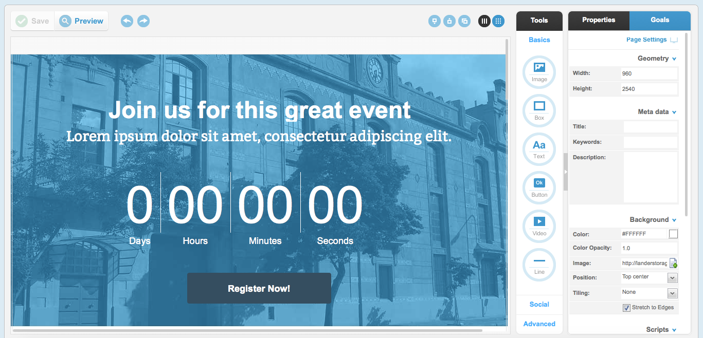
This style of builder offers a much deeper and more granular amount of control, though to an extent that may not be necessary for every user. While Instapage sometimes lost actions through its oversimplified bundling, Lander has the opposite problem: actions are sometimes lost in the expansive array of toolbars.
For example, a user trying to turn a rectangular button round glanced right over this feature among the long list of editable options for his button (it didn’t help that the field was simply titled “radius” – even calling it “corner radius,” as Instapage does, would make a big difference).
Both editors are nimble and powerful platforms, but Lander‘s learning curve is much steeper, and the UI can be dauntingly complex for new users. On the other hand, it offers a number of unique features that users appreciated, like a countdown timer and embedded maps. However, despite the greater variety of features and more impressive editing capabilities, this round goes to Instapage.
Task 4: View analytics for your page
After saving their page, we asked users to see how they would view analytics for their landing page.
Lander users were impressed with the amount of analytics they could access, in addition to options for creating confirmation pages, adding email followups, and the wide variety of integrations.
In this task as well, Instapage‘s offerings were not quite as deep, nor as complex, as Lander’s. However, all of the most important data was available and users liked the Google Analytics integration.
Lander wins this task with a more wide-reaching set of analytical tools.
Conclusion
The most clear difference between Lander and Instapage is the level of complexity which each website chooses to approach the task of building a landing page with. In every situation, Instapage has attempted to take the minimalist path, while Lander opts for depth and range over simplicity.
In the end, it is easier for the new user to build their landing page on Instapage. Though far from perfect, the platform is very intuitive and easy and fun to use. Its more basic offerings will be enough for many users who don’t need the level of granular control offered by Lander.
For the more experienced user who wants the high level of customizability Lander provides, the steeper learning curve may indeed be worth it. However,
the winner of this month’s UX War is…
Related Reading:
UX Wars January: Domino’s vs Pizza Hut
UX Wars February: Nike vs Reebok
UX Wars March: Student Universe vs STA Travel