This UX Wars edition is written by Margaret Bruetsch’16 and Christina Crasto’16 of Marist College, with edits and additions from Tim Rotolo, UX Architect at TryMyUI. Marist College is an Educational Partner with TryMyUI.
An increasing number of industries has seen a rise in companies offering subscription-style monthly packages, from shaving to fashion, cooking, gaming, and more.

NatureBox and Graze apply this model to snacking: both companies send subscribers an assorted box of health food-type goodies and snack mixes every month.
This monthly box model is a relatively new phenomenon; what does it look like for a website to successfully articulate the benefits and sell visitors on the concept? What would make customers pick one subscription over another, similar one? With a bit of usability testing, we decided to find out in this month’s UX Wars.
Task 1: Impression test
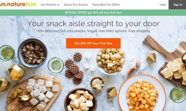
From the first 15 seconds of viewing, NatureBox users described the website as seemingly easy to use with “nice pictures.” Teresa from New York thought it wasn’t clear who the website’s target audience was, but she associated it with eco-friendly consumers.
Meanwhile, another user, Shannon, did not think that the pictures of popcorn and cookies looked healthy at all. All users reacted enthusiastically to the promotional 50% off the price of the first box, reducing the price from $19.95 to $9.97.
On the Graze website, several users said the company looked clean, casual, and fun. One person noted the website appeared very business-like, stating, “It seems corporate, but it seems personalized to each customer.” Another remembered the company’s slogan and said it seemed like they were trying to help the customer.
In addition, the users found that Graze looked modern and professional, and praised its use of images that really attracted the consumer’s eye.
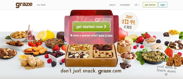
Both sites created a positive and fun first impression, but NatureBox isn’t quite as consistent in their visual/verbal messaging, causing some users to doubt whether it is what they’re looking for. Graze, on the other hand, much more clearly demonstrates their brand and product with well-chosen visuals, and so takes the lead at the end of the impression test.
Task 2: Find a box size you would like to order
On its homepage, NatureBox gives users a step-by-step list of instructions for ordering their first box, making it very easy for new users to navigate the website. As one user stated, “It has all the steps and it looks really easy.” Without even having to scroll down the page, the users were able to see the options for box types, order frequency, and prices.
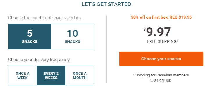
While the NatureBox users experienced no difficulties finding the different box sizes, users on Graze found this information difficult to access and were even unsure of whether or not they had completed the task.
Two users clicked on Graze’s “Get Started Now” button to try to find the information, but only one noticed that the first box size was an 8-snack variety box. “I guess the only size box is one size, and it has eight,” he said.
Another user immediately left the page because she didn’t want to put in her personal information and credit card number to start an account. Continuing further down the homepage, the the only other obvious link was another “Get started” button that went to the same page, next to a slideshow of featured snacks. After exploring the site, she returned to this page but still wasn’t sure if Graze offered different types of snack boxes.
A third user explored the site and ended up going all the way to the “About” tab, expecting to find the information under “Our Packaging” but instead only finding information about Graze’s recyclable boxes. That information was great, she commented, but it wasn’t really helping her find what she needed to know.

Finally, she followed a “How It Works” link at the bottom of the website and found the mailing dimensions, but was so confused by the layout of the page that she missed the details about the 3 different box sizes until later on in the test.
Based on users’ comments and the amount of time it took them to complete this task on each site, NatureBox was the clear winner of this task. While NatureBox users merely scrolled down the page to order, Graze users faced difficulty finding a step-by-step explanation and were left confused and short on confidence by the end of the task.
Task 3: Select a few types of foods you would like to receive in your box
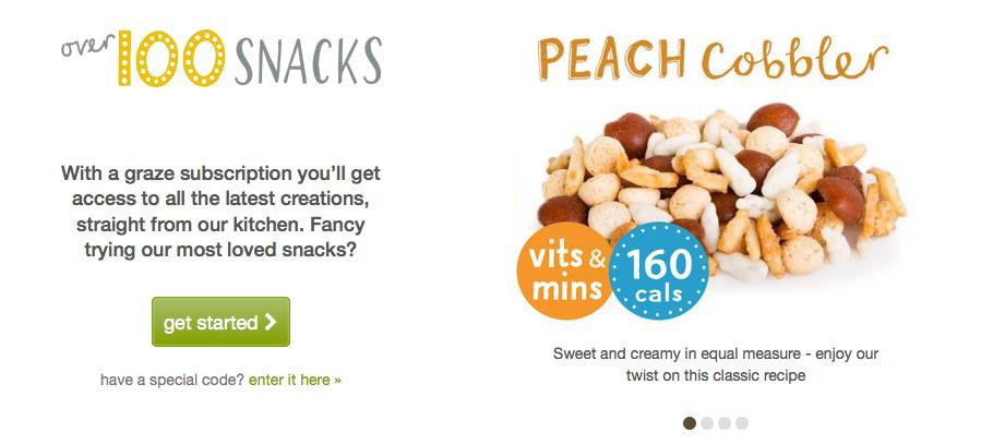
While all of the Graze users were able to view at least a few of the different types of food offered via the home page carousel, they couldn’t figure out how to select specific foods for their box without having to sign up for the service first. As user Ryan commented about the “Get Started” button, “It just brought me to the page for paying for one, but it never gave me the chance to see what options they had.”
Meanwhile, NatureBox users easily found out how to select snacks from the website’s checklist of every snack offered. After understanding that the term “pantry” meant cart, the users began to scroll through the different options, several of them losing track of how many snacks they had already selected within one minute. Shannon also mentioned that because the pictures were not to scale, it was difficult to tell the difference between the miniature and regular sized snacks.
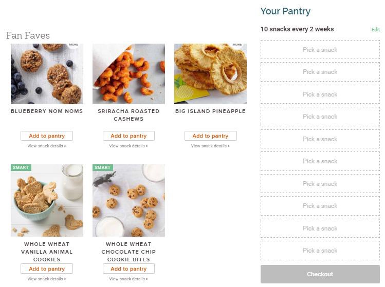
While Graze users Siobhan and Ryan relied on the slideshow to view the snacks, Leeann found the full list of foods using the “Our Food” tab which allowed her to scroll through, but not select, the snacks. She said the website blended the snack images and information in just the right way to give her the information she’d need to make a purchase.

However, she was the only user to actually navigate to the Our Food tab; other users never noticed it as it only appears at the top of the website alongside the “About” and “Wholesale” tabs, not really integrated into the information flow of the website.
Although the NatureBox users had difficulties keeping track of which snacks they had already selected, they all completed the task, whereas only one of the Graze users completed it. This was because Graze does not allow users to start selecting snacks without making an account, which turned away the users who didn’t realize there was another page to view all of the snacks.
Thanks to Graze’s higher barriers and poorly integrated information architecture, NatureBox wins this task.
Task 4: Find the shipping cost
Neither website has an easy procedure for finding the shipping cost. On each site, only one user was able to successfully complete this task.
Because of the lack of navigational guidance, Graze user Ryan visited both the “About Us” section and the “Our Packaging” and “Our Food” tabs, before returning to the payment page and assuming that shipping was included in the box’s cost. He commented that this was the worst part of his experience because he did not want to enter his credit card information to see shipping costs or food options.
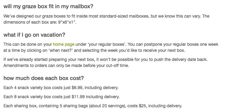
Several users found the shipping information on the “How it Works” page, which lists box prices “including delivery”; however, some were unsure if that really meant shipping didn’t cost anything extra. “There was nothing for the shipping, so it was included. I think,” Leeann said. “It was actually pretty easy… once I knew where to look.” Meanwhile, Siobhan felt that the website’s wording made it seem like shipping costs would vary depending on location.
NatureBox users became annoyed when the payment information immediately popped up on the screen when they tried to find the cost of shipping. Katie from Connecticut typed in fake credit card information to bypass the screen, while both Shannon and Teresa recalled that the homepage included a shipping price only for Canada, and that the first box for anywhere in the United States was free.
After Teresa checked the FAQs, she was unable to find out if shipping was normally free. Shannon simply concluded that the shipping cost must be included in the box price.
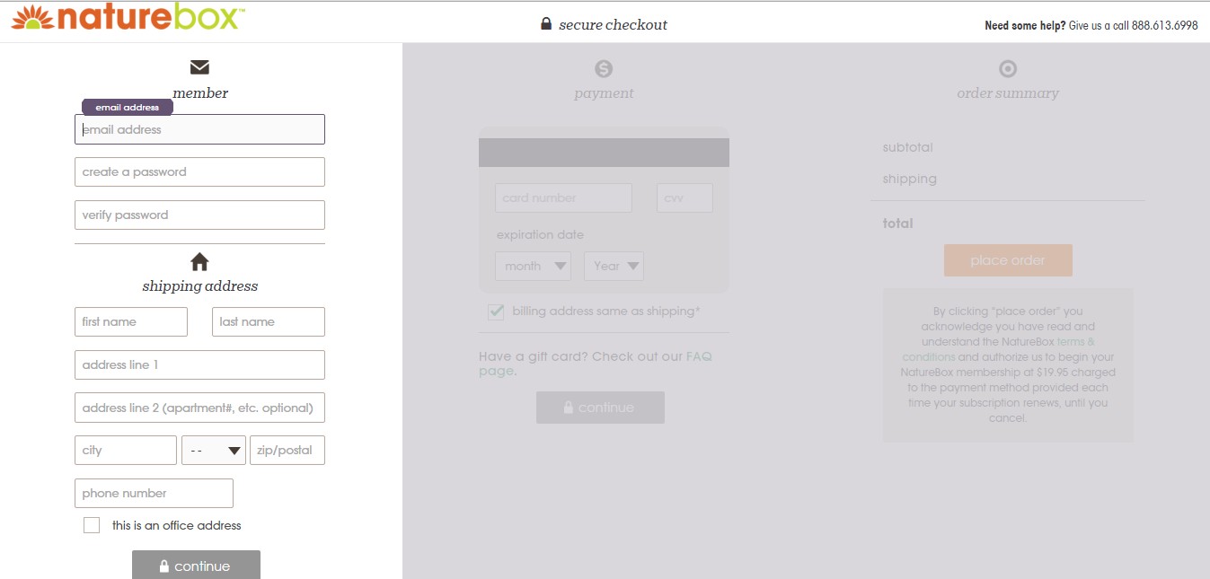
All users recommended that the two websites should simply advertise on their homepages that the box total includes shipping in a straightforward way. Despite both websites’ lack of readily available answers, decreasing efficiency, a greater proportion of NatureBox users were able to complete the final task than Graze users. By not putting this potentially decision-changing information up front, both Nature Box and Graze risk losing customer interest. The winner of Task 4 is (narrowly) NatureBox.
Conclusion
Graze and NatureBox both impressed users as healthy, fun, and creative companies that offered food products they were genuinely interested in buying. Users of both websites struggled to find certain information like shipping costs which were pertinent to deciding whether or not to order a box – especially since users felt they were asked to make an account sooner than anticipated.
Asking for a username, password, and credit card information occurred much sooner on Graze, which negatively impacted several users’ experience. In addition, the poor placement of the “How It Works” and “Our Food” links, which provided answers to many user questions, hurt the site’s chances of converting new visitors by dispersing important information.
The usability success of the NatureBox website was confirmed by user testing metrics, including both quantitative and qualitative data like task completion rates, task duration times, and psychometric ratings, as well as verbal and written feedback from the users. All in all, NatureBox prevailed in all of the core tasks, with higher completion rates and faster times. Therefore,
the winner of this month’s UX War is…
Related Reading:
UX Wars February: Nike vs Reebok
UX Wars March: Student Universe vs STA Travel
UX Wars April: Lander vs Instapage
Special Episode:


