Apple and Microsoft: the ultimate rivals. These two tech giants have loyal fans and staunch detractors, which is why we were curious to do some usability testing of their online stores and see which company has crafted a more user-friendly experience.
Scenario: You work for a company that has traditionally used (Microsoft/Apple) products, and your boss has tasked you with buying a laptop for a new hire. She explains to you that you must select a laptop that is under $1,500, has a screen of at least 13”, and has 512 GB of storage.
Microsoft and Apple are major competitors in the computer industry, and many companies exclusively use Microsoft computers and products while others only buy Apple. In most cases, when someone is purchasing a computer they have limitations based either on a price they cannot exceed, or minimum specifications necessary for work, school, or another intended use. This scenario and the following tasks were designed for users to move through the steps of finding and buying a new laptop on these sites in a real-life context.
To garner complete and objective results, we had equal numbers of Windows laptop users and Apple laptop users participate in each test. We also designed the study in this way to learn if Microsoft and Apple designed their websites similarly to their computer interfaces, so we could identify if one user group found it easier to use the interface compared to the other.
Task 1: 15-second impression test
We began each test by having participants browse the site for 15 seconds and then asking them a few questions about their initial impressions.
The Microsoft users that took the Microsoft test quickly noticed the advertisement for the new Surface Book Pro and that the site had a lot of “advertising and marketing their products”. Several also explained that the site “feels professionally done”. The Apple users that took the Microsoft test noticed the wide range of products offered and also noted that the site had a professional feel.
On the Apple website, the Apple users that took the test observed that the site was “quick paced and changing which caused products to pop out at you.” They saw numerous different products in the brief 15 seconds on the site and felt the overall feeling was “more fun than professional.” The Microsoft users noticed the site was colorful and fun to look at and got a feeling of the Apple brand. One of the Microsoft users explained that “their products and services are directed towards everyone who wants to use easy phone services, computer applications, etc.”
Task 2: Browse and evaluate laptops
In the second task, participants were asked to browse through the available laptops in their respective website given the specifications in the scenario.
The Microsoft users on the Microsoft site used the filters on the laptops page to gather more tailored results based on their specific needs. In some cases, however, it was difficult for the users to go through each of the specifications after the filters were applied. In other instances, the filters were used after a few specific laptops were chosen; these users essentially filtered on their own initially.
One of the Apple users that participated in this test did not use the filters at all, instead browsing through the available laptops and looking at each of their specifications individually. However, another Apple user did use the filters to find suitable laptops, but in one instance the filters yielded no laptops, resulting in mild confusion. Overall, each participant completed the task without much difficulty because of the ease of backtracking. This task took the shortest amount of time and had the highest usability rating of all of the tasks in this test.
For the Microsoft users participating in the Apple test, this task was difficult to complete. One participant said “I would have liked to be able to put in my specifications and have Apple provide me with options that fit it.” The Microsoft users found it difficult to compare laptops, and ended up with many clicks and circuitous navigation techniques to find an applicable laptop. It also took them longer to figure out that once a laptop is selected, specifications of that laptop are customizable.
Apple users also found it difficult to compare and browse laptops with the desired specifications, and the amount of options often confused the participants, especially ones with less background knowledge about computers. One participant found it frustrating that the user is unable to select one laptop from the compare screen. The usability rating for this task was consistent with other tasks in this test, but with a longer duration. Notably, when prompted to explain what helped or confused them in this task, none of these participants said anything about what helped them, only what confused them.
Task 3: Select a laptop and add to “cart” (Microsoft) / “bag” (Apple)
In the third task, we asked participants to select and add to “cart” or “bag” (depending on the test) the laptop that fit the requirements. Both interfaces seemed to have straightforward and adequate features for users to add a product to their cart/bag.
On the Microsoft site, after participants found a laptop that met all of the specifications they were prompted to add the laptop to their cart. The Microsoft and Apple users all found this task to be a simple one. This was the task that was completed the quickest out of all tasks.
One Apple user for the Apple test specifically commented, “It was easy to add an item to the cart.” However, Microsoft users found it difficult to select a laptop, add specific features, and then add it to their cart. Aside from adding specific features, participants did not have difficulty adding the laptop to their cart.
Task 4: Your boss walks in and tells you to change your selection to a laptop with 1000 GB / 1 TB of storage
In the fourth task, we asked participants to change their selection to determine if the interface incorporated effective backtracking features. The browsing and comparing experience is analyzed in task 2, and can be applied to this task when users are prompted to browse for a different laptop based on the new specifications.
On the Microsoft site, the Microsoft users found this task to be standard and easy. However, when one was about to begin his checkout process, he realized that the laptop in his cart was his previously selected laptop (before the change in specifications). This suggests that some participants may find it difficult to track their changes in selections and what they have added or removed from their cart. In addition, one Apple user felt it was difficult to figure out how to continue shopping after his first item was removed from the cart. However, multiple participants specifically mentioned the “remove item” link featured in the cart, making it easy to backtrack and correct potential mistakes.
On the Apple store, both Microsoft and Apple users initially described browsing through the laptops as difficult. However, Apple users found that navigating from the bag to the laptop library was easier to do in order to make the correct changes, whereas Microsoft users found navigating through the website (from the bag to the laptop library) a bit more troublesome. This is because these participants made more clicks and frequent mistakes. None of the participants had difficulty removing the previously selected items from their bag in this test.
Task 5: Proceed with checkout (use provided information)
In the last task, we asked participants to continue with their final selection after the laptop change, to understand if there was a seamless transition from shopper to buyer in their user experience.
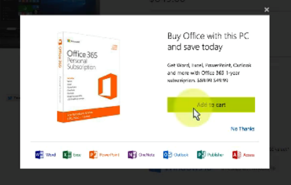
 For the most part, the checkout process for the Microsoft store was “smooth and easy to figure out.” One Microsoft user noted he was confused when the wrong computer was in his cart, which may speak to the selection of a laptop. In addition, one Apple user explained “the pop-up window for the software was a little confusing, as I simply clicked ‘x’ and the laptop was then not added to my cart.” Additional sells may cause the checkout process to confuse or distract the buyer, and may disrupt the linearity of the experience.
On the Apple site one Apple user noted, “I found the checkout process fairly simple and straightforward as long as I was clear with which model I wanted.” This shows that as long as the user is confident with their selection (which, however, was not typical on this interface for the majority of testers), then the checkout process was seamless. All participants explained the checkout process as either standard or straightforward.
Conclusion
The common trend observed in these user tests was that the Microsoft website is the easiest to use in terms of functionality, while the Apple site has more aesthetic appeal to users. Everyone who was using the Microsoft site to compare products and make a selection did it with few to no issues, and were more confident in their purchase decisions than participants testing the Apple site.
The Apple site was typically seen as a site that sold easy-to-use products during the impression test. Because users had this impression, yet frequently had issues with the Apple site, it could deter potential customers who don’t use Apple products.
The Microsoft site was easy to use for people familiar with any operating system, which resulted in more confident purchase decisions and an increased likelihood of using the site again. The Apple site was enjoyable to use and, as indicated by the company’s success, clearly has a consumer base that has gotten past the learning curve associated with the site, likely through their own use of Apple products. If the Apple online store incorporated some of the features of the Microsoft site, for example the filtering of products by specifications, it would likely create an opportunity for more non-Apple users to become Apple users.
Because of this,
this month’s UX Wars winner is…
Michael Garland is a 2015 graduate of Elon University with a B.A. in Strategic Communications and a minor in Exercise Science. He is currently pursuing an M.A. in Interactive Media at Elon. As an undergraduate, he was a member of the American Advertising Federation, as well as the Elon Transfer Student Organization. In the iMedia program, Mike is working on strengthening his development, UX, and design skills.
Tyler Parrott graduated from Elon University in 2015 with a major in Strategic Communications and a minor in Philosophy. Currently, Tyler is enrolled in the iMedia program with a passion for photography, videography and social change.
Related Reading:
UX Wars February: OkCupid vs Match.com
UX Wars May: Expedia vs Priceline
UX Wars September: DraftKings vs FanDuel


