8 months ago, I embarked on a project that would leverage technology to solve a pressing real-life problem. My mission was to create a mobile application to serve teachers and special needs students in the classroom by connecting them through an online community.
Specifically, I hoped to help teachers learn to recognize and detect the signs of dyslexia in students, and to provide those students a personalized training program to practice phonemic awareness that can be integrated into the teacher’s curriculum. This all-in-one app would help both parties and bring students and educators closer together.
I started defining the challenge ahead by observing, interviewing, and clustering insights. But as I tried to make sense of all the data I collected, it occurred to me that this venture, and its potential impact, was much bigger than I had initially thought.
I knew that to stay on target, I would need to focus stringently on the end users – teachers and dyslexic students – with an empathetic, user-centric design strategy.
The Discovery Stage
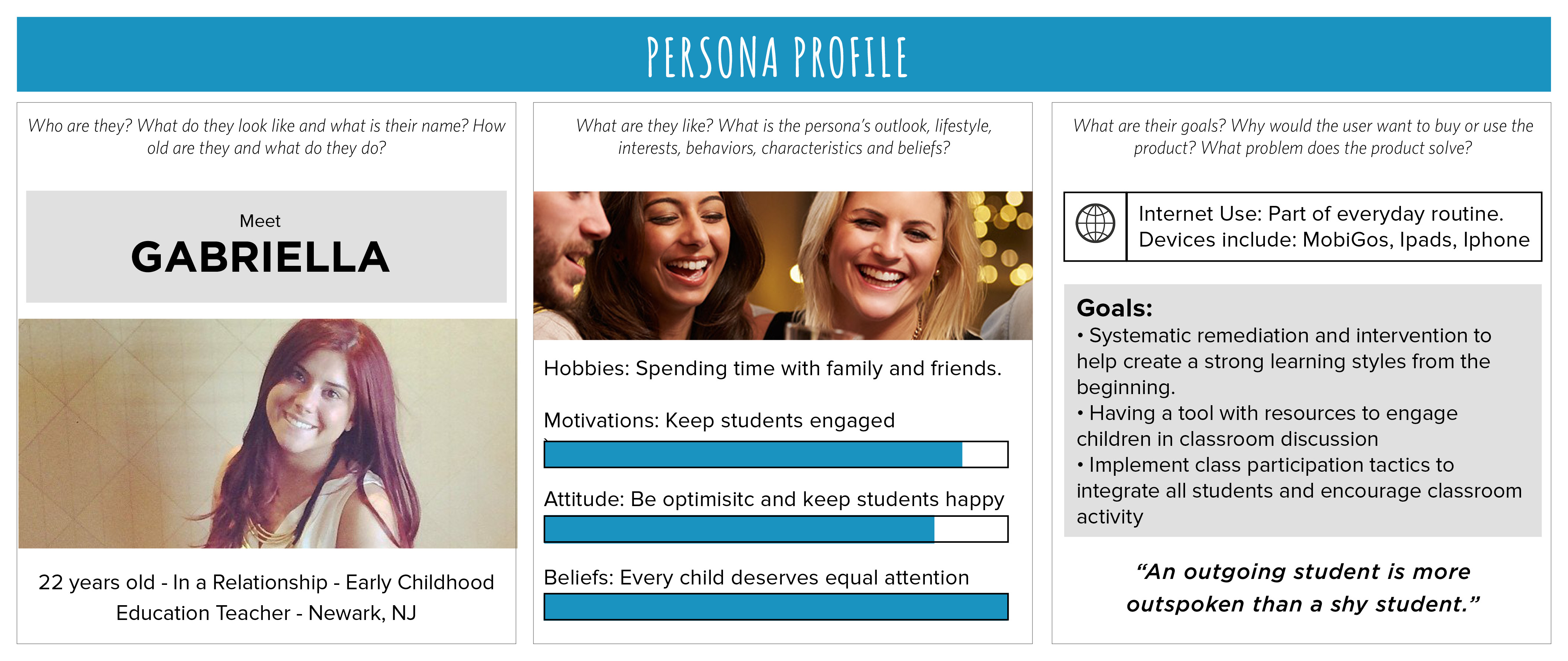
My own interest in dyslexia was sparked in conversation with my college roommate Gabriella Oliveira, an Early Childhood Education major. During a teaching internship, Gabriella had expressed frustration with one of her students who continuously refused to participate in reading or spelling activities.
She was particularly confused because this student’s consistent under-achievement appeared to be due to simple carelessness or lack of effort.
I was perplexed by Gabriella’s story, and a web search led me to the topic of dyslexia. Looking at descriptions of the symptoms, I concluded (and Gabriella later agreed) that her student may indeed have suffered from dyslexia.
This was when I realized I had stumbled upon a problem that needed solving. I began to do some more research about dyslexia, and was stunned to learn that the condition affects 20% of the population! Compared to the general public, people with learning disorders (including dyslexia) have lower high school graduation rates, lower college attendance rates, and higher rates of unemployment.
The most critical takeaway from my research was that Early Education majors don’t get the training they need to cater to special needs students. This was the actionable insight that kicked off my project.
Read more:
Creating UX journeys
Armed with the insights I needed, narratives for defining the UX were next. I developed user personas for the teachers, including persona characteristics, behaviors, hobbies, and common tasks.

The narrative focused on the day-to-day tasks of teachers using the app, beginning with time spent prior to their arrival at work. Moving through that arrival and into their experience on the job, I explored the ways they planned, monitored, and executed tasks throughout the day.

Persona stories aided in the user journey mapping for this group.
Designing for the students, on the other hand, posed a more unique challenge. It required empathy, understanding, and commitment to making design decisions that went against the norm.
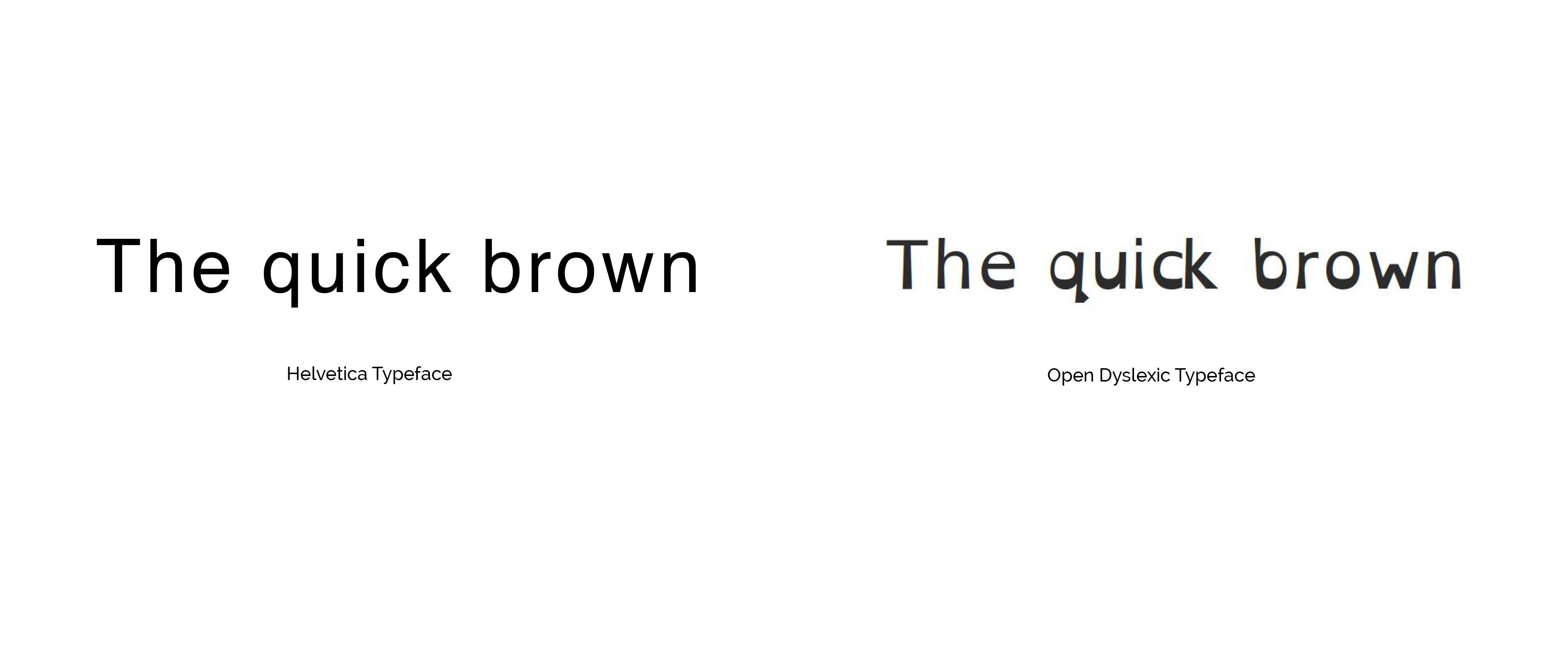
I posted questions in online forums for dyslexic adults to learn about their education struggles, using their feedback to create storyboards and user journey maps for the app. Usability testing with dyslexic users helped me craft a more usable experience: I learned to implement larger text with increased kerning, and found dyslexic-friendly fonts (below). Low color contrast between the text and background also fostered better readability for dyslexic users.

Fonts with distorted shapes and strokes help dyslexics distinguish letters.
I then synthesized the information to begin identifying the broader user flows and information architecture that would provide for the users’ needs. I also thought about key features for the app. After spending time in the creation stage, the project finally had the fully-fleshed out framework I needed to design the prototype.
I was satisfied with where the project was headed, because translating user needs into meaningful design had stroked the empathetic chord I was looking for.
The intersection of challenge and ability
As the project reached its final stages, it was time to stylize the mock-ups. I went back to the user stories to draw inspiration from the motivations, actions, and other morsels of information from those stories. At the core of the design, I felt that the app was about encouraging a state of mindfulness, getting users fully immersed and absorbed in activity, leaving them happiest in their “flow.” Finding flow in positive psychology means to be “in the zone.”
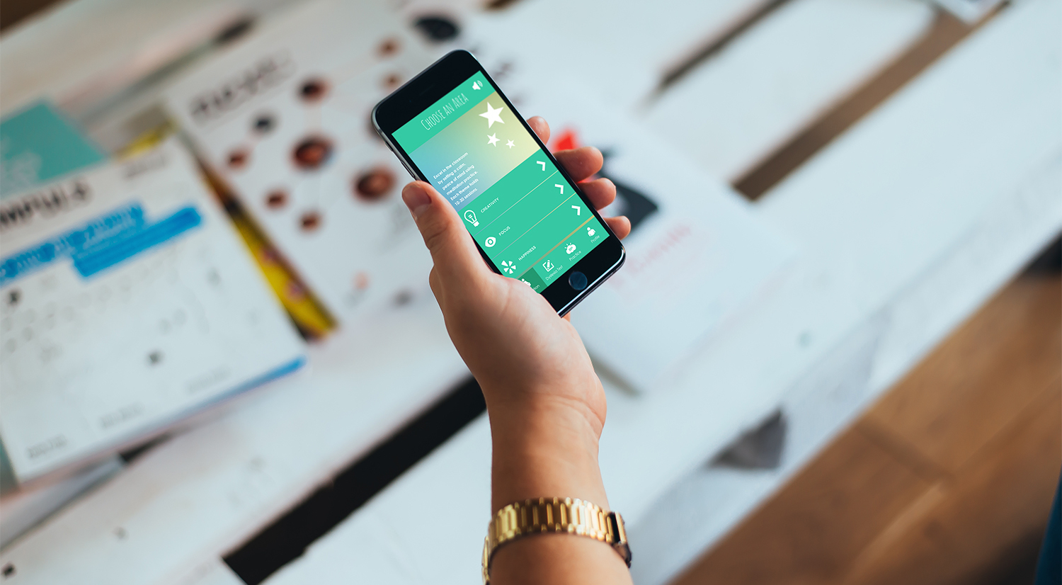
I was getting close to achieving the project’s ultimate mission. During production I checked back with my objectives: developing sensitivity to designing for dyslexic users, utilizing mobile platforms as a mode for immersive functionality, and enabling engagement between two user groups all tied into the prototype I had made. Finally, I published it live on Marvel as an interactive prototype.
Conclusion
While there is no cure for dyslexia, one thing is for sure—there is a need to address it. As Steve Jobs famously asserted, “true innovation comes from recognizing an unmet need and designing a creative way to fill it.”
Without humanistically understanding who the users are, the outcome will not resonate positively with people.
To ensure that an application has good experiential design, we must start by clearly defining the target demographic, recognizing their needs and interests, and even immersing ourselves in the user’s world to understand what they do, and why they do it. With this understanding, it becomes possible to empathize, innovate, and create something that enables a deep connection with the end users.
We also recommend you read:


