As a team of UXers, we really appreciate when an app creates an experience that pulls us in and makes us want to engage. We notice the simple things. The seamless designs. The satisfaction of checking in on an updated progress bar, or leveling up and unlocking new features.
Often we have found ourselves geeking out about the small, but addicting, delights of apps that use gamification strategies in unexpected and new ways.
So, we took it upon ourselves as UX designers and researchers—and moreso, as users—to pick out our favorite gamified apps and what we love about them.
From leveling up your money-saving to maintaining your language-learning streak, these apps turn tasks that are very much not games into a fun, engaging, and motivating experience.
Read more: The UX of Facebook Messenger’s addictive basketball game
Stash
by Nairne Farner, TryMyUI Enterprise Usability Consultant
I chose Stash as my favorite gamified app experience. This cleverly designed app gamifies the investing process: the more money I invest, the more points I earn, resulting in me moving up in levels (as well as responsibly preparing for retirement).
I really like Stash’s color scheme and style, it gives the app a game-like feel. Its charts and graphs show my current portfolio in way that makes it very simple and easy for me to understand at a glance.
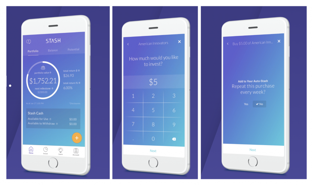
While the interface is cool and easy to navigate, it also is addicting. I can see how much I’ve invested instantly, and I find myself checking the portfolio page again and again.
The unfulfilled progress bar immediately creates a stickiness. I am intrigued to keep looking, and probably will continue checking until I reach 100% of the goals I set.
If you want to dig deep, the app also helps simplify future planning of your investments. Its graphs show the potential of your budget based off of how much money I decide I want to save every week, with the chart’s projection increasing by a percentage gain that I select.
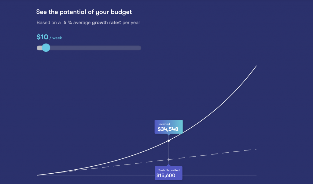
By applying these game-like features to investing, Stash keeps me hooked and motivates me to engage and actively monitor my investments. I’m sure that a lot of other users are similarly hooked.
Learn more:
Duolingo
by Tim Rotolo, TryMyUI Co-Founder & VP Product
My favorite example of gamification in mobile app UX is Duolingo. Duolingo of course is well-known for this, and for providing a great UX overall. Essentially they’ve gamified the language-learning process to make it more fun and to make it stick.
Learning a language is hard work and it’s a lot of study, so it makes sense to use gamification to turn it into something that doesn’t feel so much like work.
Vocab is broken down into topics with stages and levels, and as you master the topics one by one you pass checkpoints that unlock new vocab skills for you to try.
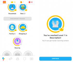
One of their smartest UX moves is the “streak”: the number of consecutive days you’ve hit your learning goal. Duolingo users really care about their streaks! To be honest, I’m not always great about it myself, but for example my mom religiously does her Italian lessons every day to maintain her streak. Duolingo is one of the only apps she uses since she got her first smartphone!

You also earn in-app currency called “lingots” as you advance through levels. This is actually one of the weaker areas of their gamification strategy, because there’s not that much you can do with the lingots. Some people use them to buy streak savers. I just buy new outfits for the owl mascot.
One of the big keys to learning a new language is sticking with it, and Duolingo’s UX really helps me to do that. It’s low-barrier, it’s fun, and there’s so much in the app that motivates me to come back for the daily practice.
They’ve really shown what a mobile app experience can be with gamification, and how that can turn into success for the company and for their users.
Read more:
How to train your team about usability testing: tips and tricks
Credit Karma
by Katie Mykleseth, TryMyUI Writer
I chose Credit Karma as my favorite gamified app. I check this app more often than I’d like to admit. With its different gamification features, Credit Karma helps track your credit score, manage your different credit cards, credit inquiries, and other aspects that impact your credit rating.
I think the visual design makes an otherwise overwhelming topic very easy to understand at a glance—it looks like a game, and the inherent point system of a credit rating makes it feel like one!
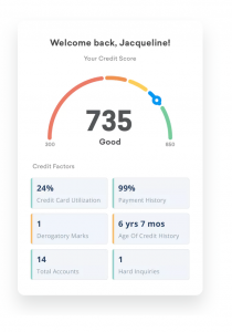
Immediately when opening the home screen, Credit Karma provides two different scores from two major credit scoring agencies for me to compare. My points (or ratings) are the first thing I’m hit with.
In addition to the general score, within each of the different ratings the app simplifies my credit factors to badges—from hard inquiries; total accounts; age of credit history, and more—similar to how a game would breakdown various levels. The display shows the metrics of each credit factor. By clicking on these badges, I get a deeper glimpse into how this information has affected my overall score.
Through another feature provided by Credit Karma, I can check my score history, track how my score has performed over time, and get a brief understanding of my credit trajectory at a glance.
The app also provides the possibility to see different scenarios of how opening a new credit card, taking out a loan, or paying down a previous balance will affect my score.
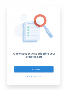
Credit Karma’s use of colors to show the status of something also make it look and feel like a game. Associating colors with each of its badges, Credit Karma simply shows whether various factors had a positive (green), neutral (yellow) or negative (orange) affect on my credit rating.
With these gamification features, colors, and visuals, Credit Karma effectively uses gamification features to make it enjoyable (and easier on the eyes) to keep tabs on my financial standing.
Read more: The UX strategy of Pokemon Go
Conclusion
All 3 of these apps put gamification strategies to use in effective ways. Tasks that might be boring, difficult, or overwhelming instead become fun (even addictive) experiences almost entirely due to gamified UX design.
Most games have winners and losers, but when well-done, this strategy makes winners of everyone. Users are motivated to stick to their goal, like boosting their credit rating, or learning a language. And the apps see higher engagement and happier, loyal users.


