Lace up! Running is a great way to stay in shape, and at America’s colleges and universities, it’s not uncommon to see students taking advantage of spacious and beautiful campuses to go for a run.
This usability testing study challenged female students to buy custom running gear from one of two footwear competitors: Nike, or Reebok. Which site provides a better user experience for this flow?
Scenario: You are a freshman at college and want to stay in shape by running around campus. You want a stylish shoe that will provide you with support and comfort during your runs.
Tasks:
1. Find a pair of running shoes to customize
2. Customize your shoes by putting your name on the sole.
3. Find shipping price.
Task 1: Find a pair of running shoes to customize
Navigational simplicity
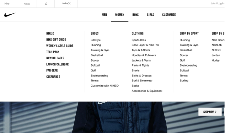
As users began their search for a shoe to customize, both the Nike and Reebok websites were organized and clear. Most users’ first instinct was to navigate towards the “Women” tab, which was located near the center of the top bar on both sites.
A strength of both sites is that “Design Your Own” (Reebok) or “Customize” (Nike) is an option both on the top bar and also under the “Women” tab, in case users hover there instead – as most of them did. Once users hovered on “Women,” most noticed Reebok’s “Design Your Own” or Nike’s “Customize with NikeID.”
One user, Caroline, faced a series of issues when searching for a customizable shoe on Nike. She clicked on the “Customize” option on the top bar; however, each shoe that she subsequently chose was deemed “unavailable” by the site. She clicked around to find different shoes only to be blocked by messages including “Product unavailable,” “Time out – Site down,” and “We can’t find the page you are looking for.” These errors ultimately caused Caroline to give up on finding a shoe.
Mariel and Steph faced some obstacles when searching for customizable shoes on Reebok. Mariel easily navigated the site to find a shoe that she liked; however, she soon realized that the shoe she chose could not be personalized with her name on the sole. She was forced to click through two more additional shoes until she found what she wanted.
On the other hand, Steph decided to use the search function to find her shoes. When she searched for “customize,” she was presented with a page that was unclear to her. She claimed it was “not effective” because she was still unsure which shoes she could customize. Eventually, she found the “Design Your Own” tab and completed the task.
Task 2: Customize your shoes by putting your name on the sole.
Customization confusion
Nike and Reebok were both considered aesthetically pleasing and visually well-designed, but in terms of usability, the two sites fell short for nearly all users during this task. While both sites had many options for users to create the shoe they desired, it was difficult for them to access everything the sites provided.
As users attempted to add their name to the sole of a customizable shoe, the common word they used for both websites was “confusing.” Many of the users had to forfeit the shoe they initially chose and select another in order to put their name on the sole, despite the shoe being labeled as “customizable.”
The problem seemed to be that it is unclear what part of the shoe can be customized. Mariel stated about Reebok, “I think that the overall layout should specify whether or not you can customize with your name, since that is a big part of it as far as friends I have who want personalized shoes.”
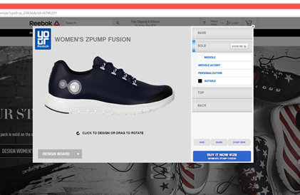
After finding a shoe on Reebok that could be personalized with the user’s name, the default color of the text presented a challenge. The text color was the same as the color of the sole in most cases; therefore, when a user entered her name to be applied to the shoe, she could not see it displayed on the sole. The user believed she had completed the task but could not see her customization.
Despite this confusion, Reebok was commended by Liliya for its presentation. She said, “It shows the exact picture from different angles, and I could change every little detail.” Clear headings also made it easy for users to find the section for customizing the sole, as shown below.
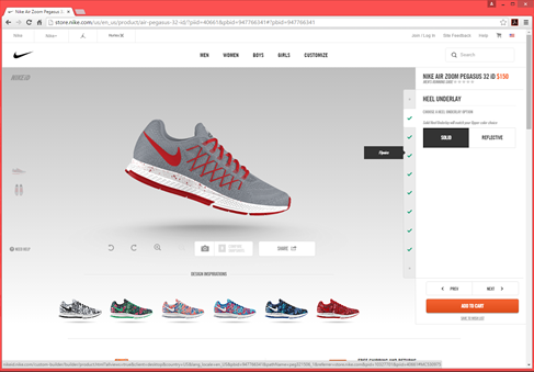
For the Nike users, each person had a problem figuring out how to customize the sole of their shoes, calling the customization tool “confusing,” “difficult to understand,” and “not intuitive.” This caused many to become frustrated, and in two instances users gave up on the task completely after attempting to customize for several minutes.
Steph felt overwhelmed by all of the customizable options. First she had to complete her “NikeID” by ticking off a list of green checkmarks. She did not understand all of the “shoe terms” on the site, which presented problems when she tried to customize the shoe – jargon such as “heel underlay” and “flywire” were unfamiliar and made the process harder to comprehend. In the end she could not even find the option that would allow her to add her name to the sole, and as a result did not complete the task.
While both sites caused confusion for a majority of the users, the Reebok users were eventually able to successfully work through the usability issues. In comparison, some of the Nike users were too perplexed by the complicated design, and Nike lost their business. While both sites have a lot to offer in the customization realm, Reebok presented these options with more clarity than Nike.
Reebok beats out Nike on this task, but more by default than by the effectiveness of its own design.
Task 3: Find the shipping price
Mostly Intuitive
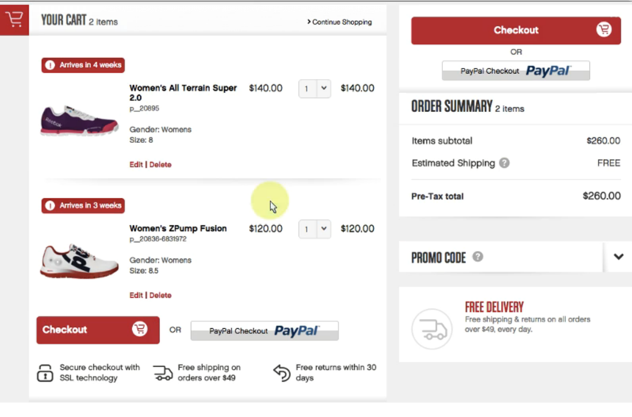
On both Nike and Reebok, the shipping price was not explicitly stated until the product was added to the cart. However, most users found the shipping price with relative ease, as they already knew they needed to add the product to their cart before seeing how much shipping costs. Reebok had a message advertising free shipping on their homepage, which was helpful to one of the users who did not go to the checkout screen first.
Caroline and Mariel both described this task as “easy” on the Nike and Reebok sites, respectively. They both found the shipping price on their checkout screens.
When Steph added her customized shoes to her cart on the Nike site, she found out shipping is free and the product would arrive in 17-22 days. She made a comment about the shipping time being “too long,” but did not try to look for faster shipping prices. Steph also said that going to the checkout screen was an extra step that dissuaded her from assigning a task usability rating of 7 (Very easy). So, although she knew how to find the price, she had to go to another screen to find it and that required some effort.
The process of customizing a shoe rather than simply choosing a pair to purchase made it more difficult to find the shipping price. On the Reebok site, Liliya attempted to “save” her shoe, which led her to a login screen. She thought she needed to register in order to find the shipping price, so she went back to the home screen; there, at the top of the page, she saw “free shipping on orders over $49” and concluded that her shipping would be free, since her order was $110.
In general, the Reebok site seems to do a better job of making the shipping price visible on their website. On both sites, users knew they had to add the shoes to their cart to see it, but still thought this extra step was unnecessary, and the shipping price could be more quickly accessible. But overall, this task was considered fairly intuitive and easy by most users.
Conclusion
Both the Reebok and Nike sites were described as aesthetically well-designed and mostly easy to navigate. However, the biggest problem that both Nike and Reebok users faced in this test was the customization step.
The process of customizing your shoes by adding a personalized message was confusing and difficult for the users. From choosing a shoe that can be customized to actually adding the desired customization, the process involved many complicated steps and even required knowledge of shoe jargon. In the end, it was Reebok that achieved more clarity in their design. Some Nike users became so frustrated that they gave up entirely.
All of this leads us to pronounce that
this month’s UX Wars winner is…
Read:
UX Wars January: Domino’s vs Pizza Hut
UX Wars February: OkCupid vs Match.com
UX Wars August: Yelp vs Zomato


