2016 has seen UX grow and mature as companies have increasingly recognized the importance of a good user experience. Boundaries were pushed; ideas floated; chasms crossed; and challenges laid bare.
Among all this rapid change and growth, we are glad to have been a part of some of these conversations through this blog. The topics that surfaced on our blog in 2016 covered a diverse range that included AR/VR, mobile gaming, big data, abstract ideas about creativity and the psychology of usability, and lots of how-tos for improving user testing methods.
Below are the 10 most widely-read articles featured on our blog this past year.
1.
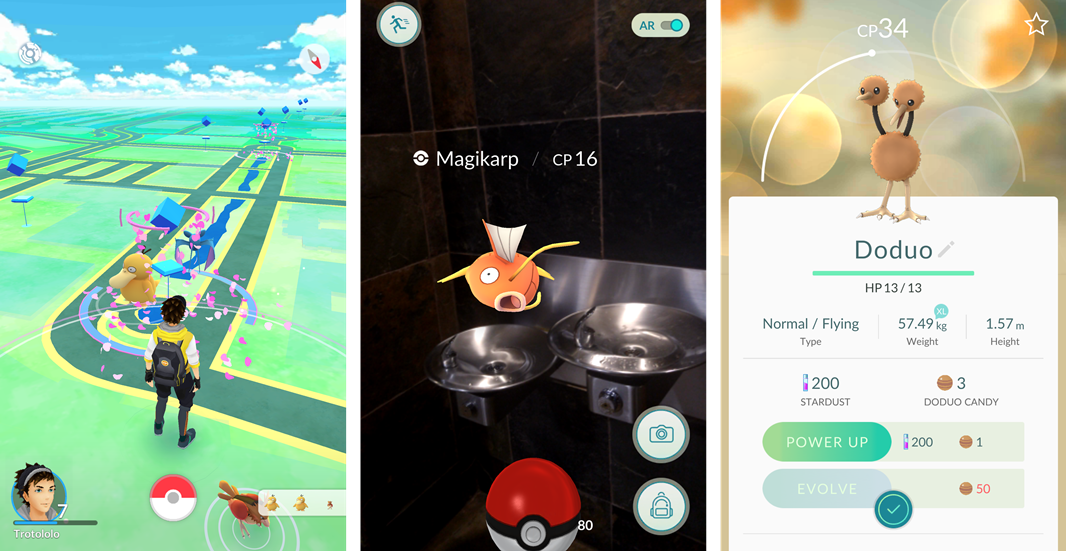
The UX of Pokemon Go

This summer saw the spectacular rise of the Pokemon Go augmented reality game. When the fervor was at its peak, you could go outside and anybody walking with their phone out was likely to be playing Pokemon (at least in the San Francisco bay area)! In this piece we took a look at what elements of the game’s UX made it such an explosive success.
2.
Domino’s vs Pizza Hut: UX Wars
Part of our series of UX Wars articles, January’s clash between these two pizza titans was a popular read. Highlights included one of our favorite user quotes of the year: “I don’t like the way it followed you – the picture of the pizza.” Spooky!
3.
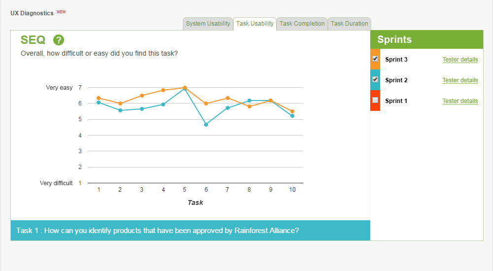
UX Sprint: Iterative usability testing to sculpt the perfect UX

We believe strongly that user testing should be a regular, recurring part of the design process. In February, we wrote this guide to using our new benchmarking tool (UX Sprint) to compare results over serial rounds of user testing. Based on how widely this article was shared, it seems a lot of people recognize the importance of iterative testing for creating user-friendly products. Great news!
4.
Prototype testing with InVision & TryMyUI
More encouraging news for UX: lots of companies are testing their prototypes before building them, too. To help out these conscientious researchers, we wrote this quick step-by-step guide for using InVision and TryMyUI together.
In addition to functional, how-to advice (“use this link,” “press this button”), the article also gives tips on how to write good tasks for testing your prototype.
5.
Nike vs Reebok: UX Wars
Our second-most popular UX Wars of the year featured guest writing by students from Marist College, one of TryMyUI’s EDU partners. The students pitted footwear giants Nike and Reebok against each other in a user flow that centered around customizing a new pair of running shoes.
6.
How to write tasks for effective usability testing
Writing a good set of tasks is critical to getting usable, accurate results from any user testing study. This article took a deep dive into the specifics of writing an effective task list, from choosing the right wording to creating a natural flow and pace. Using the Domino’s vs Pizza Hut test script as an example, we explained exactly why and how we settled on each task, and the broader lessons to be learned.
7.
What’s a rage click?

2016 saw experimentation with innovative new methods for understanding and quantifying UX. At TryMyUI, we started thinking about how to harness user behaviors to see under the lid of a website’s user experience. One of the primary behaviors we were interested in was the rage click, an obvious (and extremely common) indicator of frustration.
8.
Messenger madness: How Facebook’s basketball game nails mobile UX

Facebook celebrated March Madness this year with an addictive new basketball mini-game for their Messenger app. We played it and felt that they had absolutely nailed UX for a mobile game, so we wrote this analysis of the 3 things they did right.
9.
Happy design, branding, and UX
UX is intimately tied to many other parts of a business, among them branding. This article took a look at how UX thinking enriches companies’ abilities to build a meaningful brand identity that connects with users, considering the examples of Mini Cooper, Coca Cola, and Pokemon.
10.
Confessions of a user testing CEO
The gap between “how to test” and “what to test” remains a major difficulty for UX researchers. In this earnest post from October, our CEO Ritvij Gautam elaborated on what he feels is one of the preeminent challenges of the usability testing field, and our bid to solve it.
Recommended reading:
Want more? Check out our top 10 posts of 2015 next!


