This UX Wars edition was written by Tarah Holland, Jordynn McKnight, Nicole McEwan, and Erin Turner of Elon University, with edits and additions from Tim Rotolo, UX Architect at TryMyUI. Elon University is an Educational Partner with TryMyUI.
For American students, this time of year is spring break time, and that means many trips to the world’s premier beaches and party spots.
StudentUniverse.com and STATravel.com are two student-centered travel booking websites. Both websites provide flight, hotel, and tour booking services for students planning individual or group travel. Each website boasts cheap rates, discounts, and deals for their target users.
We decided to pit Student Universe and STA Travel against each other with some usability testing to see which one makes it easier for spring breakers to plan their trip.
Scenario: You are going on a spring break trip to Phuket, Thailand to explore the area on your own. Plan a 7 day trip between March 18th-28th to Thailand, leaving from the Raleigh-Durham Airport (RDU) to Phucket International Airport (HKT).
Task 1: Find a flight under $1700
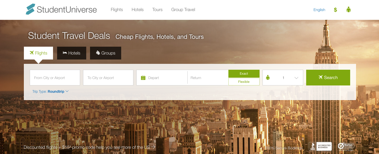
On Student Universe, the initial search is quite simple: the interface is modern, attractive, and clear. Problems arose after searching, however, first when the site opened up new windows showing ticket rates from other travel websites.
“Oh, I don’t like these popups,” said one user, not recognizing at first that the “popups” were part of Student Universe’s search experience and not spam. Another user didn’t even notice the new window, which opened behind his current one, until after he had completed the task.

Other users complained about the slow search times – several were staring at the loading screen for a while before their results were finally displayed. This issue was compounded by the fact that the results reloaded every time users clicked on a different price option from the results.
 STA Travel also faced speed issues: “The load time was horrible. I would definitely try another site before this one.”
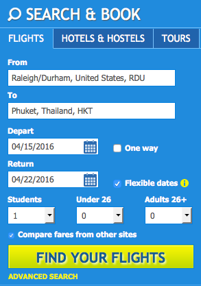
The issues began earlier though; the first thing to confuse many users was a choice offered between searching as “Students,” “Under 26,” and “Adults 26+.”
Obviously the categories are not mutually exclusive and several users, misunderstanding the question, selected both “Students” and “Under 26.” Later on, they realized that this caused the site to add an extra, unwanted ticket.
A couple users also noted that the website felt a bit cluttered. “There was a lot of things going on. It was a little distracting looking at everything and then reminding myself of the task at hand.”
Not everyone agreed on this point, however – one user stated they “liked the simplicity” of the website, saying it “didn’t have a lot of extra elements in the way.” Perhaps this divergence reflects that the variety of visual elements pulled more distractable users from their course, but the proper pathway was still marked clearly enough that it was easy for more focused users.
Both websites suffered most from slow speeds, but additional issues with STA Travel hand the lead to Student Universe.
Task 2: Find a hotel within 30 miles of the airport for under $200/night
When trying to find a hotel, users on both Student Universe and STA Travel frequently ran into a similar problem: the lack of an obvious pathway to finding a hotel after getting tickets.
“It didn’t connect to the finding the flight process, like when I am checking out my flight ticket I would have wanted to see hotel listings near the airport below my ticket purchase,” said one user in a statement that could equally describe both websites.
Users had to return to the home page and then click “Hotels” to begin their search.
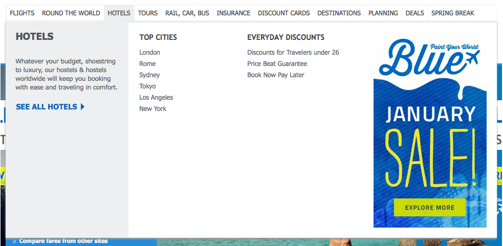
User on STA Travel had a few other problems, too. One felt that the Hotels dropdown on the top navigation bar was “a bit overwhelming” and faltered as she tried to figure out what to do next.
A recurring complaint was the apparent lack of a Cart. Several people were concerned about losing their flight tickets, or not being able to re-access flight information, if they clicked away to look for a hotel. A few users suggested that there should be an easily accessible Cart on the site for this reason.
Once again both sites shared central problems, but STA Travel falls further behind after giving users more to worry about.
Task 3: Book a tour in Phuket during your trip
Booking a tour proved the most difficult task for users on both websites. Significant issues arose almost immediately for people using Student Universe.
First, some struggled to find any information or links related to tours at all, since the home page UI doesn’t have a Tours section. Eventually those users noticed the Tours link at the top of the screen.
The bigger problem was that the Tours part of the website has a completely different appearance from the rest of the site, which threw users off and caused some to doubt the credibility of the new page at first glance.
One user later explained, “I didn’t like how it connected me to an entirely new site when I looked for a tour, I felt like I had to learn an entirely new layout and site and that was confusing.”
The Student Universe search function was also not very advanced, causing many users to struggle. Searching for “Phuket Thailand” returned 0 results – only “Phuket” would find the tours for that area. This delayed many people from finding a tour and led a few to think that no tours were available.
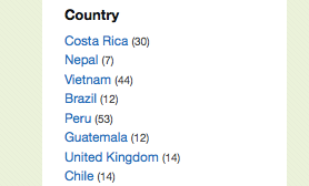 Another less fundamental issue cropped up on the Tours page that caused irritation to one user: the categories in the left-hand column were not in alphabetical or any other logical order.
Even the months were listed randomly: June, January, November, May, July. “That’s my pet peeve,” she said. This lack of organization caused annoyance and made the website seem less professional.
Users’ experience on STA Travel was not nearly so error-fraught in this task. A few users complained that the Tours page was “very different from the flight and hotel pages,” but not nearly to the same extent as Student Universe.
Another user who looked for a tour by clicking through categories found it hard to narrow down his search beyond the country level. After choosing to view Thailand tours, he couldn’t see specifically tours in the Phuket region.
STA Travel users overall had a much easier time finding a tour for their trip than Student Universe users, who struggled with a number of different issues.
Conclusion
Both sites were plagued with issues that made the user experience more complex and needlessly difficult.
Though Student Universe was mainly guilty of this in the last task, it caused several users to fail to complete their test. STA Travel‘s issues were concentrated more heavily at the beginning, and while there were a lot, users were for the most part able to work past them.
So what’s the final verdict? A look at the SUS (System Usability Score) results for each website provides insight into what users ultimately thought.
Student Universe ranked in the 68.75 percentile based on users’ response to the SUS questionnaire; STA Travel ranked in the 64.38 percentile – competitive, but not quite enough to snatch a win in this usability face-off.
Therefore,
this month’s UX Wars winner is…
Related Reading:
UX Wars January: Domino’s vs Pizza Hut
UX Wars February: Nike vs Reebok
UX Wars May: Expedia vs Priceline
UX Wars Jun: AllBirds vs Greats


