Video games and gaming culture are progressing as fast as the bandwidth to our homes is increasing. People are no longer just playing video games but are now watching them for entertainment too. Streamers, or broadcasters, use platforms like Twitch and YouTube Gaming to live-stream as they play their favorite games, while other people watch and enjoy.Twitch is the larger and more well-known location for catching live games, but YouTube has a long history of people uploading recorded game sessions and clips, and has now thrown its considerable resources into building up a rival to Twitch.
“I prefer live games because it is truer in a way. You see what is happening at that moment and how that person thinks and reacts.”
For this month’s UX Wars, we did some usability testing with video gaming fans to find out which platform provides a better user experience: Twitch or YouTube Gaming.
Task 1: Find a game to watch
Each website offers several methods for finding live games to watch: search, browse, featured games, live stream previews, and more. We asked users to navigate to a game that satisfied a certain “views” or “streamers” count range.
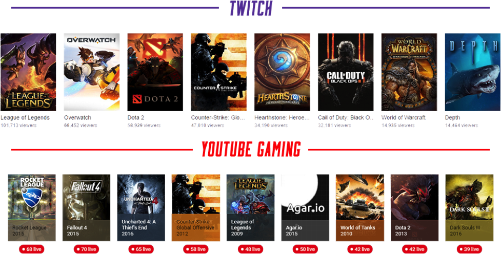
On Twitch, users would either scroll down on the home page and find the “featured games” section or navigate to “browse” where there was an array of games to choose from. Twitch uses a continuously updated “view count” on their game titles that fluctuates and displays counts ranging from 1 to 500,000+.
On YouTube Gaming the most common path users took was to navigate to the “live” tab, then scroll through the carousel of games. YouTube chooses to sort their games by “streamer count”, instead of the more typically used “view count” method. YouTube Gaming’s “streamer count” contains a cap of 100+, which became an issue for one user.
“I’d like to know if it’s more than 100+, like if there are 700 live streamers in a game. It doesn’t tell me much about the audience of these games since there could be 1 viewer per 700 streams.”
The choice to show number of streamers and not number of viewers may be partly to obscure the site’s lower traffic flow relative to Twitch, allowing the number of viewers to be ambiguous at the highest organizational level. However, as Twitch’s website points out, a stream is a “live social video” that offers community interaction as well as simple viewing entertainment; thus for some users leaving out the number of viewers is an important omission.
Task 2: Find information about the streamer
In order to help users connect and learn more about the streamers, Twitch and YouTube Gaming both offer information sections that allow the streamer to display any information they choose. For the second task, we asked users to find some of that extra information.
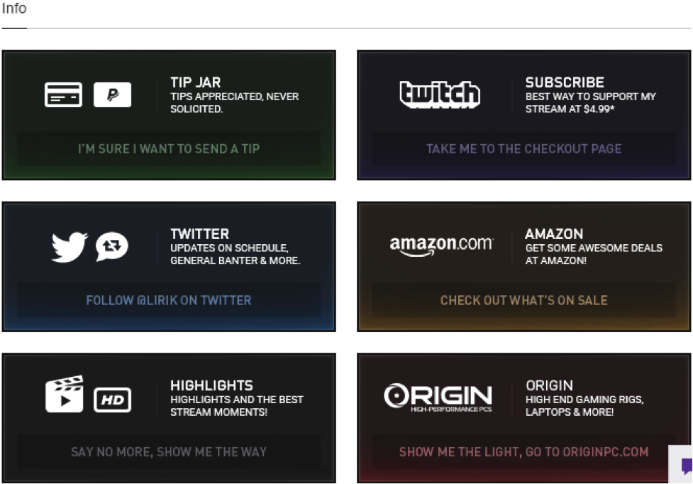
The most common route users took on Twitch was navigating below the livestream video and finding the customized information modules. Next, users proceeded to click on the streamers’ name/picture within the title of the stream, which lead them to their profile. Here users found the same custom modules as well as a short description of the channel.
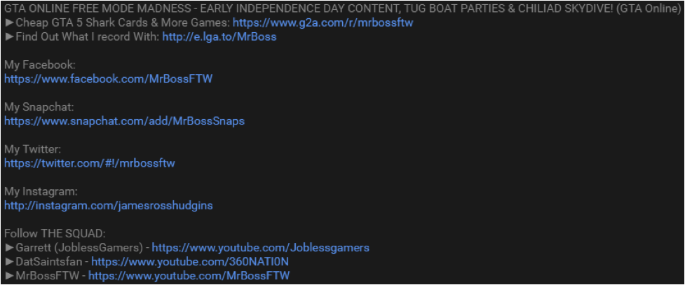
YouTube Gaming takes advantage of the pre-existing video description section from the main YouTube UI and integrates it directly into YouTube Gaming. Most users navigated below the livestream and clicked the “more” option there. The “about” tab nested within the streamer’s profile was the second most common place for users to search for information but was used significantly less.
Compared to YouTube Gaming, Twitch does 3 helpful things that allow users to find information about the streamers they’re watching:
1. When the streamer provides no information about the stream, Twitch compensates for this and writes the message “It’s empty in here”. YouTube Gaming does not provide any message if the streamer neglects to provide information (sending the user on a wild goose chase).
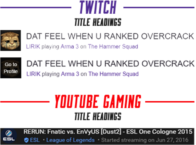
2. As users move their mouse over the streamer’s profile picture, a hover message appears with the words “Go to Profile”. YouTube Gaming has this same function within their profile image, but Twitch’s hover effect gives the user that extra guarantee of where they will end up.
3. Underneath the title of the video is the streamer’s name and the game they are playing. Twitch uses the format “Streamer name playing Current game” while YouTube Gaming’s format is: “Streamer name • Current game”. One user on YouTube Gaming was unable to complete the task and repeatedly overlooked the streamer name and current game because of the lack of context for the information.
Task 3: Support a streamer you like
Support comes in numerous forms when you want to show some love to your favorite streamer. Each service offers its own methods to support streamers and with this comes two sets of languages specific to the sites.
Twitch offers a few different options for the user to show their love. We found the most common was “following” the streamer, which is possible with a swift click of the “follow” button directly underneath the livestream video. The next most common method, directly adjacent to the follow button, is the subscribe button. If the user wants to show a little extra support, they can pay for a subscription to their favorite streamers for $4.99 a month.
“I can follow, I can subscribe…yeah, it’s really easy to navigate.”
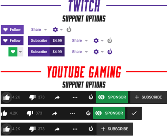
The remaining methods that users found rely more on the streamer. Normally found within the info section are modules that allow users to donate through PayPal, follow various social media profiles directly, and use promo codes for any sponsors the streamer may have partnered with.
“Well obviously he has a big donate button right here. I could follow which is like subscribing on YouTube? Or I could subscribe.”
YouTube Gaming’s options are similar to Twitch but stay true to the language that is used throughout the rest of YouTube – the familiarity factor works well (“This looks YouTube-based, so I guess we can support them by liking and subscribing to their videos”).
The most common option used was “liking” the video, then “subscribing” to the streamer’s channel. Found last or not at all was the “support” button that is shown when a streamer partners with YouTube (so not all streamers display this option).
One notable thing YouTube does well is sharing and repurposing the pre-existing language from their flagship site. Millions of users have a strong grasp of liking, disliking, and subscribing to videos, so transitioning the language over to YouTube Gaming only makes the experience that much smoother.
One problem arose on both Twitch and YouTube Gaming because monetarily “subscribing” and “supporting” only comes from a partnership with the respective company. When asked how to support a non-partnered streamer, users had no idea that “subscribing” or “supporting” was an option, and commonly left out these possibilities when answering how they could support streamers.
Conclusion
Twitch and YouTube Gaming both successfully create a professional and fun platform for users to watch live gaming content. Users on both sites had difficulty realizing that “subscribing” or “supporting” was an option if the streamer was not officially partnered, but they were still able to show their love through other methods.
Twitch does a lot of small things well that make the site easier to navigate. Their customizable information section is one of its best features, which was always found quickly and contained a wealth of information.
YouTube Gaming does an excellent job with transferring UI elements and language over from YouTube to the new game streaming platform. The similarities between designs allowed users, many of whom are already familiar with YouTube, to smoothly transition into using YouTube Gaming.
While YouTube Gaming is a skillfully built extension to YouTube’s pre-recorded and edited content, Twitch has provided a platform that was specially built and uniquely tailored for this new industry. On Twitch, users were able to find games, information, and different ways to support their favorite streamers more efficiently and easily than on YouTube Gaming. Therefore…
this month’s UX Wars winner is

Read more:
UX Wars May: NatureBox vs Graze
UX Wars April: Lander vs Instapage
UX Wars March: Student Universe vs STA Travel
UX Wars June: Google Express vs Amazon


