


DIY death match on Hallows Eve
To celebrate the Halloween season, TryMyUI has put together a “whodunit better” UX War between “how-to” / “do-it-yourself” websites eHow and wikiHow. Which site will get you ready for Halloween? Who can tout the best tutorials? Whose UX will be victorious in the crafting colosseum and haunt your computer screens?
Ten testers were beckoned to find the best (outside of Pinterest) DIY crafting site on the web. Why didn’t we run a usability test on Pinterest? Well, we didn’t think it’d be particularly useful to compare it to anything else in a straight usability test.
A quick note on scoring methodology
We did not base our decision solely on the performance of each website’s UX Diagnostics score. While we obviously took that into account, and perhaps most importantly for any usability test or UX study, those statistics helped guide us to key areas of interest. However, we also considered the most important aspects of a crafting/DIY site, and which of the two best met what we believe those aspects are.
Crafting first impressions
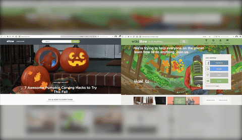
First, we had users explore the home page and give their feedback on what they saw. This is called impression testing and is something we recommend for any website usability test. The first impression and resulting perception influences the rest of a user’s experience on the site, and you only have a matter of seconds to convince them not to exit. We highly recommend including one for your own usability test.
eHow
Right away, the majority of users noted the high-quality image of eHow’s featured article that day (a cooking recipe for making cheesy waffles). The general consensus was that the site was fun, informative, and professionally done, with a killer feature photograph.
wikiHow
Unlike eHow, the majority of users for wikiHow immediately read the headline aloud before noticing the images or interface. Once the users began looking around, though, they repeated similar sentiments: fun, informative, professional. However, they also had some notable additions absent from eHow, such as “light-hearted” and “artsy.”
Generally, it was clear to most testers that both sites were going to be DIY and/or how-to websites. And, as we expected, a number of users compared both sites, unfavorably, to Pinterest.
Read more: 5 things you learn from website impression testing
Task 1: Where can you find projects specifically about Halloween?
First in our usability test, we looked at the the user flow by having them browse the sites’ organization. Maybe you don’t have something immediately in mind to create, you just want to find some Halloween-related inspiration. How well can a website funnel users to specific, seasonal interests?
Interestingly, nearly all users opted to use the search bar at the top of the page instead of looking around the front page gallery for any potential categorical listings.
Here, we uncovered the first major UX flaw with one of the sites.
eHow
Statistically, users on eHow struggled a little bit on this task with an average time-on-task of 161.67 seconds, and a completion rate of 91.37%.
The search results caused one user to recoil in disgust, immediately hitting go-back after clicking an external ad and saying, “Oh, no, I don’t like where this took me.”
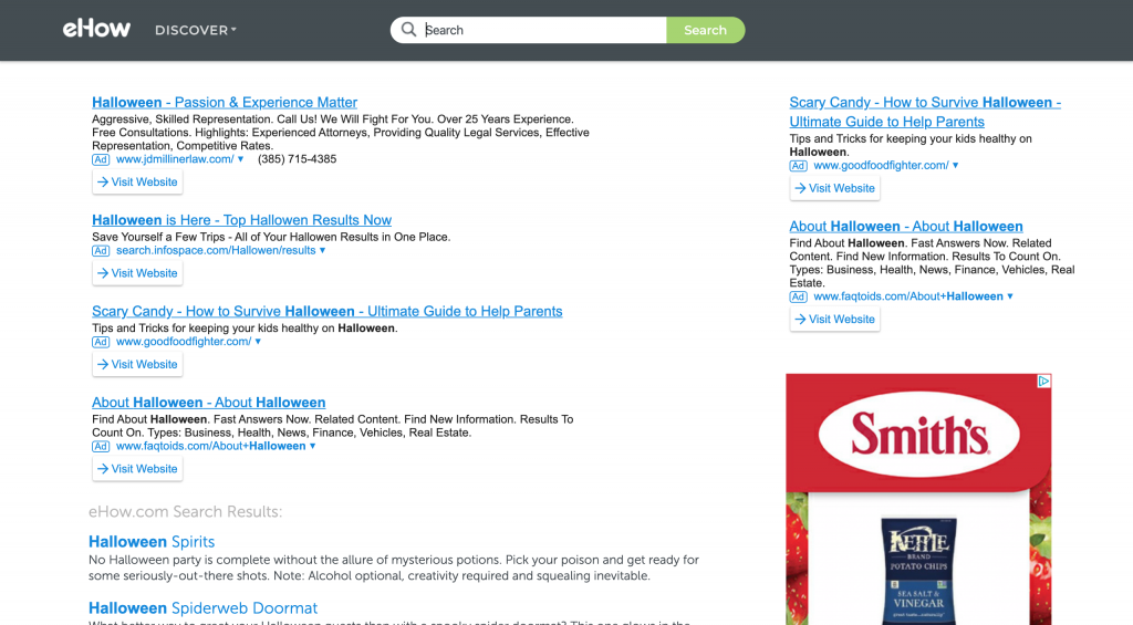
As you can see, eHow first loads external ad links that actually caused some users to unknowingly navigate off of the website. If you look closely, you can see the light gray heading “eHow.com Search Results” further down.
wikiHow
wikiHow finished a bit faster here on average at 135.2 seconds, with a 100% completion rate. Compared to eHow, users found wikiHow’s search results much more straightforward and clearly branded. The article thumbnails have their trademark illustrations, which differentiated the wikiHow articles from external links more easily than eHow’s.
However, some users still criticized the external links appearing first.
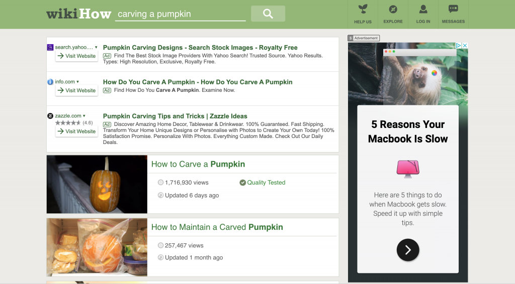
Users also appreciated getting a preview of the project before ever clicking on them via the thumbnails.

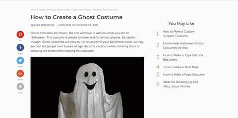
Task 2: Try and find some instructions for how to make a ghost costume. Compare a few options and pick one.
We decided to make a specific request of the users that we felt was a fairly typical Halloween costume. We did this to help mitigate any possible outliers who maybe had obscure ideas for what they would want to be for Halloween.
Obviously, it’s unlikely that everyone will be pleased by one set of instructions. You’d hate to walk out in your ghost costume and see your neighbor with the exact same costume, right? A fairly simple task that yielded fairly interesting results. While both sites did feature at least 2 results per query, the experiences were quite different.
eHow
eHow had a fairly interesting take on this task. After selecting a project, eHow continues to attach related content at the end of each set of instructions. It’s a sort of infinite scroll of related content. Users were mixed on this and felt that the related content was a bit of a stretch after the first two projects (going from costumes to props and then an article on dollar-store supply hauls).
wikiHow
wikiHow was noted by some users for projects that featured more than one set of instructions based on skill-level. This was, for the most part, well-received. However, there were some users who found it confusingly numbered and became very cluttered due in part to all of the images.
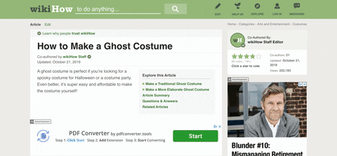
You might think that the eHow flow would be even more cluttering, but you’d be wrong. Perhaps the most recurring criticisms for wikiHow was the side bar ads that take up 20% or more of the screen. This makes the frequent (albeit helpful) images feel crammed and steps with little instruction can be easily missed.

Task 3: Do you think an average person could do this project?
When conducting your own UX research, consider the amount of tasks and tester fatigue. Combining a simple question like this in with the previous task could prevent users from feeling overwhelmed.
For this study, however, we really placed an emphasis on learning if a general demographic would be able to do these crafts. After all, we believe that the most important aspect of these websites comes down to how do-able the crafts are for a general user.
eHow
eHow’s greatest strength here comes again by showing users upfront what will be required for the project. Without going through the article, users could know immediately if specialized tools or potentially dangerous objects were required.

wikiHow
While wikiHow does have a “things you’ll need” section, but it comes at the bottom. It also has a warning section for things that involve sharp objects or open flames. This addition to the website was well-received for users who were thinking of projects to do with their children.

Task 4: Find instructions on some common decorations or props that people put in their yards for Halloween.
By asking the users to think of something on their own, we added a layer of spontaneity that the sites should be equipped to handle. User searched for a variety of crafts from little flags and to jack-o-lanterns to cauldrons and coffins.
eHow
eHow’s search function serves the bare minimum requirements for the task. Although no user was unable to find what they were looking for, it’s difficult to give eHow any additional credit for their otherwise dated design.

wikiHow
wikiHow’s search results, however, did feature some extra details that put some UX distance between its competitor. For example, its search listings included how many views the article had gotten, and how recently it was updated.

Task 5: Do you think an average person could do this project?
The most frustrating part of a crafting website would most likely be poorly written or extremely specialized instructions. While both sites were well-written, there were other elements that affected the score as well.
eHow
eHow projects have very clear steps for the user to follow, and even has a list of the tools or materials needed at the very top of the page. This allowed users to gauge the time and resources required before diving in to the instructions.
Move through the instructions, users found them to be fairly clearly written and very well organized. However, most users lamented the absence of frequent photographs for certain tasks that they had trouble visualizing.
wikiHow
The immediate contrast in the two instruction styles was that wikiHow chose to list the tools and materials needed for the end. This was a point of annoyance for users who had to scroll all the way through the project before estimating if it was possible to do.
While eHow boasts a more convenient organizational flow, it seems that every single one of wikiHow’s articles have their trademark watercolor illustrations. While these are often humorous and unnecessary in other how-to guides, crafters responded very positively.
Task 6: Is there a way to ask for clarification if the instructions aren’t clear?
Task 6 is one of some contention. Should crafting websites be liable for questions from their users if the directions are unclear? Would having a comment or contact section open the site up to spamming vulnerabilities?
Regardless, we did include it, with the idea that someone might get quite dead set on making a craft from the websites, and would become annoyed if there was no way to clarify.

eHow
eHow does have a comments section, despite many users having trouble locating it, and 25% not finding the section at all. Comments on eHow were also very few and far between, adding no real value to the projects.

wikiHow
wikiHow features a “Community Q&A” section where users can submit questions to the authors as well as replies to other community questions. A few users actually noted and predicted the use-case for the community Q&A section in earlier tasks as they browsed, confirming that it was a nice addition to have.

What the crowd had to say
The UX Crowd results were very, very similar. The common complaints and suggestions were:
- Excessive external website links at the top of the search page (for both, but especially eHow)
- Steps were clear, but include more photos (eHow)
- Cluttered and didn’t have a very simple feel (wikiHow)
- I liked the illustrations (wikiHow, which received +4 votes)
- Materials needed at the top of the article helped a lot (eHow)
wikiHow is of course known for their watercolor illustrations, which are frequently taken out of context and meme’d. This proved to be a somewhat divisive issue, some users considering them as a very fun and positive thing while others were a bit “put off” by them.
Conclusion
Both sites performed fairly similarly in their respective usability tests overall, with the greatest difference perhaps being wikiHow’s illustrations and eHow’s external ads. The task completion, duration, and overall usability were otherwise comparable.
Sometimes, your score is just at the mercy of a couple of curmudgeons who really blast you for something your top competitor might also do. That’s why the 10 testers for reliable data is more of a guideline than an actual rule, and why the quantitative score shouldn’t be the only metric that you judge your UX by.
We based our decision on who provided would-be crafters with the most helpful and thorough information, using the quantitative scores to guide us to the areas of important qualitative analysis.
And so, the winner* is …
![]()
*2nd place behind Pinterest
Related reading: