This interview was originally posted on guiseppegetto.com.
Timothy Rotolo is a UX Architect at TryMyUI where he does everything from usability analysis to graphic design to social media. In the past, he has taught in rural Taiwan and done research on security issues & policies in several major Asian countries.
1) Can you describe your work as a UX Architect? What are you mostly responsible for within your organization?
It’s easy to boil the job of UX Architect down into a single word like “design,” but putting it so simplistically is only true in a very narrow sense. Design – elegant, usable design – is the end goal of the job, but what I really do for TryMyUI is to create a vision for the product.
What this means, first of all, is doing your research. I use our product heavily myself to maintain an organic understanding of our customer experience and confront the issues our users face as they set up, order, and analyze tests (by the way, yes, we do use TryMyUI on itself). I also read customer feedback for more insights into the complaints and suggestions that our current users have.
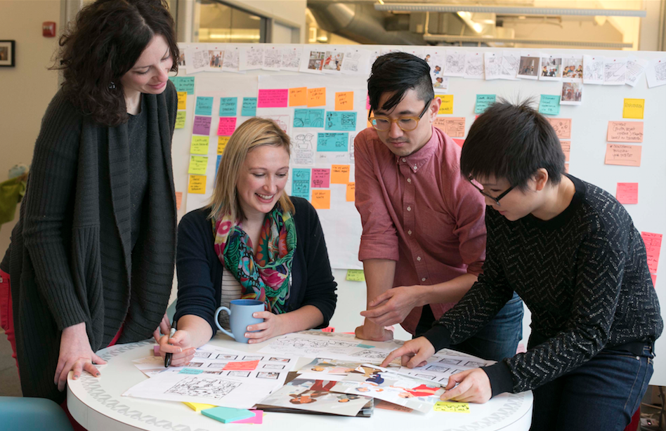
Next comes the actual work of designing, which begins with quite a bit of brainstorming. I never feel comfortable embarking on a project without getting a few extra brains in on it, so the team comes together and exchanges ideas, discusses the challenges of the project, and thinks about solutions. (Usually this involves lots of time on the whiteboard). Only then do I break out Photoshop and get to work on the mockups.

My design work is split between visualizing brand new features and interfaces, and crafting updates and reworks for existing ones. Both involve visual design (with special attention to internal stylistic consistency), interaction design, and information architecture. Redesigning older features also requires thinking about how much change current users can adapt to in a system they are already familiar with.
The job doesn’t end there, because the designs must be communicated to the development team. Every project gets an exhaustive walkthrough, with precise descriptions of each potential user flow and the interactions they will contain. And this isn’t a one-way street: I also talk to our developers about what can and can’t be done, and discuss solutions that may be more efficient or more feasible to build.
As I said before, the end goal of the job is elegant, usable design, but the goalposts are always moving back. The UX Architect’s job is to keep developing the vision for the product in step with that movement.
2) What’s it been like working with an emerging company like TryMyUI? How would you describe your experiences there?
Working at an emerging company grants you a lot of flexibility, but it also requires a lot of flexibility in return. The demands of the job can change markedly in a short space of time. For example, our product roadmap recently got reprioritized to focus on building Collaborative Analysis capabilities for multi-user accounts, and a lot of the feature reworks I’d been working on have been put on hold to push out the collaboration-centered features.
Also, because our team is so small, each of us has to frequently change hats and pick up the slack wherever needed; often these extra responsibilities can distract from the UX-related tasks at hand. We work long hours, and there’s usually still too much to do but the environment is great, and the people make it worth it.
3) What would you identify as some of the key elements of developing a UX strategy for an organization?
To my mind, the key elements basically comprise the following process:
Research > Brainstorming > Design > Communication > Iteration
All of these steps are heavily collaborative: from the analysis of user feedback, to the brainstorming of product solutions, and how to implement those through design. Getting other people in on the process and influencing the final decisions makes such a huge difference for the quality of the product, because they’ll think of things that you never would.
I’ve described most of these steps already, but the one I haven’t spoken to directly is iteration.
No design is perfect. You draw up all your mockups, you implement, and then you take some time and go back to see what’s working and what’s not, and think about what’s missing that could make this a better product. Until your design gets put into action there’s no way you can think of every little thing that might go wrong.
One of the biggest challenges, and this goes back to the question about working at a smaller company, is making the call on which features, facets, or interfaces will get iterated on next. Right now I’ve got a list of about a dozen different things that need a makeover, but obviously we can’t do more than 3 or 4 of them at once. It comes down to prioritization – Which features need it the most? Which ones are the most important to our users? Which ones are strong enough to get put on hold for now?
These are decisions that require a deep understanding of the product and of your users, as well as constant consultation with every member of the team that has a stake in the process.
4) What is the relationship between the various sub-specialties of UX, in your mind (e.g. information architecture, content strategy, user interface design, interaction design, etc.)? Why are all these sub-specialties important for creating a great user experience?
There’s a reason the job is named after architects – a lot of the components and principles of designing physical spaces are directly applicable to UX design. So to put these different sub-specialties in a context that’s more immediately familiar to everybody, we can imagine a website or web app as a living space – a house, or an apartment.

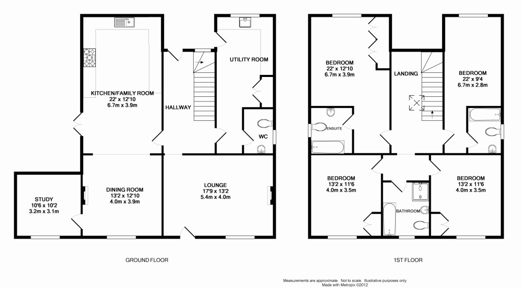
Information architecture refers to the way your rooms are laid out. Which ones are connected, and how? You have to think about what groupings and adjacencies make sense – what should be the relationship, for example, between the kitchen, the dining room, and the family room? Off of which room should the bathroom be placed? (Probably not the kitchen). How should rooms be divided between floors?
Lots of issues of hierarchy and grouping come into play, and the end goal is to create a logical flow that organizes all of the component parts in a comfortable and intuitive way. This is the framework that everything else will fit into.
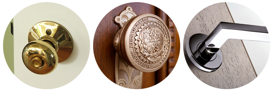
Interaction design is about crafting the specific ways in which people interact with the space. Something as simple as a doorway poses endless possibilities. A door that opens inward is different from a door that opens outward; this choice affects the way the room visually unfolds to the person entering, and the way they perceive and respond to that room. Even doorknob choice influences people’s feelings and says something about the identity of the room and the entire space.

The goal here is to manipulate the way people will experience the space, feel about it, and respond to it. We like to ask people in our research to describe the feel of websites we’re testing; whether they say “fun,” “professional,” “inviting,” or “elegant,” interaction design plays a big part in that perception.
Content strategy is about what you fill your rooms with, and in fact it’s the primary thing that makes the rooms what they are. A dining room isn’t a dining room unless there’s a table and chairs. But what content really does is to persuade, or guide people to use the space in the intended way. People in a room full of sofas and recliners will behave very differently depending on whether the furniture faces each other, or is arranged to uniformly face a TV or other focal point.
Content strategy is about communicating something to the user – informing and persuading them to take advantage of the space around them, defining purpose and creating direction.
Of course all of these overlap, but each component is oriented towards one of a set of interlocking goals that constitute a complete, intuitive user experience.


