While there hasn’t been a Disney movie about UX designers, these characters could have been talking about their insights into the field of User Experience in these quotes.
1. “If you walk the footsteps of a stranger, you’ll learn things you never knew you never knew.”
– Pocahontas (from Pocahontas)
Most of the time when you run a usability testing study, you’ll have some ideas in advance about the issues you’re going to find. If your intuition and knowledge of your users is good, you’ll likely see those issues come up in the tests. However, you will also see issues in places you never expected – places you thought were working smoothly.
When you’re the one that designed a UI, it can be very easy to overlook why others may not understand it. By walking the footsteps of a stranger through usability testing, you can discover things about your website you didn’t even know you were missing.
2. “It’s a guest! It’s a guest! Sakes alive, well I’ll be blessed. Wine’s been poured and thank the Lord I’ve had the napkins freshly pressed.”
– Mrs. Potts (from Beauty and the Beast)
First impressions are important. When new users come to your website, do they feel welcomed? Do they feel like you’re going to help them achieve their goal? Are you wowing them with your design, catching their interest with your message, and also offering something useful to them?
You have to be prepared for your users, and you can do that through research. By figuring out exactly what users want and expect, you can make the experience better for them – which will lead to higher conversions for you!
3. “Salagadoola menchicka boola bibbidi-bobbidi-boo, put ’em together and what have you got? Bibbidi-bobbidi-boo!”
– Fairy Godmother (from Cinderella)
Have you ever gone back and read web content that’s been up on your site for a while, and realized that it just doesn’t make much sense? There’s always a temptation to use industry lingo, or phrases and words unique to your company’s messaging. We’re surrounded by that kind of language and we know what it means.
But you may end up talking over your users’ heads if you aren’t careful (and sounding like the Fairy Godmother in this quote). An easy example of this is using acronyms that your users aren’t familiar with. Always think about: Will someone who’s on this website for the first time understand what I’m saying? Is my use of language serving as a barrier, or an aide, to communication?
4. “I’ve got gadgets and gizmos aplenty. I’ve got whozits and whatzits galore. You want thingamabobs? I’ve got 20! But who cares… no big deal… I want more.”
– Ariel (from The Little Mermaid)
Simiplicity of purpose is valuable in UX design. It can seem like you’re doing the user a favor by adding more and more features, options, fun animations, and other bells and whistles. However, what’s truly important is helping the user effectively and efficiently towards achieving whatever goal they have on your site. Don’t embellish so much as to distract users, or yourself, from the main focus.
Read more: Is your design drowning out your message?
5. “No matter how the wind howls, the mountain cannot bow to it.”
– The Emperor (from Mulan)
When you watch user test videos, there’s always moments where you just want to yell at the users, “That’s not what you’re supposed to do!” or “Come on, it’s right there!” It really feels like they are just wrong – that they should recognize the obviously correct way to use the website.
Unfortunately, that’s not how design works. We can yell all we want, but it won’t change user behavior; people will continue to get confused and stuck, even though you feel like the design is obvious. We are the ones that have to be flexible and adapt to what we discover.
6. “I wanna know, can you show me? I wanna know about these strangers like me.”
– Tarzan (from Tarzan)
As we’ve already seen, we truly are not our users. We will not see our designs the same way they do. We will not be able to guess their every misstep. We should contantly question our assumptions, and remain skeptical and inquisitive. There are many ways to find out what users (strangers!) are thinking. Take advantage and do as much research as you can (and make sure it’s with people who really represent your target audience).
7. “I don’t think the Empire had Wookiees in mind when they designed it, Chewie.”
– Han Solo (from Star Wars: Episode VI)
After all, Star Wars is a Disney franchise now! When Han Solo tells his tall, hairy friend this quote about their commandeered spaceship, it’s a reminder for us to think about who our target users are, and who our edge cases are. There’s a balance that has to be achieved between suiting our interface for the typical user, and accommodating other people who still may want our products or services.
It may be that a one-size-fits-all approach is the best one for your company; or, personalization and variability may be worth it to allow for and enable different experiences.
8. “Oh yes, the past can hurt. But from the way I see it, you can either run from it, or learn from it.”
– Rafiki (from The Lion King)
Rafiki’s “run from it or learn from it” advice can apply to many things, among them tough criticism. When you put your designs in front of users and get some pretty negative feedback, it can be disheartening. You may have to start all over from scratch; or you may find that after lots of time spent revising an interface, the original performed better anyways.
The best thing to do is not get defensive, but listen intently, accept what you learn, and use it to adapt your designs and make your product better.
9. “Just a spoonful of sugar helps the medicine go down in a most delightful way.”
– Mary Poppins (from Mary Poppins)
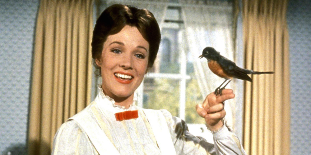
The experiences we create should ideally be not just usable, but pleasant, positive, enjoyable. You don’t have to go down Ariel’s “gadgets and gizmos” route to do this. Delightful interfaces are ones that focus on the minute details of the core experience, and perfect them such that everything is seamless. That may be animations that clarify and enrich functionalities, predictive technology, or well-chosen images or wording.
When users are surprised at how easy it was, that’s when you’ve spooned just the right amount of sugar into your design.
Read more: It’s the little things


