


This month, we ran user tests on the two brands’ mobile websites to see which company provides a better experience for young online shoppers using their phones to look for new clothes.
Task 1: Do you see anything on the home page of the website that interests you?
First, we had users explore the home page and give their feedback on what they saw. On H&M, the top third of the home page consists of a few key sections – Women, Men, Kids, Home, Sale, and Magazine – all stacked horizontally below a featured section and a rotating banner advertising “Free Returns in Store,” “Next Day Delivery,” and “Free Shipping over $40.”
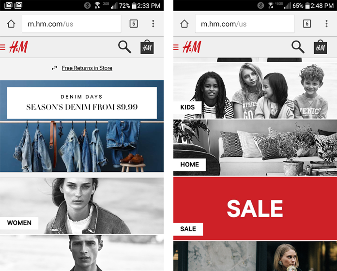
Though there’s a lot more to the home page below this, none of the users in our test scrolled below the top third of the page. By that point, all had seen something they would choose: mainly the Women or Sale section or the hamburger menu on the top left.
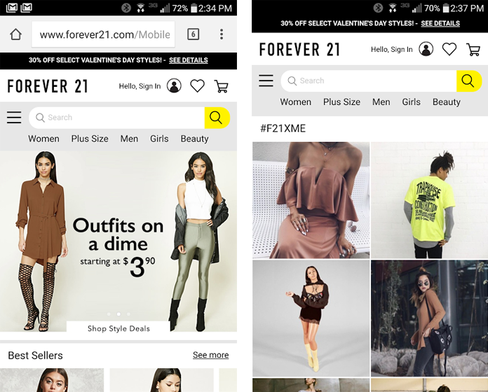
On Forever 21‘s home page, the options were less clear. Like H&M, there was a featured section (theirs is a carousel that scrolled through several promotions) and below that Best Sellers, The Outlet (“Not sure what that means, but it just looks like more clothes,” one user responded), and a section titled #F21XME (users’ takes: “Is this like people on Instagram? I don’t really know what that means”; “That’s kinda cool that you can see their products on people”; “That was quite a bit of posts”).
The most interesting option for the most users was a promotion advertising “Outfits on a dime starting at $3.90,” although one user complained that there was “nothing about sales.” The Best Sellers section also received positive attention.
Nonetheless, it was clear that H&M provided a better jumping off point for users, who were on the whole much more confident about what they were seeing and where they would want to go next. H&M wins this round.
Task 2: Try and find a sweater or cardigan that you like.
Next, we had users start their search for a new sweater or cardigan. In this step, we got to see how well each website’s navigation is set up.
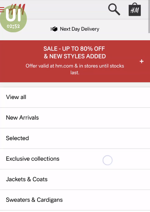
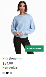
On H&M, users mainly navigated first to the Women section, then the category called Sweaters & Cardigans, and from there used filters and sorting to look for the right sweater. There was even further subcategorization under Sweaters & Cardigans, with options to only show Cardigans, Sweaters, Turtlenecks, and several other apparel styles.
One minor annoyance was that the rotating promotional banner from the home page stayed at the top of every page. “That scrolling text is a bit too persistent,” one user decided.
Navigation elements and structures on Forever 21 were not as organized or intuitive. On the home page, a small bar across the top contains links to Women, Plus Size, Men, Girls, and Beauty sections. A hamburger icon opens a side menu with the same sections arrayed along the top (a slightly weird duplication), and shopping categories like New Arrivals, Dresses, Tops, and Jackets listed vertically.
Choosing any of these categories opens a product listing page, with a separate dropdown for further navigation options at the top. For example, after choosing Tops, a dropdown button above the products offers 10 subcategories including Bodysuits, Crop Tops, Off the Shoulder, Tees + Tanks, Sweaters + Cardigans, and more.
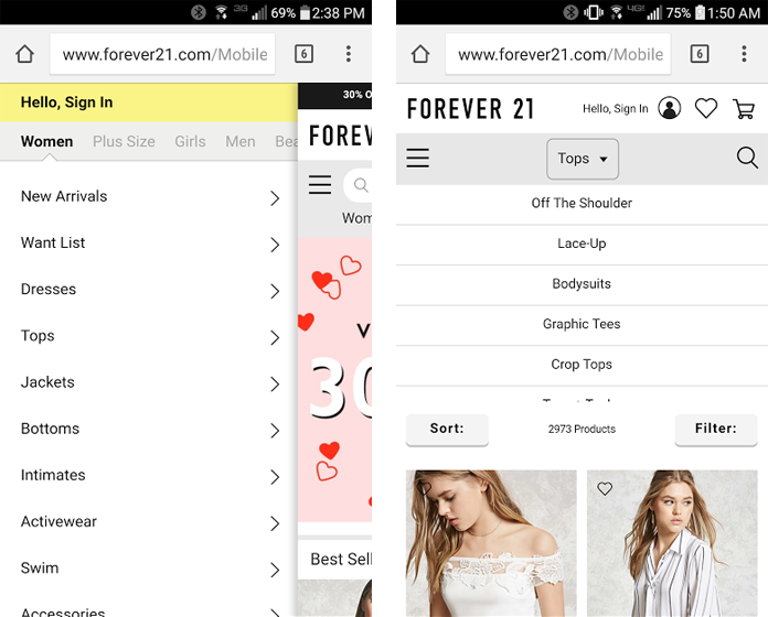
This architecture was not very intuitive to some users, who struggled their way to the Sweaters + Cardigans section. “I’m looking for something that says sweaters or something like that. I don’t see that [on the side menu], so I’m gonna click Tops,” one mildly confused user said. Then: “I thought maybe it would make another menu that would allow me to pick sweaters but it’s not doing that.”
By splitting up different levels of navigation into different structures and locations, Forever 21 makes it much harder to smoothly reach the right destination. As far as the actual product listing pages, both websites do a good job (H&M gets bonus points for showing products’ color options with swatches). H&M wins this round, too.
Task 3: Make sure the sweater you’ve chosen is in the right color and size.
After finding a sweater they were interested in, we had users take a harder look at the product and its details. A majority of the users were most interested in finding reviews for the sweater they’d chosen (“Reviews are really important to me,” one noted). However, both websites mostly disappointed the users; they had Reviews sections, but in all cases there were none there.
Users also paid attention to the contents of the product details. Both websites provided similar information – material, cut, care – but Forever 21‘s was much more thorough and useful.
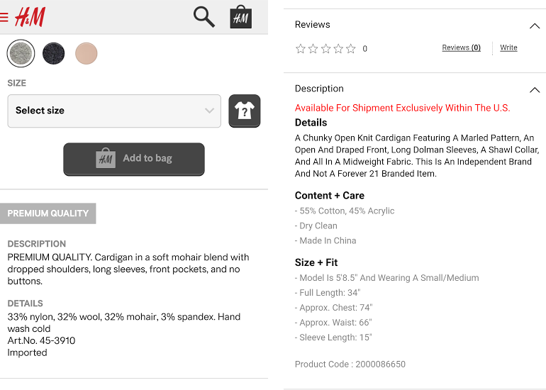
In particular, their Size + Fit section gives very exact information: full length, sleeve length, chest, and waist in inches, the height of the model and what size she’s wearing. H&M does not go into this kind of detail; the closest they have is a generic size guide (Forever 21 also has one).
As one Forever 21 user said, “It’s always nice to see measurements when you’re buying a product online to make sure it will fit you okay.”
 The link for H&M‘s size guide, an icon of a question mark on a shirt outline, was actually a source of confusion for one user. She guessed that it would help her locate the piece of clothing in a nearby store, and was surprised to find it was the size guide. Forever 21 just uses the hyperlinked words, “Size Guide.”
This round, Forever 21 takes the point.
Conclusion
Overall, both websites are pretty good, but for ecommerce sites, competition is stiff and competitors are numerous. Chances are, many users are checking multiple sites at once when they’re about to make a purchase; even a slightly worse experience can mean a lost sale.
Watch: See a full-length video of one user’s H&M mobile test
Sub-par navigation could definitely hurt: even if you have a user’s perfect sweater at your store, they won’t buy it if they can’t find it. Forever 21’s complex navigation and organization slowed users’ progress and made the experience less user-friendly. Their home page also provided less helpful options as users were just beginning their time on the site.
H&M outperformed Forever 21 in both these areas, and while their product pages were lacking valuable details that Forever 21 had,
the winner of this UX Wars edition is…
Related reading:
UX Wars: OkCupid vs Match.com
UX Wars: BBC vs New York Times
UX Wars: Expedia vs Priceline
Interested in mobile user testing for your website or app? Get started with a free account at www.trymyui.com/plans