


It’s that time of year again: holiday music; awkward conversation with family members you don’t really see much and definitely don’t agree politically with; holiday music; neighborly disputes about certain decorations being a little “extra,” as the kids say; holiday music; and our annual rundown of great UX. Oh, and then more holiday music.
For those of you celebrating this season by being corralled around a dinning table or living room couch, take refuge in some of TryMyUI’s favorite websites and apps of 2019!
Our favorite websites
Material.io: Refreshingly restrained
We’re going to get this out of the way right now: great UX or not, Pinterest will not be making an appearance on this list. However, as our lead UX designer says, Material.io is basically Pinterest for developers and designers.
Imagine that instead of projects on Pinterest, you wanted assets for your design. Material.io differentiates itself from similar tech websites with its exceptional and simplistic user flow. Clearly defined paths for learning, design, development, and resources feature card-based interfaces presented in a clean and pleasing white/black scheme with restrained smatterings of bright colors.
Another key aspect that further demarcates Material.io from sites such as Pinterest or Medium is that there is no account creation or paywalls. This, complimented again by the style and even the name, is a refreshing, cleansing sort of UX that makes the experience entirely user-centric.
Material.io is exactly what you expect it to be: material for your design, and not much else.
Read more about us excluding Pinterest from things: UX Wars: eHow vs wikiHow
Adult Swim: Unapologetically on-brand
Can you name a business more in touch with their demographic or with a stronger sense of branding than Adult Swim? No, you can’t. So it would follow that their website would be exceptionally on-brand and, for anyone who knows that brand, probably be a little antithetical for design. But knowing your user is necessary for crafting great UX.
Adult Swim has never been a programming block that takes cues from traditional broadcast networks. They’re engaging, mocking, experimental, and have always celebrated a no budget, DIY aesthetic. And so, naturally, their website is unlike anything UX Planet or trendy thought-leaders will parrot as being good design.
And it’s wonderful for it.
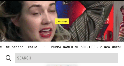
It has everything an entertainment website needs: a search function, relevant headlines, and a bizarre stream of content in place of a header image. Despite the look, it’s easily navigable while never letting you forget that you’re on a website for a studio/network that created such titles as “Assy McGee,” and “The Eric Andre Show.”
Save the Rainforest: Mission-driven UX
Something many non-profits fail at is UX, and that’s just the unfortunate side-effect of not having a dedicated, salaried UX team. But, what sets Save the Rainforest apart from other non-profits is their unique and stellar UX, a style of experience I’m dubbing Mission-driven UX, or Mi-dUX. Deal with it.
Mi-dUX’s goal is beyond informational, beyond transactional, and beyond empathetical: it’s an experiential call to action. Save the Rainforest drops users into their topographical jungle and, consequently, directly into their mission, which makes learning about and connecting with the cause arresting and inescapable (in a non-literal, good way).

Visitor take a virtual hike through whichever aspects of the jungle they want, and includes panoramas of stitched images from the Amazon rainforest. Along every point of the trail are interactive tokens of information such as videos, articles, statistics, photographs, etc. Interestingly, in contrast to our study of political candidate websites, there are very few prompts to donate.
Save the Rainforest is more interested in allowing you to experience the cause rather than wanting you to directly contribute. It’s a modern web marvel that shows what great UX can do for non-profits.
Our favorite apps
NordVPN: Fun, inviting, necessary
NordVPN is protecting your internet browsing experience and shielding you from the Silicon Valley panopticon by filtering your web identity through its virtual private network. Need to get around reputable news outlets’ limited-article paywalls? Done. Nervous about connecting to a public wi-fi? Easy. Want to watch some European Netflix? I recommend connecting to the German network.
We’ve written about gamification before, and extolled on its virtues for everything from finance and fintech to e-commerce UX and even Pokémon. Increasingly, great UX equates to great incorporation of gamification. But what many people do not understand is that gamification doesn’t only mean awarding points; it also means creating an experience that makes users want to play with your design.
NordVPN’s sleek interface makes connecting to VPNs quick and simple. Because its primary function takes a matter of seconds, I’m left wanting to explore more. And so I do. Their minimalist menus allow me to access well-structured advanced settings complete with tooltips. A thoughtful feature for the paranoid out there, you can even view activity on your connection!
Really, NordVPN in a great example of delightful, no-frills design, allowing users to immediately do what they downloaded the app for.
Pocket Casts: Straight-forward and pleasant
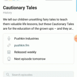
Pocket Casts hosts some of the best product/UX podcasts you can find and offers personalized listening settings for each show. Additionally, it keeps track of your listening stats, which is a fun metric you can use to feel good about how you’re spending your time.
With added features like listing the schedule, next air date, and linkable social profiles for the podcasts, Pocket Casts is a straight-forward and informative app designed to give users what they need to know upfront.
Our UX designer says that all of the information within the app is presented in a pleasant way and it’s always easy to find what he’s looking for.
He nominated it, if you couldn’t tell.
Lichess: Complexity made simple
 Lichess is one-part game, one-part educational behemoth, and all-parts great UX. Remotely challenge friends and strangers alike, with multiple ranked or unranked games going simultaneously. Its surprisingly sophisticated in-app engine logs, reviews, quantifies, and shows you where you went wrong, and how wrong you were.
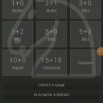
It’s also lightening fast and easy to use. The app packages the typical complexity of analyzing chess into easy-to-use and painlessly usable graphs and animations.
Lichess has three key areas of interaction: the home screen with quick setups, daily puzzles, and current matches; the menu with relevant sub-headings and iconography; and the game screen. With its dark color scheme, Lichess is highlighting where your attention should always be: on the illuminated chess board.
It’s free. It’s fun. It gets you directly into the action, and then it analyzes your game and educates you on how you could have done better. And you can always do better, but probably not for great chess UX.
Get yourself a little something and be featured next year!
If you are upset that your own app or website didn’t make the cut, or want to make something worthy of our 2020 list, sign-up for a FREE TRIAL! User experience research & usability testing are mandatory for achieving great UX, and you could start getting valuable insights today!
- Full access to Enterprise-level features ($2000 value)
- 5 TryMyUI tester credits ($175 value)
- 14 days!
Start your project here!