Love is in the air…..and, more recently, on the internet. February is the month of Valentine’s Day, and we felt this would be the perfect time to pit two online dating heavyweights, OkCupid & Match.com, against each other to see who has the most usable product. We ran a few tests with real, single men and women, and here’s what we found…
Task 1: Create an account & fill in some info about yourself
OkCupid pulls ahead for an early lead –
Both sites follow the same 3-stage registration recipe: get the basic details together, add a user-name and password, mix well. A couple of things put OkCupid in the lead here:
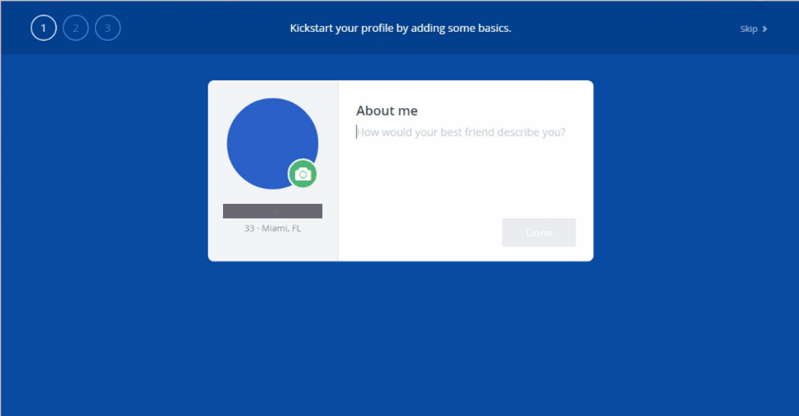
(1) Playful, tongue-in-cheek style: OkCupid keeps things interesting with an informal tone that adds character and charm and puts users at ease as they sign up. From interactive little flairs like “Ahh, Miami” (zip code recognition) to static page headings like “The last step. Don’t stop now!” OkCupid engages the user and subtly nudges them through the signup. Match’s process is functionally just as good, but misses out on style points.
(2) Username selection: Both sites have users in numbers that make picking a unique new username a challenge – a problem not unique to these two sites. But OkCupid indicates (with a checkmark or an X) when a username is already taken, while on Match users only find out once their submission is rejected.
Match.com’s early setbacks continue as account setup progresses. Pop quiz: What’s the #1 thing that people want to do when they join an online dating site? We don’t have any statistics on this, but our guess is seeing matches, as soon as possible. Here’s where OkCupid does something else right.
On their mobile site, new signups can see matches right away; no further steps are required. Of course, the matching algorithms will have nothing to work with, but you know what they say – seeing is believing. The details can be filled in later.
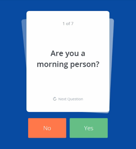
The desktop site adds a few extra steps: an “About me” field, and 5 to 7 yes-or-no questions (Could you date someone who was really messy? Do you like scary movies?) with pleasing card-flicking visuals. Oh, and all of it is skippable.
Match.com, on the other hand, packs the next step with questions that keep new users from even catching the scent of a match for as long as 7 minutes. It doesn’t help that there’s no indication of when the interrogation will end. Eduardo from Phoenix slogged through 6 questions before grumbling, “This is a lot of questions.” 20 more passed before he reaffirmed his earlier analysis, adding “Can I just get to the dating site?”
Task 2: Browse through some matches. How would you message them?
A more even stage
Both OkCupid and Match.com start off this stage with the same treatment – the new account owner is shown photos of possible matches to pick and choose the ones they like and give the algorithms a better idea of their ‘type’. OkCupid gives users endless scrolling and unlimited options (picky people rejoice!) though for many, Match.com’s dozen are probably enough. A bigger issue is that all 12 options are checked by default, which users often don’t realize until they accidentally deselect (and then confusedly reselect) the first person they like.

After this brief funnel step, users can browse potential matches at will, or see matches one at a time. The tradeoff of Match’s previous thorough probe into new users’ traits and preferences is that now, the first actual matches people see are pretty well-suited to them.
Match.com users by default first view the complete profiles of their “daily matches”, who are specifically chosen for them, and have an option to like or pass on them. A ‘like’ calls up a nice big box chat box in its place, making it easy to send a message immediately.


OkCupid doesn’t feature the ‘like’ and ‘message’ options quite so prominently on matches’ profiles, but they are still quite visible and easy to use. Both sites allow for pretty easy browsing of nearby matches. OkCupid wins this round too, but not by as much.
Task 3: You want to get better matches. Try to get more refined match results.
Match.com closes the gap
There’s two ways to go about this task – applying filters to the match results, or taking an action that tells the algorithm more about what you like and permanently improves the matches you get. On Match, this action is to rate your daily matches, and the site informs users of this with a clearly linked banner stating as much:
![]()
On OkCupid, the action is to answer “match questions”, and users are informed of this, and other things, in an inbox message from the staff (heralded by a bright pink notification that no one could miss). The problem is, the message does not contain a link to these match questions, and they aren’t exactly easy to find. Some users wandered for a while before finding them in the “questions” tab of their profile.
It’s not all going Match’s way, though – on mobile, the tides reverse. OkCupid gets it right with a direct, straightforward “Improve Matches” button on the footer, while Match doesn’t really indicate anywhere how to get better matches. For Match, though, the best is yet to come…
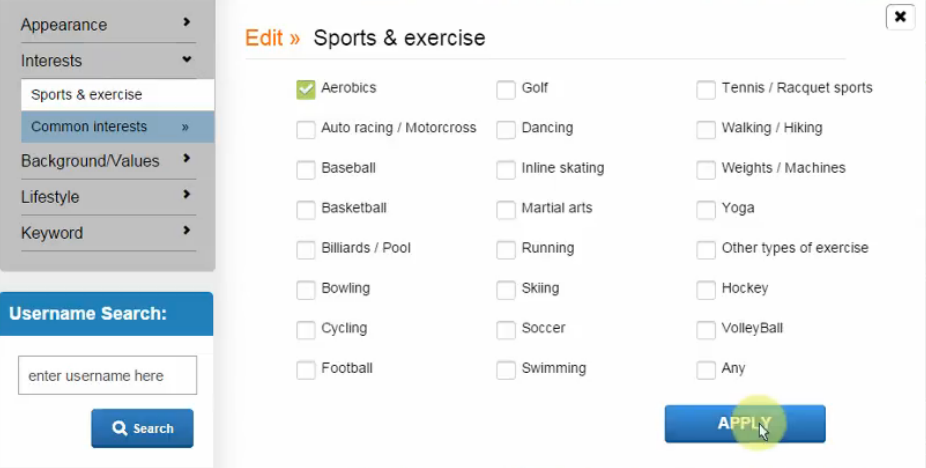
When it comes to filtering your results, Match.com blows OkCupid out of the water with a hyper-extensive search system. Almost any attribute you could think of can be selected for, with a simple and intuitive checkbox interface. OkCupid’s filters aren’t bad, but they don’t even compare for depth and breadth; and on mobile, users can’t even multi-select options (it’s only white OR black, Buddhist OR Hindu). Match doesn’t do mobile great either, with an ambiguous heading that sounds like you’re changing your own details – but all the functions are there.
Minus points: Neither site allows users to filter for guys with long hair. Sorry, Claudia from Miami.
Match.com wins this round by a solid margin. It’s not enough to put things even, but they’ve got a fighting chance again.
Task 4: Go and fill out your profile a little more.
OkCupid falters…
A relatively easy task, and both sites do it pretty well. OkCupid wins style points again for their word choice (Drinks: Very often, often, socially, rarely, desperately) but it doesn’t make up for one big misstep: the languages dropdown.
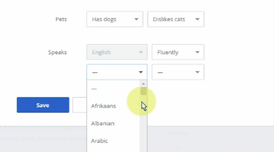
When the #1 number-two language in the country starts with an “S”, it’s not a good idea to have users choose from an alphabetical dropdown of hundreds of languages without a search option. What were they thinking?
Match wins this round, and closes the gap still further. As far as we’re concerned, though, they have yet to make up for the slew of questions during signup.
Task 5: Make sure you will get notifications when someone ‘likes’ you.
A draw?
For the last task, we wanted to investigate the usability of the settings by asking users to find ad potentially change their notification details. But both Match.com and OkCupid do pretty well on this, and there’s no issues to report.
So does OkCupid win on their current lead? Let’s factor in a few more general components.
(1) Visuals: OkCupid wins for visual style, and it’s not really much of a contest. Bold yet tasteful colors and plenty of blank space contribute to the site’s fresh, fun, disarming appeal. Match.com is much blander in its design and doesn’t quite feel up-to-date.
(2) Remembering users: Match does remember returning users, but it doesn’t keep them signed in like OkCupid does. Each time you go to Match.com, you land on the signup page, and have to click or tap onwards to the member sign-in to get logged back in again.
(3) Account deletion: Understandably, neither one wants users to leave, but while OkCupid still makes it pretty easy (very bottom of the settings), deleting your Match.com account is a nightmare – especially from mobile. In fact, there’s no mobile-optimized page for it; users have to switch to the desktop version and pinch-and-zoom their way down so they can confirm their password twice and then delete.
And with that, OkCupid puts the final nails in Match.com’s coffin. As far as usability goes, OkCupid is the champ of the online dating heavyweights. Of course, usability isn’t the only important thing for these two; but ensuring that the user experience is smooth, enjoyable, and painless is one of the best ways to get people on board as well as keep them coming back.
This month’s UX Wars winner is…

Read:
UX Wars July: Apple Music vs Spotify
UX Wars May: Expedia vs Priceline
UX Wars March: BeerAdvocate vs RateBeer


